CS7280 OMSCS - Network Science Notes
Content of these notes are from Georgia Tech OMSCS 7280: Network Science: Methods and Applications by Prof. Constantine Dovrolis. They kindly allowed this to be shared publicly, please use them responsibly!
Module one
L1 - What is Network Science?
Overview
Required Reading
- Chapter-1 from A-L. Barabási, Network Science, 2015.
Recommended Reading
Read at least one of the following papers, depending on your interests:
Networks in Epidemiology: An Integrated Modeling Environment to Study the Co-evolution of Networks, Individual Behavior and Epidemics by Chris Barrett et al.
Networks in Biology: Network Inference, Analysis, and Modeling in Systems Biology by Reka AlbertNetworks in Neuroscience: Complex brain networks: graph theoretical analysis of structural and functional systems by Ed Bullmore and Olaf Sporns
Networks in Social Science: Network Analysis in the Social Sciences by Stephen Borgatti et al.
Networks in Economics: Economic Networks: The New Challenges by Frank Schweitzer et al.
Networks in Ecology: Networks in Ecology by Jordi Bascompte
Networks and the Internet: Network Topologies: Inference, Modelling and Generation by Hamed Haddadi et al.
What is Network Science?
The study of complex systems focusing on their architecture, i.e., on the network, or graph, that shows how the system components are interconnected.
In other words, Network Science or NetSci focuses on a network representation of a system that shows how the system components are interconnected. To understand this definition further, let’s first explore the concept of Complex Systems.
Complex Systems
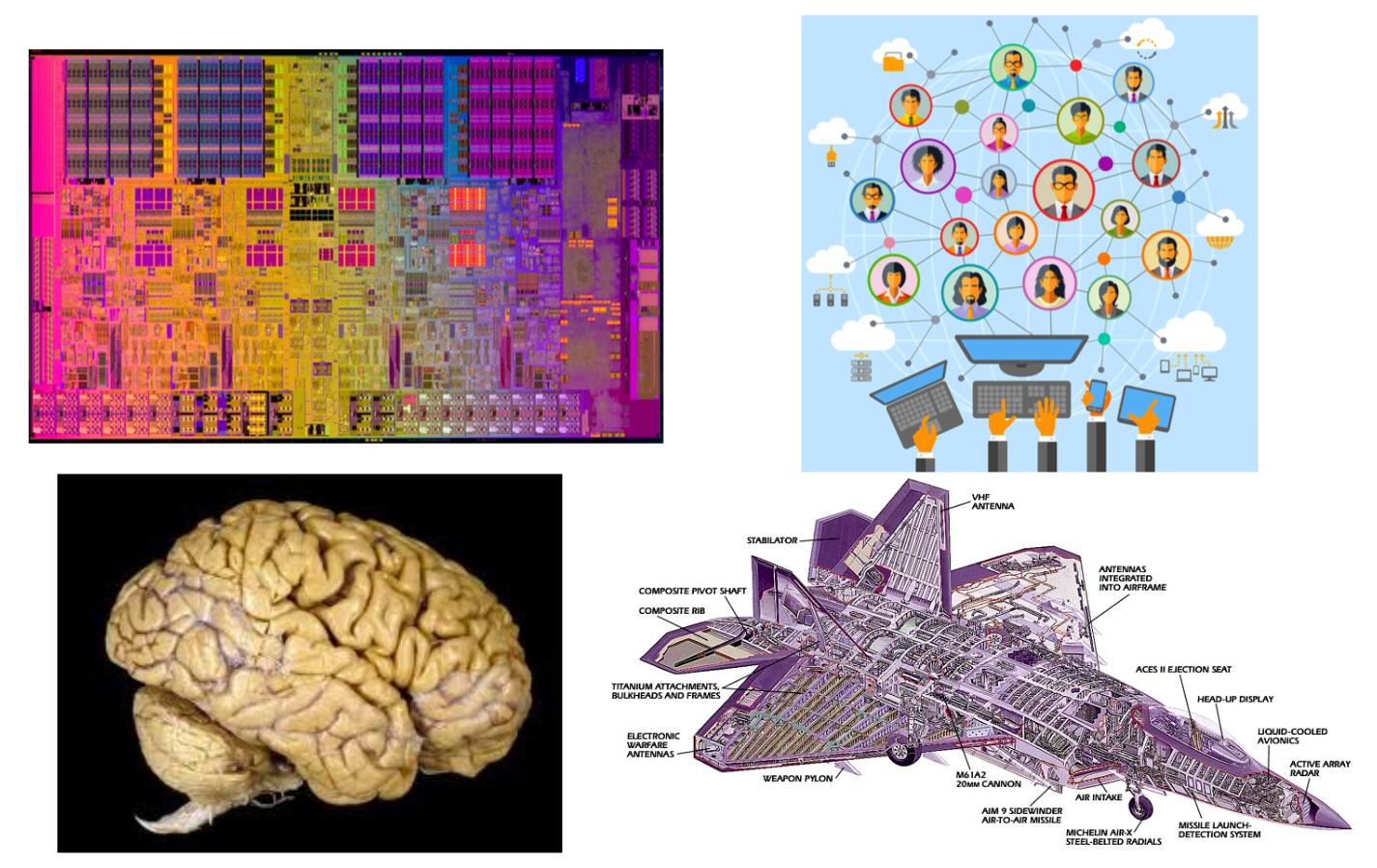
The image above shows a microprocessor, a human brain, an online social network, and a fighter jet. On the surface, you may think that these systems have nothing in common!
However, they all have some common fundamental properties:
- Each of them consists of many autonomous parts, or modules – in the same way, that a large puzzle consists of many little pieces. The microprocessor, for example, consists of mostly transistors and interconnects. The brain consists of various cell types, including excitatory neurons, inhibitory neurons, glial cells, etc.
- The parts of each system are not connected randomly or in any other trivial manner – on the contrary, the system only works if the connections between the parts are highly specific (for example, we would not expect an electronic device to work if its transistors were randomly connected). These interconnections between the system components define the architecture of the system – or in other words, the network representation of the system.
- The interactions between connected parts are also non-trivial. A trivial interaction would be, mathematically, a linear relation between the activity of two parts. On the contrary, as we will discuss later in the course, in all interesting systems at least, these interactions are non-linear.
To summarize, Complex Systems have:
- Many and heterogeneous components
- Components that interact with each other through a (non-trivial) network
- Non-linear interactions between components
Next, we’ll discuss Trivial Networks versus Complex Networks.
Trivial Networks Versus Complex Networks
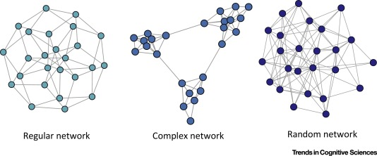
Trivial Networks also known as regular or random networks differ significantly from complex networks as the image above shows.
“Regular networks“ are a large family of networks that have been studied extensively by mathematicians over the last couple of centuries. Regular networks such as rings, cliques, lattices, etc, have the same interconnection pattern, the same structure, at all nodes.
The example shown at the left in the image above is a regular network in which every node connects to four other nodes.
Another well-studied class of networks in graph theory is that of “Random networks”. Here, the connections between nodes are determined randomly. In the simplest model, each pair of nodes is connected with the same probability.
In practice, most technological, biological and information systems do NOT have a regular or random network architecture. Instead, their architecture is highly specific, resulting in interconnection patterns that are highly variable across nodes.
For example, the network in the middle has several interesting properties that would not be expected if the network was randomly “wired”: note that there are three major clusters of nodes, few nodes have a much larger number of connections than others, and there are many connected three-node groups.
A major difference between network science and graph theory is that the former is an applied data-science discipline that focuses on complex networks encountered in real-world systems.
Graph theory, on the other hand, is a mathematical field that focuses mostly on regular and random graphs. We will return to the connection between these two disciplines later in this lesson.
Example: The Brain of the C.elegans Worm
 (Image Source: wormwiring.org)
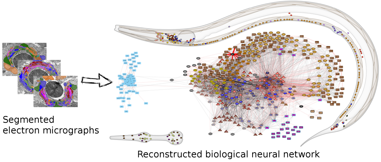
To understand the relationship between a complex system and its network representation, let’s focus on a microscopic worm called C.elegans.
This amazing organism, which is about 1mm in length, has roughly only 300 neurons in its neural system. Still, it can move in different ways, react to touch, mate, sense chemical odors, and respond to food versus toxins, etc.
Each dot represents a neuron, and the location of every neuron at the worm’s body is shown at the top right. The connections between neurons, at the level of individual synapses, have been mapped using electron micrographs of tiny slices of the worm’s body.
The network on the right in the image shows each neuron as a node and each connection between two neurons as an edge between the corresponding two nodes. Do not worry about the different colors for now – we will discuss this network again later in the course. The important point, for now, is that network science maps this highly complex living system into a graph – an abstraction that we can analyze mathematically and computationally to ask a number of important questions about the organization of this neural system.
Note that this mapping from an actual system to a graph representation is only a model, and so it discards some information that the modeler views as non-essential. For instance, the network representation does not show in this example if a neuron is excitatory or inhibitory – or whether these connections remain the same during the worm’s lifetime.
So it is always important to ask: does the network representation of a given system provide sufficient detail to answer the questions we are really interested in about that system?
The Main Premise
We can now state the main idea, the main premise, of network science:
The network architecture of a system provides valuable information about the system’s function, capabilities, resilience, evolution, etc.
In other words, even if we don’t know every little detail about a system and its components, simply knowing the map or “wiring diagram” that shows how the different system components are interconnected provides sufficient information to answer a lot of important questions about that system.
Or, if our goal is to design a new system (rather than analyze an existing system), network science suggests that we should first start from its network representation, and only when that is completely done, move to lower-level design and implementation.
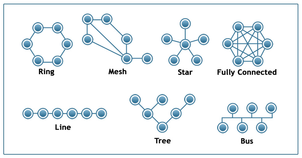 Image Source: techiereader.com
Above, is an example to illustrate the previous point.
Even if you know nothing about the underlying system, what would you say about its efficiency and resilience under each of the following architectures?
Suppose that we are to design a communication system of some sort that will interconnect 6 sites. The first question is: what should be the network architecture? This figure shows several options. For example, the Ring architecture provides two disjoint paths between every pair of nodes. The Line, Tree, and Star architectures require the fewest number of links but they are highly vulnerable when certain nodes or edges fail. The Fully Connected architecture requires the highest number of links but it also provides the most direct (and typically faster) and resilient communication. The Mesh architecture provides a trade-off between all previous properties.
Examples of Systems Studied by Network Scientists
Skipped. Just some examples provided.
Network Centrality
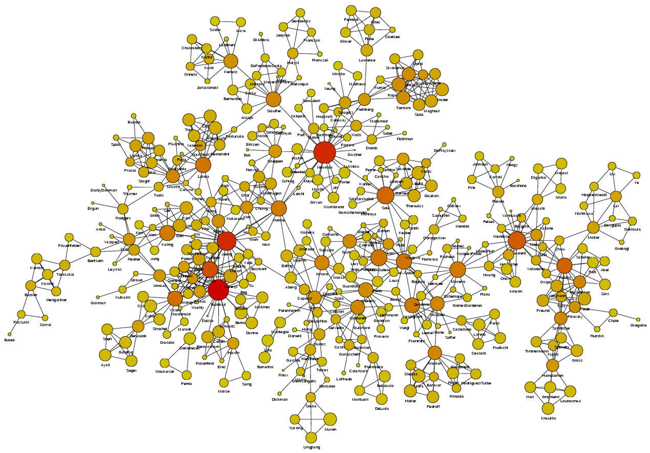 Image Source: University of Michigan
Above is an image that shows the co-authorship network for a set of Network Science researchers: each node represents a researcher and two nodes are connected if they have published at least one paper together.
A very common question in network science is: given a network representation of a system, which are the most important modules or nodes? Or, which are the most important connections or edges?
Of course, this depends on what we mean by “important” – and there are several different metrics that quantify the “centrality” of nodes and edges.
Sometimes we want to identify nodes and edges that are very central in the sense that most pairs of other nodes communicate through them.
Or, nodes and edges that, if removed, will cause the largest disruption in the underlying network.
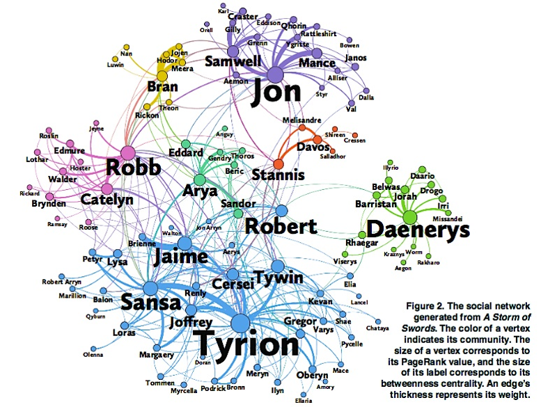 Image Source: The Measurement Standard, Carma
Two nodes are connected if the corresponding two characters interacted in that novel, and the weight of the edge represents the length of that interaction.
Two different node centrality metrics are visualized in this figure. The size of the node refers to a centrality metric called PageRank – it is the same metric that was used by Google in their first web search engine. The PageRank value of a node v does not depend simply on how many other nodes point to v, but also how large their PageRank value is and how many other nodes they point to.
The second centrality metric refers to a centrality metric called “Betweenness” and it is shown by the size of the node’s label. The Betweenness centrality of a node v relates to the number of shortest paths that traverse node v, considering the shortest paths across all node pairs.
Both metrics suggest that Tyrion and Jon are the most central characters in that novel, even though they were not interacting yet.
Source Links
- Finding community structure in networks using the eigenvectors of matricesLinks to an external site.
Communities (Modules) in Networks
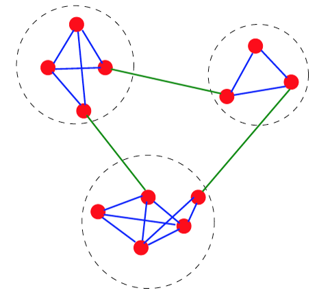
Another important problem in Network Science is to discover Communities – in other words, clusters of highly interconnected nodes. The density of the connections between nodes of the same community is much larger than the density of the connections between nodes of different communities.
Returning to the previous Game of Thrones visualization, each color represents a different community – with a total of 7 communities of different sizes.
For those of you that are familiar with the book or TV show (mostly seasons 3 and 4), these communities make a lot of sense. Up to that point in the story, Daenerys, for instance, was mostly interacting with the Dothrakis and with Barristan, while Jon was mostly interacting with characters at Castle Black.
There are many algorithms for Community Detection – and some of them are able to identify nodes that participate in more than one community. We will discuss such algorithms later in the course.
Dynamics of Networks
An important component of Network Science is the focus on Dynamic Networks – systems that change over time through natural evolution, growth or other dynamic rewiring processes.
For example, the brain’s neural network is changing dramatically during adolescence – but more recent research in neuroscience shows that brain connections also change when people learn something new or even when they meditate.
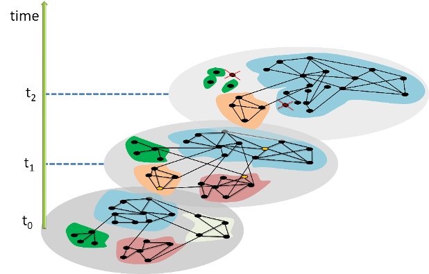 The image above shows how the community structure of a network may be changing over time. (Image Source: The University of Florida
Note that the white and red communities are gradually absorbed by the blue and the green community gradually collapses.
We will study algorithms that can detect and quantify such dynamic processes in networks.
Another important problem in Network Science is the study of Dynamic Processes on Networks. Here, the network structure remains the same – but there is a dynamic process that is gradually unfolding on that network.
For example, the process may be an epidemic that spreads through an underlying social network.
For certain viruses, such as HIV, the state of each human can be one of the following: healthy but susceptible to the virus, infected by the virus but not yet sick, or sick (symptomatic).
The video above shows a simulation of the spread of the H1N1 virus over the global air transportation network. The H1N1 outbreak started in Mexico in 2009 and it quickly spread throughout the world mostly through air transportation.
An important question in Network Science: how does the structure of the underlying network affect the spread of such epidemics?
As we will see later in the course, certain network properties enhance the spread of epidemics to the point that they can become pandemics before any intervention is possible. The only way to prevent such pandemics is through immunizations when they are available.
Influence and Cascade Phenomena
The dynamic processes that take place on a network are often not physical. For example, ideas, opinions, and other social trends and hypes can also spread through networks – especially over online social networks.
We will study such influence or “information contagion” phenomena in the context of mostly Facebook and Twitter.
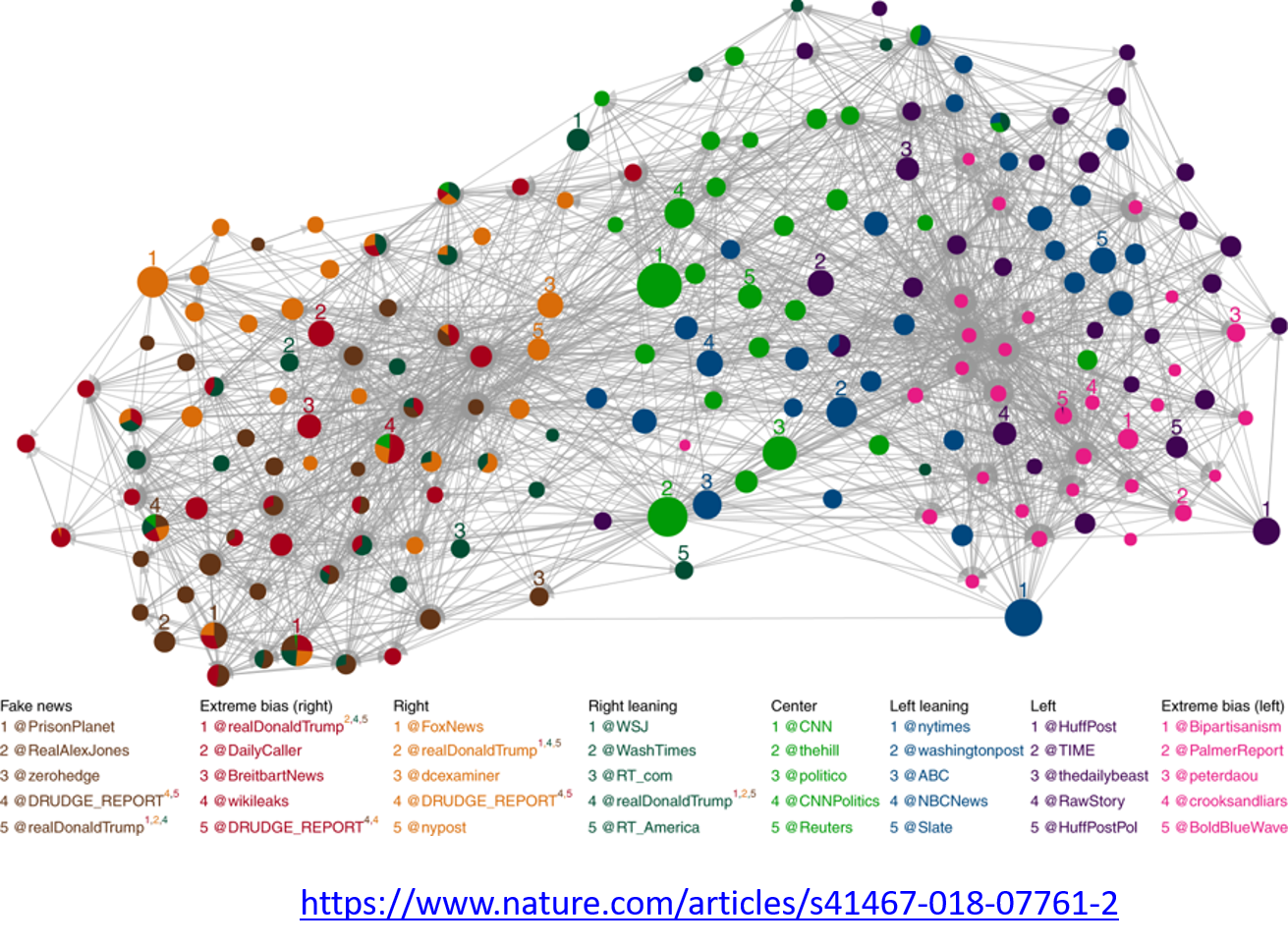 Image Source: Bovet, A., Makse, H.A. Influence of fake news in Twitter during the 2016 US presidential election. Nat Commun 10, 7 (2019)
For example, the image above comes from a recent study focusing on the effect of misinformation (known as “fake news”) on Twitter in the 2016 US Presidential Elections.
The study used network science to identify the most influential spreaders of fake news as well as traditional news.
An important but still open research question is whether it is possible to develop algorithms that can identify influential spreaders of false information in real-time and block them.
Source Links
Machine Learning and Network Science
We will also study problems at the intersection of Network Science and Machine Learning.
As you probably know, Machine Learning generates statistical models from data and then uses these models in classification, regression, clustering, and other similar tasks.
Network Science has contributed to this field by focusing on graph models – statistical models of static or dynamic networks that can capture the important properties of real-world networks in a parsimonious manner.
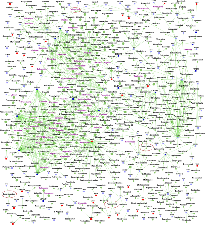
The image above comes from a recent research paper about schizophrenia
It shows the interactions between genes associated with schizophrenia, and drugs that target either specific genes/proteins or protein-protein interactions. Machine Learning models have been used to predict previously unknown interactions between drugs and genes.
The drugs are shown as round nodes in green, and genes as square nodes in dark blue, light blue or red. Nervous system drugs are shown as larger size green colored nodes compared with other drugs. Drugs that are in clinical trials for schizophrenia are labeled purple. You can explore the visualization interactively with the following link: Schizophrenia interactome with 504 novel protein–protein interactions.
The History of Network Science
Let’s talk now, rather briefly, about the history of network science.
First, it is important to emphasize that the term “network” has been used for decades in different disciplines.
For example, computer scientists would use the term to refer exclusively to computer networks, sociologists have been studying social networks for more than 50 years, and of course, mathematicians have been studying graphs for more than two centuries.
So what is new in network science?
Network Science certainly leveraged concepts and methods that were developed earlier in Graph Theory, Statistical Mechanics and Nonlinear Dynamics in Physics, Computer Science algorithms, Statistics and Machine Learning. The list below shows the key topics that each of these disciplines contributed to Network Science.
-
Graph theory:
- Study of abstract (mostly static) graphs
-
Statistical mechanics:
- Percolation, phase transitions
-
Nonlinear dynamics:
- Contagion models, threshold phenomena, synchronization
-
Graph algorithms:
- Network paths, clustering, centrality metrics
-
Statistics:
- Network sampling, network inference
-
Machine learning:
- Graph embeddings, node/edge classification, generative models
-
Theory of complex systems:
- Scaling, emergence
There are two main differences however between these disciplines and Network Science.
First, Network Science focuses on real-world networks and their properties – rather than on regular or random graphs, which are easier to analyze mathematically but not realistic. Most of the earlier work in graph theory or physics was assuming that networks have that kind of simple structure.
Second, Network Science provides a general framework to study complex networks independent of the specific application domain. This unified approach revealed that there are major similarities and universal properties in networks, independent of whether they represent social, biological or technological systems.
The Birth of Network Science
The birth of Network Science took place back in 1998 or 1999, with the publication of two very influential research papers.
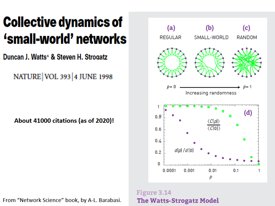
The first was the discovery by Watts and Strogatz of the Small-World property in real-world networks. Roughly speaking, this means that most node-pairs are close to each other, only within a small number of hops. You may have heard the term “six degrees of separation”, in the context of social networks, meaning that most people are connected with each other through a path of 6 (or so) acquaintances.
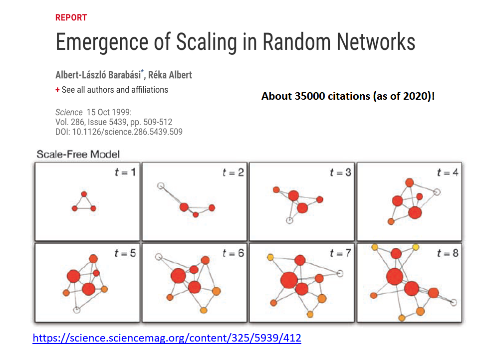
A second influential paper was published in 1999 by two physicists, Barabási and Albert.
That paper showed that real-world networks are “Scale Free”. This means that the number of connections that a node has is highly skewed: most nodes have a very small number of connections but there are few nodes, referred to as hubs, that have a much larger number of connections. Mathematically speaking, the number of connections per node follows a power-law distribution – something that we will discuss extensively later in this course.
Barabási and Albert explained this general phenomenon based on a ”rich get richer” property. As a network gradually grows, new nodes prefer to create links to more well-connected existing nodes, and so the latter become increasingly more powerful in terms of connectivity. This is referred to as “preferential attachment” – and we will study it in detail later.
Source Links
TED Lecture: Albert-László Barabási
L2 - Relevant Concepts from Graph Theory
Overview
Required Reading
- Chapter-2 from A-L. Barabási, Network Science 2015.
- Chapter-2 from D. Easley and J. Kleinberg, Networks, Crowds and Markets Cambridge Univ Press, 2010.
Recommended Reading
An Introduction
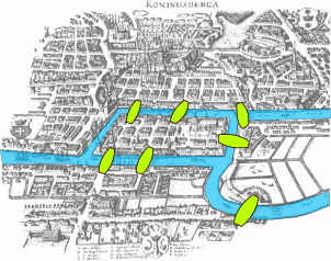
This visualization shows the seven bridges of Königsberg. The birth of graph theory took place in 1736 when Leonhard Euler showed that it is not possible to walk through all seven bridges by crossing each of them once and only once.
Food for Thought
Try to model this problem with a graph in which each bridge is represented by an edge, and the landmass at each end of a bridge is represented by a node. The graph should have four nodes (upper, lower, the island in the middle, and the landmass at the right) and seven edges. What is the property of this graph that does not allow to walk through each edge once and only once?
You can start from any node you want, and end at any node you want. It is ok to visit the same node multiple times but you should cross each edge only once (this is referred to as a Eulerian path in graph theory).
Undirected Graphs
Let’s start by defining more precisely what we mean by graph or network – we use these two terms interchangeably. We will also define some common types of graphs.
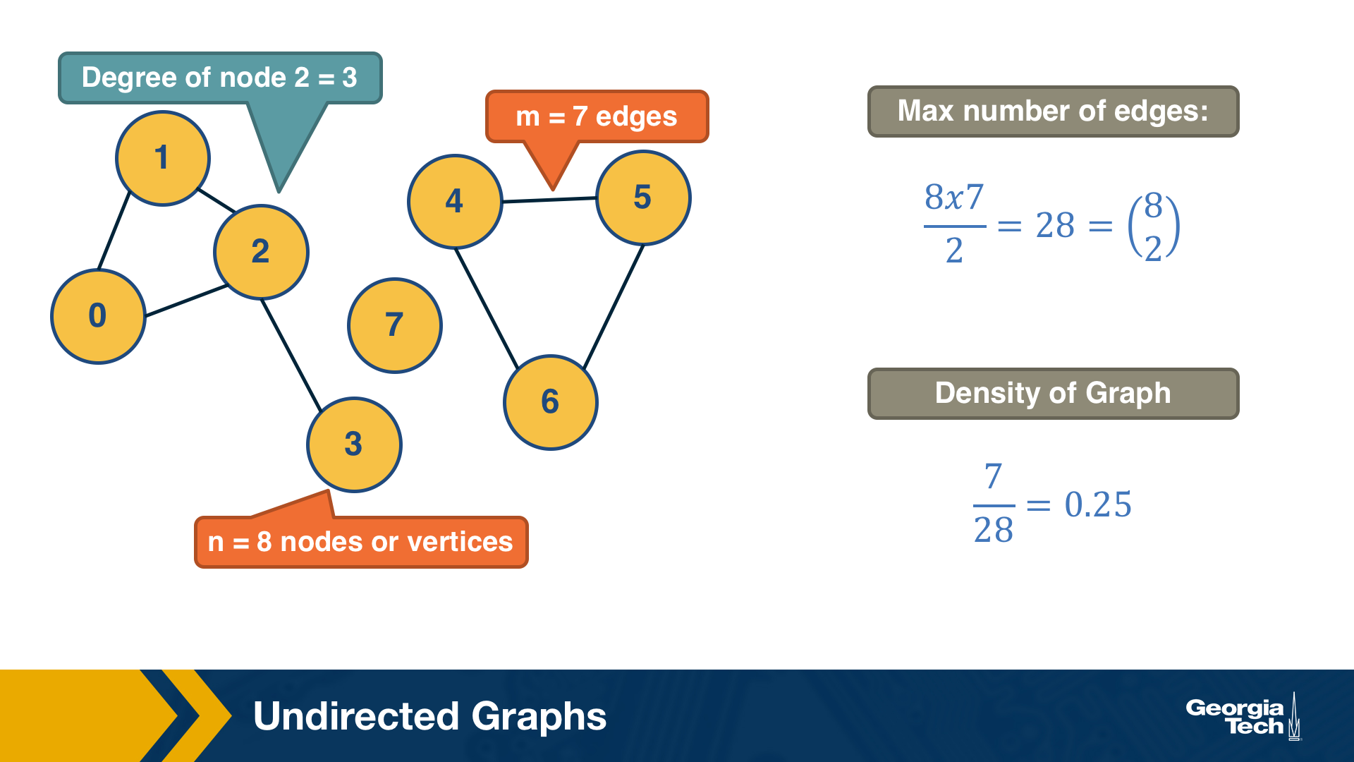
A graph, or network, represents a collection of dyadic relations between a set of nodes. This set is often denoted by V because nodes are also called vertices. The relations are referred to as edges or links, usually denoted by the set E. So, an edge (u,v) is a member of the set E, and it represents a relation between vertices u and v in the set V.
The number of vertices is often denoted by n and the number of edges by m. We will often use the notation G=(V,E) to refer to a graph with a set of vertices V and a set of edges E. This definition refers to the simplest type of graph, namely undirected and unweighted.
Typically we do not allow edges between a node and itself. We also do not allow multiple edges between the same pair of nodes. So the maximum number of edges in an undirected graph is $n(n-1)/2$– or “n-choose-2”. The density of a graph is defined as the ratio of the number of edges m by the maximum number of edges (n-choose-2). The number of connections of a node v is referred to as the degree of v. The example above illustrates these definitions.
Adjacency Matrix
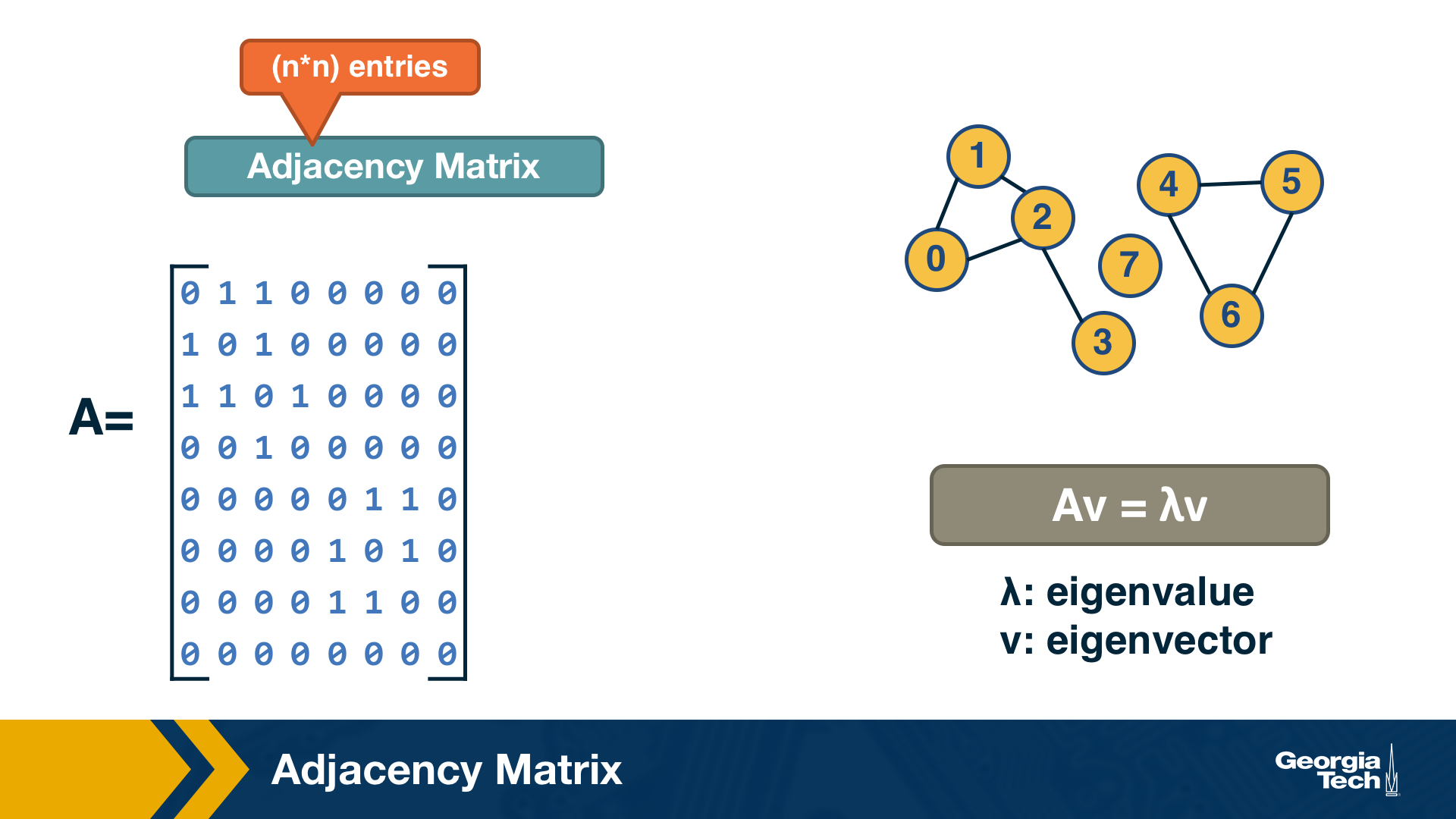
A graph is often represented either with an Adjacency Matrix, as shown in this visualization. The matrix representation requires a single memory access to check if an edge exists but it requires $n^2$ space. The adjacency matrix representation allows us to use tools from linear algebra to study graph properties.
For example, an undirected graph is represented by a symmetric matrix A – and so the eigenvalues of A are a set of real numbers (referred to as the “spectrum” of the graph). The equation at the right of the visualization reminds you the definition of eigenvalues and eigenvectors.
Food for Thought
How would you show mathematically that the largest eigenvalue of the (symmetric) adjacency matrix A is less or equal than the maximum node degree in the network? Start from the definition of eigenvalues given above.
Adjacency List
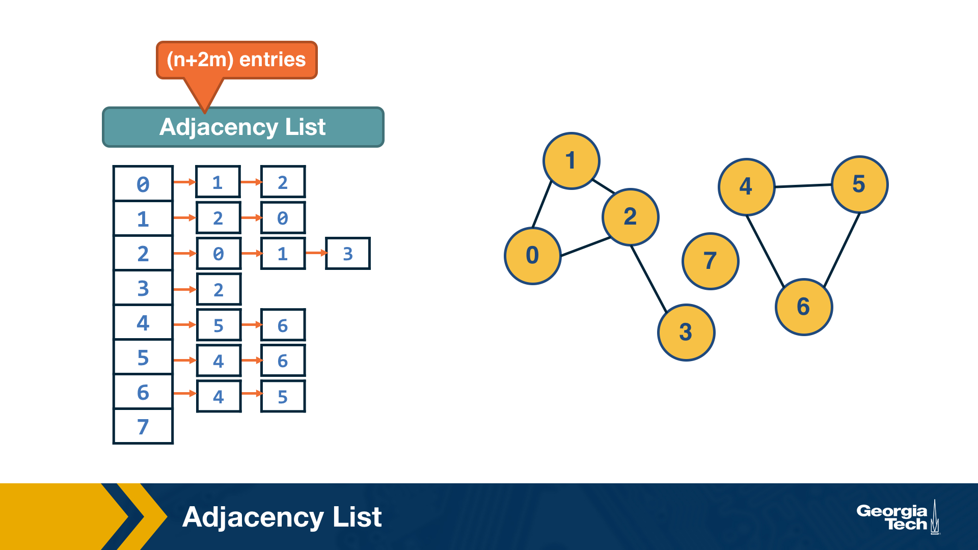
The adjacency list representation requires n+2*m space because every edge is included twice.
The difference between adjacency matrices and lists can be very large when the graph is sparse. A graph is sparse if the number of edges m is much closer to the number of nodes n than to the maximum number of edges (n-choose-2). In other words, the adjacency matrix of a sparse graph is mostly zeros.
A graph is referred to as dense, on the other hand, if the number of edges is much closer to n-choose-2 than to n.
It should be noted that most real-world networks are sparse. The reason may be that in most technological, biological and social networks, there is a cost associated with each edge – dense networks would be more costly to construct and maintain.
Food for Thought
Suppose that a network grows by one node in each time unit. The new node always connects to k existing nodes, where k is a constant. As this network grows, will it gradually become sparse or dense (when n becomes much larger than k)?
Walks, Paths and Cycles
A walk from a node S to a node T in a graph is a sequence of successive edge that starts at S and ends at T. A walk may visit the same node more than once.
For example a walk that visits node C more than once (edges in red):
A path is a walk in which the intermediate nodes are distinct (edges in green).
A cycle on the other hand, is a path that starts and ends at the same node (edges in orange).
How can we efficiently count the number of walks of length k between nodes s and t?
The number of walks of length k between nodes s and t is given by the element (s,t) of the matrix $A^k$ (the k’th power of the adjacency matrix).
Let us use induction to show this:
For k=1, the number of walks is either 1 or 0, depending on whether two nodes are directly connected or not, respectively.
For k>1, the number of walks of length k between s and t is the number of walks of length k-1 between s and v, across all nodes v that connect directly with t. The number of walks of length k between s and v is given by the (s,v) element of the matrix $A^k$ (based on the inductive hypothesis). So, the number of walks of length k between s to t is given by:
\[\sum_{v \in V} A^{k-1}(s,v)A(v,t) = A^k(s,t)\]- Walks of length-3 from A to C:
- ABDC, ABAC, ACAC, ACDC
- Walks of length-3 from A to D:
- None
1
2
3
4

import numpy as np
X = np.array([[0,1,1,0],[1,0,0,1],[1,0,0,1],[0,1,1,0]])
X2 = np.matmul(X,X)
X3 = np.matmul(X2,X)
Trees and Other Regular Networks
In graph theory, the focus is often on some special classes of networks, such as trees, lattices, regular networks, planar graphs, etc.
In this course, we will focus instead on complex graphs that do not fit in any of these special classes. However, we will sometimes contrast and compare the properties of complex networks with some regular graphs.
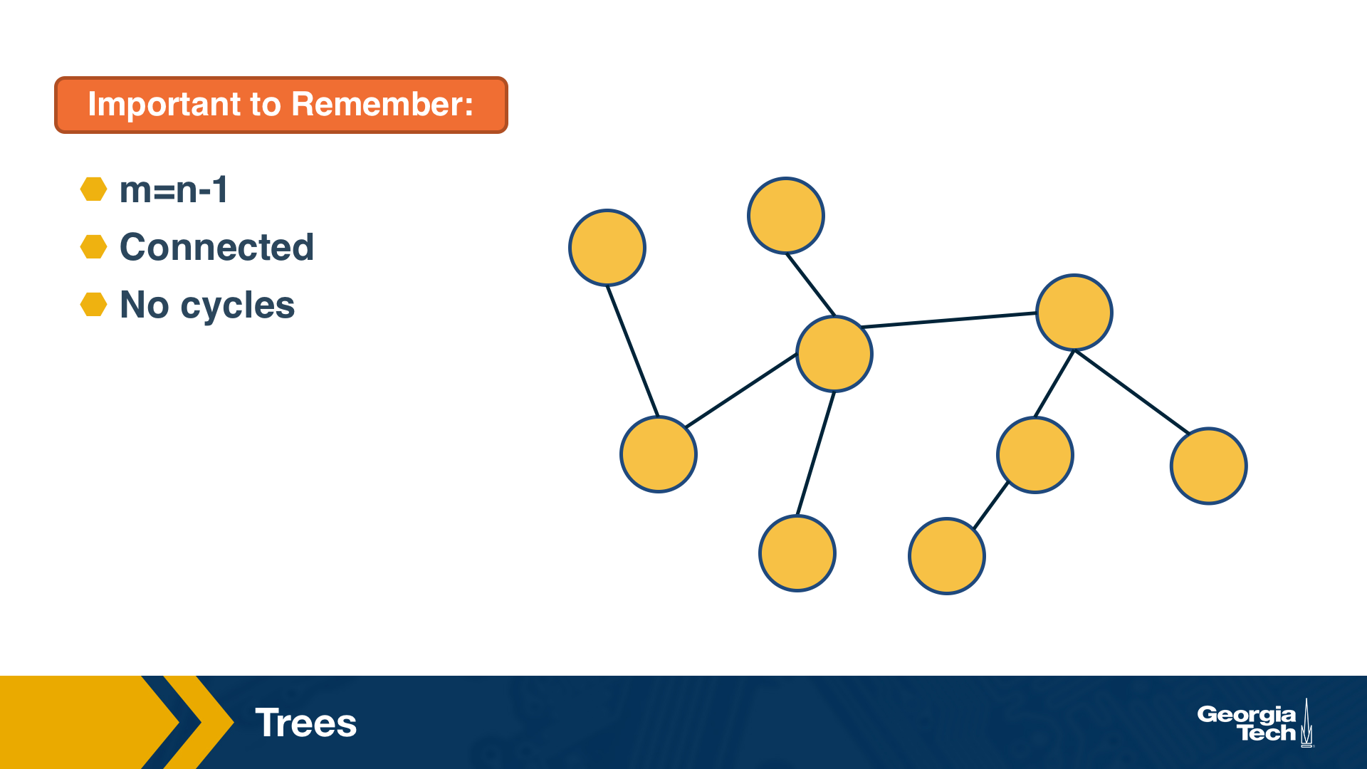
For instance, trees are connected graphs that do not have cycles – and you can easily show that the number of edges in a tree of n nodes is always m=n-1.
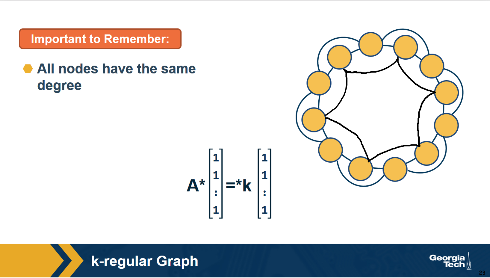
A k-regular graph is a network in which every vertex has the same degree k. The visualization shows an example of a k-regular network for k=4.
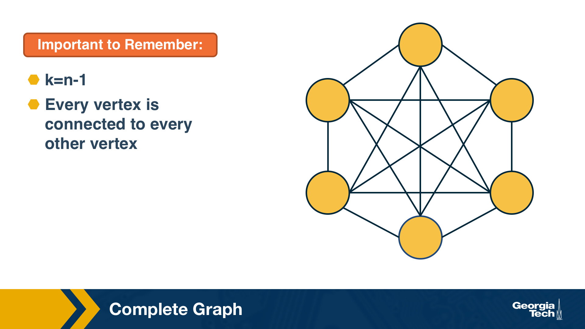
A complete graph (or “clique”) is a special case of a regular network in which every vertex is connected to every other vertex (k=n-1). The example shows a clique with 6 nodes.
Food for Thought
Suppose that a graph is k-regular. How would you show that a vector of n ones (1, 1, … 1) is an eigenvector of the adjacency matrix – and the corresponding eigenvalue is equal to k?
Directed Graphs
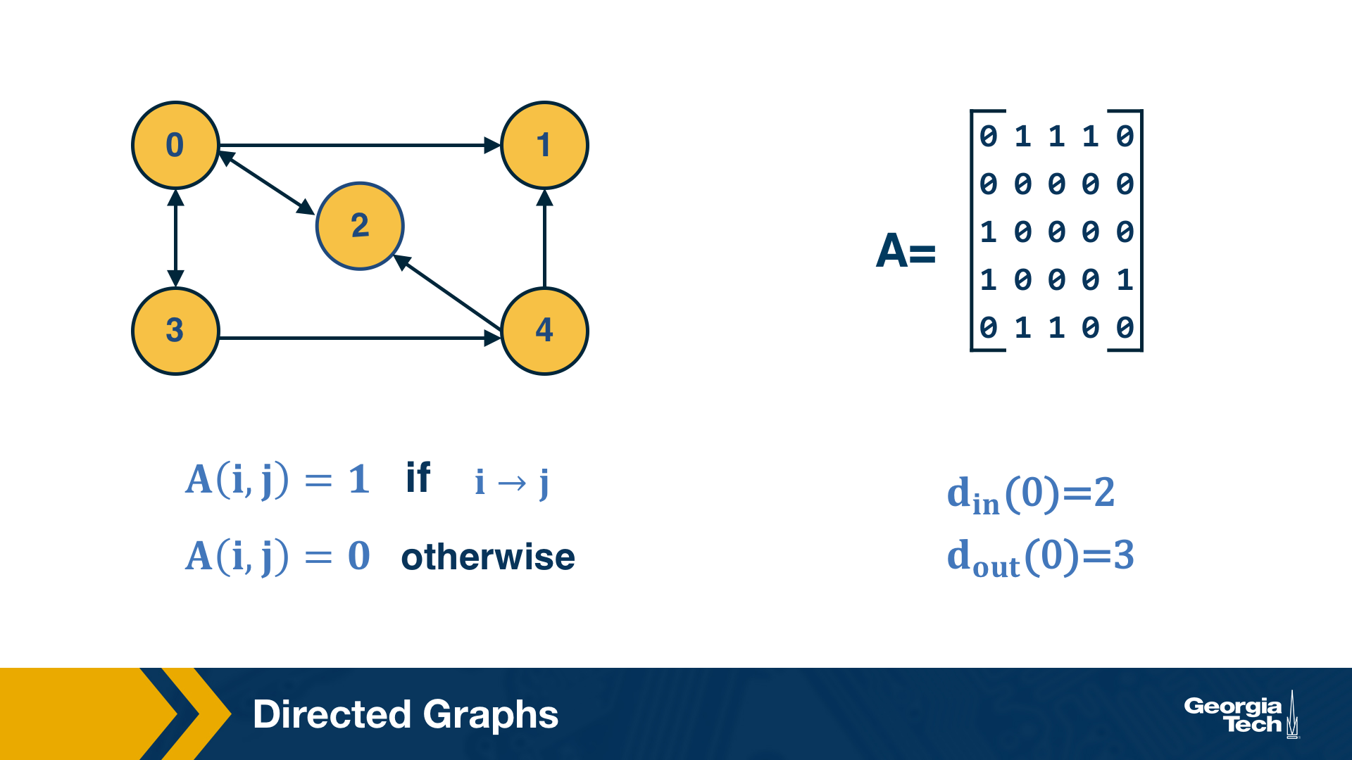
Another common class of networks is directed graphs. Here, each edge (u,v) has a starting node u and an ending node v. This means that the corresponding adjacency matrix may no longer be symmetric.
A common convention is that the element (i,j) of the adjacency matrix is equal to 1 if the edge is from node i to node j – please be aware however that this convention is not universal.
We also need to revise our definition of node degree: the number of incoming connections to a node v is referred to as in-degree of v, and the number of outgoing connections as out-degree of v.
Food for Thought
Do you see that the sum of in-degrees across all nodes v is equal to the number of edges m? The same is true for the sum of out-degrees.
Weighted Directed Graphs
So far we assumed that all edges have the same strength – and the elements of the adjacency matrix are either 0s or 1s. In practice, most graphs have edges of different strength – we can represent the strength of an edge with a number. Such graphs are referred to as weighted.
In some cases the edge weights represent capacity (especially when there is a flow of some sort through the network). In other cases edge weights represent distance or cost (especially when we are interested in optimizing communication efficiency across the network).
In undirected networks, the “strength” of a node is the sum of weights of all edges that are adjacent to that node.
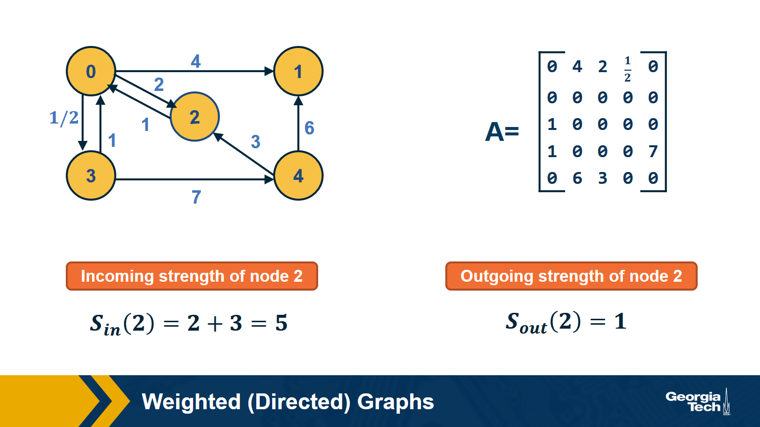
In directed networks, we define in-strength (for incoming edges) and out-strength (for outgoing edges).
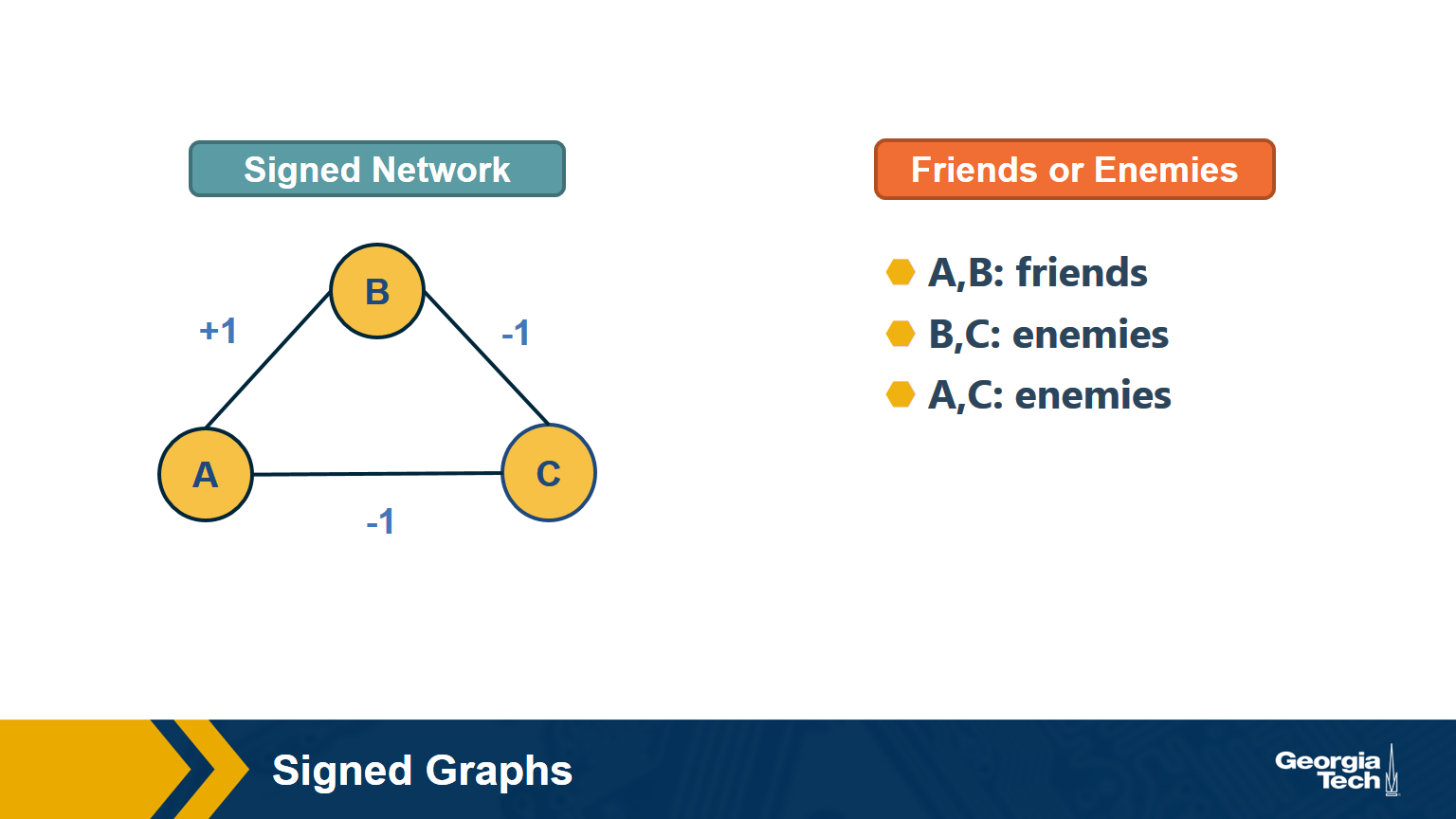
In signed graphs, the edge weights can be negative, representing competitive interactions. For example, think of a network of people in which there are both friends and enemies (as shown in the visualization above).
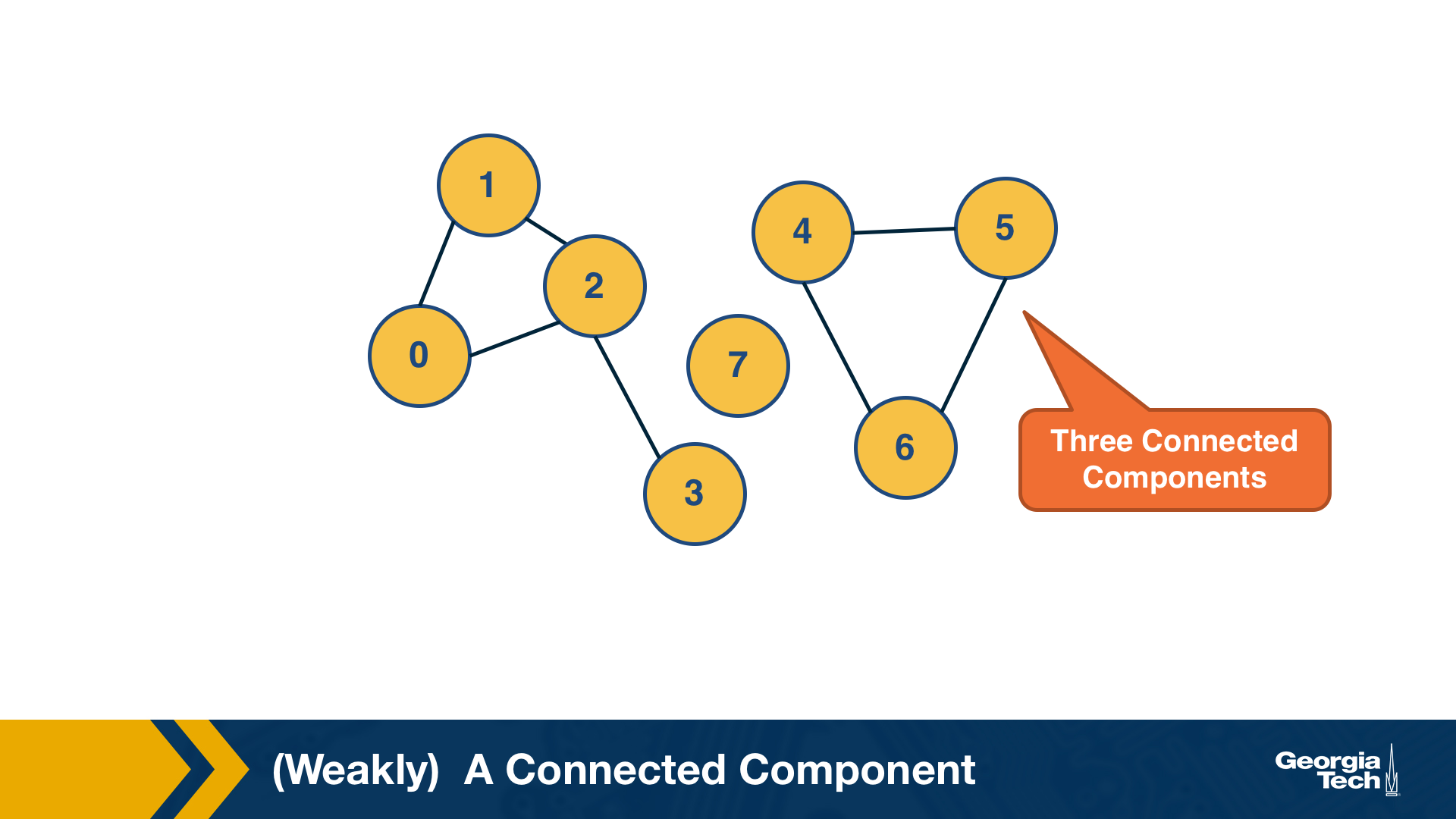
(Weakly) Connected Components
An undirected graph is connected if there is a path from any node to any other node. We say that a directed graph is weakly connected if and only if the graph is connected when the direction of the edge between nodes is ignored. It follows that if a directed graph is strongly connected, it is also weakly connected. In undirected graphs, we can simply refer to connected components.
As we saw in Lesson-1, there are many real-world networks that are not connected – instead, they consist of more than one connected components.
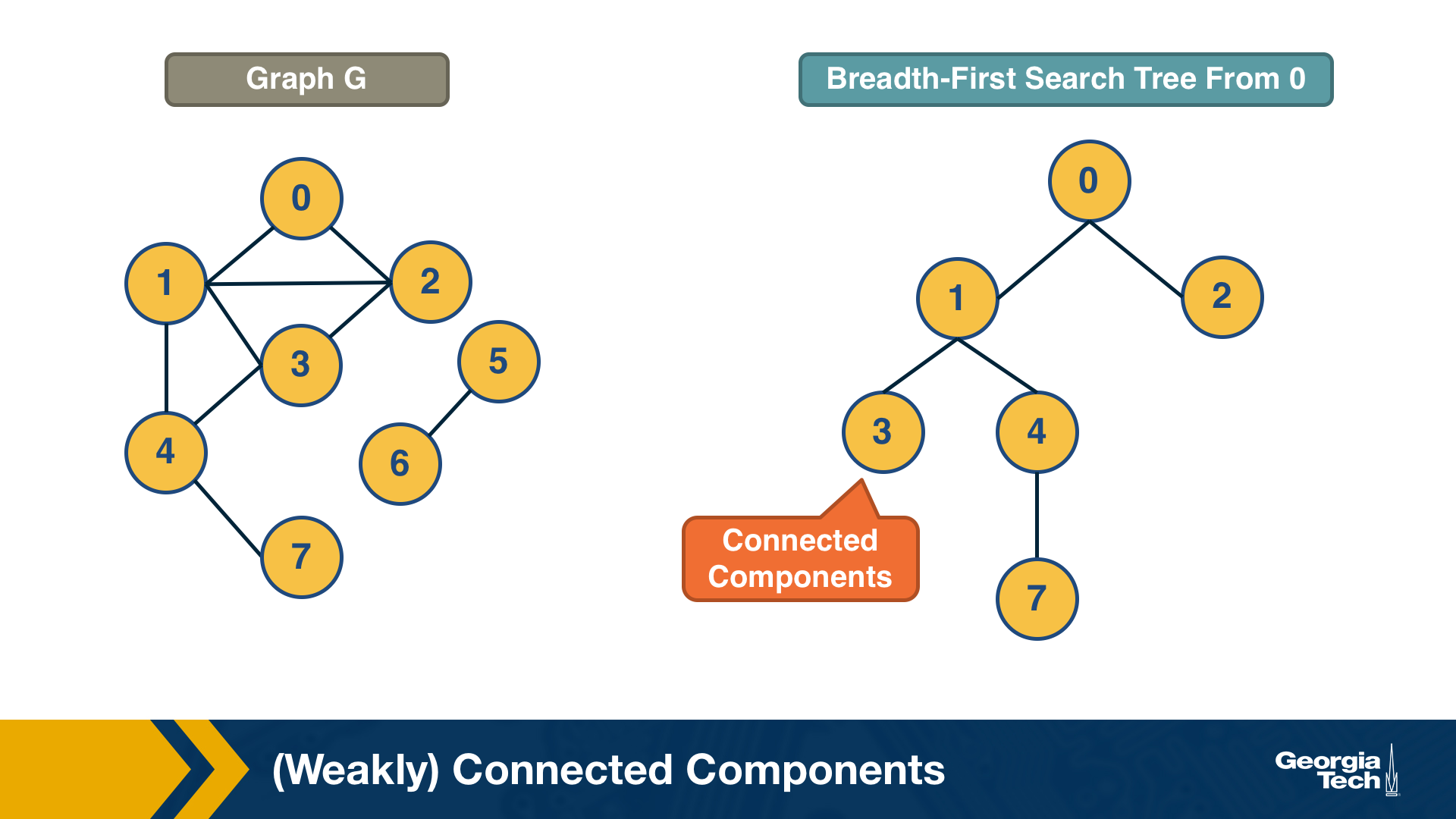
A breadth-first-search (BFS) traversal from a node s can be used to find the set of nodes in the connected component that includes s. Starting from any other node in that component would result in the same connected component.
If we want to compute the set of all connected components of a graph, we can repeat this BFS process starting each time from a node s that does not belong to any previously discovered connected component. The running-time complexity of this algorithm is 𝝝(m+n) time because this is also the running-time of BFS if we represent the graph with an adjacency list.
Food for Thought
If you are not familiar with the $O, \Omega, \Theta$ notation, please read about them at: https://en.wikipedia.org/wiki/Big_O_notationLinks
Strongly Connected Components
In directed graphs, the notion of connectedness is different: a node s may be able to reach a node t through a (directed) path – but node t may not be able to reach node s.
A directed graph is strongly connected if there is a path between all pairs of vertices. A strongly connected component(SCC) of a directed graph is a maximal strongly connected subgraph.
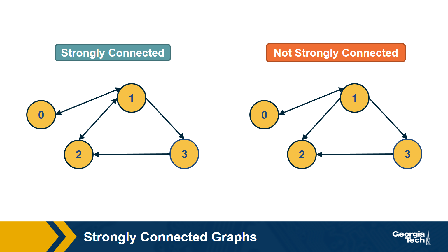
If the graph has only one SCC, we say that it is strongly connected. How would you check (in linear time) if a directed graph is strongly connected? Please think about this for a minute before you see the answer below.
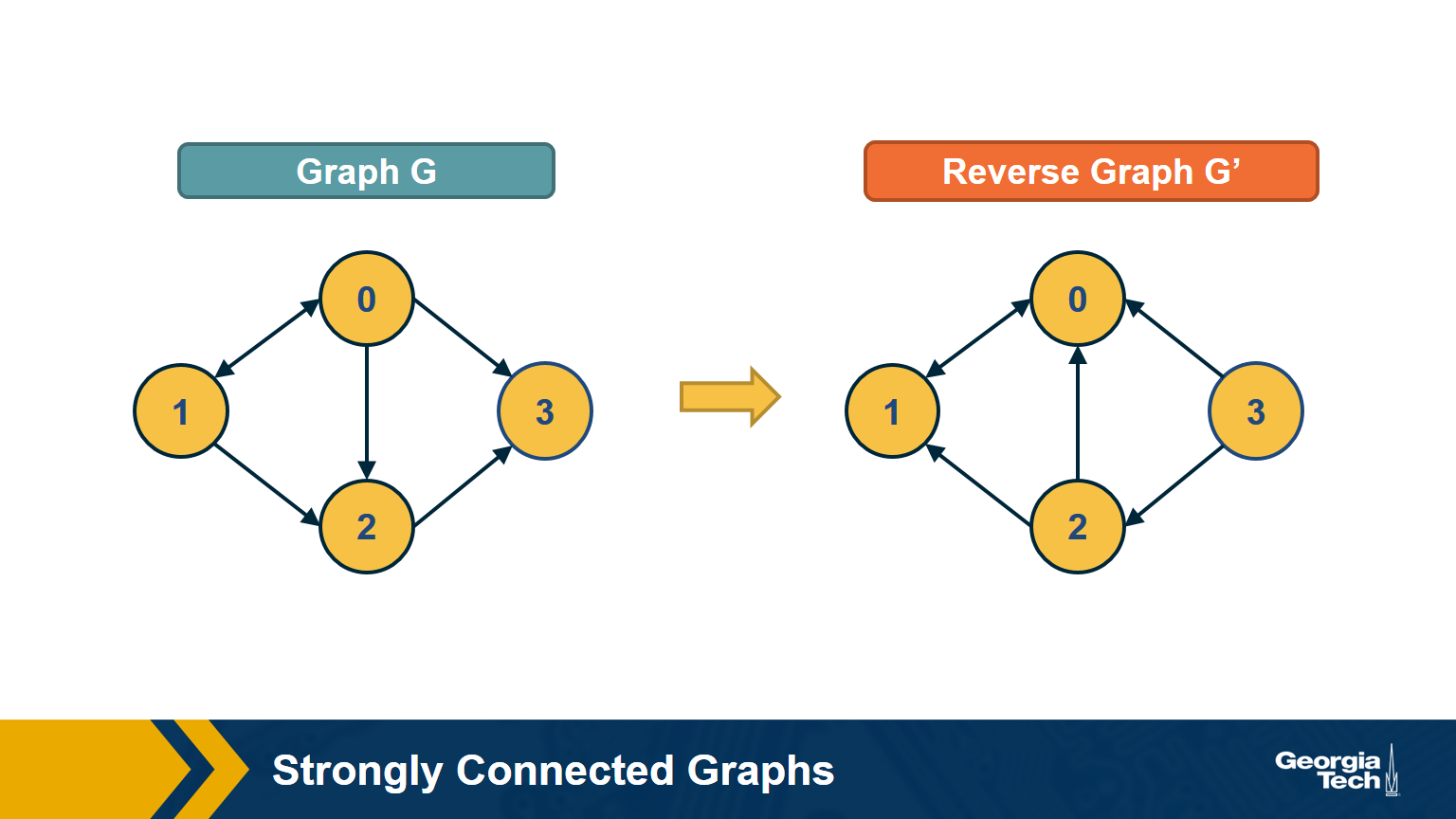
Answer
First, note that a directed graph is strongly connected if and only if any node s can reach all other nodes, and every other node can reach s. So, we can pick any node s and then run BFS twice. First, on the original graph G. Second, run BFS on the graph G’ in which each edge has opposite direction than in G – G’ is called the reverse graph of G. If both BFS traversals reach all nodes in G, it must be that G is strongly connected (do you see why?).
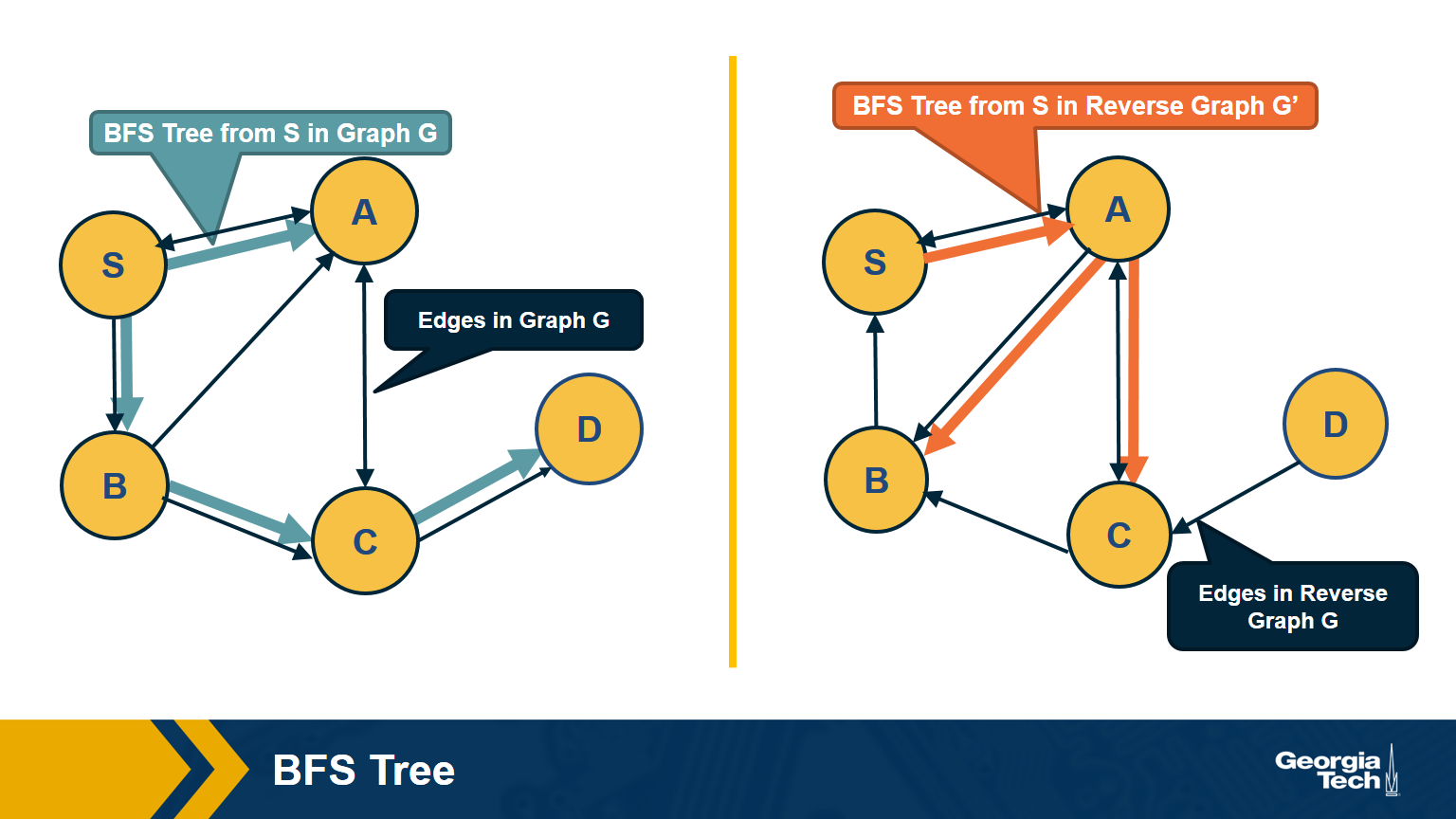
The visualization above shows an example in which node D cannot reach S (so S cannot reach D in the reverse graph).
How would you compute the set of strongly connected components in a directed graph? Two famous algorithms to do so are Tarjan’s algorithm and Kosaraju’s algorithm. They both rely on Depth-First Search traversals and run in 𝚯(n+m) time, if the graph is represented with an adjacency list.
Food for Thought
We suggest you study Tarjan’s or Kosaraju’s algorithm. For instance, Kosaraju’s algorithm is described at: https://en.wikipedia.org/wiki/Kosaraju%27s_algorithm
Directed Acyclic Graphs (DAGs)
A special class of directed graphs that is common in network science is those that do not have any cycles. They are referred to as directed acyclic graphs or DAGs. DAGs are common because they represent generalized hierarchy and dependency networks. In a generalized hierarchy a node may have more than one parent. An example of a dependency network is the prerequisite relations between college courses. We say that a directed network has a topological order if we can run its nodes so that every edge points from a node of lower rank to a node of higher rank.
A directed graph G:
A Topological Ordering of Graph G (All nodes in which all edges point from nodes at the left to nodes at the right):
Important facts about DAGS:
-
If a directed network has a topological order then it must be a DAG.
- This is easy to show: if the network had a cycle, there would be an edge from a higher-rank node to a lower-rank node – but this would violate the topological order property.
-
A DAG must include at least one source node. i.e a node with zero incoming edges.
- To see that, start from any node of the DAG and start moving backwards, following edges in the opposite direction. Given that there are no cycles and the graph has a finite number of nodes, we will eventually reach a source node.
-
If a graph is a DAG, then it must have a topological ordering.
- You can show this as follows:
- Start from a source node s (we already showed that every DAG has at least one source node).
- Then remove that source node s and decrement the in-degree of all nodes that s points to. The graph is still a DAG after the removal of s.
- Choose a new source node s’ and repeat the previous step until all nodes are removed. Note that the topological order of a DAG may not be unique.
- You can show this as follows:
Example:
Topological Ordering: G,A,B,E,D,C,F
Remove G:
Remove A:
remove B:
And continue to remove E,D,C,F.
Dijkstra’s Shortest Path Algorithm
We are often interested in the shortest path (or paths) between a pair of nodes. Such paths represent the most efficient way to move in a network.
In unweighted networks, all edges have the same cost, and the shortest path from a node s to any other node in the same connected component (or SCC for directed networks) can be easily computed in linear time using a Breadth-First Search traversal from node s.
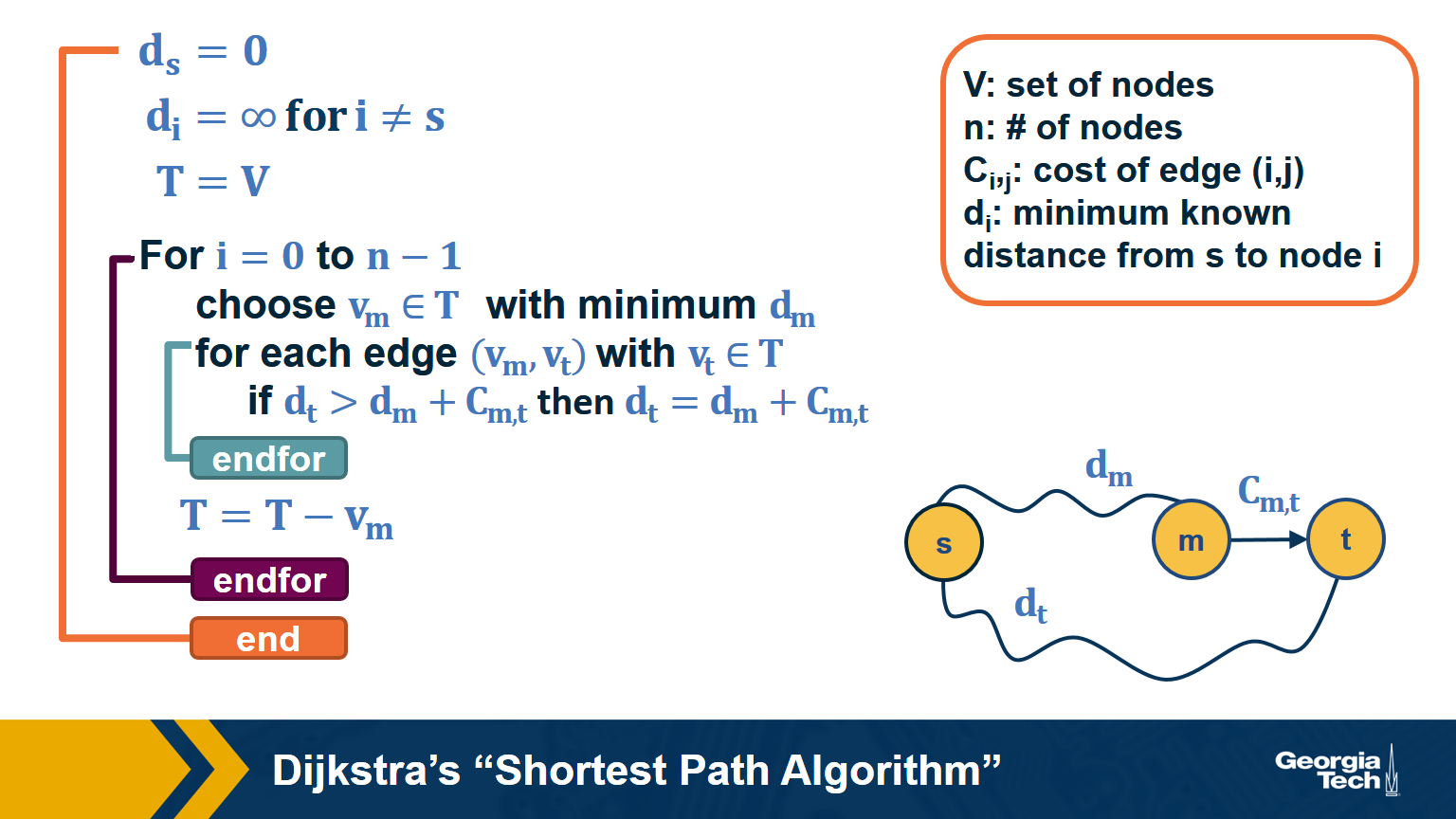
If the network is weighted, and the weight of each edge is its “length” or “cost”, we can use Dijkstra’s algorithm, showed above, to compute the shortest path from s to any other node. Note that this algorithm is applicable only if the weights are positive.
The key idea in the algorithm is that in each iteration we select the node m with the minimum known distance from s – that distance cannot get any shorter in subsequent iterations. We then update the minimum known distance to every neighbor of m that we have not explored yet, if the latter is larger than the distance from s to m plus the cost of the edge from m to t.
If the network is weighted and some weights are negative, then instead of Dijkstra’s algorithm we can use the Bellman-Ford algorithm, which is a classic example of dynamic programming. The running-time of Bellman-Ford is $O(mn)$, where m is the number of edges and n is the number of nodes. On the other hand, the running time of Dijkstra’s algorithm is $O(m+nlogn)$ if the latter is implemented with a Fibonacci heap (to identify the node with the minimum distance from s in each iteration of the loop).
Food for Thought
If you are not familiar with Fibonacci heaps, we suggest you review that data structure at: https://en.wikipedia.org/wiki/Fibonacci_heap
Random Walks
In some cases, we do not have a complete map of the network. Instead, we only know the node that we currently reside at, and the connections of that node. When that is the case, it is often useful to perform a random walk in which we move randomly between network nodes.
The simplest example of a random walk is to imagine a walker that is stationed at node $v$. The walker then randomly selects a neighbor of $v$ and moves to that neighbor. If the network is unweighted, the walker will transition along each edge with a probability of $\frac{1}{k}$ where $k$ is the number of outgoing edges for that particular node. If a network is weighted, the transition probabilities are functions of the edge weights. These transition probabilities can be represented with a matrix $P$ in which the $(i,j)$ element is the probability that the walker moves from node $i$ to node $j$.
If the walker continues randomly moving from neighbor to neighbor and recording the number of times it transitions along a particular edge, a probability distribution of finding the walker on a particular node at any given time emerges. This distribution is known as the stationary distribution.
So how can we calculate this distribution using our transition matrix $P$? There are two ways to approach this. For the first, we need a vector that represents the walker probability for each node at a time $t$. Let’s call this vector $q_t$. Often we are given the probability values for the initial state of each node, but the stationary distribution is not dependent on the initial state probabilities. This means we can assign each node any initial probability so long as they all add up to 1. Next, we describe each iteration of the random walk by the equation: $q_{t+1} = P^Tq_t$, where $P^T$ is the transpose of the transition matrix. For each iteration of $t$, the $i_{th}$ element of the resulting vector $q_{t+1}$ is nothing but the probability of $i$ being the current node calculated as the probability incoming edge $(j,i)$ was taken, times the probability that the walker was at previous node $j$. We can express this as
\[\begin{aligned} P(current_{node} = i) &= \sum_{j=1}^N P(edge(prev_{node}=j,current_{node}=i )) \\ &\times P(prev_{node}=j) \end{aligned}\]where $N$ is the total number of nodes in the graph. As $t$ increases, the probability values of will converge asymptotically. Note that the sum of the elements of $q_t$ will remain equal to 1 for any time $t$.
Even though this method takes several iterations of time to find the distribution, note that the distribution itself does not change over time. Exploiting this fact leads us to our second method as follows.
Let $q$ be the stationary distribution expressed as a column vector. It satisfies the relationship $P^Tq = q$ for transition matrix $P$. Recall from linear algebra that a transition matrix $T$ has an eigenvector $v$ if $Tv= \lambda v$ for an eigenvalue $\lambda$. From this, we can see that the eigenvectors of $P^T$ are the stationary distribution expressed as column vectors where the eigenvalue $\lambda$ = 1.
For example:
Then the transition matrix:
\[P = \begin{bmatrix} 0 & 1 & 0 \\ 0 & 0 & 1 \\ .5 & .5 & 0 \end{bmatrix},\]And the stationary distribution:
\[\begin{aligned} q &= P^Tq \\ q &= \begin{bmatrix} 1/5 \\ 2/5 \\ 2/5 \end{bmatrix} \end{aligned}\]An important result of this is that, in undirected and connected networks, a stationary distribution always exists. It is not, however, necessarily unique. See also the first “food-for-thought” question below.
Food for Thought
- Show that in undirected and connected networks in which the elements of the matrix P are strictly positive (and so there is at least a small probability of transitioning from every node to every other node), the steady-state probability vector q is unique and it is the leading eigenvector of the transition matrix $P$. Hint: the largest eigenvalue of $P^T$ is equal to 1. Why?
- What can go wrong with the stationary distribution equation in directed networks?
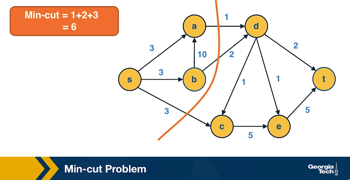
Min-Cut Problem
Another important concept in graph theory (and network science) is the notion of a minimum cut (or min-cut). Given a graph with a source node s and a sink node t, we define as cut(s,t) of the graph a set of edges that, if removed, will disrupt all paths from s to t.
In unweighted networks, the min-cut problem refers to computing the cut with the minimum number of edges. In weighted networks, the min-cut refers to the cut with minimum sum of edge weights.
Max-flow Problem
Another problem that occurs naturally in networks that have a source node s and a target node t is to compute a “flow” from s to t.
The edge weights here represent the capacity of each edge, i.e., an edge of weight w>0 cannot carry more than w flow units.
Additionally, edges cannot have a negative flow.
The total flow that arrives at a non-terminal node v has to be equal to the total flow that departs from v – in other words, flow is conserved.
The max-flow problem refers to computing the maximum amount of flow that can originate at s and terminate at t, subject to the capacity constraints and the flow conservation constraints.
The max-flow problem can be solved efficiently using the Ford-Fulkerson algorithm, as long as the capacities are rational numbers. In that case, the running time of the algorithm is $O(mF)$, where m is the number of edges and F is the maximum capacity of any edge.
The algorithm works by constructing a residual network, which shows at any point during the execution of the algorithm the residual capacity of each edge. In each iteration, the algorithm finds a path from s to t with some residual capacity (we can use BFS or DFS on the residual network to do that). Suppose that the minimum residual capacity among the edges of the chosen path is f. We add f on the flow of every edge (u,v) along that path, and decrease the capacity of those edges by f in the residual network. We also add f on the capacity of every reverse edge (v,u) of the residual network. The capacity of those reverse edges is necessary so that we can later reduce the flow along the edge (u,v), if needed, by routing some flow on the edge (v,u).
In the next step, $s \rightarrow a \rightarrow t$ reduces by 1 unit
Then:
Then:
So the max flow is 3.
Max-flow=Min-cut
An important result about the min-cut and max-flow problems is that they have the same solution: the sum of the weights of the min-cut is equal to the max-flow in that network.
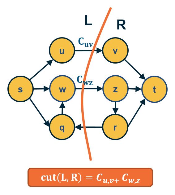
- Part A:
- ANY cut(L,R) such that s∈L and t∈R has capacity ≥ ANY flow from s to t.
- Thus: mincut(s,t)≥maxflow(s,t)
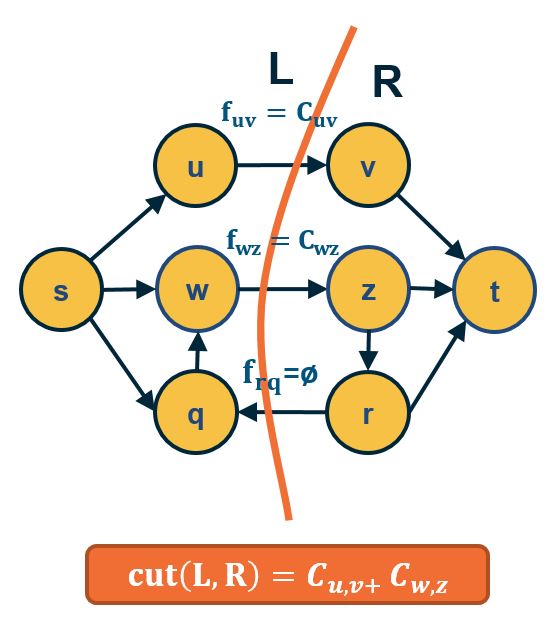
- Part B:
- IF $f^*=$ maxflow(s,t) , the network can be partitioned in two sets of nodes L and R with s∈L and t∈R , such that:
- All edges from L to R have flow =capacity
- All edges from R to L have flow = 0.
- So, edges from L to R define a cut(s,t) with capacity = maxflow(s,t) and, because of Part A, this cut is mincut(s,t).
- Thus: mincut(s,t)=maxflow(s,t)
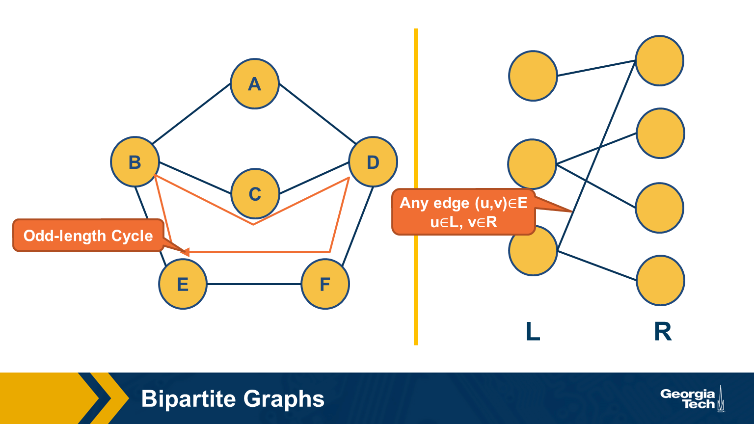
Bipartite Graphs
Another important class of networks is bipartite graphs. Their defining property is that the set of nodes V can be partitioned into two subsets, L and R, so that every edge connects a node from L and a node from R. There are no edges between L nodes – or between R nodes.
Food for Thought Show the following theorem. A graph is bipartite if and only if it does not include any odd-length cycles.
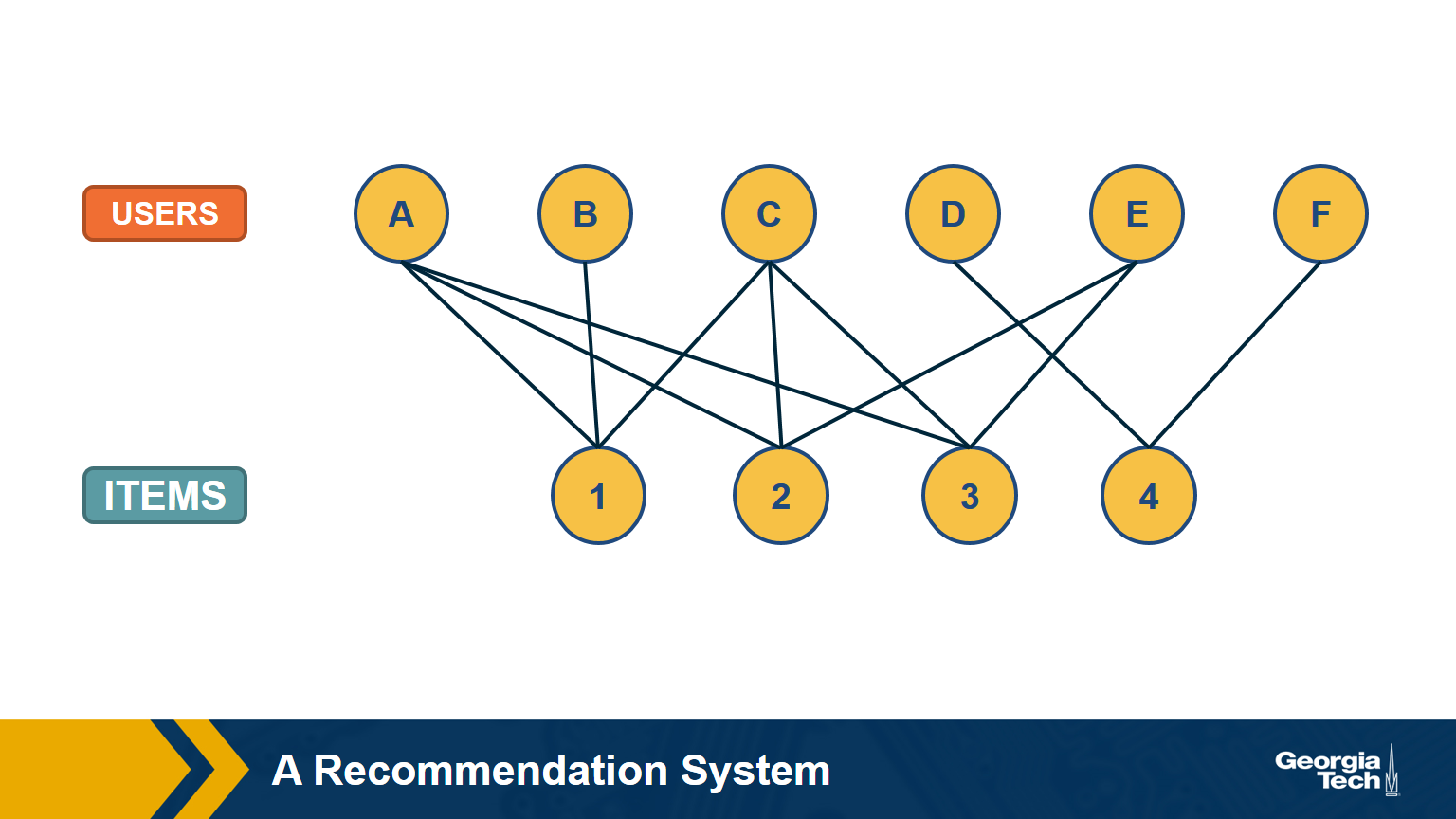
A Recommendation System as a Bipartite Graph
Let’s close this lesson with a practical application of bipartite graphs.
Suppose you want to create a “recommendation system” for an e-commerce site. You are given a dataset that includes the items that each user has purchased in the past. You can represent this dataset with a bipartite graph that has users on one side and items on the other side. Each edge (user, item) represents that that user has purchased the corresponding item.
How would you find users that have similar item preferences? Having such “similar users” means that we can give recommendations that are more likely to lead to a new purchase.
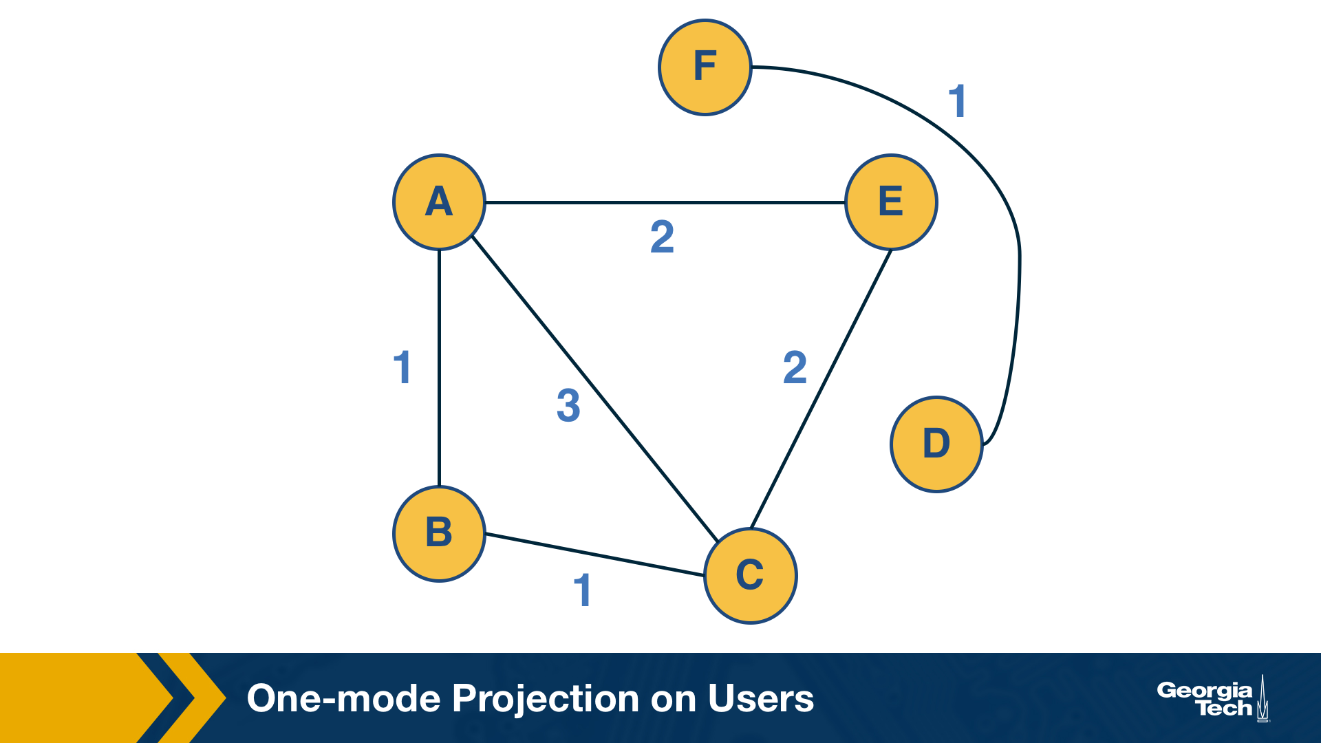
This question can be answered by computing the “one-mode projection” of the bipartite graph onto the set of users. This projection is a graph that includes only the set of users – and an edge between two users if they have purchased at least one common item. The weight of the edge is the number of items they have both purchased.
How would you find items that are often purchased together by the same user? Knowing about such “similar items” is also useful because we can place them close to each other or suggest that the user considers them both.
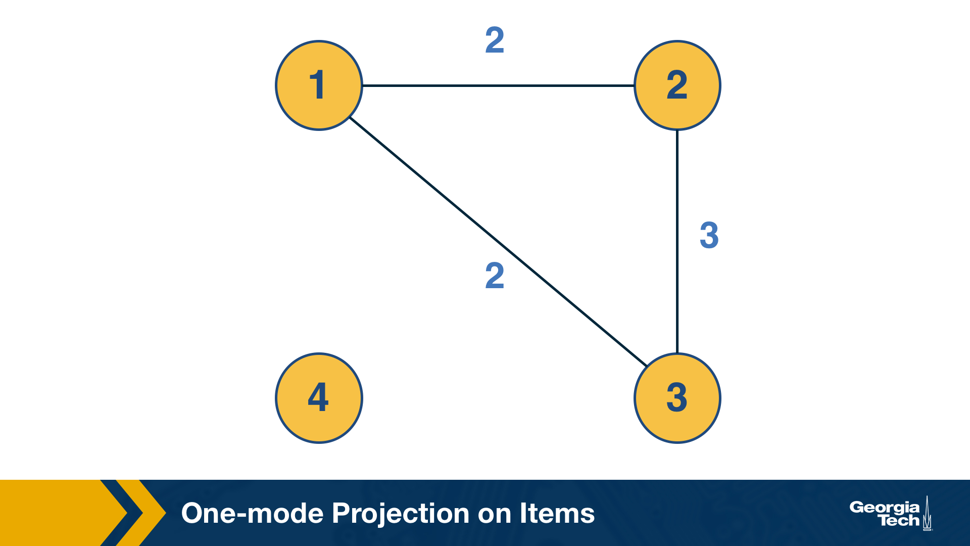
This can be computed by the “one-mode projection” of the bipartite graph onto the set of items. As in the previous projection, two items are connected with a weighted edge that represents the number of users that have purchased both items.
Co-citation and Bibliographic Coupling
The previous one-mode projections can also be computed using the adjacency matrix A that represents the bipartite graph.
Suppose that the element (i,k) of A is 1 if there is an edge from i to k – and 0 otherwise.
The co-citation metric $C_{i,j}$ for two nodes i and j is the number of nodes that have outgoing edges to both i and j. If i and j are items, then the co-citation metric is the number of users that have purchased both i and j.
On the other hand, the bibliographic coupling metric $B_{i,j}$ for two nodes i and j is the number of nodes that receive incoming edges from both i and j. If i and j are users, then the bibliographic coupling metric is the number of items that have been purchased by both i and j.
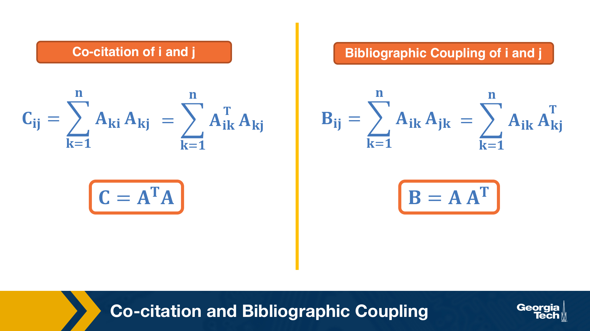
As you can see both metrics can be computed as the product of $A$ and $A^T$ – the only difference is the order of the matrices in the product.
Example python code using the above graphs:
1
2
3
4
5
6
7
8
9
10
11
12
13
14
15
16
17
18
19
20
21
22
23
24
25
26
27
28
29
30
31
32
33
34
35
36
37
38
39
40
41
42
43
44
45
46
47
48
49
50
51

import networkx as nx

contents_users = ["A","B","C","D","E","F"]
contents_projects = [1,2,3,4]

contents_edges = [("A",1),("A",2),("A",3),("B",1),("C",1),("C",2),("C",3),("D",4),("E",2),("E",3),("F",4)]
len(contents_edges)


G = nx.Graph()
G.add_nodes_from(contents_users, bipartite = 0)
G.add_nodes_from(contents_projects,bipartite = 1)
G.add_edges_from(contents_edges)

bi_M = nx.algorithms.bipartite.biadjacency_matrix(G,
                                    row_order = contents_users,
                                    column_order = contents_projects)
bi_M.todense()

"""
array([[1, 1, 1, 0],
       [1, 0, 0, 0],
       [1, 1, 1, 0],
       [0, 0, 0, 1],
       [0, 1, 1, 0],
       [0, 0, 0, 1]])
"""

user_matrix = bi_M @ bi_M.T

projects_matrix = bi_M.T @ bi_M

user_matrix.todense()

"""
array([[3, 1, 3, 0, 2, 0],
       [1, 1, 1, 0, 0, 0],
       [3, 1, 3, 0, 2, 0],
       [0, 0, 0, 1, 0, 1],
       [2, 0, 2, 0, 2, 0],
       [0, 0, 0, 1, 0, 1]])
"""

projects_matrix.todense()

"""
array([[3, 2, 2, 0],
       [2, 3, 3, 0],
       [2, 3, 3, 0],
       [0, 0, 0, 2]])
"""
Lesson Summary
The objective of this lesson was to review a number of important concepts and results from graph theory and graph algorithms.
We will use this material in subsequent lessons. For example, the notion of random walks will be important in the definition of the PageRank centrality metric, while the spectral properties of an adjacency matrix will be important in the eigenvector centrality metric.
The Module-1 assignment will also help you understand these concepts more deeply, and to learn how to apply them in practice with real-world network datasets.
Module two
L3 - Degree Distribution and The “Friendship Paradox”
Overview
Required Reading
- Chapter-3 from A-L. Barabási, Network Science 2015.
- Chapter-7 (sections 7.1, 7.2, 7.3, 7.5) from A-L. Barabási, Network Science 2015.
Recommended Reading
- Simulated Epidemics in an Empirical Spatiotemporal Network of 50,185 Sexual Contacts.Luis E. C. Rocha, Fredrik Liljeros, Petter, Holme (2011)
Degree Distribution
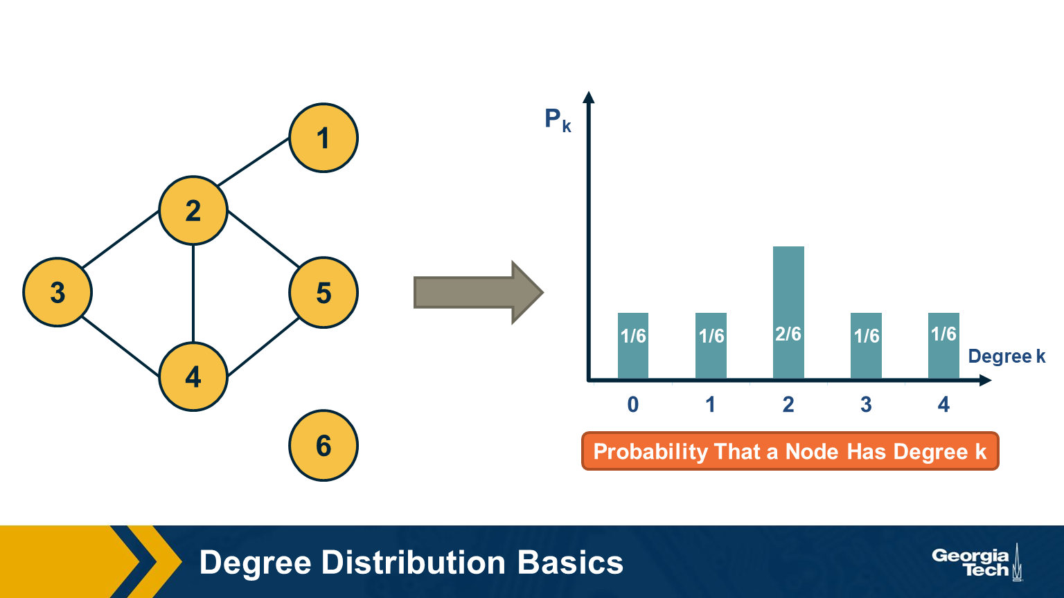
The degree distribution of a given network shows the fraction of nodes with degree k.
If we think of networks as random samples from an ensemble of graphs, we can think of $p_k$ as the probability that a node has degree k, for k>=0.
The network in this visualization has six nodes and the plot shows the empirical probability density function (which is a histogram) for the probability $p_k$.
Degree Distribution Moments
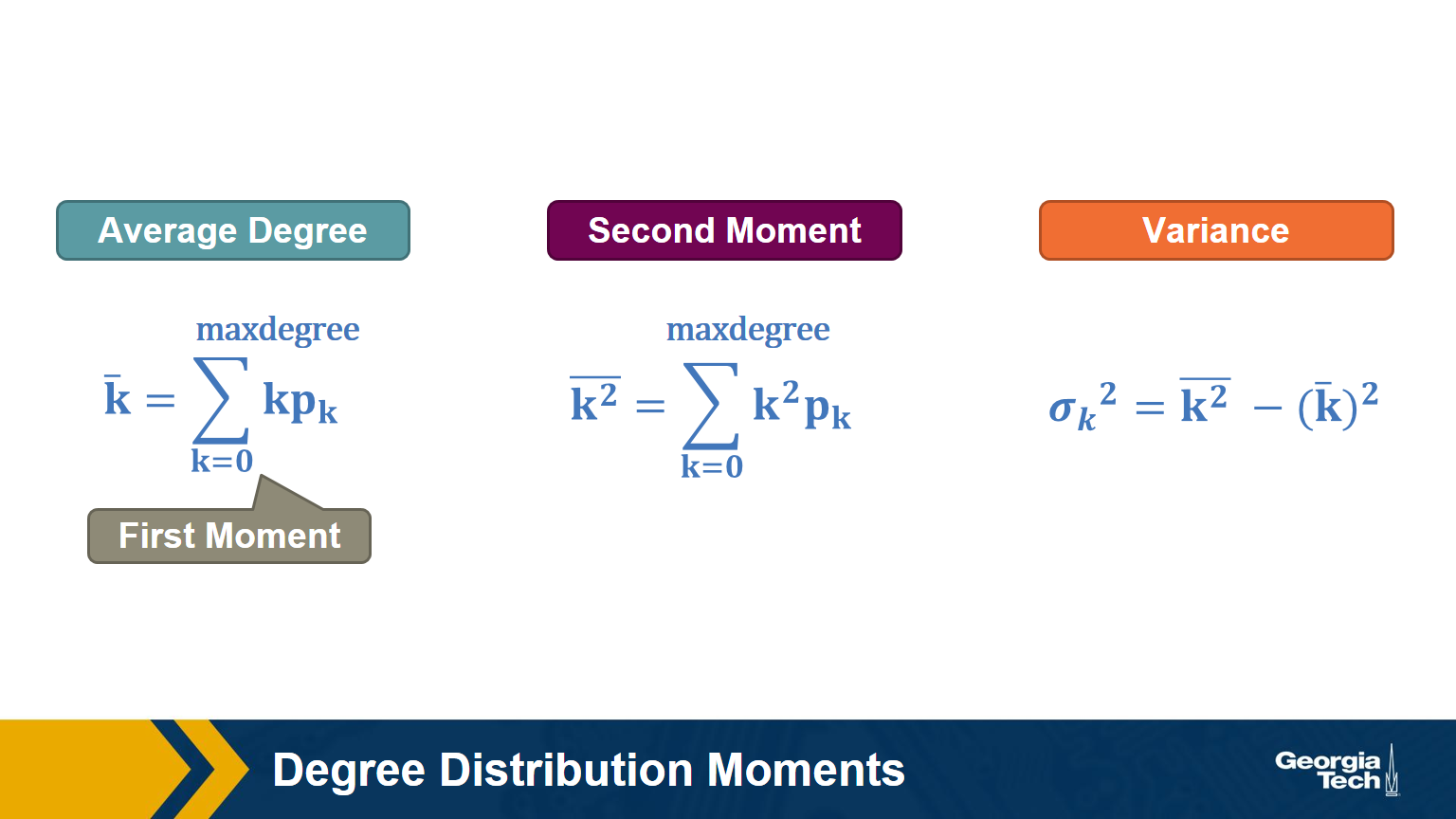
Recall that, given the probability distribution of a random variable, we can compute the first moment (mean), second moment, variance, etc.
The above formulas show the moments that we will mostly use in this course: the average degree, the second moment of the degree (the average of the squared degrees), and the variance of the degree distribution.
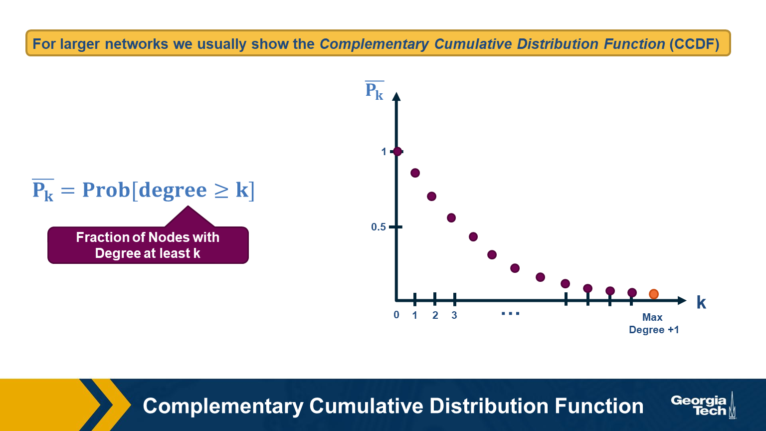
For larger networks, we usually do not show the empirical probability density function $p_k$. Instead, we show the probability that the degree is at least k, for any k>=0.
This is referred to as the Complementary Cumulative Distribution Function (denoted as C-CDF). Note that $\bar{P}_k$= Prob[degree>=k] is the sum of all $p_x$ values for x>=k.
Two Special Degree Distributions
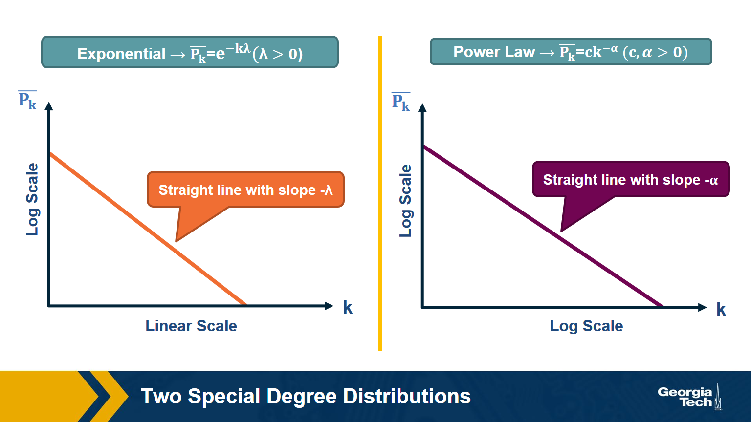
The C-CDF plots are often shown using a logarithmic scale at the x-axis and/or y-axis. Here is why.
Suppose that the C-CDF decays exponentially fast. In a log-linear plot (as shown at the left in the image above), this distribution will appear as a straight line with slope $-\lambda$. The average degree in such networks is 1/$\lambda$. The probability that a node has degree at least k drops exponentially fast with k.
On the other hand, in many networks, the C-CDF decays with a power-law of k. For example, if $\alpha=2$, the probability to see a node with a degree at least k drops proportionally to $1/k^2$ . In a log-log plot (as shown at the right), this distribution will appear as a straight line with slope $\alpha$. As we will see later in this course, such networks are referred to as “scale-free” and they are likely to have nodes with much larger degree than the average degree.
Food for Thought
Show why the previous two distributions give straight lines when we plot them in a log-linear and log-log scale, respectively. Also show that, with the exponential degree distribution, the probability to see nodes with degree more than 10 times the average is about 1/10000 of the probability to see nodes with higher degree than the average. On the other hand, with the power-law distribution, the probability to see nodes with degree more than 10 times the average is 1/100 of the probability to see nodes with higher degree than the average (when $\alpha =2$).
Example: Degree Distribution of a Sex-Contact Network
Human sexual contacts for a special temporal network, the underlying structure over which sexually transmitted infections (STI) spread. By understanding the structure of the network, we can better understand the dynamics of such infections. Here we show you some results from a bipartite network between sex buyers and their escorts. The nodes in this bipartite network are either male sex buyers, about 17,000 of them or female escorts about 10,000 of them. An edge between them denotes sexual intercourse between a male sex buyer and the female escort.
The average degree of the male buyer is about 5. The average escort degree is about 7.6 and the maximum degree of nay node is actually 615. What you see in these plots is the probability density function of the node degrees, either for male clients or female escorts.
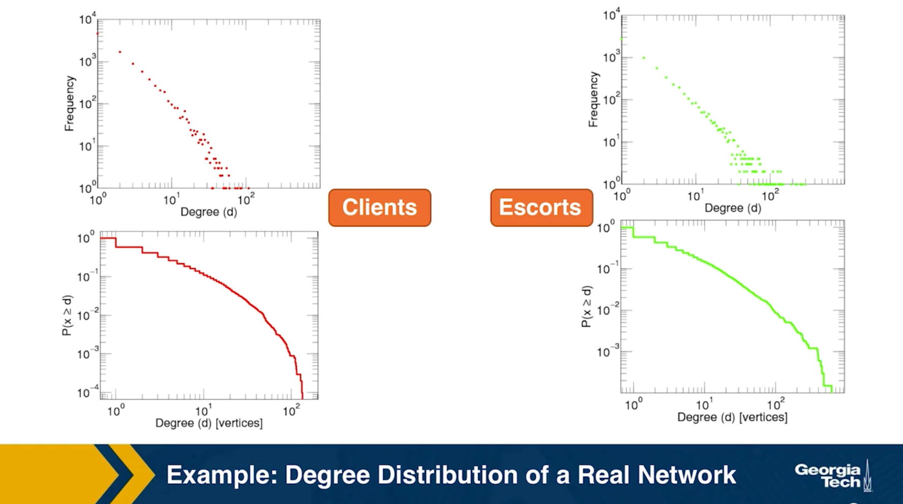
The plots at the lower part are the complimentary cumulative distribution functions of the degrees for this network in log log scale. These plots as you can see, they are not straight lines of course, but if we focus on the part of the distribution that extends up to the probability of 10 to the minus three, (0.001), They can be approximated as straight lines.
Note that even though 90% of the escorts have fewer than 20 clients there is a small number of hubs escorts that have a significantly larger number of clients. As we will see later in this course, such nodes that have a very very large degree can play a major role in epidemics.
Simulated Epidemics in an Empirical Spatiotemporal Network of 50,185 Sexual Contacts.Luis E. C. Rocha, Fredrik Liljeros, Petter, Holme (2011)
Friendship paradox
Informally, the friendship paradox states: “On the average, your friends have more friends than you”.
In more general and precise terms, we will prove that: “The average degree of a node’s neighbor is higher than the average node degree”.
The probability that a random edge connects to a node of degree k
Let’s start by deriving a simple fact that we will use repeatedly in this course.
Suppose that we pick a random edge in the network – and we randomly select one of the two end-points of that edge – we refer to those end-points as the stubs of the edge. What is the probability $q_k$ that a randomly chosen stub belongs to a node of degree k?
This is easy to answer when the degrees of connected nodes are independent.
\[\begin{aligned} q_k &= \text{(number of nodes of degree k)} \\ &\times \text{ (probability an edge connects to a specific node of degree k)} \\ &= np_k \frac{k}{2m} \\ &= \frac{ kp_k}{\frac{2m}{n}} \\ &= \frac{kp_k}{\bar{k}} \end{aligned}\]Note that the probability that the randomly chosen stub connects to a node of degree k is proportional to both k and the probability that a node has degree k.
This means that, for nodes with degree $k \ge \bar{k}$, , it is more likely to sample one of their stubs than the nodes themselves. The opposite is true for nodes with degree $k \le \bar{k}$.
Based on the previous derivation, we can now ask: what is the expected value of a neighbor’s degree?
Note that we are not asking for the average degree of a node. Instead, we are interested in the average degree of a node’s neighbor.
This is the same as the expected value of the degree of the node we select if we sample a random edge stub. Lets denote this expected value as $\bar{k}_{nn}$.
The derivation is as follows:
\[\begin{aligned} \bar{k}_{nn} &= \sum_{k=0}^{k_{\text{max}}} k \cdot q_k \\ &= \sum_k k \frac{kp_k}{\bar{k}} \\ &= \frac{\sum_k k^2p_k}{\bar{k}} \\ & = \frac{\bar{k^2}}{\bar{k}} \\ &= \frac{(\bar{k})^2+(\sigma_k)^2}{\bar{k}} \\ &= \bar{k} + \frac{\sigma_k^2}{\bar{k}} \end{aligned}\]We can now give a mathematical statement of the friendship paradox: as long as the variance of the degree distribution is not zero, and given our assumption that neighboring nodes have independent degrees, the average neighbor’s degree is higher than the average node degree.
The difference between the two expected values (i.e., $\sigma_k^2/\bar{k}$) increases with the the variability of the degree distribution.
Food for Thought
Can you explain in an intuitive way why the average neighbor’s degree is larger than the average node degree, as long as the degree variance is not zero?
Two Extreme Cases of The Friendship Paradox
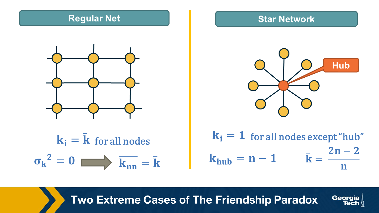
Think of two extremes in terms of degree distribution: an infinitely large regular network in which all nodes have the same degree (and thus the degree variance is 0), and an infinitely large star network with one hub node at the center and all peripheral nodes connecting only to the hub.
In the regular network, the degree variance is zero and the average neighbor’s degree is not different than the average node degree.
In the star network, on the other hand, the degree variance diverges as n increases, and so does the difference between the average node degree and the average neighbor degree.
Food for Thought
Derive the second moment of the degree distribution for the star network as the size of the network tends to infinity.
Application of Friendship Paradox in Immunization Strategies
An interesting vaccination strategy that is based on friendship paradox is refer to as Acquaintance immunization.
Instead of vaccinating random people, we select few few individuals, and ask each of them to identify his or her contact with a maximum number of connections. These contacts may be a sexual partner or other type of contact depending on the underlying virus. Now, based on the friendship paradox, we know that even network include some hubs, then they are probably connected to some of the random selected individuals we choose to survey.
The G(n,p) model (ER Graphs)
Let’s consider now the simplest random graph model and its degree distribution.
This model is referred to as G(n, p) and it can be described as follows: the network has n nodes and the probability that any two distinct nodes are connected with an undirected edge is p.
The model is also referred to as the Gilbert model, or sometimes the Erdős–Rényi (ER) model, from the last names of the mathematicians that first studied its properties in the late 1950s.
Note that the number of edges m in the G(n,p) is a random variable. The expected number of edges is $p \cdot \frac{n(n-1)}{2}$, the average node degree is $p \cdot (n-1)$, the density of the network is $p$ and the degree variance is $p\cdot(1-p)\cdot(n-1)$. These formulas assume that we do not allow self-edges.
The degree distribution of the G(n,p) model follows the Binomial(n-1,p) distribution because each node can be connected to n-1 other nodes with probability p.
Note that the G(n,p) model does not necessarily create a connected network – we will return to this point a bit later.
Also, in the G(n,p) model there are no correlations between the degrees of neighboring nodes. So, if we return to the friendship paradox, the average neighbor degree at a G(n,p) network is
- $\bar{k}_{nn} = \bar{k} + (1-p)$ (using the Binomial distribution)
- or $\bar{k}_{nn} = \bar{k} + 1$ (using the poisson approximation when $p \ll 1$ )
In other words, if we reach a node v by following an edge from another node, the expected value of v’s degree is one more than the average node degree.
Food for Thought
Derive the previous expressions for the average neighbor degree with both the Binomial and Poisson degree distributions.
Degree Distribution of G(n,p) Model
Here is a well-known fact that you may have learned in a probability course: the Binomial distribution can be approximated by the Poisson distribution as long as $p$ is much smaller than 1. In other words, this approximation is true for sparse networks in which the average degree $p \cdot (n-1)$ is much lower than the size of the network n. The Poisson distribution is described by:
\[\begin{aligned} p_k &= e^{-\bar{k}} \cdot \frac{\bar{k}^k}{k!}, k = 0,1,2, ...\\ \bar{k} &= p \cdot (n-1) \\ \sigma_k^2 &= \bar{k} \end{aligned}\]Because of the $\frac{1}{k!}$ term, $p_k$ decreases with $k$ faster than expontentially.
You may ask, why to use the Poisson approximation instead of the Binomial(n-1,p) distribution?
The reason is simple: the Poisson distribution has a single parameter, which is the average node degree $\bar{k}$.
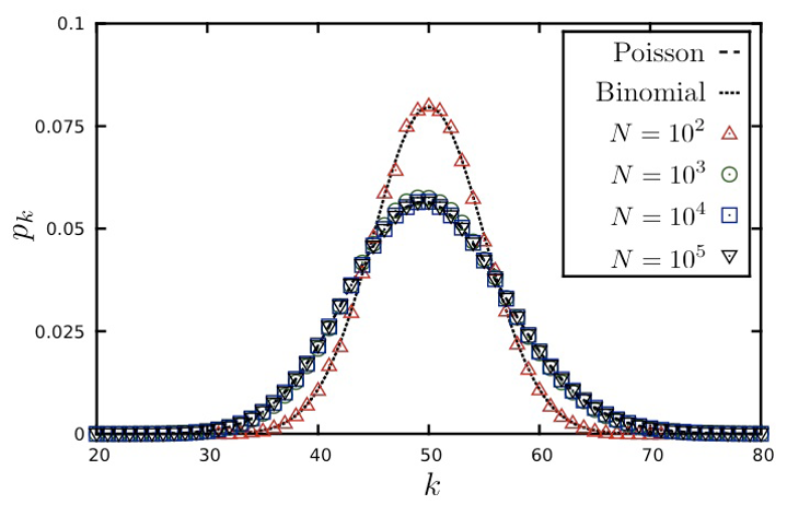
The visualization shows the degree distribution for a network in which the average degree is 50. As we increase the number of nodes n, we need to decrease the connection probability p so that their product remains constant. Note that the Poisson distribution is a rather poor approximation for n=100 (because the average node degree is half of n) but it is excellent as long as n is larger than 1000.
Food for Thought Try to derive mathematically the Poisson distribution from the Binomial distribution for the case that p is much smaller than 1 and n is large. If you cannot do it, refer to a textbook or online resource for help.
Connected Components in G(n,p)
Clearly, there is no guarantee that the G(n,p) model will give us a connected network. If $p$ is close to zero, the network may consist of many small components. So an important question is: how large is the Largest Connected Component (LCC) of the G(n,p) model?
Here is an animation that shows a network with n=1000 nodes, as we increase the average node degree $\bar{k}$ (shown at the upper-left of the animation). Recall that the connection probability is approximately $p \approx \frac{\bar{k}}{n}$.
As you see, initially we have only small groups of connected nodes – typically just 2-3 nodes in every connected component.
After the first 5-10 seconds of the animation however, we start seeing larger and larger connected components. Most of them do not include any loops – they form tree topologies.
Gradually, however, as the average degree approaches the critical value of one, we start seeing some connected components that include loops.
Something interesting happens when the average degree exceeds one (about 40 seconds after the start of the animation): the largest connected component (LCC), which is identified with a different color than the rest of the nodes, starts covering a significant fraction of all network nodes. It starts becoming a “giant component”.
If you continue watching this animation until the end (it takes about five minutes), you will see that this giant component gradually changes color from dark blue to light blue to yellow to red – the color “temperature” represents the fraction of nodes in the LCC. Eventually, all the nodes join the LCC when the average node degree is about 6 in this example.
Size of LCC in G(n,p) as Function of p
We can derive the relation between p and the size of the LCC as follows:
Suppose that S is the probability that a node belongs in the LCC. Another way to think of S is as the expected value of the fraction of network nodes that belong in the LCC.
Then, $\bar{S} = 1- S$ is the probability that a node does NOT belong in the LCC.
That probability can be written as:
\[\bar{S} = \big( (1-p) + p \cdot \bar{S} \big)^{n-1}\]The first term refers to the case that a node v is not connected to another node, while the second term refers to the case that v is connected to another node that is not in the LCC.
Since, $p = \frac{\bar{k}}{n-1}$, , the last equation can be written as:
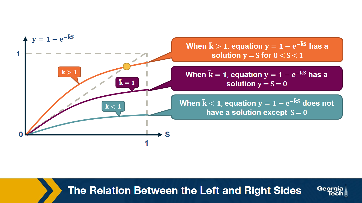
\[\begin{aligned} \bar{S} &= \bigg( 1- \frac{\bar{k}}{n-1} \bigg( 1- \bar{S}\bigg)\bigg)^{n-1} \\ ln \bar{S} &= (n-1) ln \bigg( 1- \frac{\bar{k}}{n-1} \bigg( 1- \bar{S}\bigg)\bigg) \\ &\approx -(n-1)\frac{\bar{k}}{n-1}\bigg(1-\bar{S}\bigg) (\text{by taylor expansion})\\ S &= 1-e^{-\bar{k}S} \end{aligned}\]The visualization shows the relation between the left and right sides of the previous equation, i.e., the relation between S and $1-e^{-\bar{k}S}$.
The equality is true when the function $y = 1-e^{-\bar{k}S}$ crosses the diagonal x=y line.
Note that the derivative of y with respect to S is approximately $\bar{k}$ when S approaches 0.
So, if the average degree is larger than one, the function y(S) starts above the diagonal. It has to cross the diagonal at a positive value of S because its second derivative of y(S) is negative. That crossing point is the solution of the equation $S=1-e^{-\bar{k}S}$. . This means that if the average degree is larger than one ($\bar{k} > 1$), the size of the LCC is S>0.
One the other hand, if the average node degree is less (or equal) than 1, the function y(S) starts with a slope that is less (or equal) than 1, and it remains below the diagonal y=x for positive S. This means that if the average node degree is less or equal than one, the average size of the LCC in a G(n,p) network includes almost zero nodes.
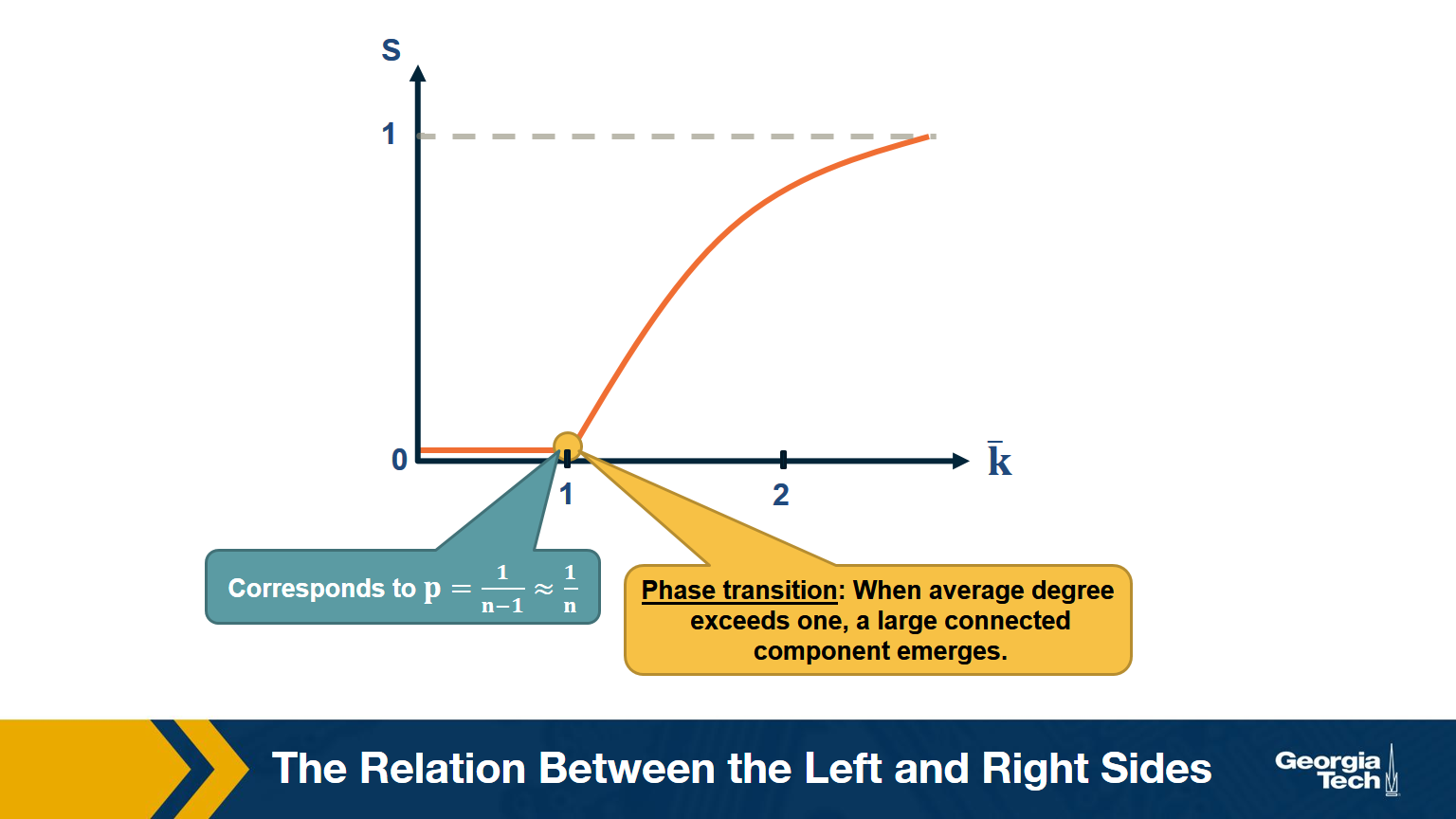
The visualization shows how S increases with the average node degree $\bar{k}$. Note how the LCC suddenly “explodes” when the average node degree is larger than 1. This is referred to as “phase transition”. A phase transition that we are all familiar with is what happens to water when its temperature reaches the freezing or boiling temperature: the macroscopic state changes abruptly from liquid to solid or gas. Something similar happens with G(n,p) when the average node degree exceeds the critical value $\bar{k}=1$: the network suddenly acquires a “giant connected component” that includes a large fraction of all network nodes.
Note that the critical point corresponds to a connection probability of $p=\frac{1}{n-1}\approx \frac{1}{n}$ because $\bar{k} = (n-1) \times p $.
When Does G(n,p) have a Single Connected Component?
Here is one more interesting question about the size of the LCC: how large should p (or $k$) be so that the LCC covers all network nodes?
Note that the previous derivation did not answer this question – it simply told us that there is a phase transition when $k =1$
Suppose again that S is the probability that a node belongs in the LCC.
Then, the probability that a node does NOT connect to ANY node in the LCC :
\[\left(1-p\right)^{S \, n}\approx\left(1-p\right)^n\:if\:S\approx1\]The expected number of nodes not connecting to LCC:
\[\overline{k_o}\:=\:n\cdot\left(1-p\right)^n\:=\:n\left(1-\frac{np}{n}\right)^n\approx n\cdot e^{-np}\]Recall that $\left(1-\frac{x}{n}\right)^n\approx e^{-x}$ when $x\ll n$. So we assume at this point of the derivation that the network is sparse ($p \ll 1$).
If we set $\overline{k_o}$ to less than one node, we get that:
\[\begin{aligned} \:n\cdot e^{-np}&\le\:1 \\ -np&\le\ln\left(\frac{1}{n}\right)=-\ln n \\ p&\ge\frac{\ln n}{n} \\ \overline{k}&=np\:\ge\ln n \end{aligned}\]which means that when the average degree is higher than the natural logarithm of the network size ($\bar{k}>\ln{n}$) we expect to have a single connected component.
Degree Correlations
We assumed throughout this lesson that the degree of a node does not depend on the degree of its neighbors. In other words, we assumed that there are no degree correlations.
Mathematically, if nodes u and v are connected, we have assumed that:
Prob[degree(u) = k | degree(v) = k'] =Prob[degree(u) = k | u connects to another node] =- $q_k$ =
- $p_k \cdot \frac{k}{\bar{k}}$
Note: this probability does not depend on the degree k’ of neighbor v. Such networks are referred to as neutral.
In general, however, there are correlations between the degrees of neighboring nodes, and they are described by the conditional probability distribution:
P[k'|k] = Prob[a neighbor of a k-degree node has degree k']
The expected value of this distribution is referred to as the average nearest-neighbor degree $k_{nn}(k)$ of degree-k nodes:
\[k_{nn}(k) = \sum_{k'} k' \cdot P(k'|k)\]In a neutral network, we have already derived that $k_nn(k)$ is independent of k (recall that we derived $k_{nn}(k) = \bar{k} + \frac{\sigma_k^2}{\bar{k}} = \bar{k}_{nn}$
In most real networks, $k_{nn}(k)$$ depends on k and it shows an increasing or decreasing trend with k.
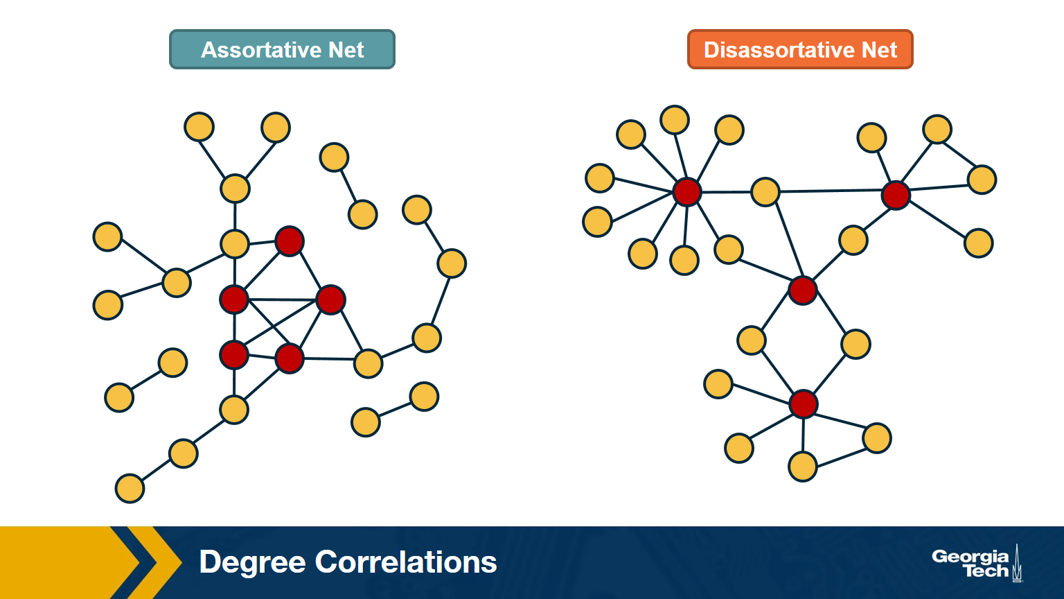
The network at the left shows an example in which small-degree nodes tend to connect with other small-degree nodes (and similarly for high-degree nodes).
The network at the right shows an example of a network in which small-degree nodes tend to connect to high-degree nodes.
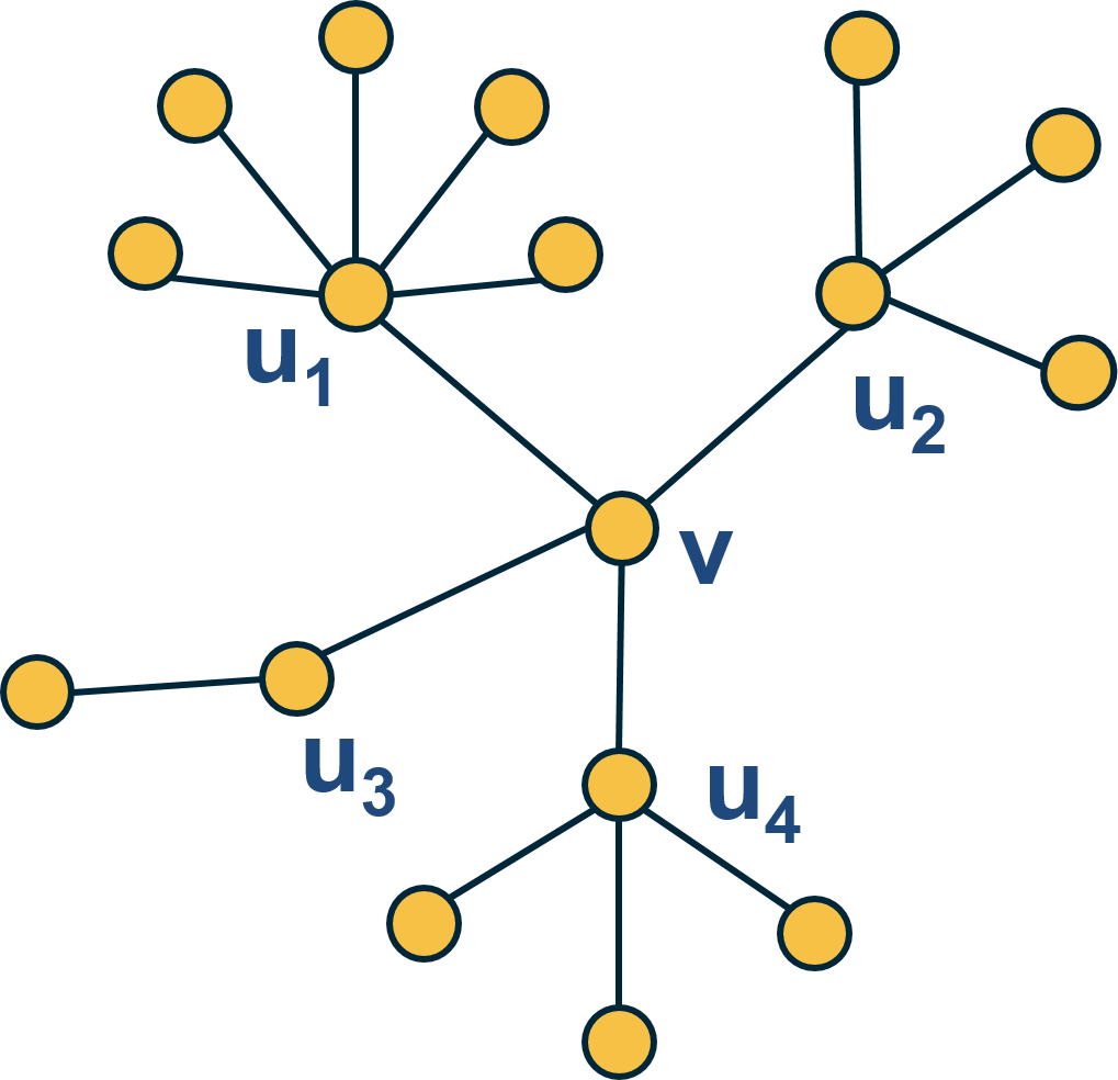
Here is an example: what is the average nearest neighbor degree of node v in this network?
\[\overline{k_{nn}}\left(v\right)\:=\frac{\:1}{k\left(v\right)}\sum_{i=1}^{k\left(v\right)}k\left(u_i\right)=\frac{6+4+2+4}{4}\:=\:4\]To calculate $k_{nn}(k)$ we compute the average value of $k_{nn}(v)$ for all nodes v with $k(v)=x$ .
Then, we plot $k_{nn}(k)$ versus k, and examine whether that plot shows a statistically significant positive or negative trend.
How to Measure Degree Correlations
One way to quantify the degree correlations in a network is by modeling (i.e., approximating) the relationship between the average nearest neighbor degree $k_{nn}(k)$ and the degree k with a power-law of the form:
\[{k_{nn}}\left(k\right)\approx a\cdot k^{\mu}\]Then, we can estimate the exponent $\mu$ from the data.
If $\mu >0$, we say that the network is Assortative: higher-degree nodes tend to have higher-degree neighbors and lower-degree nodes tend to have lower-degree neighbors. Think of celebrities dating celebrities, and loners dating other loners.
If $\mu < 0$, we say that the network is Disassortative: higher-degree nodes tend to have lower-degree neighbors. Think of a computer network in which high-degree aggregation switches connect mostly to low-degree backbone routers.
If $\mu$ is statistically not significantly different from zero, we say that the network is Neutral.
Food for Thought
Suppose that instead of this power-law relation between $k_{nn}(k)$ and k we had used a linear statistical model. How would you quantify degree correlations in that case?
Hint: How would you apply Pearson’s correlation metric to quantify the correlation between degrees of adjacent nodes?
Assortative, Neutral and Disassortative Networks
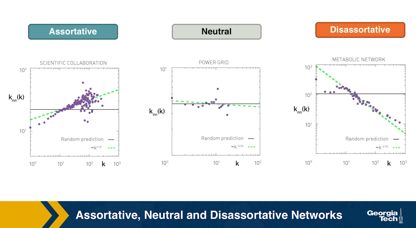
Let’s look at some examples of science degree correlation plots from real world networks. The first network refers to the collaboration between a group of scientists, two nodes are connected if they have written at least one research paper together. Notice that the data is quite noisy especially when the degree K is more than 70.
The reason is simply that we did not have a large enough sample of such nodes with large degrees. Nevertheless, we clearly see a positive correlation between the degree K and the degree of the nearest neighbor which is shown in the y axis.
If we model the data with a power law relation, the exponent $\mu$ is approximately 0.37 in this case. We can use this value to quantify and compare the sort of activity of different networks when the estimate is $\mu$ is statistically significant.
The second network refers to a portion of the power grid in the United States. the data in this case does not support a strong correlation between the degree K and the degree of the nearest neighbor. So it is safe to assume that this network is what we call neutral
The third network refers to a metabolic network where nodes here are metabolites and they are connected if two metabolites A and B appear in the opposite side of the same chemical reaction in a biological cell. The data shows a strong negative correlation in this case but only if the nodes have degree 5, 10, or higher. If we model the data with power law relation, the exponent $\mu$ is approximately minus 0.86. This suggests that complex metabolites such as glucose are either synthesized through a process called anabolism or broken down into through a process called catabolism into a large number of simpler molecules such as carbon dioxide.
Lesson Summary
The main objective of this lesson was to explore the notion of “degree distribution” for a given network. The degree distribution is probably the first thing you will want to see for any network you encounter from now on. It gives you a quantitative and concise description of the network’s connectivity in terms of average node degree, degree variability, common degree modes, presence of nodes with very high degrees, etc.
In this context, we also examined a number of related topics. First, the friendship paradox is an interesting example to illustrate the importance of degree variability. We also saw how the friendship paradox is applied in practice in vaccination strategies.
We also introduced G(n,p), which is a fundamental model of random graphs – and something that we will use extensively as a baseline network from now on. We explained why the degree distribution of G(n,p) networks can be approximated with the Poisson distribution, and analyzed mathematically the size of the largest connected component in such networks.
Obviously, the degree distribution does not tell the whole story about a network. For instance, we talked about networks with degree correlations. This is an important property that we cannot infer just by looking at the degree distribution. Instead, it requires us to think about the probability that two nodes are connected as a function of their degrees.
We will return to all of these concepts and refine them later in the course.
L4 - Random vs. Real Graphs and Power-Law Networks
Overview
Required Reading
- Chapter 4 (sections 4.1, 4.2, 4.3, 4.4., 4.7, 4.8, 4.12), A-L. Barabási , Network Science, 2015.
- Chapter 5 (sections 5.1, 5.2, 5.3), A-L. Barabási ,Network Science 2015
Degree Distribution of Real Networks
What is the degree distribution of real networks?
- Scientists used to think that real networks can be modeled as random ER graphs.
- Such networks follow the binomial degree distribution.
- In the late 1990s, researchers observed that real networks are very different, with highly skewed degree distribution.
- For many networks, the power law degree distribution $p_k \sim k^{-\alpha}$ is a more appropriate model.
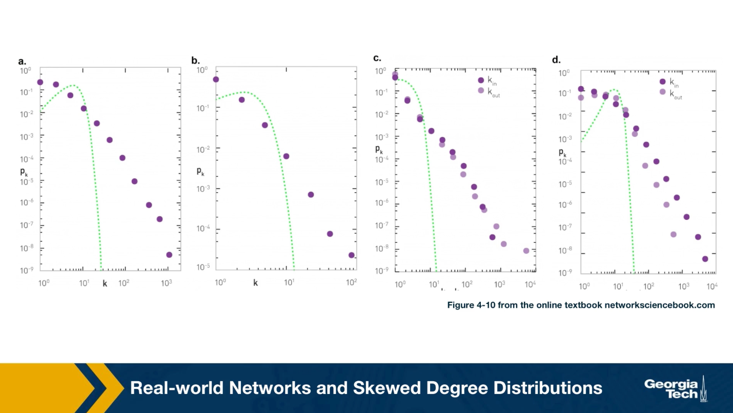
For instance, the plots that you see here illustrate the measured degree distribution of an older internet topology at the router level, a protein-protein interaction network, an email social network, which shows basically who sends email to whom and a citation network showing which papers cite other papers.
Note that the last two networks are directed and so the corresponding plots show separately, the in-degree and the out-degree distributions. You can find more information about these networks in table 41 of your textbook.
The plot also shows in green (the second plot), the poisson distribution with the same average degree as the observed network. c 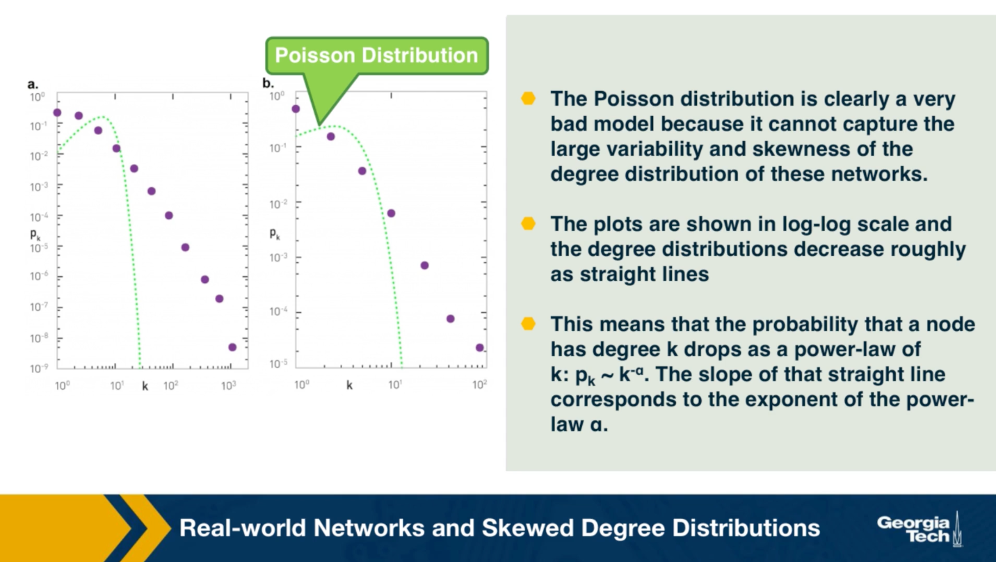
Please note the following points about these plots:
- The poisson distribution is clearly a very bad model because it cannot capture the large variability and skewness of the degree distribution of these networks.
- The plots are shown in the log-log scale and the degree distributions decreases roughly as straight lines
- This means that the probability that a node has degree k drops as a power-law of $k:p_k \sim k^{-\alpha}$. The slope of that straight line corresponds to the exponent of the power-law $\alpha$.
This observation is not just a statistical technicality. The fact that the real world networks often follow a power-law degree distribution has major implications about the function robustness and efficiency as we will see later in the semester.
To further visualize the differences between a poisson and power law distribution, here are two distributions in both linear-linear and log-log scales.
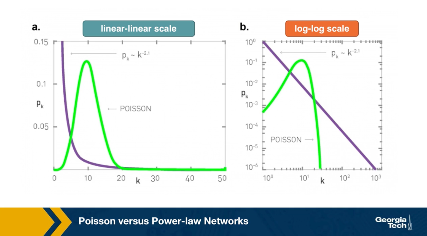
The poisson distribution has an average degree of 11 here, while the power-law distribution has a lowered average degree set to 3, and the exponent is 2.1. The linear-linear plot shows that almost bell-shaped form of the poisson distribution centered around its mean. The power-law distribution on the other hand is not centered around the specific value. The major difference between the two distributions becomes clear in log-log scale. We see that the poisson distribution cannot produce values that are much larger than its average.
In this example, the maximum value of the poisson distribution is roughly 30, almost 3 times larger than the mean. The power-law distribution extends over three orders of magnitude and there is a non negligible probability that we get values that are much greater than its mean.
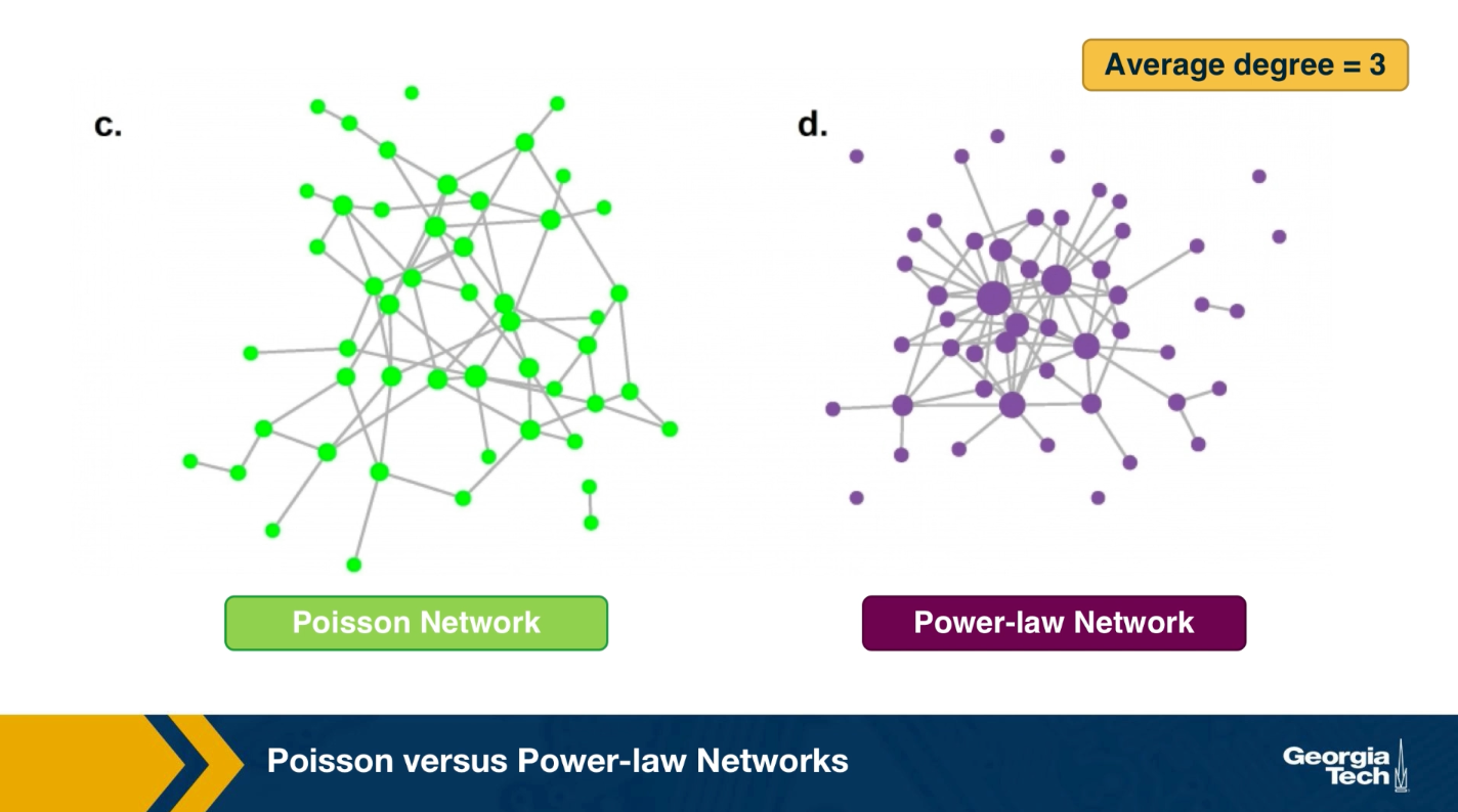
The visualization here, shows 2 networks with 50 nodes. They both have the same average degree equal to 3. The network at the left follows the poisson distribution, while the network at the right follows a power-law distribution with exponent 2.1.
The size of the nodes is drawn to be proportional to the degree. Note that the poisson network is uniform looking, there is not much variability in the degree of different nodes. The power-law network on the other hand, is very heterogeneous in that respect, some nodes are completely disconnected, many nodes have a degree of only 1 while 2 or 3 nodes have a much higher degree than the average. It is those nodes that we refer to as hubs.
Power-law Degree Distribution
A “power-law network” has a degree distribution that is defined by the following equation:
\[p_k = ck^{-\alpha}\]In other words, the probability that the degree of a node is equal to a positive integer $k$ is proportional to $k^{-\alpha}$ where $\alpha$ >0.
The proportionality coefficient c is calculated so that the sum of all degree probabilities is equal to one for a given $\alpha$ and a given minimum degree $k_{\text{min}}$ (the minimum degree may not always be 1).
\[\sum_{k=k_{\text{min}}}^\infty p_k = 1\]The calculation of c can be simplified if we approximate the discrete degree distribution with a continuous distribution:
\[\begin{aligned} \, \, \int_{k=k_{min}}^{\infty} p_k = \, c\int_{k=k_{min}}^{\infty} k^{-\alpha} = - \frac{c}{\alpha-1} k^{-(\alpha-1)} |_{k_{min}}^{\infty} = \frac{c}{\alpha-1} k_{min}^{-(\alpha-1)} = 1 \end{aligned}\]which gives:
\[c = \left(\alpha-1\right) \, {k_{min}^{\alpha-1}}\]So, the complete equation for a power-law degree distribution is:
\[p_k= \frac{\alpha-1}{k_{min}} \, \bigg(\frac{k}{k_{min}}\bigg)^{-\alpha}\]The Complementary Cumulative Distribution Function (C-CDF) is:
\[P[\mbox{degree} \geq k] = \bigg(\frac{k}{k_{min}}\bigg)^{-(\alpha-1)}\]Note that the exponent of the CCDF function is $\alpha-1$, instead of $\alpha$. So, if the probability that a node has degree $k$ decays with a power-law exponent of 3, the probability that we see nodes with degree greater than $k$ decays with an exponent of 2.
For directed networks, we can have that the in-degree or the out-degree or both follow a power-law distribution (with potentially different exponents).
Food for Thought
Prompt 1: Repeat the derivations given here in more detail.
Prompt 2: Can you think of a network with n nodes in which all nodes have about the same in-degree but the out-degrees are highly skewed?
The Role of the Exponent of a Power-law Distribution
What is the mean and the variance of a power-law degree distribution?
More generally we can ask: what is the m’th statistical moment of a power-law degree distribution? It is defined as:
\[E[k^m] = \sum _{k_{min}}^{\infty} k^m p_k = c \sum _{k_{min}}^{\infty} k^{m-\alpha}\]where c is the proportionality coefficient we derived in the previous page.
If we rely again on the continuous $k$ approximation, the previous summation becomes an integral that we can easily calculate:
\[E[k^m] = c \int_{k_{min}}^{\infty} k^{m-\alpha} {dk} = \frac{c}{m-\alpha+1} k^{m-\alpha+1} |_{k_{min}}^{\infty}\]Note that this integral diverges to infinity if $m -\alpha+1\geq 0$ and so, the m’th moment of a power-law degree distribution is well defined (finite) if $m < \alpha -1$.
Consequently, the mean (first moment) exists if $\alpha>2$ and the variance (second moment minus the square of the mean) exists if $\alpha>3$.
Of course the variance cannot be “infinite” if the network has a finite number of nodes (i.e., $k$ never ”extends to infinity” in real networks). For many real-world networks however, the exponent $\alpha$ is estimated to be between 2 and 3, which means that even though the distribution has a well-defined average degree, the variability of the degree across different nodes is extremely large.
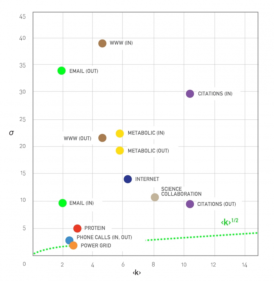 Standard Deviation is Large in Real Networks, Figure 4.8 from networksciencebook.com by Albert-László Barabási
To illustrate this last point, let’s look at the relation between the average degree and the standard deviation of the degree distribution for several real-networks (for more details about these networks please review Table 4.1 of your textbook).
For a network with Poisson degree distribution (such as random ER graphs), the degree variance is equal to the average degree $\left(E[k]=\bar{k}=\sigma^2\right)$ and so $\sigma = \sqrt{\bar{k}}$
Note that many real-world networks have much higher $\sigma$ than that – in some cases $\sigma$ is even an order of magnitude larger than $\bar{k}$. In the case of the WWW in-degree distribution, for example, the average in-degree is only around 4 while the standard deviation of the in-degree is almost 40!
Food for Thought
Prompt: repeat the derivation for the m’th moment outlined above in more detail.
How to Check if a Network Has Power-law Degree Distribution
 Rescaling the Degree Distribution, Figure 4.23 from networksciencebook.com by Albert-László Barabási
In practice, the degree distribution may not follow an ideal power-law distribution throughout the entire range of degrees. In other words, the empirical degree distribution may not be a perfect straight-line when plotted in log-log scale. Instead, it may look similar to the left plot at this page. There are two important points about this distribution:
-
For lower values of $k$, we observe a “low-degree saturation” that decreases the probability of seeing low-degree nodes compared to an ideal power-law. If this saturation effect takes place mostly for nodes with degree less than $k_{\text{sat}}$, we can capture this effect by considering a modified power-law expression: $(k+k_{\text{sat}})^{-\alpha}$.
Do you see why adding the term $k_{\text{sat}}$ causes a decrease in the probability of low-degree nodes (but it has a minor effect on high-degree nodes)?
-
For very high values of $k$ there is again a deviation from the ideal power-law form. The reason is that in practice there are always some “structural” effects that limit the maximum degree that a node can have. For example, in a router-level computer network, the maximum degree is limited by the maximum number of interfaces that a router can have due to hardware or cost constraints. To capture such a high-degree cutoff point, we often need to constrain the upper-tail of the degree distribution up to a value $k_{\text{cut}}$. This value is determined by practical connectivity constraints for the network we analyze.
In summary, when we want to check if a network follows a power-law degree distribution, we need to consider whether that distribution drops almost linearly with $k$ in a range between $k_{\text{sat}}$ and $k_{\text{cut}}$
Another approach, that addresses the low-degree saturation effect, is to “rescale” the distribution so that we examine the behavior of the degree probability with $(k+k_{\text{cut}})$ (instead of $k$) - still considering the range up to $k_{\text{cut}}$. This rescaling approach is shown at the plot at the right.
Food for Thought
A more rigorous statistical approach to examine if a network has a power-law degree distribution is described at the following site: Power-law Distributions in Empirical Data. You will experiment with this (or similar) method in an assignment. For now, you may just want to read the description of that method from the given URL.
How to Plot Power-law Degree Distribution
 Plotting a Degree Distributions, Image 4.22 from networksciencebook.com by Albert-László Barabási
There are several ways to plot a power-law distribution – but not all of them are good and some of them can even be misleading.
This plot visualizes the same distribution, $p_k = c’ (k + k_0)^{-\alpha}$, with $k_0 = 10$ and $\alpha=2.5$, in four different ways. The term $k_0 = 10$ causes the “low-degree saturation” that you see at the left tail of the distribution, decreasing the probability of lower-degrees.
The four plots are:
- linear-linear scale. This is clearly a bad way to plot a power-law distribution.
- log-log scale but with linear binning (the bin width of the histogram increases linearly with $k$). This is also not an appropriate approach because the bins of the histogram for high values of $k$ are quite narrow and they often include 0 or 1 measurements, creating the “plateau” that you see at the tail of the distribution.
- log-log scale but with logarithmic binning (the bin width of the histogram increases exponentially with $k$). Note how the tail of the distribution drops almost linearly with $k$ when the degree is higher than about 50-100. A potential issue with this approach is that we still need to figure out how fast to increase the bin width with $k$.
- the Complementary Cumulative Distribution Function (C-CDF), which shows the probability $P_k$ that the degree is higher or equal than $k$ (all previous plots show the probability $p_k$ that the degree is equal to $k$). This is the best approach because we do not need to determine an appropriate sequence of bin-widths. Please note however that the slope of the C-CDF is not the same as the slope of the degree distribution. In this example, $\alpha=2.5$ and so the exponent of the C-CDF is 1.5.
Scale-free Nature of Power-law Networks
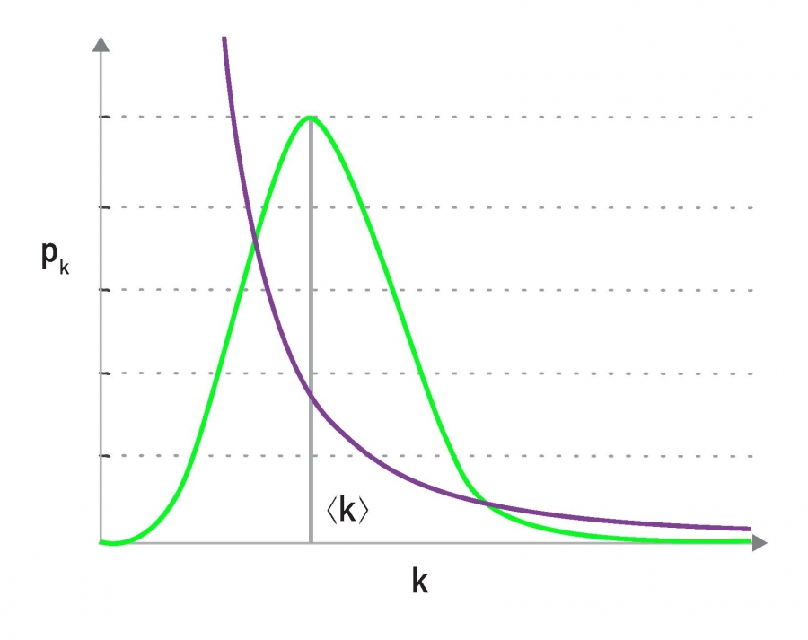 Lack of an Internal Scale, figure 4.7 from networksciencebook.com by Albert-László Barabási
One of the first things we learn in statistics is that the Normal distribution describes quite accurately many random variables (due to the Central Limit Theorem), and that according to that distribution 99.8% of the data are expected to fall within 3 standard deviations from the average.
Qualitatively, this is true for all distributions with exponentially fast decreasing tails, which includes the Poisson distribution and many others. In networks that have such degree distributions, the average degree represents the “typical scale” of the network, in terms of the number of connections per node (see green distribution at the visualization).
On the other hand, a power-law degree distribution with exponent $2<\alpha<3$ has finite mean but infinite variance (any higher moments, such as skewness are also infinite). The infinite variance of this statistical distribution means that we cannot expect the data to fall close to the mean. On the contrary, the mean (the average node degree in our case) can be a rather uninformative statistic in the sense that a large fraction of values can be lower than the mean, and that many values can be much higher than the mean (see purple distribution at the visualization).
For this reason, people often refer to power-law networks as “scale-free”, in the sense that the node degree of such networks does not have a “typical scale”. In the rest of this course, we prefer to use the term “power-law networks” because it is more precise.
The Maximum Degree in a Power-law Network
Let us now derive an expression for the maximum degree we can expect to see in a power-law network with $n$ nodes, and to compare that with the corresponding maximum degree we can expect to get from a network in which the degree distribution decays exponentially fast with the degree $k$. Recall that the Poisson distribution of $G(n,p)$ networks decays even faster than exponential distribution.
To make the calculations easier, let us work with the (continuous) exponential distribution $p_k = ce^{-\lambda k}$, where $k$ is the degree, $\frac{1}{\lambda}$ is the average degree, and $c$ is a normalization constant. In a network in which the minimum degree is $k_{\text{min}} \geq 0$ (with 1 $\frac{1}{\lambda} > k_{\text{min}}$), the parameter $c$ should be equal to $\lambda e^{\lambda k_{\text{min}}}$, and so the probability that a node has degree $k$ is
\[p_k = \lambda e^{\lambda k_{min}} e^{- \lambda k}\]Suppose that the node with maximum degree $k_{\text{min}}$ is unique – so the probability of having a degree $k_{\text{max}}$ is $\frac{1}{n}$.
Thus, relying on the continuous $k$ approximation again, we can write that:
\[\int_{k_{max}}^{\infty} p_k {dk} = \frac{1}{n}\]Substituting the previous expression for $p_k$ and calculating this integral, we can easily get that the maximum degree for the exponential degree distribution is:
\[k_{max} = k_{min} + \frac{\ln n}{\lambda}\]This means that the maximum degree increases very slowly (logarithmically) with the network size $n$, when the degree distribution decays exponentially fast with $k$.
Let us now repeat these derivations but for a power-law network with the same minimum degree $k_{min}$ and an exponent $\alpha$.
\[p_k = \frac{\alpha-1}{k_{min}} \, (\frac{k}{k_{min}})^{-\alpha}\]Suppose that the node with maximum degree $k_{max}$ is unique – so the probability of having a degree $k_{max}$ is $\frac{1}{n}$
Thus, relying on the continuous $k$ approximation, we can again write that:
\[\int_{k_{max}}^{\infty} p_k {dk} = \frac{1}{n}\]Substituting the previous expression for $p_k$ and calculating this integral, we can easily get that the maximum degree for a power-law network is:
\[k_{max} = k_{min} \, n^{1/(\alpha-1)}\]This means that the maximum degree in a power-law network increases as a power-law of the network size $n$. If $\alpha=3$ the maximum degree increases with the square-root of $n$.
In the more extreme case that $\alpha=2$ the maximum degree increases linearly with $n$!
To put these numbers in perspective, consider a network with one million nodes, and an average degree of $\bar{k}=3$. If the network follows the exponential degree distribution, the maximum expected degree is only about 10 – not much larger than the average degree.
If the network follows the power-law degree distribution with exponent $\alpha=2.5$ (recall that this is a typical value for many real-world networks), we get that the maximum degree is about 10,000!
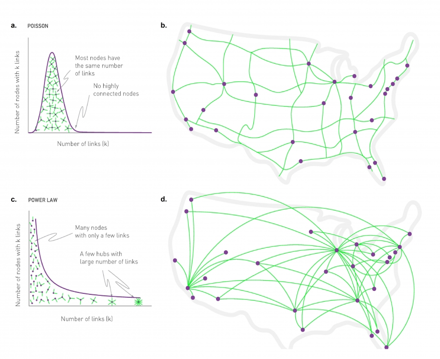 Random vs. Scale-free Networks, Figure 4.6 from networksciencebook.com by Albert-László Barabási
The example above clearly illustrates a major difference between exponential and power-law networks: the latter have nodes with a much greater number of connections than the average node – we typically refer to those nodes as Hubs.
The visualization at this page illustrates the difference between exponential and power-law networks focusing on the presence of hubs. The network of major interstate highways in the US follows a Poisson distribution, without any nodes (cities) that have a much larger degree than the average. On the other hand, the network of direct flights between the major US cities follows a power-law degree distribution and there are obvious hubs, such as the airports in Atlanta, Chicago or New York city.
Food for Thought
Derive the integrals shown in this page yourself.
Random Failures and Targeted Attacks in Power-law Networks
Another interesting characteristic of power-law networks is that they behave very differently than random ER-graphs (or, more generally, networks with Poisson degree distribution) in the presence of node failures.
Let us first distinguish between random failures (where a fraction f of randomly selected nodes are removed from the network), and targeted attacks (where a fraction f of the nodes with the highest degree are removed from the network). In a communication network, for instance, random failures can be caused by router malfunctions, while targeted attacks may be caused by a terrorist that knows the topology of the network and disrupts the highest-connectivity routers first.
 Scale-free Network Under Attack, Figure 8.11 from networksciencebook.com by Albert-László Barabási
 Attacks and Failures in Random Networks. Figure 8.13 from networksciencebook.com by Albert-László Barabási
The plots in this page compare the effect of both random failures and attacks on both power-law networks (left) and ER-graphs (right). In both cases, the networks have the same size (10,000 nodes and 15,000 edges). The exponent of the power-law distribution in the network at the left is 2.5 (meaning that the variance of the degree distribution is infinite) and the average degree is 3.
The y-axis of both plots shows the fraction of nodes that belong to the largest connected component, for a given fraction f of removed nodes (more precisely, the y-axis shows the ratio $P_{\infty}(f)/P_{\infty}(0)$, where the numerator is the probability that a node belongs in the largest connected component given a fraction f of removed nodes, while the denominator is the same probability but when $f=0$).
In terms of random failures, the power-law degree network is much more robust than the random network: the largest connected component includes almost all nodes, even as f approaches 100% of the nodes. On the other hand, the random network’s largest connected component disintegrates after f exceeds a critical threshold (around 0.7 in this example). This difference is mostly due to the presence of hubs in power-law networks: hubs have so many connections that they manage to keep the non-deleted nodes in the same connected component, even when f is close to 1.
The situation is very different from targeted attacks: power-law networks are very sensitive to those because an attacker would first delete the hub nodes, causing a disintegration of the largest connected component after f exceeds a critical threshold (around 0.15 in this example). That critical threshold is higher for Poisson networks because they do not have hub nodes.
In summary, power-law networks are more robust to random failures than Poisson networks – but they are also more sensitive to targeted attacks than Poisson networks.
Degree-preserving Randomization
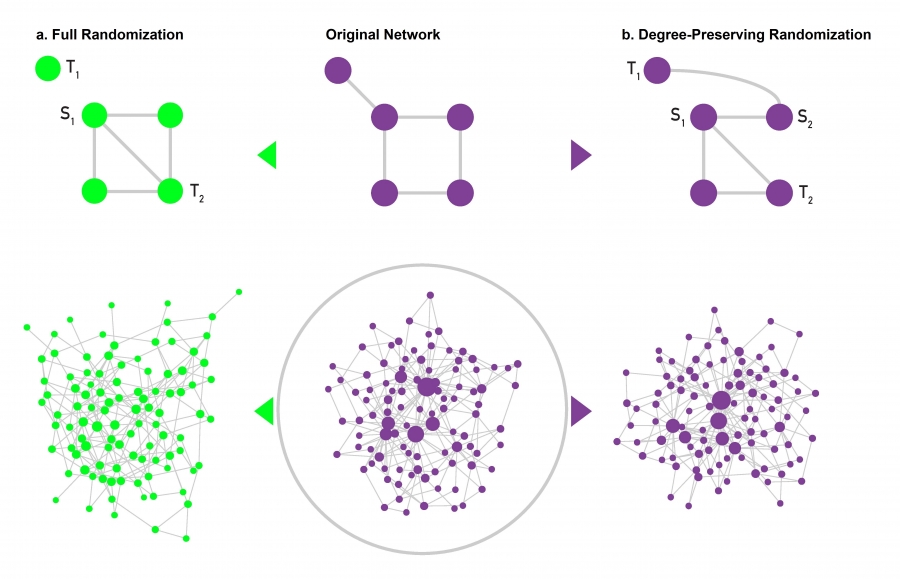 Degree Preserving Randomization, Figure 4.17 from networksciencebook.com by Albert-László Barabási
Suppose that you analyze a certain network G and you find it has an interesting property P. For example, P may be one of the robustness properties we discussed in the previous page about the size of the largest connected component under random or targeted node removals. How can you check statistically whether P is caused by the degree distribution of the network G (as opposed to other network characteristics)?
One approach to do is to ”randomize” the network G but without modifying the degree of any node. If we have a way to do so, we can create a large number of “degree-preserving” random networks – and then examine whether these networks also exhibit the property P. To make the analysis convincing we can also create another ensemble of randomized networks that do NOT have the same degree distribution with G but that maintain the same number of nodes and edges. Let us call these networks ”fully randomized”.
If the property P of G is present in the degree-preserving randomized networks – but P is not present in the fully randomized networks, we can be confident that the property P is a consequence of the degree distribution of G and not of any other property of G.
To perform ”full randomization”, we can simply pick each edge (S1, T1) of G and change it to (S1, T2), where T2 is a randomly selected node. Note that this does not change the number of nodes or edges (and so the network density remains the same). The degree distribution however can change significantly.
To perform “degree-preserving randomization”, we can pick two random edges(S1, T1) and (S2, T2) and rewire them to (S1,T2) and (S2, T1). Note that this approach preserves the degree of every node. This approach is repeated until we have rewired each edge at least once.
The visualization at the lower part of the panel shows an example of a power-law network and two randomized networks. The degree-preserving network maintains the presence of hubs as well as the connected nature of the original network. The fully randomized network on the other hand does not have hubs (and it could even include disconnected nodes – even though that does not happen in this example).
Food for Thought
There are more randomization approaches that can preserve more network properties than the degree distribution. How would you randomize a directed network so that the in-degree and the out-degree distributions remain the same?
The Average Degree of the Nearest Neighbor at a Power-law Network
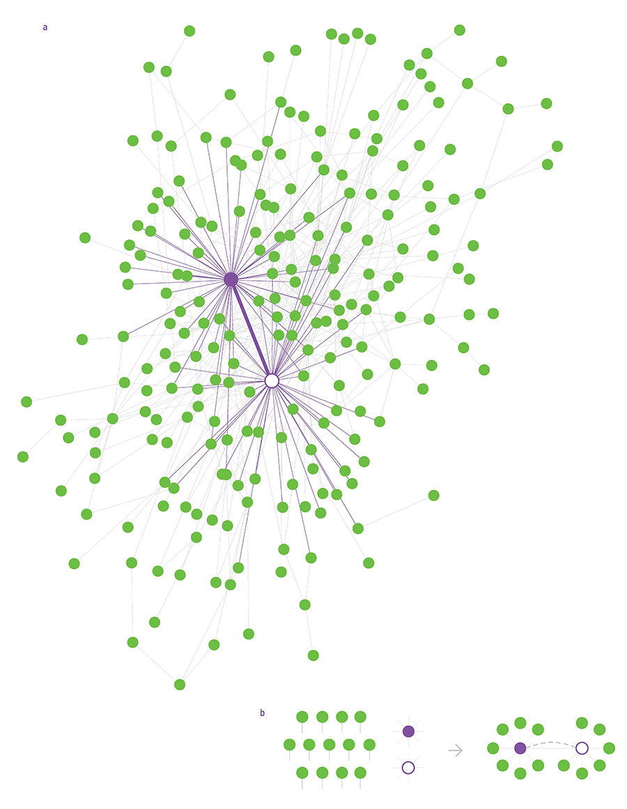 Structural Disassortativity, Figure 7.7 from networksciencebook.com by Albert-László Barabási
Recall the notion of “average neighbor degree” from Lesson-3 – which is the same with the expected degree of a node that is connected to a randomly sampled edge stub.
Under the assumption of a “neutral network” (i.e., no correlation between the degrees of two connected nodes), we derived that the average neighbor degree is:
\[\bar{k}_{n} = \bar{k} + \frac{\sigma^2_k}{\bar{k}}\]This shows one more interesting property of power-law networks: as we previously discussed, these networks can have very large degree variability in practice (i.e., $\sigma_k$ is much higher than $\bar{k}$). Consequently, the average neighbor degree can be much higher than the network’s average degree – intensifying the impact of the friendship paradox.
The visualization at this page shows a power-law network with 300 nodes, 450 edges, and exponent 2.2, generated by the configuration model. We highlight the two highest-degree hubs. Note that many nodes are connected to those hubs, increasing the average neighbor degree of those nodes.
Configuration Model
Suppose that a real-world communication network with one thousand nodes has a power-law degree distribution with exponent $\alpha=2.5$ –you may want to investigate how this network will perform when it grows to ten thousand nodes, assuming that its degree distribution exponent remains the same.
How can we create a synthetic network that has a given degree distribution? This is a central question in network modeling.
A general way to create synthetic networks with a specified degree distribution $p_k$ is the “configuration model”. The inputs to this model is
- the desired number of nodes n, and
- the degree $k_i$ of each node i. The collection of all degrees specifies the degree distribution of the synthetic network.
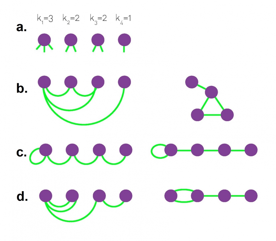 The Configuration Model, Figure 4.15 from networksciencebook.com by Albert-László Barabási
The configuration model starts by creating the n nodes: node $i$ has $k_i$ available “edge stubs”. Then, we keep selecting randomly two available stubs and connect them together with an edge, until there are no available stubs. The process is guaranteed to cover all stubs as long as the sum of all node degrees is even.
The configuration model process is random and so it creates different networks each time, allowing us to produce an ensemble of networks with the given degree distribution.
Additionally, note that the constructed edges may form self-loops (connecting a node to itself) or multi-edges (connecting the same pair of nodes multiple times). In some applications multi-edges and self-loops are not allowed – but the good news is that they are unlikely to happen when n is very large and the network is sparse. Removing them artificially is another option but it can cause deviations from the desired degree distribution.
The visualization of this page shows three different networks with n=4 that can result from the configuration model, given the same degree distribution. Note that there are more than three different networks that could include self loops and multi-edges - can you find the rest?
Food for Thought
What is the probability that the configuration model will connect two nodes of degree $k_i$ and $k_j$?
Preferential Attachment Model
The configuration model can generate networks with arbitrary degree distributions – including power-laws with any exponent. However, the configuration model does not suggest any “generating mechanism” that explains how a network can gradually acquire a power-law degree distribution.
 Evolution of the Barabási-Albert Model, Figure 5.3 from networksciencebook.com by Albert-László Barabási
One such generating model is known as “preferential attachment” (or PA model or “Barabási-Albert” model). In this model, the network grows by one node at each time step – so the network has t nodes after t time steps. Every time a new node is added to the network, it connects to m existing nodes (m is the same for all new nodes – suppose that we allow self-loops and multi-edges for now). The neighbors of the new node are chosen randomly but with a non-uniform probability, as follows.
Suppose that the new node arrives at a point in time $t$, and let $k_i(t)$ be the degree of node $i$ at that time. The probability that the new node will connect to node $i$ is:
\[\Pi_i(t) = \frac{k_i(t)}{\sum_{j=1}^t k_j(t)} = \frac{k_i(t)}{2 m t}\]In other words, in the preferential attachment model, the network grows over time and new nodes are more likely to connect to nodes with higher degrees (see above plot). This is a ”rich get richer” effect because nodes with higher degree attract more connections from new nodes, making their degree even higher relative to other nodes.
Later in the course, we will return to this model and study its behavior mathematically.
For now, we only mention without proof that this model produces power-law networks with an exponent $\alpha=3$. The value of the parameter m (number of edges of new node) does not affect the exponent of the distribution.
The degree distribution at the plot below refers to a network that was created with the preferential attachment model, after generating n=100,000 nodes and with m=3 (the green dots show a log-binned estimate of the distribution while the purple dots show a linearly-binned histogram).
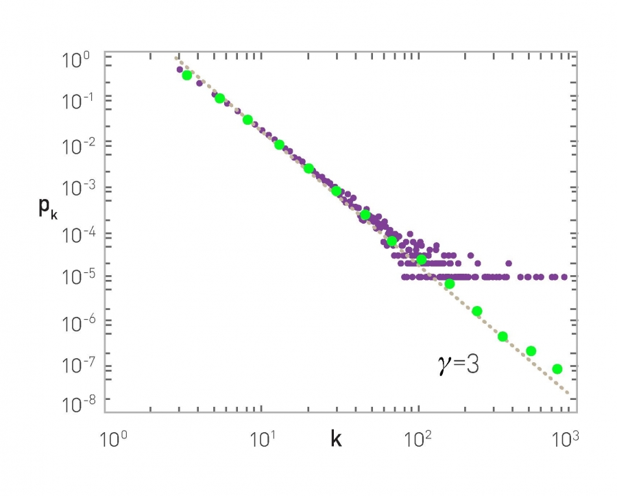 The Degree Distribution, Figure 5.4 from networksciencebook.com by Albert-László Barabási
The main value of the preferential attachment model is that it suggests that power-law networks can be generated through the combined effect of two mechanisms: growth and preferential connecting to nodes with a higher degree. Either of these two mechanisms on its own would not be sufficient to produce power-law networks.
Food for Thought
How would you modify the preferential attachment model so that you get an exponent $\alpha$ between 2 and 3?
Link Selection Model
 Link Selection Model, Figure 5.13 from networksciencebook.com by Albert-László Barabási
Another very simple generating model that also creates power-law networks with exponent 3 is the “link selection” model.
Suppose that each time we introduce a new node, we select a random link and the new node connects to one of the two end-points of that link (randomly chosen). In other words, the new node connects to a randomly selected edge-stub (see visualization).
In this model, the probability that the new node connects to a node of degree k is proportional to k (because the node of degree-k has k stubs). But this is exactly the same condition with the preferential attachment model: a linear relation between the degree k of an existing node and the probability that the new node connects to that existing node of degree-k.
So, the link selection model is just a variant of preferential attachment and it also produces power-law degree distribution with exponent $\alpha=3$.
What Does The Power-law Property Mean in Practice?
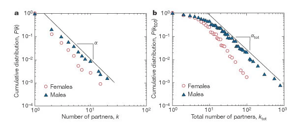 Image source: https://www.nature.com/articls/35082140/figures/2Links
The focus of this lecture so far has been on the statistical properties of networks with power-law degree distribution. What does this property mean in practice, however? And how does it affect network phenomena that all of us care about, such as the spread of epidemics?
To answer the first question, let us consider the case of networks of sexual partners. There are several diseases that spread through sexual intercourse, including HIV-AIDS, syphilis or gonorrhea.The degree distribution in such networks relates to the number of sexual partners of each individual (node in the graph). The plots on this page are based on a 1996 survey of sexual behavior conducted in Sweden. The number of respondents was 2,810 and the age range was from 18 to 74 years old (roughly balanced between men and women).
The plot at the left is the C–CDF for the number of partners of each individual during the last 12 months, shown separately for men and women. Note that the distributions drop roughly linearly in the log-log scale plot, suggesting the presence of a power-law distribution (at least in the range from 2 to 20).
The plot at the right is the corresponding C-CDF but this time for the entire lifetime of each individual. As expected, the range of the distribution now extends to a wider range (up to 100 partners for women and 1000 for men). Note the low-degree saturation effect we discussed earlier in this lesson, especially for less than 10 partners. The exponent of the C-CDF distributions is αtot = 2.1 ± 0.3 for women (in the range $k_{tot} > 20$), and $\alpha_{tot} = 1.6 \pm 0.3$ for men (in the range $20 < k_{tot} < 400$). Estimates for females and males agree within statistical uncertainty. Note that these exponents refer to the C-CDF – so the corresponding exponents for the degree distributions would be, on average, 3.1 for women and 2.6 for men.
These exponent values suggest that, at least for men, the corresponding network of sexual contacts would have a power-law distribution with very high variability (theoretically, “infinite variance”). The distribution also shows the presence of hubs: individuals with hundreds of partners during their lifetime. The wide variability in this distribution justifies targeted intervention approaches that aim to identify the “hub individuals” and provide them with additional information, resources (such as condoms or treatment), and when available, vaccination.
Case Studies: Superspreaders
Superspreaders in SARS epidemic
The SARS (Severa Acute Respiratory Syndrome) was an epidemic back in 2002-3. It infected 8000 people in 23 countries and it caused about 800 deaths.
 Source: Super-spreaders in infectious diseases Richard A.Stein, International Journal of Infectious Diseases, August 2011 https://doi.org/10.1016/j.ijid.2010.06.020
The plot shown here shows how the infections progressed from a single individual (labeled as patient-1) to many others. Such plots result from a process known as “contact tracing” – finding out the chain of successive infections in a population.
It is important to note the presence of a few hub nodes, referred to as “superspreaders” in the context of epidemics. The superspreaders are labeled with an integer identifier in this plot. The superspreader 1, for example, infected directly about 20 individuals.
The presence of superspreaders emphasizes the role of degree heterogeneity in network phenomena such as epidemics. If the infection network was more “Poisson-like”, it would not have superspreaders and the total number of infected individuals would be considerably smaller.
Superspreaders Versus The Average Reproductive Number $R_0$
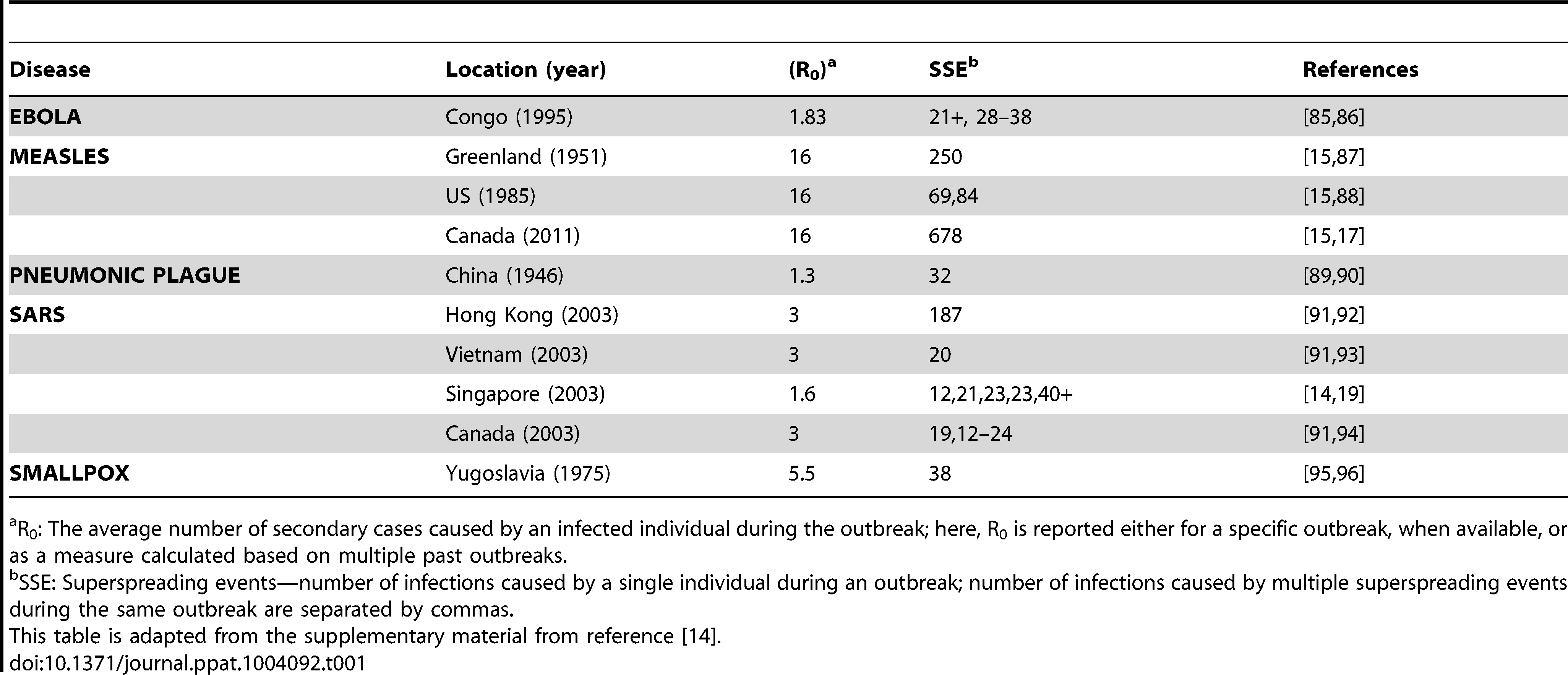 Source: Cellular Superspreaders: An Epidemiological Perspective on HIV Infection inside the Body Kristina Talbert-Slagle et al., 2014, https://doi.org/10.1371/journal.ppat.1004092
Epidemiologists often use the basic “reproductive number”, $R_0$, which describes the average number of secondary infections that arise from one infected individual in an otherwise totally susceptible population.
One way to estimate $R_0$ is to multiply the average number of contacts of an infected individual by the probability that a susceptive individual will become infected by a single infected individual (“shedding potential”). So, the $R_0$ metric does not depend only on the given pathogen – it also depends on the number of contacts that each individual has. If $R_0$>1 then an outbreak is likely to become an epidemic, while if $R_0$<1 then an outbreak will not spread beyond a few initially infected individuals
It is important to realize however that $R_0$ is only an average – it does not capture the heterogeneity in the number of contacts of different individuals (and it also does not capture the heterogeneity in the shedding potential of the pathogen at different individuals). As we know by now, contact networks can be extremely heterogeneous in terms of the degree distribution, and they can be modeled with a power-law distribution of (theoretically) infinite variance. Such networks include hubs – and as we saw above, hubs can act as superspreaders during epidemic outbreaks.
The table in this page confirms this point for several epidemics. The third column shows R0 while the fourth column shows ”Superspreading events” (SSE). These are events during an outbreak in which a single infected individual causes a large number of direct or indirect infections. For example, in the case of the 2003 SARS epidemic in Hong Kong, even though $R_0$ was only 3, there was an SSE in which an infected individual caused a total of 187 infections (patient-1 above).
SSEs have been observed in practically every epidemic – and they have major consequences both in terms of the speed through which an epidemic spreads and in terms of appropriate interventions. For example, in the case of respiratory infections (such as COVID-19) “social distancing” is an effective intervention only as long as it is adopted widely enough to also include superspreaders.
Lesson Summary
The goal of this module was to introduce you to real networks, their degree distributions and the differences they have with random networks. From there we explored the Power-law degree distribution, how to test for it, methods of plotting it, and the special properties of networks that have this distribution. These properties include the maximum degree, the robustness of these networks reason that power-law network are sometimes also referred to as scale-free networks. Additionally, we introduced you to several models for generating real networks such as the configuration model, the link-selection model and the preferential attachment model.
Because real networks with power-law degree distributions are the ones that occur in nature, we will continue to build upon these concepts further in the remainder of the modules as we explore concepts such as sociological networks, communities within networks, and the dynamics of contagion spreading withing a network.
Assortative, Neutral and Disassortative Networks
Let’s look at some examples of science degree correlation plots from real world networks. The first network refers to the collaboration between a group of scientists, two nodes are connected if they have written at least one research paper together. Notice that the data is quite noisy especially when the degree K is more than 70.
The reason is simply that we did not have a large enough sample of such nodes with large degrees. Nevertheless, we clearly see a positive correlation between the degree K and the degree of the nearest neighbor which is shown in the y axis.
If we model the data with a power law relation, the exponent $\mu$ is approximately 0.37 in this case. We can use this value to quantify and compare the sort of activity of different networks when the estimate is $\mu$ is statistically significant.
The second network refers to a portion of the power grid in the United States. the data in this case does not support a strong correlation between the degree K and the degree of the nearest neighbor. So it is safe to assume that this network is what we call neutral
The third network refers to a metabolic network where nodes here are metabolites and they are connected if two metabolites A and B appear in the opposite side of the same chemical reaction in a biological cell. The data shows a strong negative correlation in this case but only if the nodes have degree 5, 10, or higher. If we model the data with power law relation, the exponent $\mu$ is approximately minus 0.86. This suggests that complex metabolites such as glucose are either synthesized through a process called anabolism or broken down into through a process called catabolism into a large number of simpler molecules such as carbon dioxide.
Lesson Summary
The main objective of this lesson was to explore the notion of “degree distribution” for a given network. The degree distribution is probably the first thing you will want to see for any network you encounter from now on. It gives you a quantitative and concise description of the network’s connectivity in terms of average node degree, degree variability, common degree modes, presence of nodes with very high degrees, etc.
In this context, we also examined a number of related topics. First, the friendship paradox is an interesting example to illustrate the importance of degree variability. We also saw how the friendship paradox is applied in practice in vaccination strategies.
We also introduced G(n,p), which is a fundamental model of random graphs – and something that we will use extensively as a baseline network from now on. We explained why the degree distribution of G(n,p) networks can be approximated with the Poisson distribution, and analyzed mathematically the size of the largest connected component in such networks.
Obviously, the degree distribution does not tell the whole story about a network. For instance, we talked about networks with degree correlations. This is an important property that we cannot infer just by looking at the degree distribution. Instead, it requires us to think about the probability that two nodes are connected as a function of their degrees.
We will return to all of these concepts and refine them later in the course.
L5 - Network Paths, Clustering and The “Small World” Property
Overview
Required Reading
- Sections 3.8, 3.9, 5.10 from A-L. Barabási, Network Science, 2015
- Sections 3.1, 3.2, 20.1, 20.2 - D. Easley and J. Kleinberg, Networks, Crowds and Markets., Cambridge Univ Press, 2010 (also available online).
- Structure and function of the feed-forward loop network motif. S. Mangan and U. Alon, PNAS October 14, 2003 100 (21) 11980-11985
Clustering Coefficient
In social networks, it is often the case that if A is a friend of B and C, then B and C are also likely to be friends with each other. In other words, A, B, and C form a “friendship triangle”. The presence of such triangles is quite common in almost all real-world networks.
To quantify the presence of such triangles of connected nodes, we can use the Clustering Coefficient. For a node-i with at least two neighbors, this metric is defined as the fraction of its neighbors’ pairs that are connected.
Mathematically, suppose that the network is undirected, unweighted, and described by an adjacency matrix A. The clustering coefficient for node-i is defined as:
\[C_i = \frac{1/2 \, \sum_{j,m} A_{i,j}A_{j,m}A_{m,i}}{k_i (k_i-1)/2} = \frac{\sum_{j,m} A_{i,j}A_{j,m}A_{m,i}}{k_i (k_i-1)}\]The denominator at the left fraction is the number of distinct neighbor pairs of node-i, while the numerator is the number of those pairs that form triangles with node-i. If the degree of node-i is one or zero, the clustering coefficient is not well-defined.
The visualization at the top shows three examples in which node-i is the purple node. As you see, the clustering coefficient quantifies the extent to which node-i and its direct neighbors form an interconnected cluster. If they form a clique the clustering coefficient is maximized (one) – while if they form a star topology with node-i at the center the clustering coefficient is minimized (zero).
We often want to describe the clustering coefficient not only of one node in the network – but of all nodes. One way to do so is with the plot at the below.
For every degree-k, the plot shows the average clustering coefficient C(k) of all nodes with degree k>1. Typically there is a decreasing trend in C(k) as k increases, suggesting that it becomes less likely to find densely interconnected clusters of many nodes compared to clusters of fewer nodes.
Food for Thought
In signed social networks, where a positive edge may represent friends while a negative edge may represent enemies, the “triadic closure” property also relates to the stability of that triangle. Which signed triangles do you think are unstable, meaning that one or more edges will probably be removed over time?
Average Clustering and Transitivity Coefficient
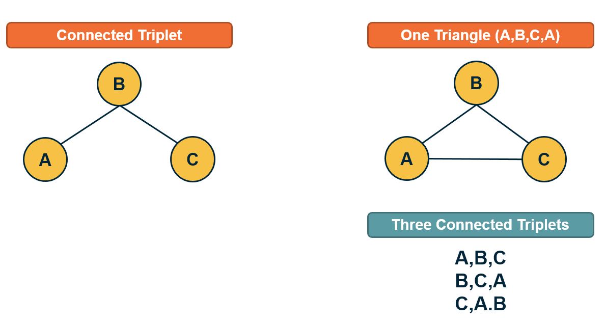
If we want to quantify the degree of clustering in the entire network with a single number, we have two options. The first is to simply calculate the Average Clustering Coefficient for all nodes with degree larger than one.
A better metric, however, is to calculate the Transitivity (or global clustering coefficient), which is defined as the fraction of the connected triplets of nodes that form triangles.
Mathematically, the transitivity is defined as:
\[T = \frac{\mbox{3} \times\mbox{Number of triangles}} {\mbox{Number of connected triplets}}\]A connected triplet is an ordered set of three nodes ABC such that A connects to B and B connects to C. For example, an A, B, C triangle corresponds to three triplets, ABC, BCA, and CAB. In contrast, a chain of connected nodes A, B, C, in which B connects to A and C, but A does not link to C, forms an open triplet ABC. The factor three in the previous equation is needed because each triangle is counted three times in the triplet count.
Food for Thought
Note that the Transitivity and the Average Clustering Coefficient are two different metrics. They may often be close but there are also some extreme cases in which the two metrics give very different answers. To see that consider a network in which two nodes A and B are connected to each other as well as to every other node. There are no other links. The total number of nodes is n. What would be the transitivity and average clustering coefficient in this case (you can simplify by assuming that n is quite large)?
Clustering in Weighted Networks
The definition of clustering coefficient can also be generalized for weighted networks as follows. Suppose that $w_{i,j}$ is the weight of the edge between nodes i and j.
First, in weighted networks, instead of the degree of a node we often talk about its “strength”, defined as the sum of all weights of the node’s connections:
\[s_i = \sum_j A_{i,j} \, w_{i,j}\]Then, the weighted clustering coefficient of node i is defined as:
\[C_{w}(i) = \frac{1}{s_i \, (k_i-1)} \sum_{j,h} \frac{w_{i,j}+w_{i,h}}{2} A_{i,j}A_{i,h}A_{j,h}\]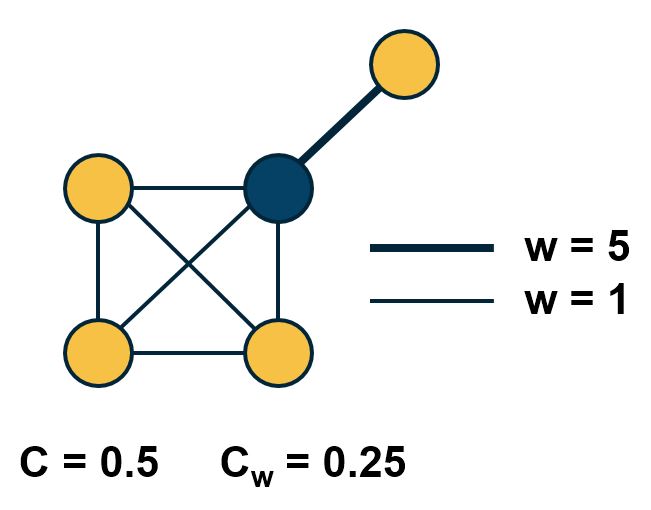 Comparison of weighted and unweighted clustering coefficient for an example graph.
The normalization term $\frac{1}{s_i \, (k_i-1)}$ is such that the maximum value of the weighted clustering coefficient is one.
The product of the three adjacency matrix elements at the right is one only if the nodes $i,j,h$ form a triangle. In that case, that triangle contributes to the clustering coefficient of node-i based on the average weight of the two edges that connect node i with j and h, respectively. Note that the weight between nodes j and h does not matter.
The visualization shows the unweighted and weighted clustering coefficient values for the darker node. That node has a stronger connection with a node that does not belong to the cluster of nodes at the lower-left side. This is why the weighted clustering coefficient is lower than the unweighted.
Food for Thought
How would you generalize the definition of Transitivity for weighted networks?
Clustering in G(n,p) networks
How large is the expected clustering coefficient at a random ER network (i.e., a network constructed using the G(n,p) model from Lesson-3)?
Recall that any two nodes in that model are connected with the same probability p. So, the probability that a connected triplet A-B-C forms a triangle (A-B-C-A) is also p. Thus, the expected value of the clustering coefficient for any node with more than one connection is p. Similarly, the transitivity (and the average clustering coefficient) of the whole network is also expected to be p.
In G(n,p), the average degree is $\bar{k}=p \, (n-1)$. So, if the average degree remains constant, we expect p to drop inversely proportional with n as the network size grows. This means that if real networks follow the G(n,p) model, we would see a decreasing trend between the clustering coefficient and the network size.
 Figure 3-13 from networksciencebook.com
This is not the case with real networks however. The plot shows the average clustering coefficient, normalized by the average degree, as a function of the network size N. In the G(N,p) model, this normalized version of the average clustering coefficient should be equal to 1/N (shown as a green line in the plot). The various colored dots show the clustering coefficient for several real-world networks that appear in Table 3.2 of your textbook. These networks have widely different sizes, ranging from a thousand nodes to almost a million. Note that their clustering coefficient does not seem to get smaller as the network size increases.
The main message here is that the G(n,p) model predicts negligible clustering, especially for large and sparse networks. On the contrary, real-world networks have a much higher clustering coefficient than G(n,p) and its magnitude does not seem to depend on the network size.
Food for Thought
The transitivity (and clustering coefficient) focuses on a microscale property of a network, in the sense that it shows how likely it is that connected triplets form triangles. How would you explain that the value of this metric does not seem to depend on the size of the overall network in practice? What does that imply about the mechanisms that guide the formation of such networks?
Clustering in Regular Networks
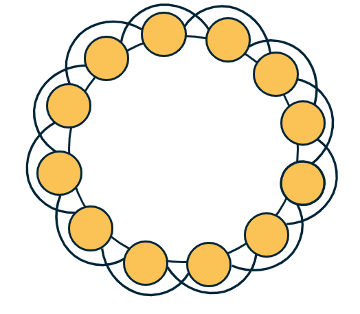
On the other hand, regular networks typically have a locally clustered topology. The exact value of the clustering coefficient depends on the specific network type but in general, it is fair to say that “regular networks have strong clustering”. Further, the clustering coefficient of regular networks is typically independent of their size.
To see that, let’s consider the common regular network topology shown at the visualization. The n nodes are placed in a circle, and every node is connected to an even number c of the nearest neighbors (c/2 at the left and c/2 at the right). If c=2, this topology is simply a ring network with zero clustering (no triangles). For a higher (even) value of c however, the transitivity coefficient is:
\[T = \frac{3(c-2)}{4(c-1)}\]Note that this does not depend on the network size. Additionally, as c increases the transitivity approaches ¾.
Food for Thought
Prove the previous formula for the transitivity coefficient.
Diameter, Characteristic Path Length, and Network Efficiency
The notion of small-world networks depends on two concepts: how clustered the network is (covered in the previous pages) and how short the paths between network nodes are – that we cover next.
As you recall from Lesson-2 if a network forms a connected component we can compute the shortest-path length $d_{i,j}$ between any two nodes i and j. One way to summarize these distances for the entire network is to simply take the average such distance across all distinct node pairs. This metric L is referred to as Average (shortest) Path Length (APL) or Characteristic Path Length (CPL) of the network. For an undirected and connected network of n nodes, we define L as:
\[L = \frac{2}{n(n-1)} \sum_{i < j} d_{i,j}\]A related metric is the harmonic mean of the shortest-path lengths across all distinct node pairs, referred to as the efficiency of the network:
\[E = \frac{2}{n(n-1)} \sum_{i < j} \frac{1}{d_{i,j}}\]The efficiency varies between 0 and 1.
Another metric that is often used to quantify the distance between network nodes is the diameter, which is defined as the maximum shortest-path distance across all node pairs:
\[D = \max_{i < j} d_{i,j}\]A more informative description is the distribution of the shortest-path lengths across all distinct node pairs, as shown in the visualizations below.
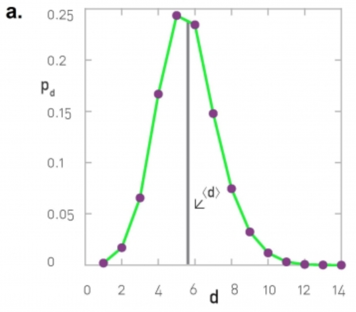 |
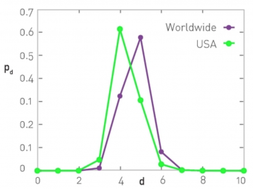 |
At the left, the corresponding network is the largest connected component of the protein-protein interaction of yeast (2,018 nodes and 2,930 edges, the largest connected component include 81% of the nodes). The characteristic path length (CPL) is 5.61 while the diameter is 14 hops.
At the right, the network is based on the friendship connections of Facebook users (all pairs of Facebook users worldwide and within the US only). The CPL is between 4 and 5, depending on the network.
Diameter and CPL of G(n,p) Networks
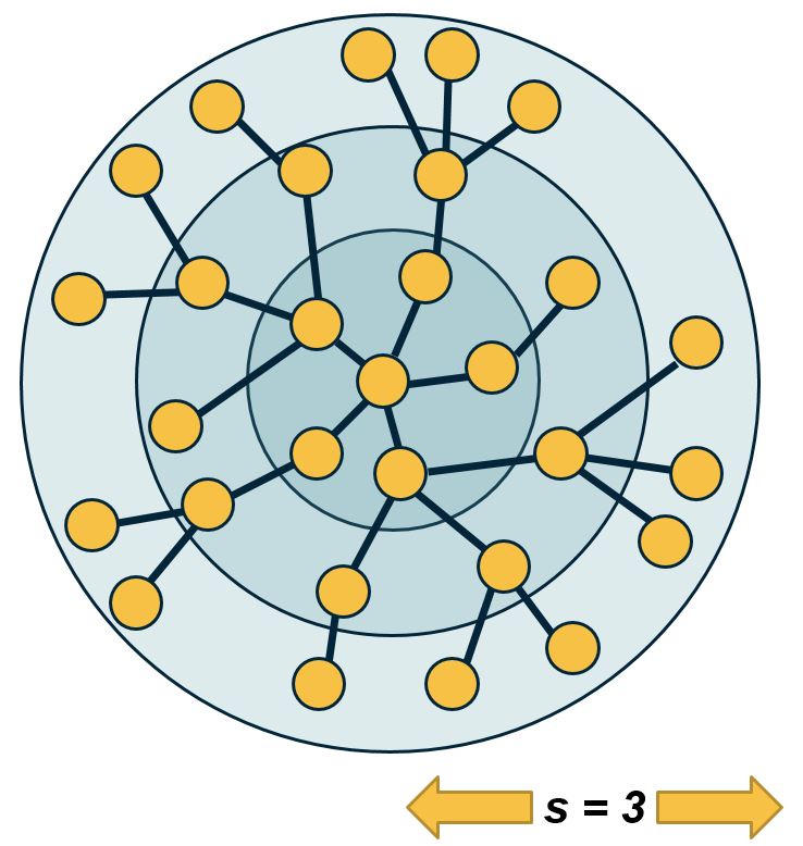
Let us now go back to the simplest random graph model we have studied so far, i.e., the ER or G(n,p) model. What is the diameter of such a network?
We can derive an approximate expression as follows.
Suppose that the average degree is $\bar{k}=(n-1)\, p > 1$ (so that the network has a giant connected component). We will further assume that the topology of the network is a tree.
We start from node i. Within one hop away from that node, we expect to visit $\bar{k}$ nodes. Within two hops, we expect to visit approximately $(\bar{k})^2$ nodes. And with a similar reasoning, after s hops we expect to visit approximately $(\bar{k})^s$ nodes.
The total number of nodes in the network is n however, and we expect to visit all of them with the maximum number of hops that is possible, which is the network diameter $D$.
So, $n \approx (\bar{k})^D$. Solving for D, we get that
\[D \approx \frac{\ln n}{\ln{\bar{k}}}\]Even though this expression is a very rough approximation, it shows something remarkable: in a random network, even the longest shortest—paths are expected to grow very slowly (i.e., logarithmically) with the size of the network.
Here is a numerical example: suppose we have a social network that covers all people (around 7 billion today) and assumes that each person knows well 64 other people. According to the previous expression, any two people are connected to each other with a “social chain” (shortest-path) of 5.4 relations.
Additionally, the CPL is lower (or equal) than the diameter of the network. So the average shortest-path length is also upper bounded by the same logarithmic expression we derived above.
The diameter of G(n,p) networks – more accurate expressions
Two approximate expressions that are often used in practice apply for sparse and dense networks, respectively.
Specifically, for very sparse networks, as k approaches to 1 from above (so that the network is still expected to have a large connected component), the diameter is expected to be
\[D \approx 3 \frac{\ln n}{\ln{\bar{k}}}\]This is three times larger than the expression we derived in the previous page. For very dense networks, on the other hand, a good approximation for the diameter is:
\[D \approx \frac{\ln n}{\ln{\bar{k}}} + \frac{2\ln n}{\bar{k}} + \ln n \frac{\ln \bar{k}}{(\bar{k})^2}\]Note that in both cases, the diameter is still increasing with the logarithm of the network size. So, the main qualitative conclusion remains what we stated in the previous page, i.e., the diameter of G(n,p) networks increases very slowly (logarithmically) with the number of nodes – and so the CPL cannot increase faster than that either.
Food for Thought
- Enumerate all the assumptions we made in the derivation for the diameter of G(n,p) networks.
- Go back to the example of the previous page (a social network with 7 billion nodes and an average degree of 64). What would be the diameter according to either of the previous two approximations?
Diameter and Efficiency of G(n,p) Versus Regular Networks
Does the diameter of all networks increase logarithmically? Clearly not. Let’s examine what happens in regular networks – and more specifically, in lattice networks.
In one-dimensional lattices, each node has two neighbors, and the lattice is a line network of n nodes – so the diameter increases linearly with $n$.
In two dimensions, each node has 4 neighbors, and the lattice is a square with $\sqrt{n}$ nodes on each side – so the diameter increases as $O(n^{1/2})$
Similarly, in three dimensions each node has 8 neighbors, and the diameter grows as $O(n^{1/3})$ – and so on in higher dimensions.
This suggests that in lattice networks the diameter grows as a power-law of the network size – this grows much faster than a logarithmic function.
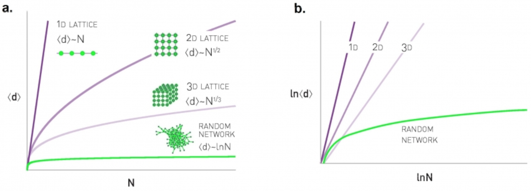
Let us go back to the hypothetical social network of 7 billion humans – and with an average of 64 connections per person. If this social network was a regular lattice, it would need to have 6 dimensions so that each node has 64 connections. So the diameter would be in the order of $n^{1/6}$, which is about 44 – this is much larger than the diameter we derived earlier for a random network of the same size and density.
These simple derivations show a major qualitative difference between regular networks and random networks: in the former, the diameter and CPL increase much faster than in the latter – as a power-law in the former and logarithmically in the latter.
Food for Thought
Pick a non-lattice regular network and examine if the diameter still increases as a power-law.
What Does “Small-world” Network Mean?
A small-world network is a network that satisfies the small-world property. To determine if a network has small-world property, we compare two of its characteristics against an ensemble of random G(n,p) networks with the same size n and density p.
For the first condition we check, is the clustering coefficient much larger than the random G(n,p) networks? This condition can be examined with an appropriate hypothesis test. For instance, the one-sample one-tailed t-test would examine, in this case, whether the clustering coefficient of the given network is significantly greater than the mean of the clustering coefficient values in the G(n,p) ensemble.
For the second condition, we again check that the CPL of the given network is not significantly greater than the mean CPL value in the G(n,p) ensemble.
Please note that whether the previous conditions hold or not may depend on the significance level (“alpha value”) of the corresponding hypothesis tests. Additionally, it may be that even though the given network has a CPL (for instance) that is greater than the mean of the CPL values in the G(n,p) ensemble, the difference may be small in absolute magnitude (e.g., 2.1 versus 2.0).
Clustering and efficiency in real-world networks
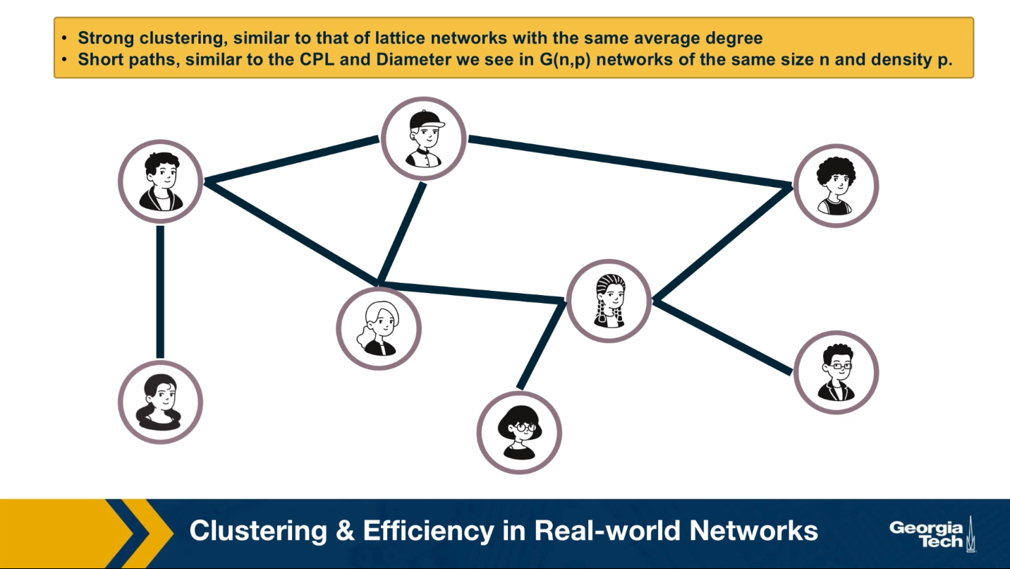
So far this lesson has focused on two network properties, the presence of clustering and the relation between diameter and network size. You may wonder what about real world networks? Where do they stand in terms of these two properties?
An important discovery by Watts and Strogatz in 1998 was that the networks we often see in practice have the following two properties:
- They have strong clustering similar to that of lattice networks with the same average degree,
- They have short paths similar to the characteristics path length and diameter we see in random Erdos-Renyi networks that we have same size n and density P as the real-world networks we were given.
We refer to such networks as small-world networks. They are small in the sense that the shortest paths between nodes increase only modestly with a size of the network. Modestly means logarithmically or even slower. At the same time, small world networks are not randomly formed.
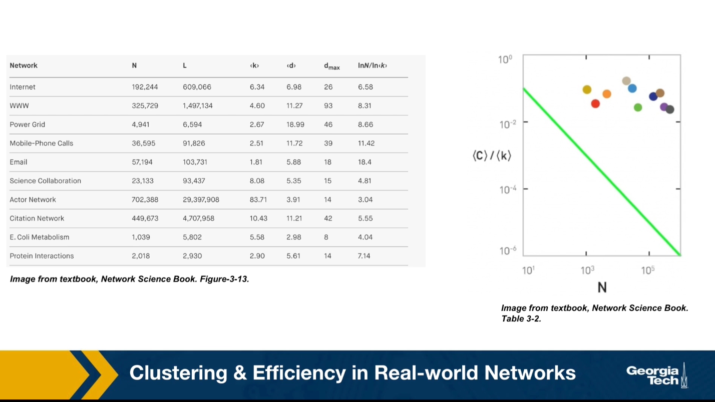
On the contrary, the nodes form clusters of interconnected triangles, similar to what we see in social groups, such as families, groups of friends, or larger organizations of people. The table that you see here shows the characteristics of some real-world networks.
The column shows the network name, the number of nodes n, the number of edges L, the average degree, the characteristic path length, the diameter, and the predicted diameter based on the formula we derived earlier in the last column. Note that the characteristic path length is the same order of magnitude with what we would expect from a $G(n,p) random network.
Additionally, this plot shows the clustering coefficient for each of these networks with different colors. All networks have a much larger clustering coefficient than what would be expected from a corresponding $G(n,p)$ network.
Watt Strogatz Model
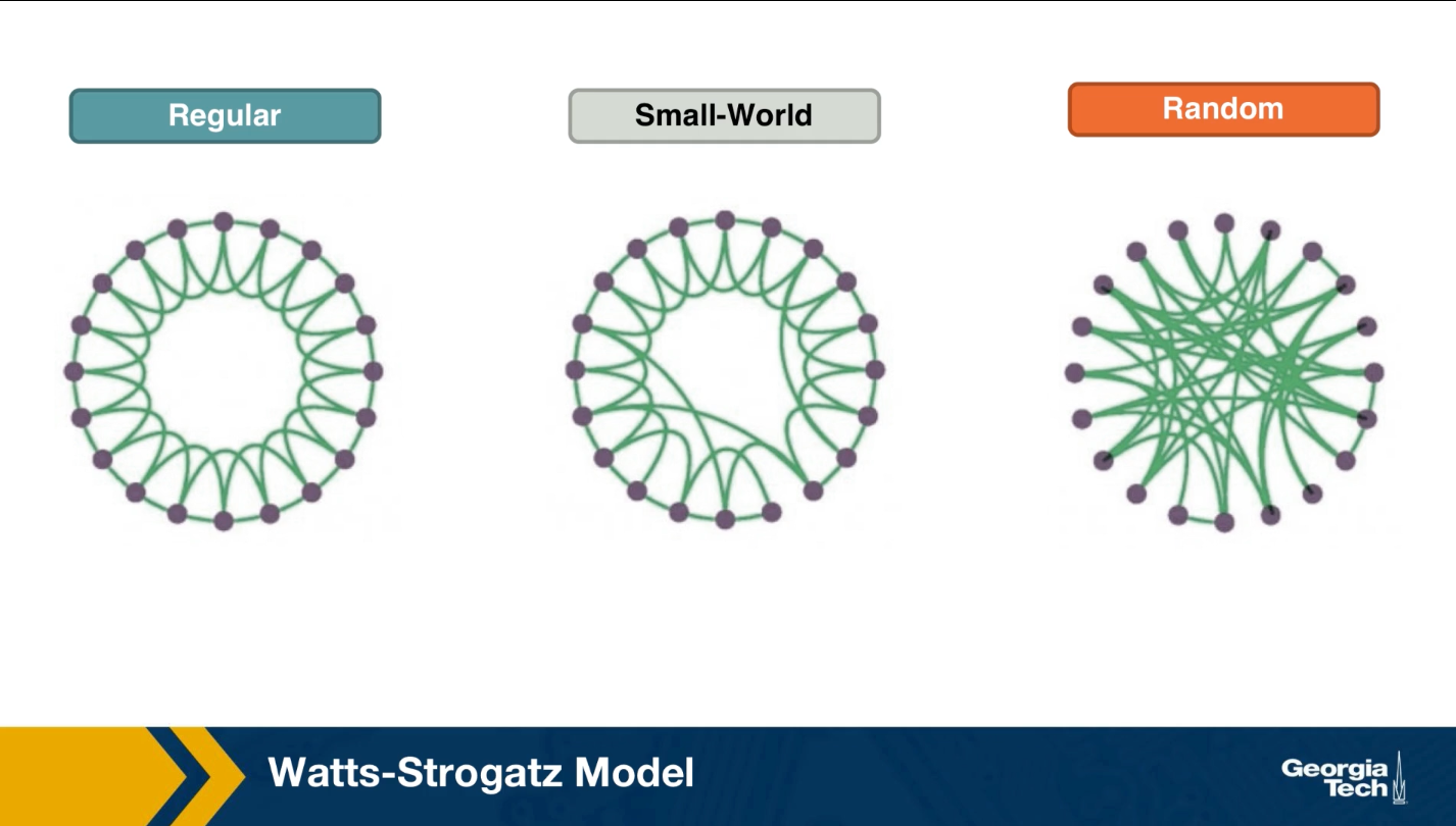
How can we create networks that have this small world property? Once such model was proposed by Watts and Strogatz in their 1998 paper that started the network science field. The model starts with a regular network with the desired number of nodes and average degree. The topology of the regular network is often the ring that we saw here (middle plot). With a small probability p, we select an edge and reassign one of its two stabs to a randomly chosen node as you see here. You may wonder, why do we expect that a small fraction of randomized edges will have any significant properties of this network?
It turns out that even if this rewiring probability p is quite small, the randomized edges provides shortcuts that reduce the length of the shortest path between node pairs. As we will see next, even a small number of such shortcuts, meaning a rewiring probability p close to 1% is sufficient to reduce the characteristic path length and the diameter down to the same level with a corresponding random $G(n,p)$ network.
At the same time, the rewired network is still highly clustered at the small level with the regular network we started from, as long as p, of course, is quite small.
If this writing probability p was set to one, we should end up with a random $G(n,p)$ graph, which is what we see at the right. This network would have even shorter path, but it would not have any significant clustering.
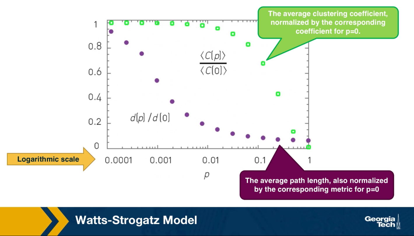
There have been analytical studies of the Watts-Strogatz Model that derived the clustering coefficient or the diameter as a function of the rewiring probability p. For our purposes, it is sufficient to see some simulation results only. The visualization here refers to a network of 1,000 nodes with an average degree of 10.
It also shows the average clustering coefficient normalized by the corresponding coefficient when p is equal to zero with green dots. The plot also shows the average path length with purple dots, also normalized by the corresponding metric when p is equal to 0. Note that the logarithmic scale on the x-axis.
As you can see, when p is close to 1%, the clustering coefficient is still almost the same as the regular network we started with and the average path length is close to what we would expect from a random graph.
Degree distribution of Watts Strogatz Model
In lesson 4, we focused on the degree distribution of real-world networks, and so that many such networks have a power law degree distribution. You may wonder, is the Watts-Strogatz Model able to product networks with a power law degree distribution? The answer is no. The degree distribution of that model depends on the rewiring probability p. if p is close to 0, most nodes have the same degree. As p approaches 1, we get the poisson degree distribution of a random graph. In either way, the resulting degree distribution is not sufficiently skewed towards higher values. It cannot be mathematically modeled as a power law and we do see hubs. In summary, even though the Watts-Strogatz Model was a great first step in discovering two important properties of real-world networks, clustering and short paths, it is not a model that can construct realistic networks because it does not capture the degree distribution of many real-world networks.
Food for Thought
- Can you think of networks that have both weak clustering (similar to G(n,p)) and long paths (similar to regular networks)? Can you think of any real-world networks that may have these properties?
- The Watts-Strogatz model described above is only one possible model to create small-world networks. Can you think of other approaches to create a network that is both highly clustered and with short paths (CPL ~ O(log(n)))?
- Look at the literature for mathematical expressions that show the transitivity or average clustering coefficient as a function of n, $\bar{k}$, and p for the Watts-Strogatz model. Similarly, look for mathematical expressions for the average path length or diameter.
- In Lesson-4, we briefly reviewed the preferential attachment model, which is able to produce power-law networks. How would you combine the Watts-Strogatz model with the Preferential Attachment model so that you get:
- Strong clustering
- Short paths
- Power-law degree distribution
Clustering in PA Model
Lesson-4 described the Preferential Attachment (PA) model and we saw that it generates networks with a power-law degree distribution (with exponent=3). Are those networks also small-world, the way we have defined this property in this Lesson?
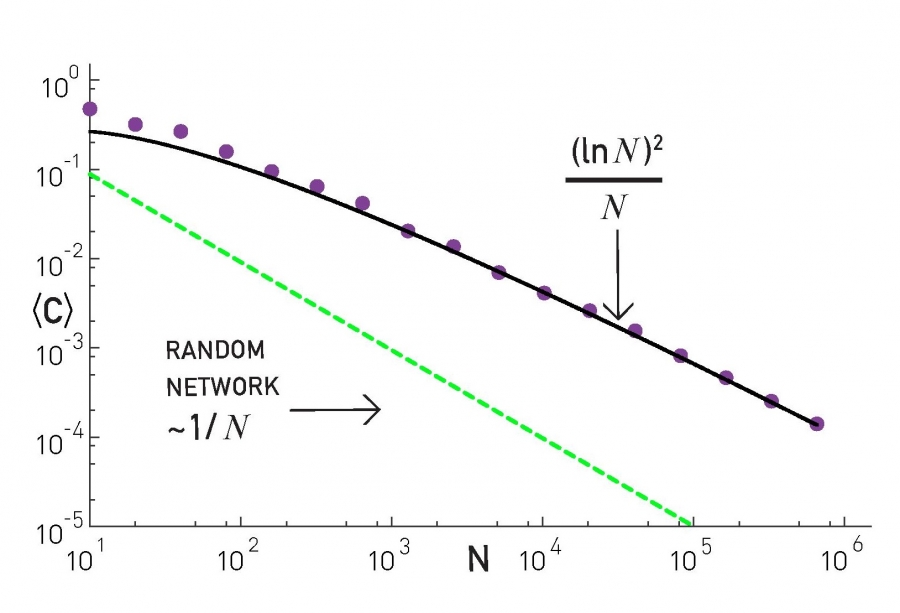
The plot at the top shows the average clustering coefficient for networks of increasing size (the number of nodes is shown here as N). The networks are generated with the PA model, with m=2 links for every new node. Note that the clustering coefficient is significantly higher than that of random G(N,p) random graphs of the same size and density (p=m/(N-1)). It turns out (even though we will not prove it here) that the average clustering coefficient of a PA network scales as $\frac{({\ln{N}})^2}{N}$ – this is much larger than the corresponding clustering coefficient in G(N,p), which is $O(\frac{1}{N})$.
However, this also means that the clustering coefficient of PA networks decreases with the network size N. This is not what we have seen in practice (see figure at the below). In most real-world networks, the clustering coefficient does not reduce significantly at least as the network grows. Thus, even though the PA model produces significant clustering relative to random networks, it does not produce the clustering structure we see in real-world networks.

Food for Thought
Can you derive the mathematical expression we give here for the clustering coefficient of PA networks?
Length of Shortest Paths in PA Model
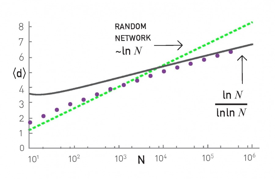
How about the length of the shortest paths in PA networks? How does their CPL scale with the network size N?
It turns out that the CPL in PA networks scales even slower than in G(n,p) random graphs. In particular, an approximate expression for the CPL in PA networks is $O(\frac{\ln{N}}{\ln{\ln{N}}})$, which has sub-logarithmic growth. This is shown with simulation results in the plot, where the PA networks were generated using m=2.
To summarize, the PA model generates networks with a power-law degree distribution (exponent=3), a clustering coefficient that decreases with network size as $\frac{({\ln{N}})^2}{N}$, and a CPL that increases sub-logarithmically as $O(\frac{\ln{N}}{\ln{\ln{N}}})$.
Food for Thought
Look at the literature for a derivation of the previous formula for the CPL of PA networks.
Path Lengths in Power-law Networks
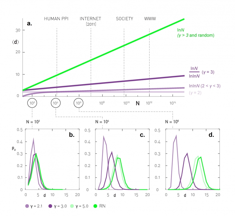
What about power-law networks with other exponent values? How does the CPL of those networks scale with network size?
As we saw in the previous page, when the exponent (shown as $\gamma$ in this plot) is equal to 3, we get the $O(\frac{\ln{N}}{\ln{\ln{N}}})$ expression of PA networks.
The value $\gamma=3$ is critical because the variance of the degree distribution becomes well-defined when $\gamma > 3$. In that case the power-law networks do not differ from G(N,p) random graphs in terms of their CPL – the average shortest path length increases as $O(\ln{N})$.
For $\gamma$ values between 2 and 3 (i.e., the mean is finite but the variance of the degree distribution diverges), the CPL scales even slower, following a double-log pattern: $O(\ln{\ln{N}})$. These networks are sometimes referred to as ultra-small world networks.
The plots at the lower part of the visualization show shortest-path length distributions for three different exponent values as well as for a corresponding G(N,p) random graph. As you see, the differences between all these networks are minor when the network is only a few hundreds of nodes. For networks with millions of nodes, however, we see a major difference in the resulting path length distributions, showing clearly the major effect of the degree distribution exponent as well as the critical value of $\gamma=3$.
Food for Thought
Look at the literature for a derivation of the previous formula for the CPL of networks when $\gamma$ is between 2 and 3.
Directed Subgraph Connectivity Patterns
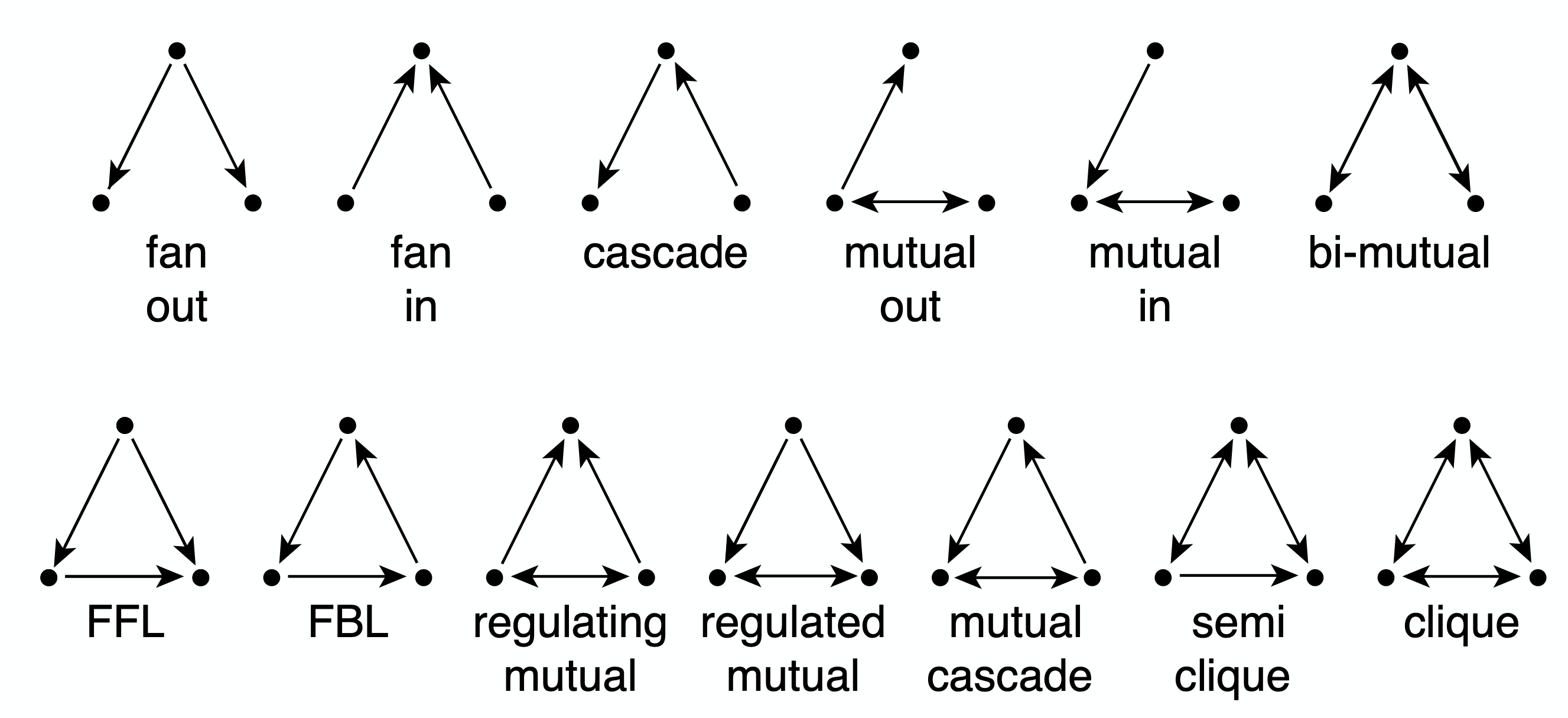
So far, we have primarily focused on clustering in undirected networks. Such undirected clustering manifests through the presence of triangles of connected nodes. What about directed networks, however?
In that case, we can have various types of connected triplets of nodes. The upper part of the visualization shows the 13 different types of connection patterns between three weakly connected network nodes.
Note that each of the 13 patterns is distinct when we consider the directionality of the edges. Also, if you are not convinced that these are the only 13 possible patterns you can try to find any additional patterns (hint: you will not be able to!).
Each of these patterns is also given a name (e.g., FeedForward Loop or FFL). Instead of using the word “pattern”, we will be referring to such small subgraph types as network motifs.
A specific network motif (e.g., FFL) may occur in a network just based on chance. How can we check if that motif occurs much more frequently than that? What does it mean when a specific network motif occurs very frequently? Or the opposite, what does it mean when a network motif occurs much less frequently than expected based on chance? We will answer these questions next.
Food for Thought
Given that we know that there are 13 motifs between 3 weakly connected nodes, how many network motifs exist between 4 weakly connected nodes?
Statistical Test For The Frequency of a Network Motif
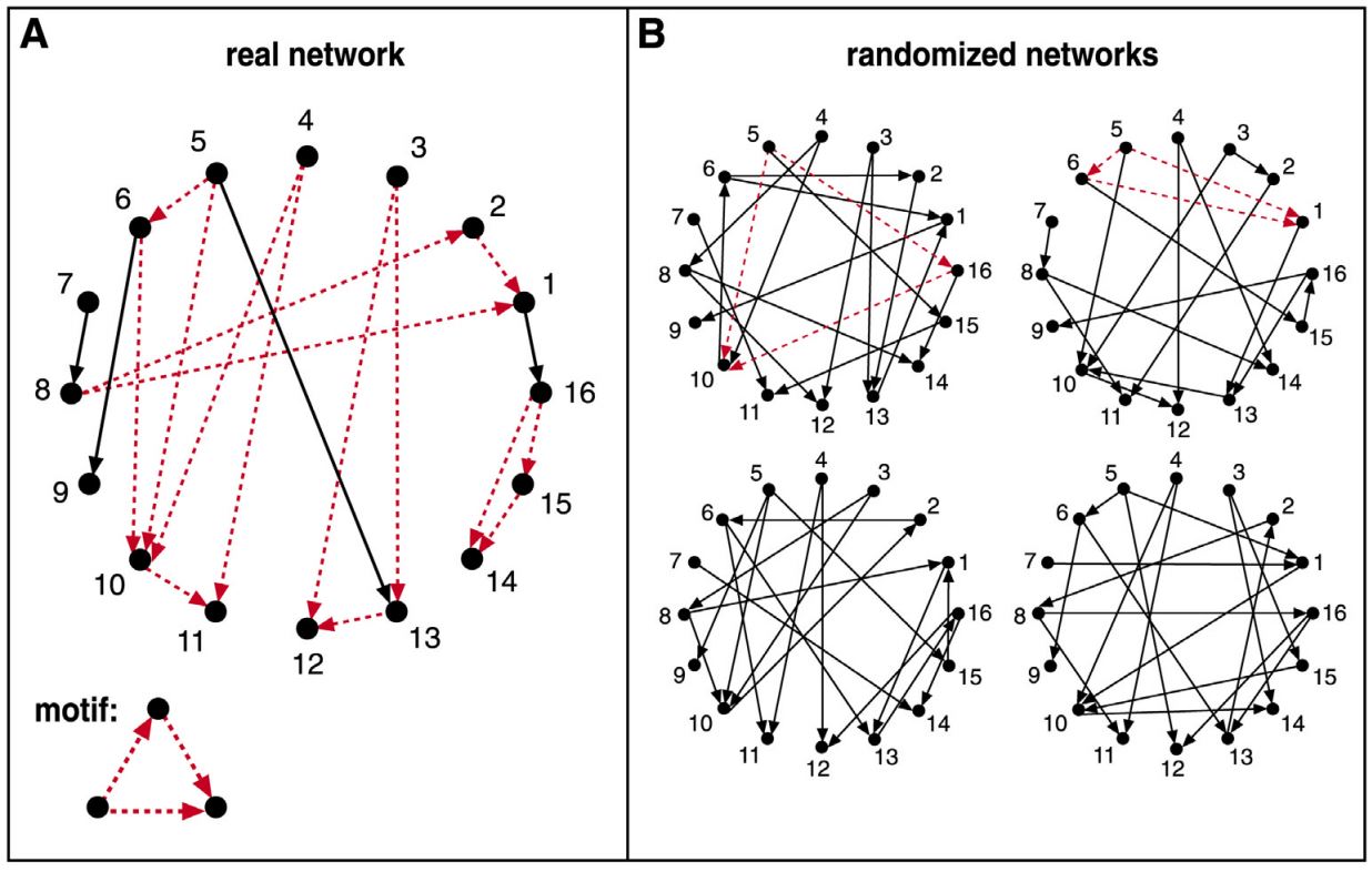
Suppose we are given the 16-node network G at the left, and we want to examine if the FFL network motif (shown at the bottom left) appears too frequently. How would we answer this question?
First, we need to count how many distinct instances of the FFL motif appear in G. One way to do so is to go through each node u that has at least two outgoing edges. For all distinct pairs of nodes v and w that u connects to uni-directionally, we then check whether v and w are also connected with a uni-directional edge. If that is the case (u,v,w) is an FFL instance. Suppose that the count of all FFL instances in the network G is m(G).
We then ask: how many times would the FFL motif take place in a randomly generated network $G_r$ that:
- has the same number of nodes with G, and
- each node u in $G_r$ has the same in-degree and out-degree with the corresponding node u in G?
One way to create $G_r$ is to start from G and then randomly rewire it as follows:
- Pick a random pair of edges of (u,v) and (w,z)
- Rewire them to form two new edges (u,z) and (w,v)
- Repeat the previous two steps a large number of times relative to the number of edges in G.
Note that the previous rewiring process generates a network $G_r$ that preserves the in-degree and out-degree of every node in G. We can now count the number of FFL instances in $G_r$ – let us call this count $m(G_r)$.
The previous process can be repeated for many randomly rewired networks $G_r$ (say 1000 of them). This will give us an ensemble of networks $G_r$. We can use the counts $m(G_r)$ to form an empirical distribution of the number of FFL instances that would be expected by chance in networks that have the same number of nodes and the same in-degree and out-degree sequences as G.
We can then compare the count $m(G)$ of the given network with the previous empirical distribution to estimate the probability with which the random variable $m(G_r)$ is larger than $m(G)$ in the ensemble of randomized networks. If that probability is very small (say less than 1%) we can have a 99% statistical confidence that the FFL motif is much more common in G than expected by chance.
Similarly, if the probability with which the random variable $m(G_r)$ is smaller than $m(G)$ is less than 1%, we can have 99% confidence that the FFL motif is much less common in G than expected by chance. The magnitude of $m(G)$ relative to the average plus (or minus) a standard deviation of the distribution $m(G_r)$ is also useful in quantifying how common a network motif is.
The method we described here is only a special case of the general bootstrapping method in statistics.
Frequent Motifs and Their Function
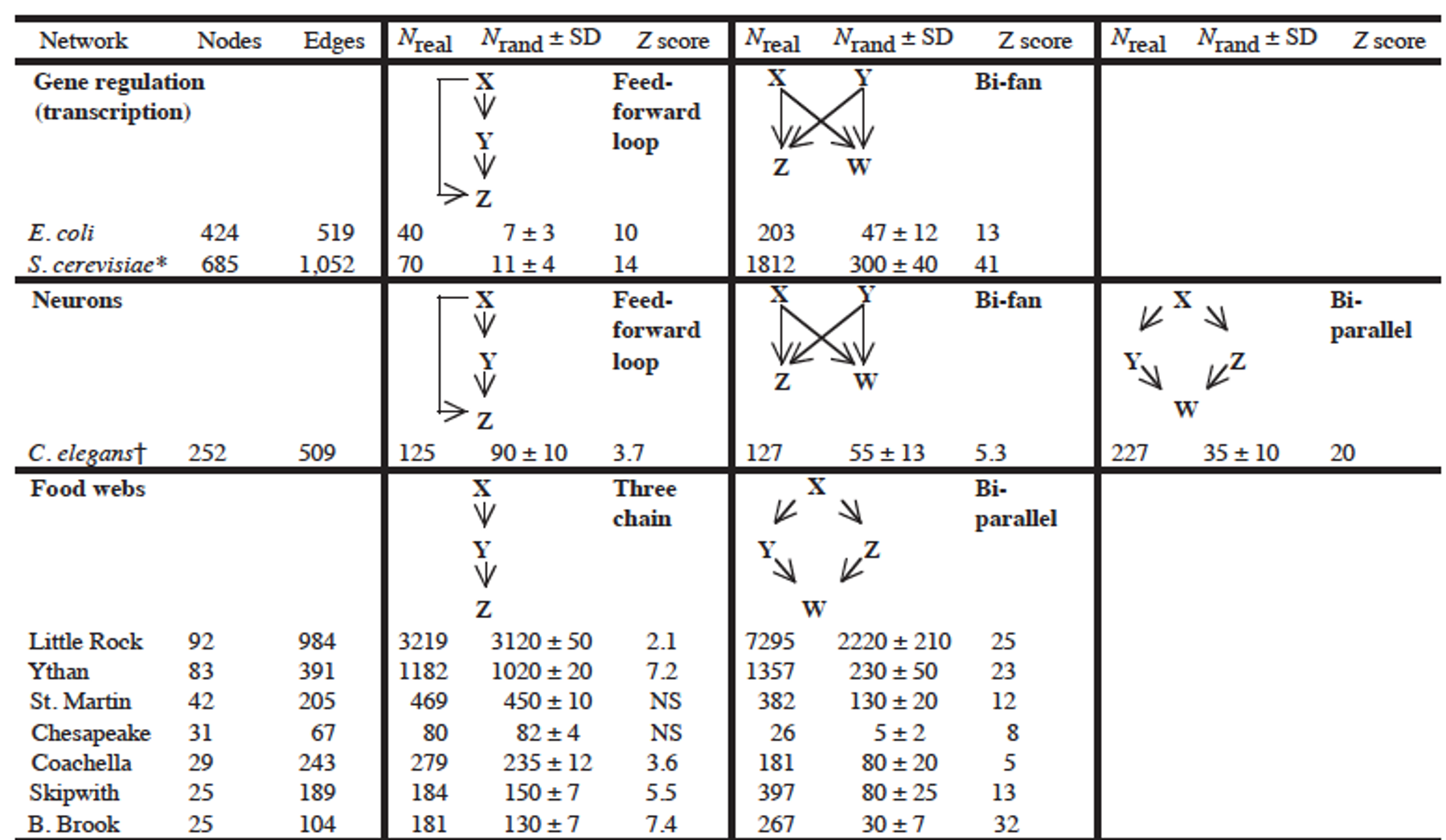
Most real-world networks are either designed by humans (such as electronic circuits or communication networks) or they evolve naturally (such as biological or social networks) to perform certain functions.
Consequently, the frequent presence of a network motif in a network suggests that that specific connectivity pattern has a functional role in the network. For example, the frequent presence of the Feedback Loop motif (see FBL motif in previous pages) suggests that the network includes control loops that regulate the function of a three-node network path with feedback from the output node back to the input node.
Similarly, the absence of a network motif from a network suggests that that connectivity pattern is functionally “not allowed” in that kind of network. For example, a hierarchical network that shows who is reporting to whom at a company should not contain any motifs that include a directed cycle.
The research paper that we refer to in this page has analyzed a large variety of networks (gene regulatory networks, neuronal networks, food webs in ecology, electronic circuits, the WWW, etc) and identified the network motifs that are most frequently seen in each type of network. Their study did not consider only 3-node motifs but also larger motifs. For each type of network, the authors identify a few common network motifs and associated a plausible function for that motif.
For instance, in gene regulatory networks the FeedForward Loop (FFL) motif is a prevailing structure.
In that context, an FFL instance consists of three genes (X,Y,Z): two input transcription factors (X and Y), one of which regulates the other ($X\rightarrow Y$), both jointly regulating a target gene Z. The FFL has eight possible structural types, because each of the three interactions in the FFL can be activating or repressing. Four of the FFL types, termed incoherent FFLs, act as sign-sensitive accelerators: they speed up the response time of the target gene expression following stimulus steps in one direction (e.g., off to on) but not in the other direction (on to off). The other four types, coherent FFLs, act as sign-sensitive delays. For additional information about the biological function of the FFL motif, please see the following research paper:
In food webs, on the other hand, we rarely see the FFL motif. The reason is that if a carnivore species X eats a herbivore species Y, and Y eats a plant species Z, we rarely see that X also eats Z.
Module three
L6 - Centrality and Network-core Metrics and Algorithms
Overview
Required Reading
- Chapter 7 (mostly sections 7.1-7.8) - M.E.J.Newman, Networks: An Introduction., Oxford University press.
- Section 14.3 - D. Easley and J. Kleinberg, Networks, Crowds and Markets , Cambridge Univ Press, 2010 (also available online)
- “Rich-clubness test: how to determine whether a complex network has or doesn’t have a rich-club?” By Alessandro Muscoloni and Carlo Vittorio Cannistraci
Recommended Reading
- Sabrin, K, Dovrolis, C. The Hourglass Effect in Hierarchical Dependency Networks, Journal of Network Science, (2017)
- Faskowitz, J., Yan, X., Zuo, X. et al. Weighted Stochastic Block Models of the Human Connectome across the Life Span. Sci Rep 8, 12997 (2018).
Degree, Eigenvector and The Katz Centrality
Degree and Strength Centrality
The simplest way to define the importance of a network node is based on its number of connections – the more connections a node has, the more important it is. So, the degree centrality of a node is simply the degree of that node.
For weighted networks, the corresponding metric is the sum of the weights of all edges of that node, i.e., the strength of that node.
One problem with this definition of centrality however is that it only captures the “local role” of a node in the network. A node may have many connections within an isolated cluster of nodes that are completely disconnected from the rest of the network. On the other hand, an important node may have only a few direct connections but it can be the only node between two large groups of nodes that are otherwise disconnected.
Another issue with this centrality metric is that it is easy to manipulate locally. Back in the early days of the Web, some search engines used to rank results based on degree centrality (how many other Web pages point to that page). Some online firms quickly exploited that vulnerability: they would create 1000s of links from fake web pages so that they boost the centrality/rank of their sponsored web sites.
Eigenvector Centrality
A better centrality metric is to consider not only the number of neighbors of a node – but also the centrality of those neighbors. So the basic idea is that a node is more central when its neighbors are also more central. Suppose that we are given an undirected network with adjacency matrix A. Let $v_i$ be the centrality of node i. We can then define that:
\[v_i = \frac{1}{\lambda} \sum_j A_{i,j} \, v_j\]We can think of the term $\frac{1}{\lambda}$ as a normalization constant for now. Note that the centrality of a node is the (normalized) sum of the centralities of all its neighbors.
The previous equation can be written in matrix form as:
\[\lambda v = A \, v\]where $v$ is the vector all node centralities. This equation, however, is simply the eigenvector definition of matrix A: $\lambda$ is the corresponding eigenvalue for eigenvector $v$. This is why we refer to this centrality metric as “eigenvector centrality”.
We wish to have non-negative centralities. In other words, the eigenvector $v$ corresponding to eigenvalue $\lambda$ should consist of non-negative entries. It can be shown (using the Perron–Frobenius theorem) that using the largest eigenvalue of $A$ satisfies this requirement.
The Katz Centrality
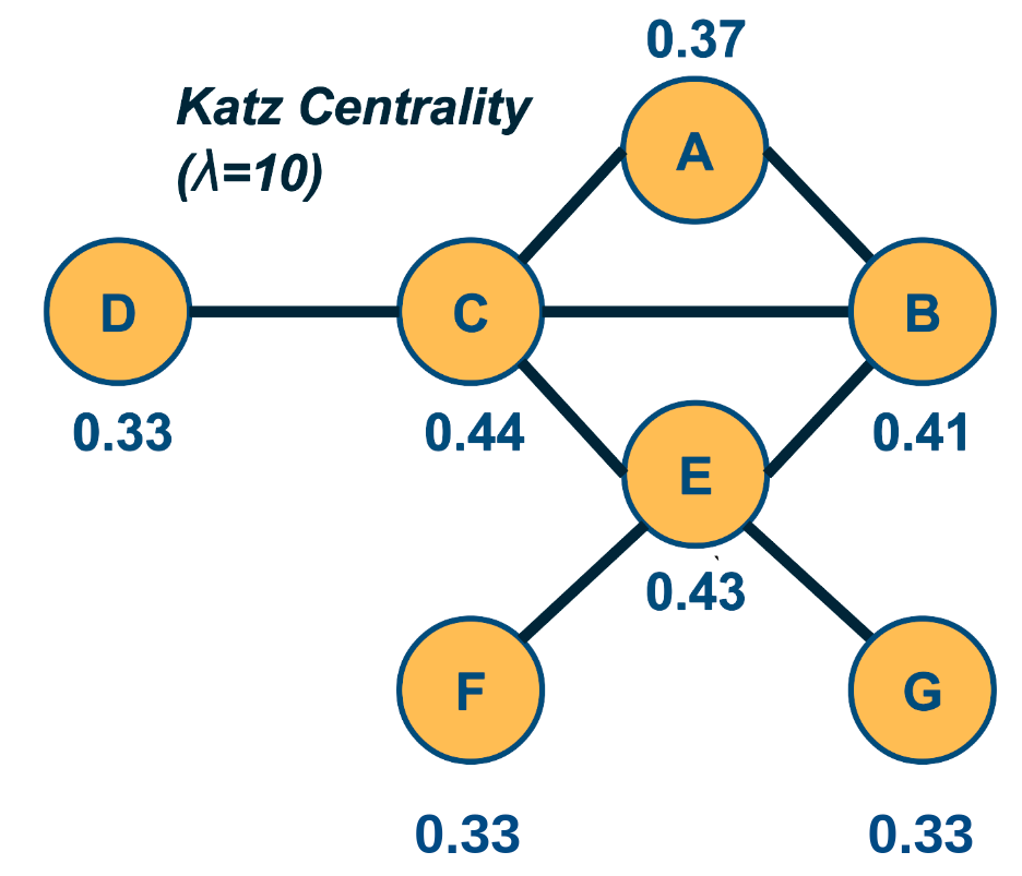
The Katz centrality metric is a variation of eigenvector centrality that is more appropriate for directed networks.
The eigenvector centrality may be zero even for nodes with non-zero in-degree and out-degree, and so Katz starts from the same equation as eigenvector centrality but it also assigns a small centrality $\beta$ to every node.
So, the definition becomes:
\[v_i = \beta + \frac{1}{\lambda} \sum_j A_{i,j} \, v_j\]where the summation is over all nodes j that connect with i.
Given that we are only interested in the relative magnitude of the centrality values, we can arbitrarily assign $\beta=1$.
Then, we can rewrite the previous definition in matrix form:
\[v = (I - \frac{1}{\lambda} A)^{-1} . {\bf 1}\]Where ${\bf 1}$ is a n-by-1 vector of all ones.
The value of $\lambda$ controls the relative magnitude between the constant centrality $\beta$ we assign to each node and the centrality that each node derives from its neighbors. If $\lambda$ is very large, then the former term dominates and all nodes have roughly the same centrality. If $\lambda$ is too small, on the other hand, the Katz centralities may diverge. This is the case when the determinant of the matrix $(I - \frac{1}{\lambda} A)$ is zero, which happens when $\lambda$ is equal to an eigenvalue of $A$. To avoid this divergence, the value of $\lambda$ is typically constrained to be larger than the maximum eigenvalue of $A$.
Note that the Katz centrality values given in the figure are normalized by the L2-norm of the centrality vector.
Food for Thought
Derive the matrix-form equation of Katz centrality from the initial definition.
PageRank Centrality
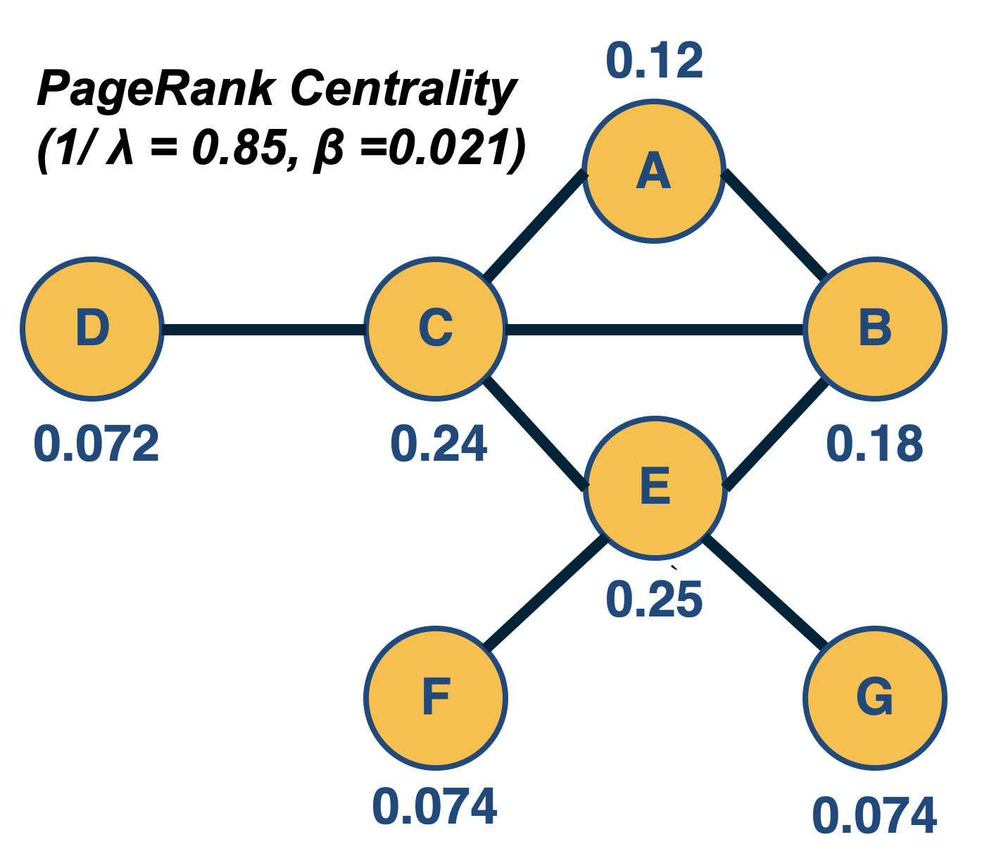
PageRank, created by the co-founder of Google, Larry Page, is a famous centrality metric because it was the main algorithm that made Google the most successful search engine back in the late 1990s.
PageRank, created by the co-founder of Google, Larry Page, is a famous centrality metric because it was the main algorithm that made Google the most successful search engine back in the late 1990s.
In fact, PageRank is only a slight modification of the Katz centrality metric. It is based on the following idea: if a node j points to a node i (and thus $A_{i,j} =1$), and node $j$ has $k_{j,\text{out}}$ outgoing connections, then the centrality of node j should be ”split” among those $k_{j,\text{out}}$ neighbors. In other words, the “wealth” of node j should not be just inherited by all nodes it points to – but rather, the “wealth” of node j should be split among those nodes.
So, the defining equation of PageRank centrality becomes:
\[v_i = \beta + \frac{1}{\lambda} \sum_j A_{i,j} \, \frac{v_j}{k_{j,out}}\]where the summation is over all nodes j that point to i (and thus, $k_{j,\text{out}}$ is non-zero).
Please contrast this equation with the definition of Katz centrality.
In matrix form, similar to Katz centrality, the previous definition becomes (when $\beta=1$):
\[v = (I - \frac{1}{\lambda} A \, D)^{-1} . {\bf 1}\]where D is a diagonal n-by-n matrix in which the j’th element is $\frac{1}{k_{j,\text{out}}}$ if $k_{j,\text{out}}$ is non-zero (the diagonal elements for which $k_{j,\text{out}}=0$ simply do not matter).
Undirected networks are typically transformed to directed networks by replacing each undirected edge with two directed edges.
In practice, the computation of both Katz and PageRank centralities is performed numerically, using a power-iteration method that iterates the computation of the centrality values until those values converge. Typical values for $\frac{1}{\lambda}$ and $\beta$ are 0.85 and $(1-\frac{1}{\lambda})/n$, respectively – but as in the case of Katz centrality, it is theoretically possible that the PageRank centrality computation does not converge if $\lambda$ is too low.
Food for Thought
Recall the concept of random walks on networks, that we introduced in Lesson-2. How can you interpret the PageRank centrality equation based on random walks?
Closeness Centrality and Harmonic Centrality
Closeness Centrality
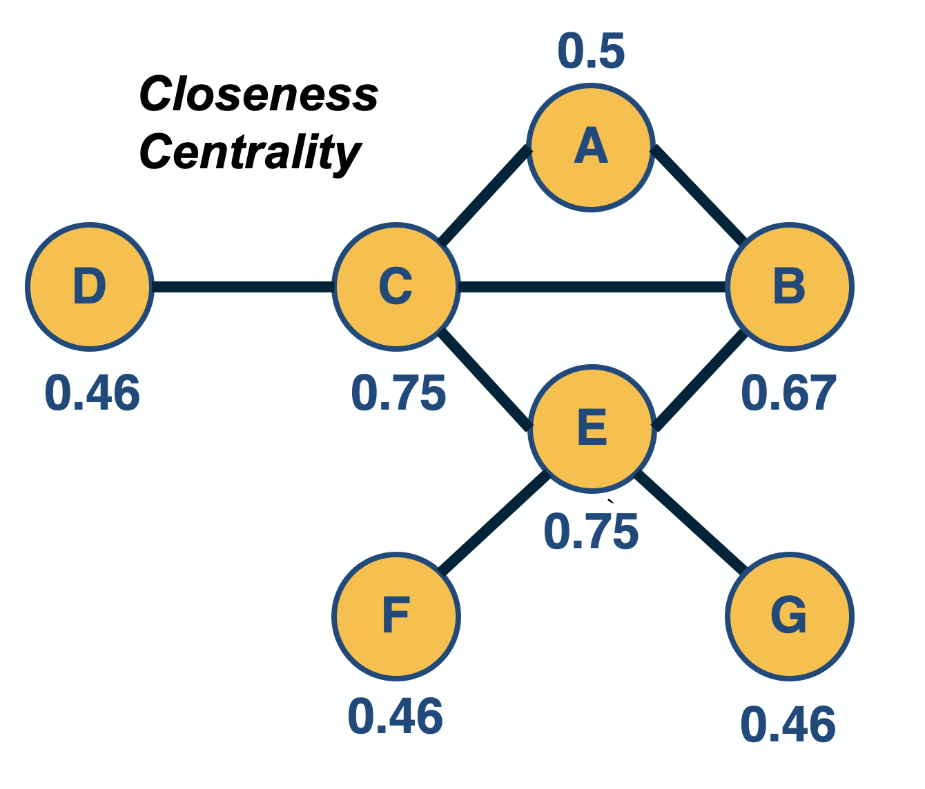
The previous centrality metrics are all based on the direct connections of a node. Another group of centrality metrics focuses on network paths. Paths represent ”routes” over which something is transferred through a network (e.g., information, pathogens, materials). Consequently, another way to think about the centrality of a node is based on how good the routes are of that node to the rest of the network (or how many are the routes that traverse a node).
A commonly used path-based metric is closeness centrality. It is based on the length (number of hops) of the shortest-path between a node i and a node j, denoted by $d_{i,j}$. The closeness centrality of node i is defined as the inverse of the average shortest path length $d_{i,j}$, across all nodes j that i connects to:
\[v_i = \frac{n-1}{\sum_j d_{i,j}}\]where j is any node in the same connected component with i, and n is the number of nodes in that connected component (including i). If the network is directed, then we typically focus on shortest-paths from any node j to node i (i.e., incoming paths to i). The range of closeness centrality values is limited between 0 and 1.
The closeness centrality has some shortcomings, including the fact that it does not consider all network nodes – only nodes that are in the same connected component with i. So an isolated cluster of nodes can have high closeness centrality values (close to 1) even though those nodes are not even connected to most other nodes.
Harmonic Centrality
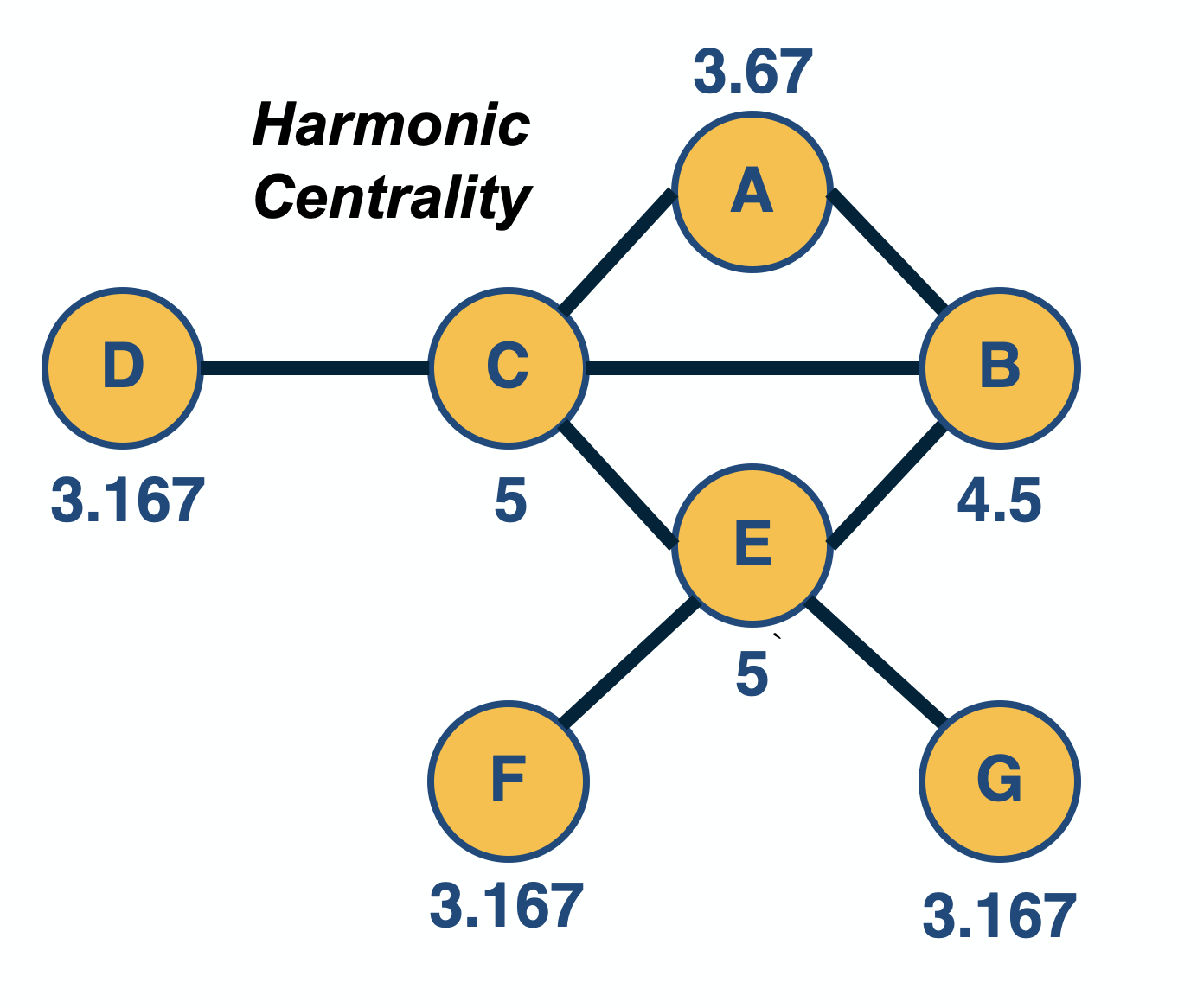
An improved metric is harmonic centrality, defined as:
\[v_i = \sum_{j\neq i} \frac{1}{d_{i,j}}\]Here, if nodes i and j cannot reach other, the corresponding distance can be thought of as infinite, and thus the term $\frac{1}{d_{i.j}}$ is $0$. Sometimes, the harmonic centrality is normalized by $\frac{1}{n-1}$ – but that does not affect the relative ordering of node centralities.
Food for Thought
Can you think of some network analysis applications where it would make more sense to use the closeness centrality (or harmonic centrality) metric instead of the eigenvector/Katz/PageRank metrics? What about the opposite?
Betweenness Centrality Variants
Shortest-path Betweenness Centrality
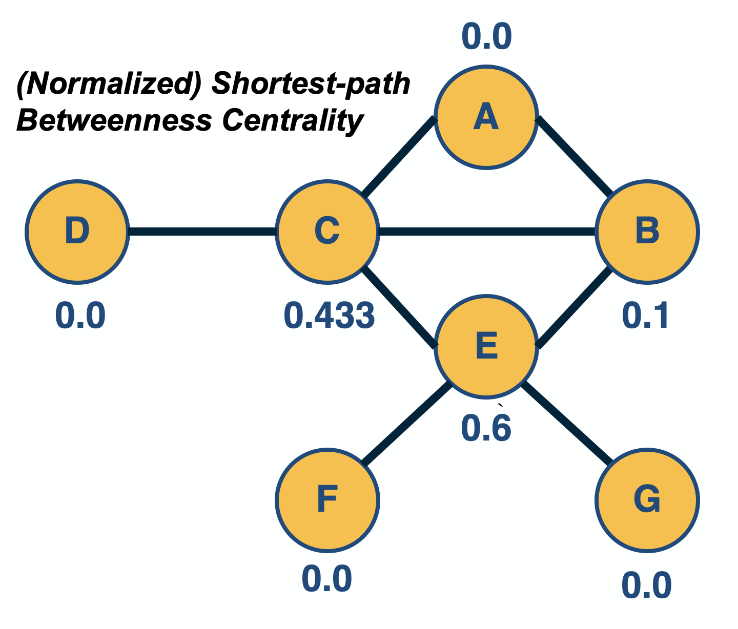
In some network analysis applications, the importance of a node is associated with how many paths go through a node: the more routes go through a node, the more central that node is.
The most common instance of this metric is the “shortest-path betweenness centrality”. Consider any two nodes s (source) and t (target) in the same connected component, and let us define that the number of shortest-paths between these two nodes is $n_{s,t}$. Also, suppose that the subset of these paths that traverses node i is $n_{s,t}(i)$, where node i is different than s and t.
The (shortest-path) betweenness centrality of node i is defined as:
\[v_i = \sum_{s,t \neq i} \frac{n_{s,t}(i)}{n_{s,t}}\]If s and t are the same, we define that $n_{s,t}=1$.
The previous metric is often normalized by its maximum possible value (which is $(n-1)(n-2)$, for a star network with n nodes) so that the centrality values are between 0 and 1. This is not necessary however given that we only care about the relative magnitude of centralities.
Note that node E, in the visualization, has higher betweenness centrality than node C – even though the two nodes have the same closeness centrality (and node C has higher eigenvector centrality than node E). The reason is that node E is the only “bridge” between nodes F and G and the rest of the network.
For weighted networks, where the (non-negative) weight represents the cost of an edge, the shortest-paths can be computed using Dijkstra’s algorithm for weighted networks.
There are many variants of the betweenness centrality metric, depending on what kind of paths we use. One such variant is the flow betweenness centrality in which we compute the max-flow from any source node s to any target node t – and then replace the fraction $\frac{n_{s,t}(i)}{n_{s,t}}$ with the fraction of the max-flow that traverses node i – see Lesson-2 if you do not remember the definition of max-flow.
Yet another variant is the random-walk betweenness centrality, which considers the number of random walks from node-s to node-t that traverse node-i.
Edge Centrality Metrics
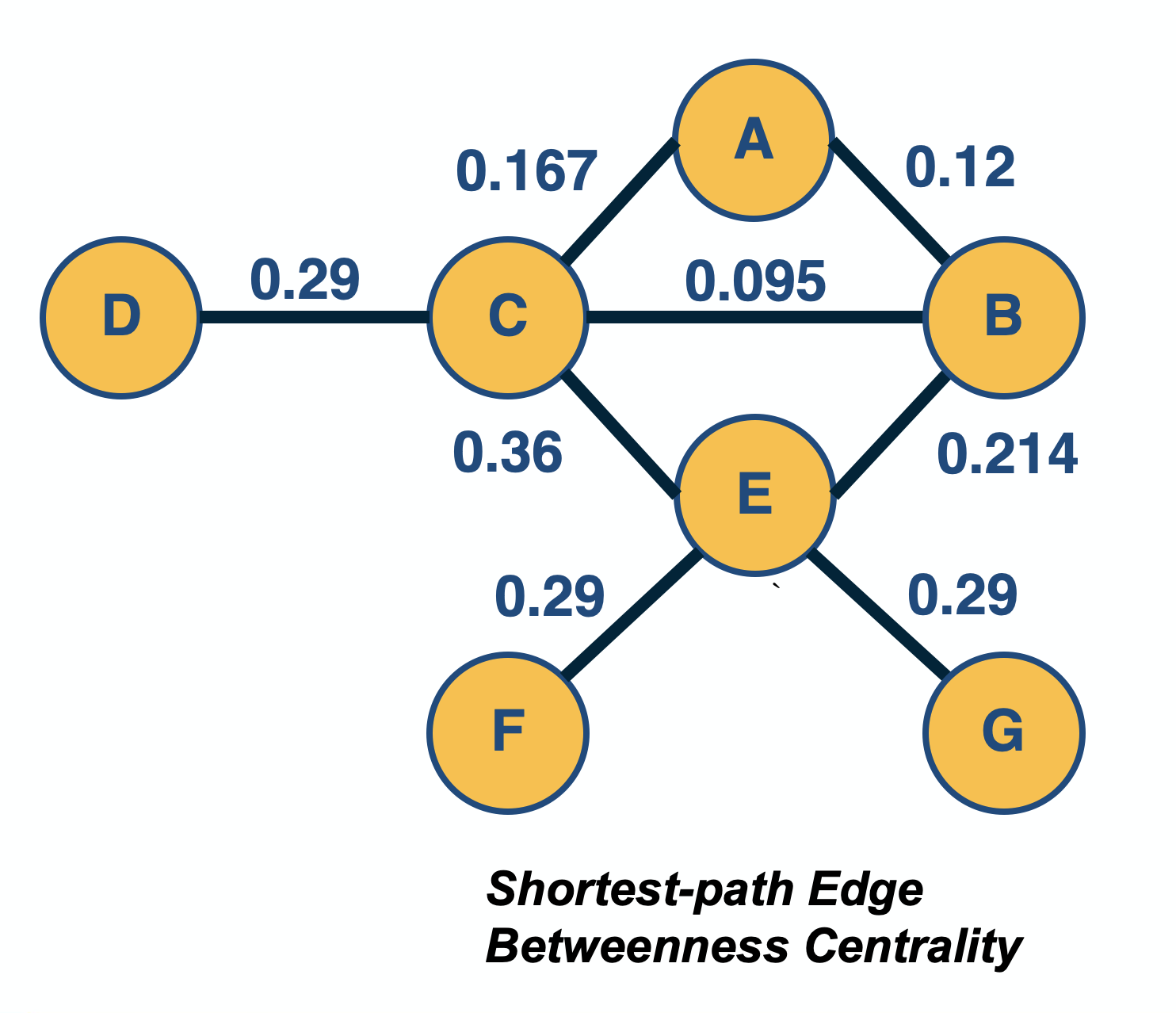
In some cases, we are interested in the centrality of edges, rather than nodes. For example, suppose you are given a communication network and you want to rank links based on how many routes they carry.
One such metric is the edge betweenness centrality. The definition is the same as for node betweenness centrality – but instead of considering the fraction of paths that traverse a node i, we consider the fraction of that traverse an edge (i,j). These paths can be shortest-paths or any other well-defined set of paths, as we discussed on the previous page.
Another way to define the centrality of an edge is to quantify the impact of its removal. For instance, one could measure the increase in the Characteristic Path Length (CPL, see Lesson-5) after removing edge (i,j) – the higher that CPL increase is, the more important that edge is for the network.
Food for Thought
An interesting question is how to compute the shortest-path betweenness centrality metric efficiently. We recommend you review the following paper for an efficient algorithm:
Path Centrality For Directed Acyclic Graphs
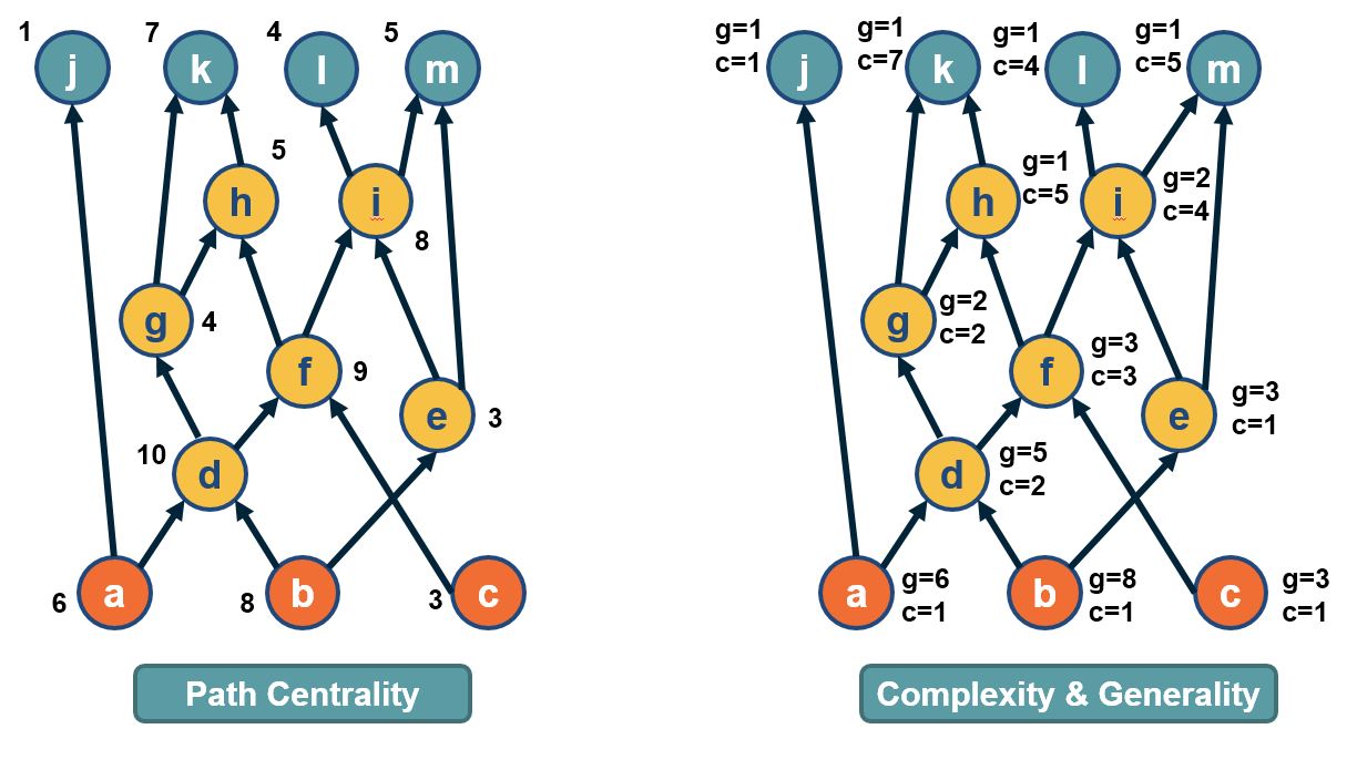
In directed acyclic graphs (DAGs), we can consider all paths from the set of sources to the set of targets. The visualization above shows a DAG with three sources (orange nodes) and four targets (blue nodes). Each source-target path (ST-path) represents one “dependency chain” through which that target depends on the corresponding source.
The path centrality of a node (including sources or targets) is defined as the total number of source-target paths that traverse that node.
It can be easily shown that the path centrality of node-i is the product of the number of paths from all sources to node-i, times the number of paths from node-i to all targets. The former term can be thought of as the “complexity” of node-i, while the second term can be thought of as the “generality” of node-i.
The Notion of “Node Importance”
Now that we have defined a number of centrality metrics, the obvious question is: which metric should we use for each network analysis application?
To choose the right metric, it is important to understand the notion of “node importance” that each of these centrality metrics focuses on.
- Degree (or strength) centrality: these metrics are more appropriate when we are interested in the number or weight of direct connections of each node. For example, suppose that you try to find the person with most friends in a social network.
- Eigenvector/Katz/PageRank centrality: these metrics are more appropriate when we are mostly interested in the number of connections with other well-connected nodes. For example, suppose that you analyze a citation network and you try to identify research papers that are not just cited many times – but they are cited many times by other well-cited papers. For undirected networks, it is better to use Eigenvector centrality because it does not depend on any parameters. For directed networks, use Katz or PageRank depending on whether it makes sense to split the centrality of a node among its outgoing connections. For instance, this splitting may make sense in the case of Web pages but it may not make sense in the case of citation networks.
- Closeness (or harmonic) centrality: these metrics are more appropriate when we are interested in how fast a node can reach every other node. For example, in an epidemic network, the person with the highest closeness centrality is expected to cause a larger outbreak than a person with very low closeness centrality. If the network includes multiple connected components, it is better to use harmonic centrality.
- Betweenness centrality metrics: these metrics are more appropriate in problems that involve some form of transfer through a network, and the importance of a node relates to whether that node is in the route of such transfers. For example, consider a data communication network in which you want to identify the most central router. You should use a betweenness centrality that captures correctly the type of routes used in that network. For instance, if the network uses shortest-path routes, it makes sense to use shortest-path betweenness centrality. If however, the network uses equally all possible routes between each pair of nodes, the path centrality may be a more appropriate metric.
k-core Decomposition
In some applications of network analysis, instead of trying to rank individual nodes in terms of centrality, we are interested in identifying the most important group of nodes in the network. There are different ways to think about the importance of groups of nodes. One of them is based on the notion of k-core:
A k-core (or “core of order-k”) is a maximal subset of nodes such that each node in that subset is connected to at least k others in that subset.
Note that, based on the previous definition, a node in the k-core also belongs to all lower cores, i.e., to any k’-core with $k’<k$.
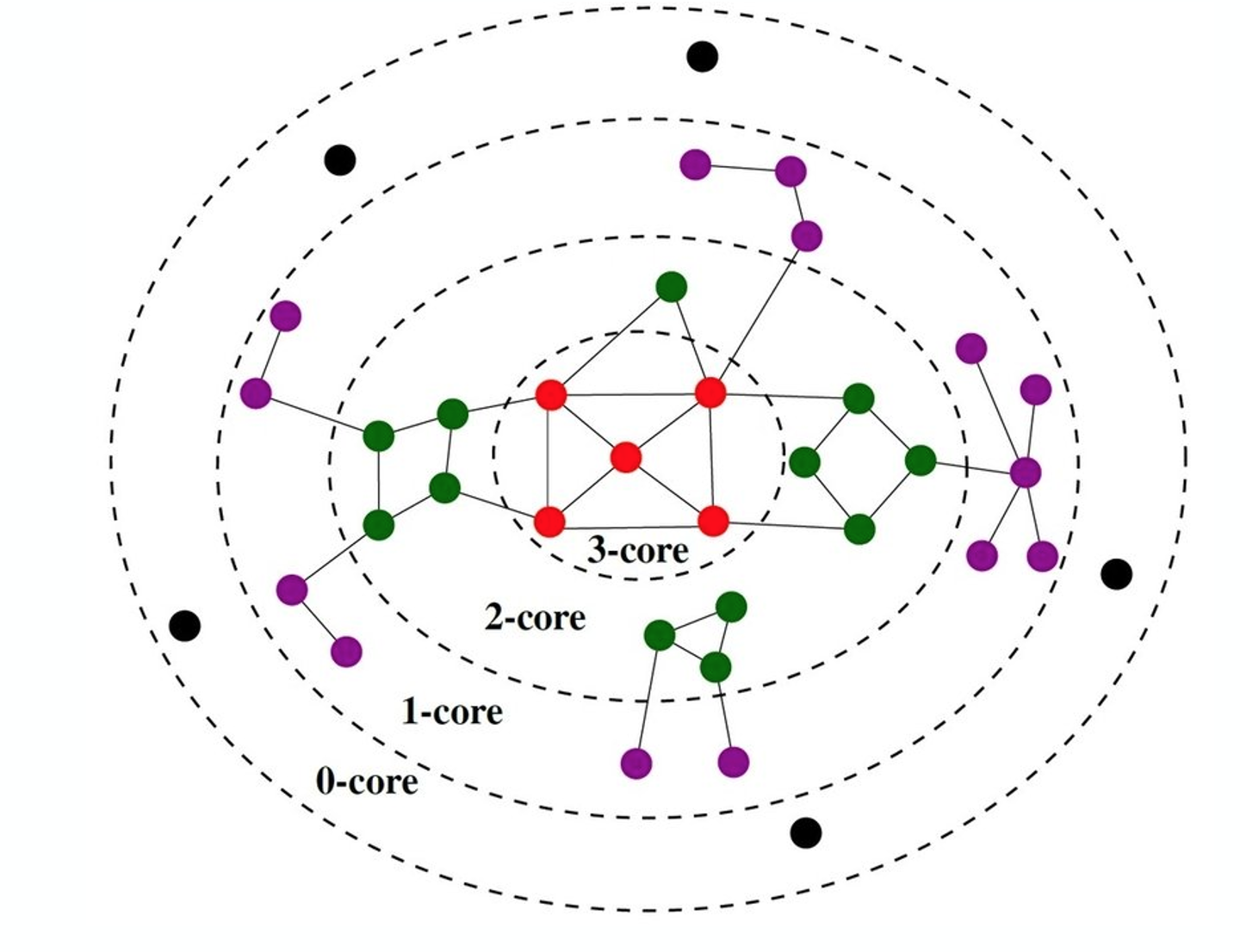 (Image from research paper: Perturb and combine to identify influential spreaders in real-world networks,AJP Tixier, MEG Rossi, FD Malliaros, J Read )
The visualization shows a network in which the red nodes belong to a core of order-3 (the highest order in this example), the green and red nodes form a core of order-2, while all nodes (except the black) form a core of order-1.
Note that there is a purple node with degree=5 – but its highest order is 1 because all its connections except one are to nodes of degree-1. Similarly, there are green nodes of degree-3 that are in the 2-core set.
A simple algorithm, known as “k-core decomposition”, can associate each node with the highest k-core order that that node belongs to. The algorithm proceeds iteratively by removing all nodes of degree k, for k=0, 1, 2, … During the iteration that the algorithm removes nodes of degree k, some higher-degree nodes may lose connections and become of degree-k. Those nodes would also be removed, joining the k-core until no further nodes can be removed in that iteration. The algorithm terminates when all nodes have been removed. Note that the maximum-order core set may not form a connected component.
One way to think about k-cores is as the successive layers of an onion, where k=1 corresponds to the external layer of the onion, while the highest value of k corresponds to the “heart” of the onion. Using this metaphor, the k-core decomposition process gradually peels off the network layer by layer until it reaches its most internal group of nodes.
The nodes in the maximum core order are considered as the most well-connected group of nodes in the network. Additionally, the k-core decomposition process is useful by itself because it allows us to assign a layer to each node, with nodes of lower order (lower values of k) considered as peripheral, and nodes of higher-order as more central in the overall network.
A related concept is:
The k-shell is the subgraph induced by nodes in the k-core that are not in the (k+1)-core. For example, the green nodes in the visualization form the 2-shell.
Food for Thought
We claim that the k-core decomposition approach can rank nodes in terms of importance, and that the highest-order core consists of the most important nodes. Can you come up with an example in which this claim is probably true – and maybe another example in which it is not?
Core-Periphery Structure
Another related concept is that some networks have a core-periphery structure. Intuitively this means that the nodes of such networks can be partitioned into two groups, the core nodes and the periphery nodes.
The core nodes are very densely connected to each other, and the rest of the network.
Periphery nodes are well connected only to core nodes - not to other periphery networks.
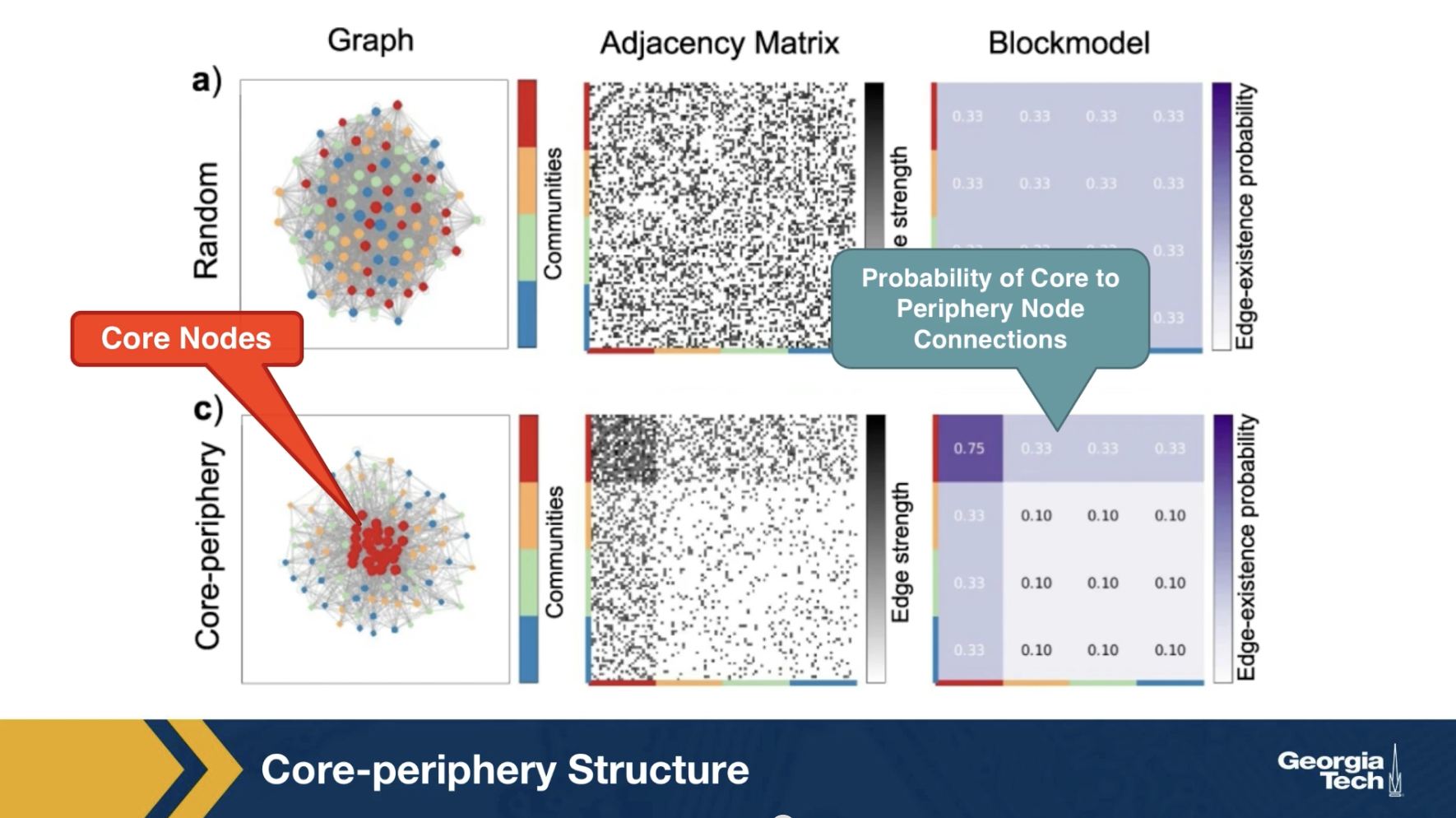
The visualization here contrasts it’s synthetically generated core periphery network, with a random generated network of the same number of nodes and edges. The core nodes appear in red, and they are about 25% of all nodes. The block model matrix at the right, shows the probability that the core node connects to another core node is 75%.
The probability that a core node connects to the periphery node is 33% and the probability that two periphery node connects to each other is only 10%. There are several algorithms in the literature that try to detect first, whether a network has a core periphery structure, and if so, to identify the set of core nodes.
It is important to do so for an arbitrary number of nodes in the core set and to establish the statistical significance of the detected core using an appropriate null model, meaning an ensemble of random networks that preserve the degree distribution and potentially other characteristics of the original network.
We will review a specific approach to detect if a network has a core periphery structure in the next page.
Rich-Club Set of Nodes
A common approach for the detection of core-periphery structure is referred to as the rich-club of a network.
The metaphor behind this concept comes from social networks: the very rich people are few and they have a large number of acquaintances, which include the rest of those few very rich people. So those few very rich people form a highly clustered small group of nodes (the “rich-club”) that is also very well-connected with the rest of the network.
To define this notion for general (but undirected) networks, suppose that the number of nodes with degree greater than $k$ is $n_k$. Let $e_k$ be the number of edges between those nodes. The maximum number of possible edges between those nodes is $\frac{n_k\,(n_k-1)}{2}$. The “rich-club coefficient” for degree k is defined as:
\[\phi(k) = \frac{2\, e_k}{n_k\, (n_k-1)}\]and it quantifies the density of the connections between nodes of degree greater than k.
How can we tell however whether the value of $\phi(k)$ is statistically significant for a given k? It could be that even randomly wired networks have about the same value of $\phi(k)$, at least for some degree values. To do so, we also generate an ensemble of random networks with the same number of nodes and degree distribution (as we did in Lesson-4 for the detection of network motifs). These random networks represent our null model. We can then compute the average value of $\phi(k)$ for each k, averaging across all random networks.
If the rich-club coefficient for degree k in the given network is much larger than the corresponding coefficient in the null model, we can mark that value of k as statistically significant for the existence of a rich-club. If there is at least one such statistically significant value of k, we conclude that the network includes a rich-club – the set of nodes with degree greater than k. If there are multiple such values of k, the rich-club nodes can be identified based on the value of k for which we have the largest difference between the rich-club coefficient in the real network versus the null model (even though there is some variation about this in the literature).
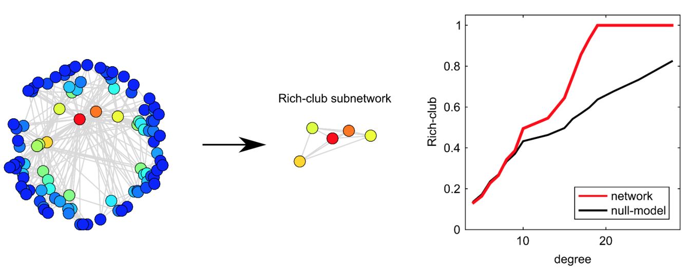
The visualization shows a synthetic network (left). The plot at the right shows the rich-club coefficient as a function of the degree k for the given network (red) as well as for the null model. The value of k for which we are most confident that a rich-club exists is k=19. There are five nodes with degree greater than 19 –they are shown (separately than the rest of the network) at the center of the visualization. Note that the corresponding rich-club coefficient is 1, which means that these five nodes form a clique. If we had chosen a higher value of k, the rich-club would only consist of a subset of these five nodes.
Food for Thought
Think about the similarities and differences between the following notions:
- the rich-club set of nodes (if it exists)
- the maximum order k-core group (this set of nodes always exists)
- a group of nodes that can be described as hubs because their degree is higher than the average degree plus 3 standard deviations (they may or may not exist).
Core Set of Nodes in DAGs
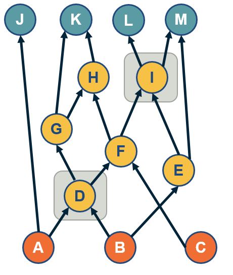
A path-based approach to identify a group of core nodes in a network is referred to as the “$\tau$-core”.
We define that a node v “covers” a path p when v is traversed by p.
The $\tau$-core is defined as follows: given a set of network paths P we are interested in, what is the minimal set of nodes that can cover at least a fraction 𝜏 of all paths in P?
In the context of DAGs, the set P can be the ST-paths from the set of all sources (orange nodes) to all targets (blue nodes).
The rationale for covering only a fraction $\tau$of paths (say 90%) instead of all paths is because in many real networks there are some ST-paths that do not traverse any intermediate nodes.
The problem of computing the the “$\tau$-core” has been shown to be NP-Complete in the following paper. It can be approximated by a greedy heuristic that iteratively selects the node with the maximum number of remaining un-covered paths until the 𝜏 constraint is met.
Sabrin, Kaeser M., and Constantine Dovrolis. “The hourglass effect in hierarchical dependency networks.” Network Science 5.4 (2017): 490-528.
The visualization shows the two core nodes (d and i) for the value of $\tau$=80%. Note that there are three ST-paths (a-j, b-e-m and c-f-h-k) that are not covered by this core set.
Applications
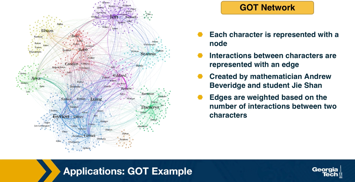
Let us look now at a couple of applications of the previous network analysis metrics. First we focus on the use of nodes and centrality metrics, considering the Game of Thrones sequence of novels by George RR Martin. For each book of the saga, we can represent each character with a node, and the interaction between two characters with an edge. This data set has been created by the applied mathematician Andrew Beveridge and his student Jie Shan. In the data set, the edges are weighted based on the number of interactions between the two characters. But for most of this lesson, we will ignore the weights and consider the unweighted and undirected network. Combining all the interactions across the five books, we get the network that is shown in the visualization at the left.
For now, you can ignore the colors, they refer to community, something that we will discuss later. Suppose you have not read the books or watch the TV show, how would you analyze this network to identify the most important characters?
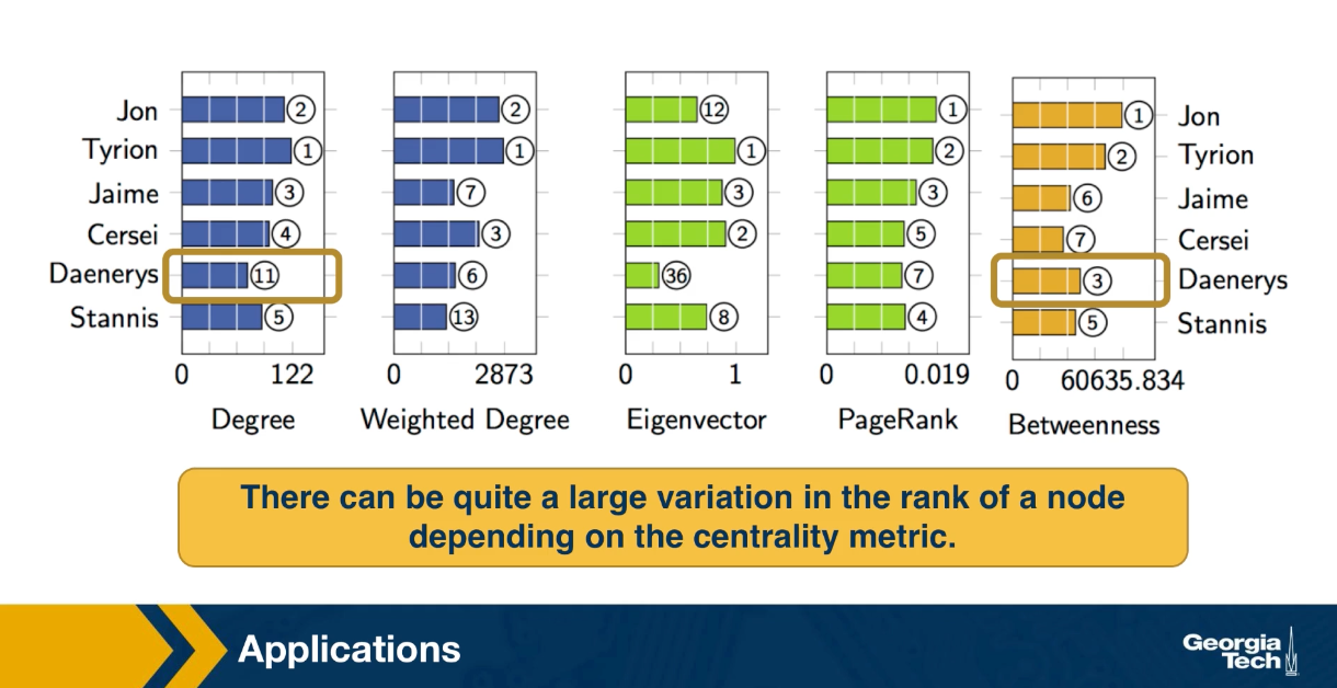
This table shows the top six characters according to five different centrality metrics we discussed earlier. The degree centrality, the weight degree or strength of a node. The eigenvector centrality, the PageRank centrality and the shortest path betweenness centrality. For each metric, the visualization shows the rank of the corresponding character according to that metric. As you see Jon is the leading character according to PageRank and betweenness centrality. While Tyrion is the leading character according to degree, strength and eigenvector centrality. For those of you who are familiar with the story, this is not very surprising. Jon and Tyrion are probably the two most important characters in the saga, and they had many more interactions with almost all the import characters.
Note that there can be quite a large variation in the rank of a node depending on the centrality metric. For instance the Daenerys is rank three according to the betweenness centrality, but 11th according to degree centrality. This may be because in the first few books, she did not have direct interactions with the rest of the characters in Westeros.
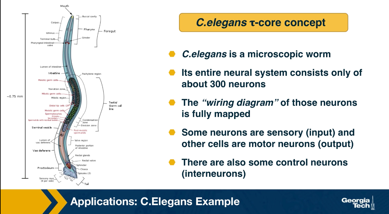
Finally, let us look at an application of the Tao core concept that was introduced earlier in this lesson. Recall that C.elegans is a microscopic worm, and it’s a dire brain consists only of about 300 neurons. Additionally, the writing diagram of those neurons is fully mapped. So we know all the chemical and electrical synopsis between the neurons of C.elegans. Some neurons are sensory, meaning that they are directly connected to sensory inputs and they deliver information from the outside world to the brain. For example if the worm smells odors or it is touched at certain body parts, specific sensory neurons will fire. Other cells are motor neurons, and they are directed connected to the muscles of this microscopic organism causing motions, and all other body actions. There are also some interneurons that are transforming the sensory input to output. In a recent study, we analyze this neural network considering all fit forward paths from sensory to motor neurons. This set of paths was then analyzed using the Tao core algorithm we discussed earlier in this lesson.
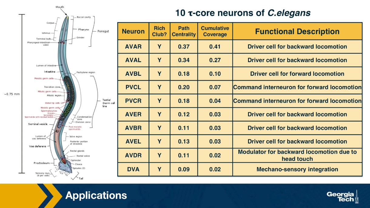
It turns out that a small set of about ten interneurons thast you see here is sufficient to cover 90% of all sensory to motor paths in the brain of C.elegans. This list of neurons is shown here. Most of these interneurons were previously known to neuroscientists as important commands neurons based on ablation studies or circuit level studies. The new analysis based on the Tao core method provides a different way to understand all of these ten inter neurons. Their activity as a group, compressed all the information provided by the about 100 sensory neurons to a much lower dimension space which is represented by the activity of only 10 cells. Then this compressed representation is used to drive all the output behavior secrets of the organism that involve about 100 motor neurons. In other words, it appeaars that C.elegans deploy an encoder/decoder architecture similar to the architecture of deep artificial neural nets that first reduce the dimensionally of their inputs before computing typically much larger dimensionally output vector.
You can find additional details about the C.Elegans network analysis mentioned here in the following paper: The hourglass organization of the Caenorhabditis elegans connectome by K. Sabrin et al, PLOS Computational Biology, 2020.
Lesson Summary
This lesson introduced you to a toolbox of network analysis that you can use any time you want to identify the most important nodes or edges of the network, to rank nodes or edges in terms of importance, or to identify the most important groups of nodes.
The collection of centrality metrics and core-group detection algorithms we reviewed is not comprehensive of course. You can find many more such metrics in the literature, depending on the specific notion of importance in the problem you study. In some cases, you may even need to define your own metric.
In practice, applying a wide collection of centrality metrics and core-group detection algorithms is one of the first steps we perform whenever we are given a new network dataset. Such a preliminary analysis helps to identify the nodes or edges that stand out in the network, at least according to one of these metrics.
L7 - Modularity and Community Detection
Overview
Required Reading
- Chapter-9 from A-L. Barabási, Network Science , 2015.
The Graph Partitioning Problem
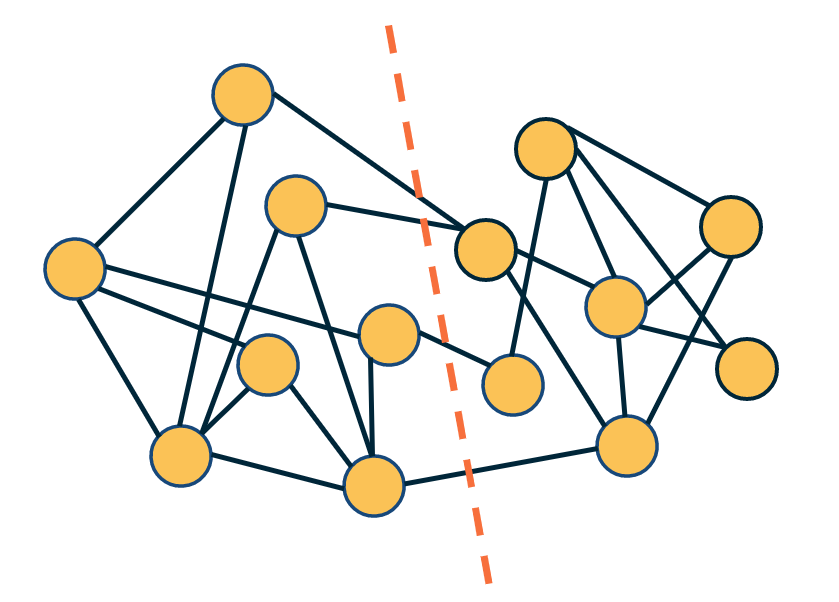
Let us start with “graph partitioning” – a classical problem in computer science.
Given a graph, how would we partition the nodes into two non-overlapping sets of the same size so that we minimize the number of edges between the two sets? This is also known as the “minimum bisection problem”.
The visualization at the right shows such a bisection. Note that there are only four edges that cross the partition boundary (red dashed line) – and each set in the partition has seven nodes.
We can also state more general versions of this problem in which we partition the network into K non-overlapping sets of the same size, where K>2 is a given constant.
The graph partitioning problem is important in many applications. For instance, in distributed computing, we are given a program in which there are N interacting threads but we only have K processors (K<N). The interactions between threads can be represented with a graph, where each edge represents a pair of threads that need to communicate while processing. It is important to assign interacting groups of threads to the same processor (so that we minimize the inter-processor communication delays) and to also equally split the threads between the K processors so that their load is balanced.
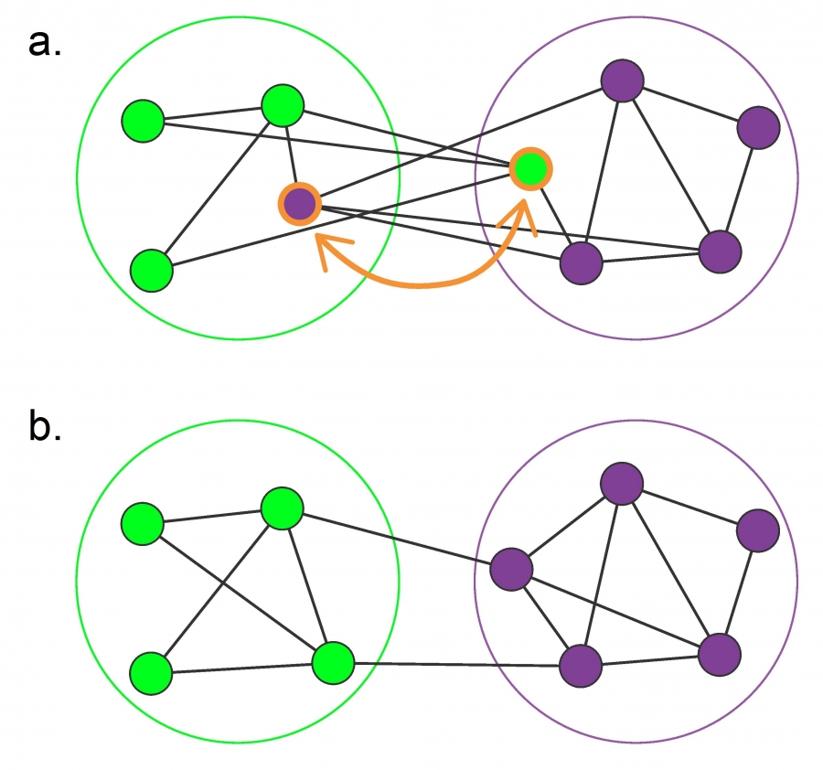 Figure from Box 9.1 of Network Science Book by A.L.Barabási
The graph partitioning problem is NP-Complete and so we only have efficient algorithms that can approximate its solution. The Kerninghan-Lin algorithm – as shown in the visualization above – iteratively switches one pair of nodes between the two sets of the partition, selecting the pair that will cause the largest reduction in the number of edges that cut across the partition.
For our purposes, it is important to note that in the graph partitioning problem we are given the number of sets in the partition and that each set should have the same size. As we will see, this is very different than the community detection problem.
Network Community Detection
Community detection problem
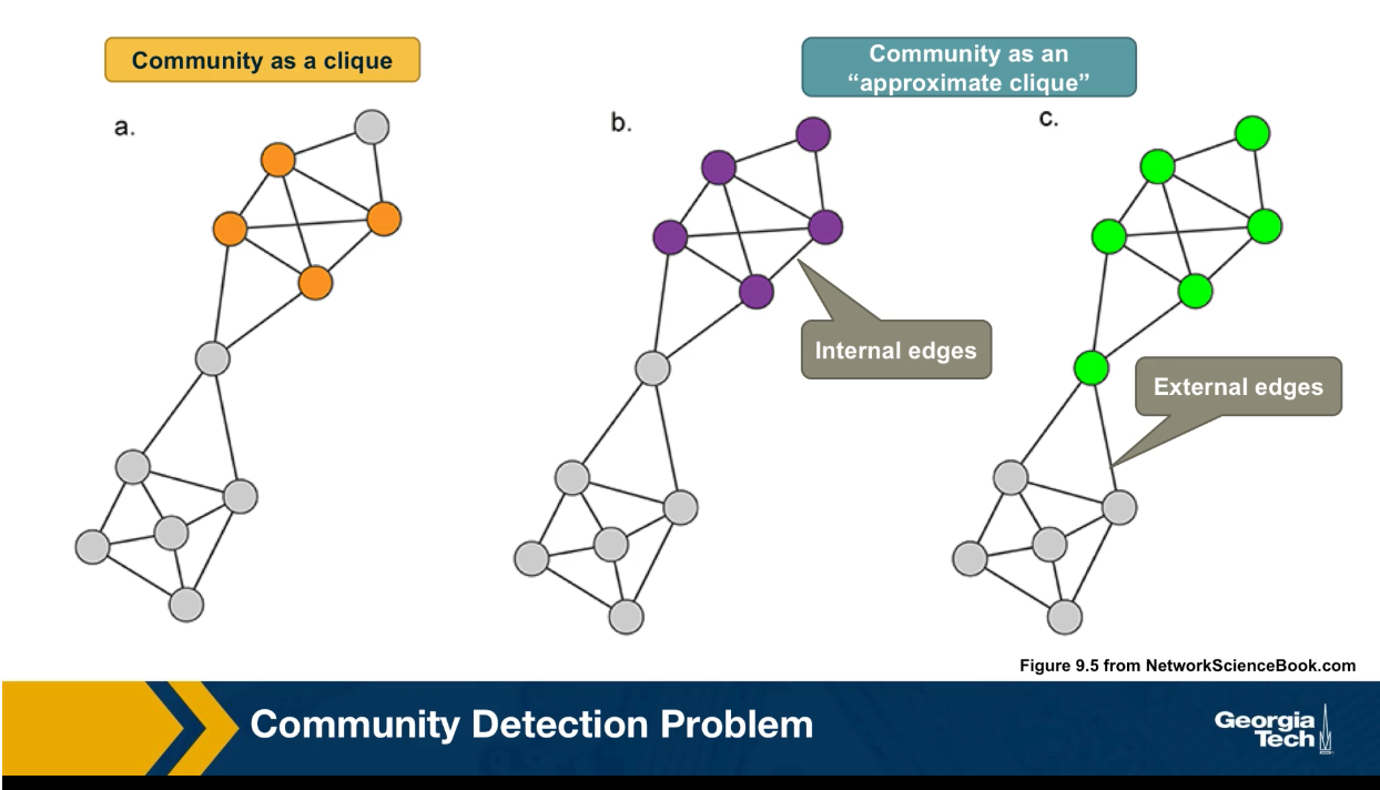
In the community detection problem, we also need to partition the nodes of a graph into a set of non overlapping clusters or communities. But the key difference is that we do not know a priori how many sets communities exists and there is no requirement that they have the same size. What is the key property of its community?
Loosely speaking, the nodes within its community should form a densely connected sub-graph. Of course, this is not a mathematically precise definition because it does not specify how densely the community sub graph should be. One extreme point wold be to require that this community is a maximally sized clique. In other words, a complete sub graph that cannot be increased any further.
Here in this visualization, we see a clique based community with four orange nodes. This is a stringent definition however, and it does not capture the pragmatic fact that some edges between nodes of a community may be missing. So another way to think of its community is an approximate clique, a sub graph in which the number of internal edges, in other words, edges between nodes of the sub graph is much larger than the number of external edges, edges between nodes of that sub graph and the rest of the graph. This is again a rather loose definition, however, and it does not tell us which community is better. The purple at the left or the green at the right?
Modular networks: The Adjacency Matrix View
In order to make the community detection problem well defined, we need to add some additional constraints. Before we address this question, it is good to reflect on some high level questions regarding communities.
- Should we require that every node belongs to a community? What if some nodes do not belong to any community?
- Is it necessary that the communities are non-overlapping? What if some nodes belong to more than one community?
- What if there are no real communities in a network? What if the network is randomly formed?
In particular, if a network is made of random connections, it may still have some densely connected sub graphs depending on the graph density. It would not make sense to claim that such a network has an interesting community structure however. So how should we avoid discovering communities that are formed strictly by chance? We will return to these questions later in this lesson as well as at the next lesson.
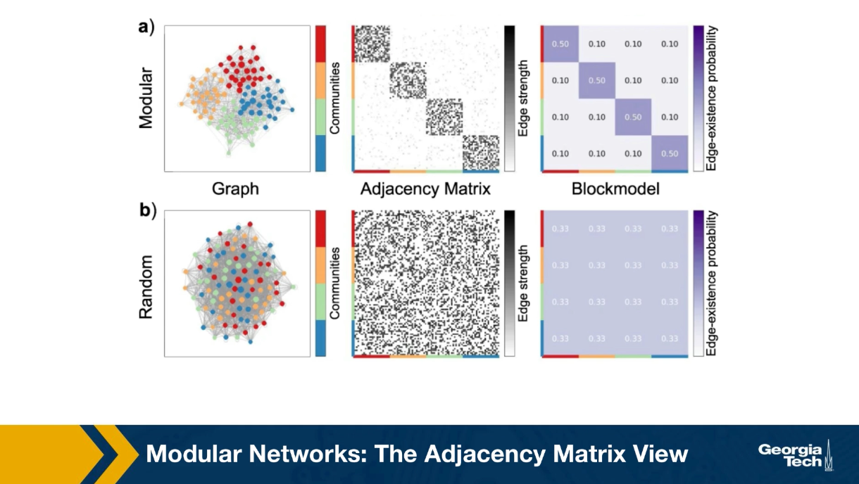
Another way to think about network communities and visualize the presence is through the adjacency matrix. Suppose that there are k non-overlapping groups of nodes of potentially different sizes, so that, the density of the internal connections within its group is much greater than the density of external connections.
If we reorder the adjacency network of the network, so that the nodes of its group appear in consecutive rows, we will observe that the adjacency matrix includes k dense sub matrices one for each community. The rest of the adjacency matrix is not completely zeros, but it is much more sparsely populated. This is shown in the visualization for a network with four communities, the red, the blue, the green and the yellow. In this case all four communities have the same size. the probability that two nodes of the same community are connected is 50%. The density of the external edges is only 10%.
For example, we also saw a reference network the connection probabilities is the same for all pairs of nodes and the total number of edges is the same as in the first row. Clearly the second network, the random one, doesn’t have communities, and the adjacency matrix cannot be represented in the blog structure we show earlier.
Example Network Communities: Zachary’s Karate club
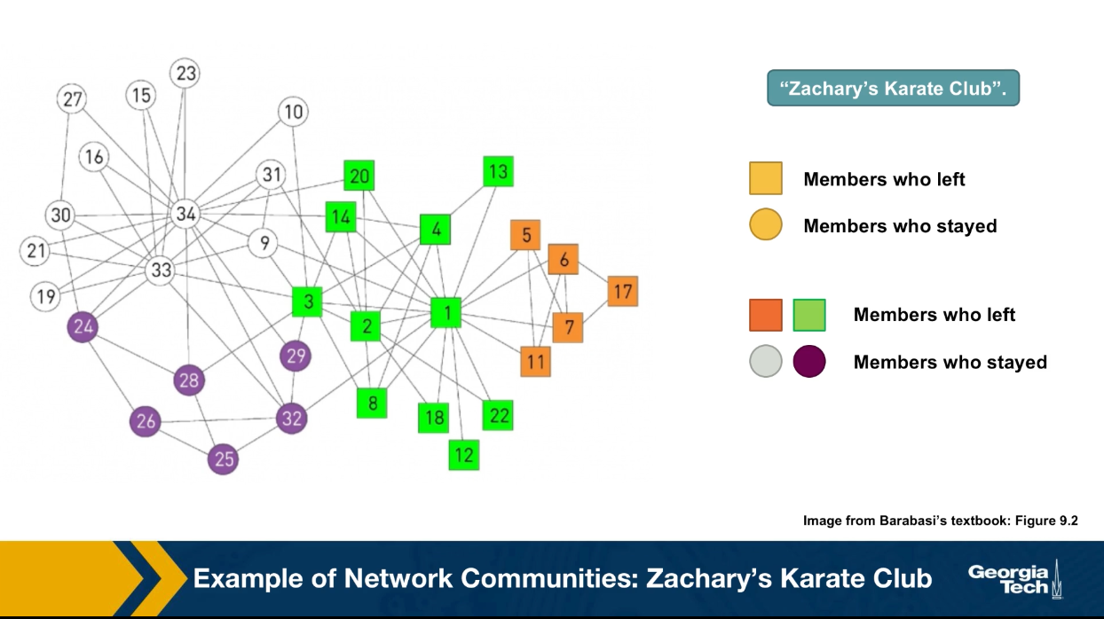
In some instances of community detection problem, we’re fortunate to know the correct communities based on additional information about that data set. In other words, we know hte ground truth.
A famous such case is the Zachary’s Karate Club network. Zachary was a sociologist that started the interactions between 34 members of a karate club in the early 1970s. He documented the pairwise interactions between all members of the club and he found 78 such edges pairs of members that interacted regularly outside the club.
What made the data famous is that the president of the club and the instructor had a conflict at some point and so the club split into two groups. About half of the members followed the instructor into a different club. So we do know for this data set that there were actually two communities and we know that exact membership of its community. These two communities are shown in the visualization with circles versus squares.
Today, any proposed community detection algorithm is also evaluated with the Zachary Karate club data set. It is a very small data set, but it is one of the very few cases in which we know the ground truth. The four different colors in the visualization shows the results of a community detection algorithm that we will discuss later in this lesson referred to as modularity maximization. Note that the algorithms detects four communities instead of two, which is the right answer.
It manages to correctly identify two communities, the green and the orange that represent the club members that follow the instructor to a different club. And two other communities, the white and the purple that represents members that stayed with the club president.
Community Detection Based on Edge Centrality Metrics
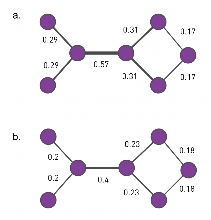 Three centrality measures that are discussed in this image (Image 9.11) from networksciencebook.com.
A family of algorithms for community detection is based on hierarchical clustering. The goal of such approaches is to create a tree structure, or “dendrogram”, that shows how the nodes of the network can iteratively split in a top-down manner into smaller and smaller communities (“divisive hierarchical clustering”) – or how the nodes of the network can be iteratively merged in a bottom-up manner into larger and larger communities (“agglomerative hierarchical clustering”).
Let us start with divisive algorithms. We first need a metric to select edges that fall between communities – the iterative removal of such edges will gradually result in smaller and smaller communities.
One such metric is the edge (shortest path) betweenness centrality, introduced in Lesson-6. Recall that this metric is the fraction of shortest paths, across all pairs of terminal nodes, that traverses a given edge. Visualization (a) shows the value of the betweenness centrality for each edge. Removing the edge with the maximum centrality value (0.57) will partition the network into two communities. We can then recompute the betweenness centrality for each remaining edge, and repeat the process to identify the next smaller communities. This algorithm is referred to as “Girvan-Newman” in the literature.
Another edge centrality metric that can be used for the same purpose is the random walk betweenness centrality. Here, instead of following shortest paths from a node u to a node v, we compute the probability that a random walk that starts from u and terminates at v traverses each edge e, as shown in visualization (b). The edge with the highest such centrality is removed first.
Note that the computational complexity of such algorithms depends on the algorithm we use for the computation of the centrality metric. For betweenness centrality, that computation can be performed in $O(LN)$, where $L$ is the number of edges and $N$ is the number of nodes. Given that we remove one edge each time, and need to recompute the centrality of the remaining edges in each iteration, the computational complexity of the Girvan-Newman algorithm is $O(L^2N)$. In sparse networks the number of edges is in the same order with the number of nodes, and so the Girvan-Newman algorithm runs in $O(N^3)$.
Divisive Hierarchical Community Detection
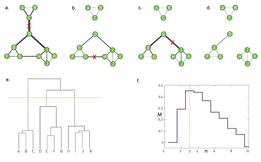 Image 9.12 from networksciencebook.com “The final steps of a divisive algorithm mirror those we used in agglomerative clustering: 1. Compute the centrality xij of each link. 2. Remove the link with the largest centrality. In case of a tie, choose one link randomly. 3. Recalculate the centrality of each link for the altered network. 4. Repeat steps 2 and 3 until all links are removed.
To illustrate the iterative top-down process followed by divisive hierarchical community detection algorithms, let us focus on the edge betweenness centrality metric.
The Girvan-Newman algorithm uses that metric to remove a single edge in each iteration – the edge with the highest edge betweenness centrality.
The value of the edge betweenness centrality of the remaining edges has to be re-computed because the set of shortest paths changes in each iteration.
The visualizations (a) through (d) show how a toy network changes in four steps of the algorithm, after removing three successive edges. The removal of the first edge, between C and D, creates the first split in the dendrogram, starting at the root. At the left, we have a community formed by A, B, and C – while at the right we have a community with all other nodes.
The next split takes place after we remove two edges, the edge between G and H and the edge between D and I. At that branching point the dendrogram shows three communities: $(A,B,C), (D,E,F,G)$ and $(H,I,J,K)$ (as shown by the horizontal yellow line).
The process can continue, removing one edge at a time, and moving down the dendrogram, until we end up with isolated nodes.
Note that a hierarchical clustering process does NOT tell us what is the best set of communities – each horizontal cut of the dendrogram corresponds to a different set of communities. So we clearly need an additional objective or criterion to select the best such set of communities. Such a metric, called modularity M, is shown in the visualization (f), which suggests we cut the dendrogram at the point of three communities (yellow line). We will discuss the metric M a bit later in this lesson.
This algorithm always detect communities in a given network. So, even a random network can be split in this hierarchical manner, even though the resulting communities may not have any statistical significance.
Food for Thought
How would you check if the detected communities have statistical significance, so that a random network does not have any community structure?
Agglomerative Hierarchical Clustering Approaches - Node Similarity Metric
Let us now switch to agglomerative (or bottom-up) hierarchical clustering algorithms.
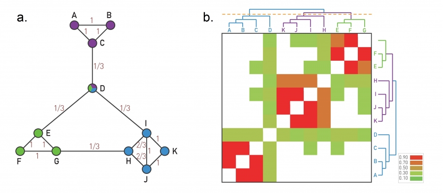 Image 9.9 from networksciencebook.com . The Ravasz Algorithm The agglomerative hierarchical clustering algorithm proposed by Ravasz was designed to identify functional modules in metabolic networks, but it can be applied to arbitrary networks.
Here, we start the dendrogram at the leaves, one for each node. In each iteration, we decide which nodes to merge so that we extend the dendrogram by one branching point towards the top. The merged nodes should ideally belong to the same community. So we first need a metric that quantifies how likely it is that two nodes belong to the same community.
If two nodes, i and j, belong to the same community, we expect that they will both be connected to several other nodes of the same community. So, we expect that i and j have a large number of common neighbors, relative to their degree.
To formalize this intuition, we can define a similarity metric $S_{i,j}$ between any pair of nodes i and j:
\[S_{i,j} = \frac{N_{i,j}+A_{i,j}}{\min\{k_i,k_j\}}\]where $N_{i,j}$ is the number of common neighbors of i and j, $A_{i,j}$ is the adjacency matrix element for the two nodes (1 if they are connected, 0 otherwise), and $k_i$ is the degree of node i.
Note that $S_{i,j}=1$ if the two nodes are connected with each other and every neighbor of the lower-degree node is also a neighbor of the other node.
On the other hand, $S_{i,j}=0$ if the two nodes are not connected to each other and they do not have any common neighbor.
The visualization at the left shows the node similarity value for each pair of connected nodes.
The visualization at the rights shows the color-coded node similarity matrix, for every pair of nodes (even if they are not connected). Note that three groups of nodes emerge with higher similarity values: (A, B, C), (H,I,J,K) and (E,F,G). Node D on the other hand has a lower similarity with any other node, and it appears to be a “connector” between the three communities.
Food for Thought
What if a node has no connections? How should we modify this similarity metric to deal with that case?
Hierarchical Clustering Approaches – Group Similarity
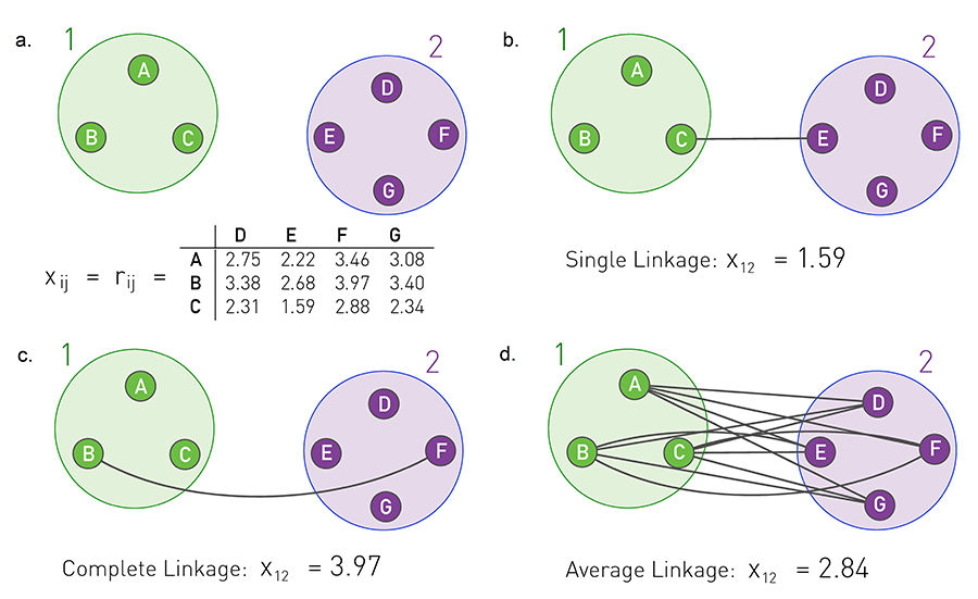 Image 9.10 from networksciencebook.com Three approaches, called single, complete and average cluster similarity, are frequently used to calculate the community similarity from the node-similarity matrix xij
How to compute the similarity between two groups of nodes (as opposed to individual nodes)?
In other words, if we are given two groups of nodes, say 1 and 2, and we know the pairwise node similarities, how to compute the similarity between groups 1 and 2?
There are three ways to do so:
- Single linkage: the similarity of groups 1 and 2 is determined by the minimum distance (i.e., maximum similarity) across all pairs of nodes in groups 1 and 2.
- Complete linkage: the similarity of groups 1 and 2 is determined by the maximum distance (i.e., minimum similarity) across all pairs of nodes in groups 1 and 2.
- Average linkage: the similarity of groups 1 and 2 is determined by the average distance (i.e., average similarity) across all pairs of nodes in groups 1 and 2.
The visualization illustrates the three approaches. Note that this figure gives the pairwise distance between nodes. The similarity between two nodes can be thought of as inversely related to their distance.
Average linkage is the most commonly used metric.
Where to “cut” the dendrogram and computational complexity
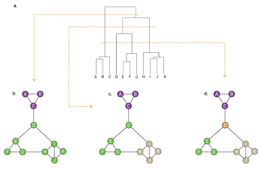 A hierarchical tree in which any cut of the hierarchical tree offers a potentially valid partition (Image 9.15) from networksciencebook.com
Now that we have defined a similarity metric for two nodes (based on the number of common neighbors), and we have also learned how to calculate a similarity value for two groups of nodes, we can design the following iterative algorithm to compute a hierarchical clustering dendrogram in a bottom-up manner.
We start with each node represented as a leaf of the dendrogram. We also compute the matrix of $N^2$ pairwise node similarities.
In each step, we select the two nodes, or two groups of nodes more generally, that has the highest similarity value – and merge them into a new group of nodes. This new group forms a larger community and the corresponding merging operation corresponds to a new branching point in the dendrogram.
The process completes until all the nodes belong in the same group (root of the dendrogram).
Note that depending on where we “cut” the dendrogram we will end up with a different set of communities. For instance, the lowest horizontal yellow line at the visualization corresponds to four communities (green, purple, orange, and brown) – note that node D forms a community by itself.
The computational complexity of this algorithm, which is known as Ravasz algorithm, is $O(N^2)$ because the algorithm requires:
- $O(N^2)$ for the initial calculation of the pairwise node similarities
- $O(N)$ for updating the similarity between the newly formed group of nodes and all other groups – and this is performed in each iteration, resulting in $O(N^2)$
- $O(NlogN)$ for constructing the dendrogram
Food for Thought
Try to think of another agglomerative hierarchical clustering approach, based on a different similarity metric.
Modularity Metric
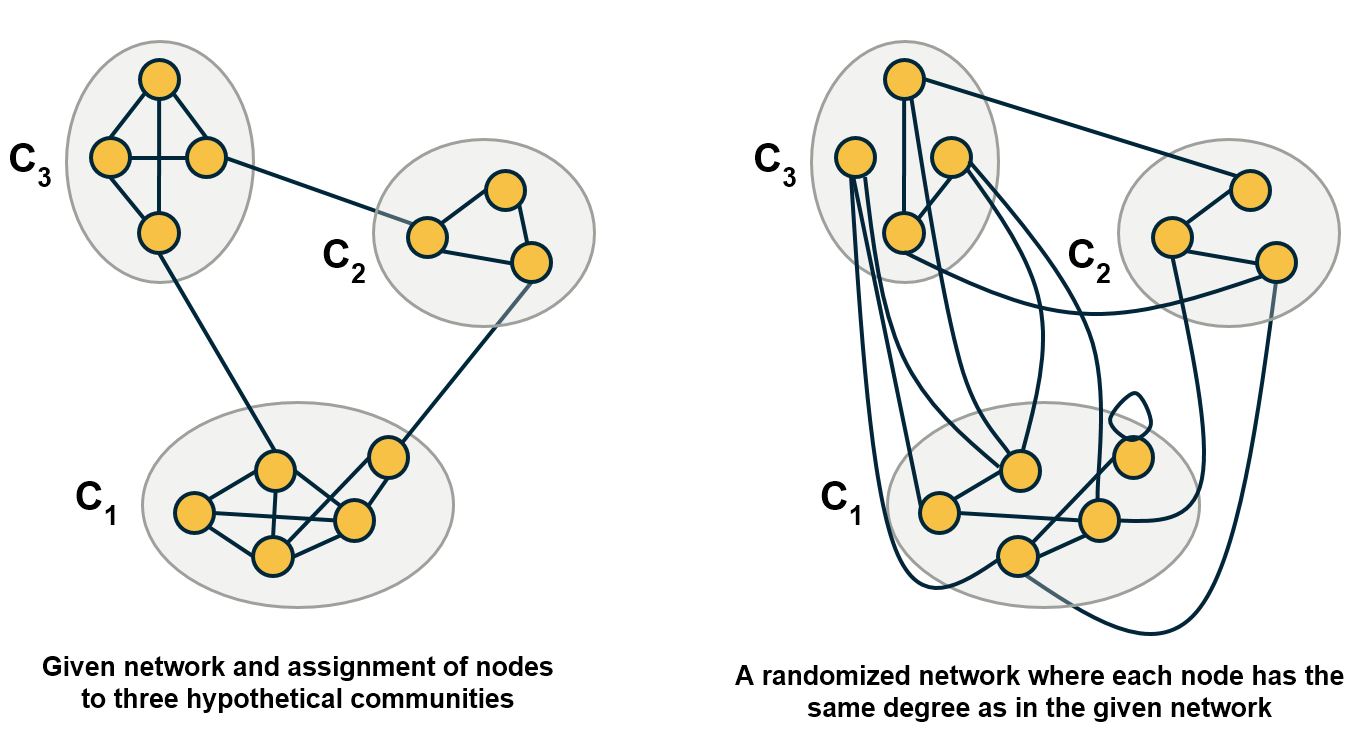
All approaches for community detection we have seen so far cannot answer the following two questions:
Which level of the dendrogram, or more generally, which partition of the nodes into a set of communities is the best?
And, are these communities statistically significant?
The modularity metric gives us a way to answer these questions. The idea is that randomly wired networks should not have communities – and so a given community structure is statistically significant if the number of internal edges within the given communities is much larger than the number of internal edges if the network was randomly rewired (but preserving the degree of each node).
In more detail: suppose we are given a network with N nodes and L edges – for now, let us assume that the network is undirected and unweighted.
We denote the degree of node i as $k_i$.
Additionally, we are given partitioning of all nodes to a set of C hypothetical communities $C_1,C_2,…,C_C$.
Our goal is to evaluate this community structure – how good it is and whether it is statistically significant.
Let A be the network adjacency matrix.
The number of internal edges between all nodes of community $C_C$ is
\[\frac{1}{2} \sum_{(i,j) \in C_c} A_{i,j}\]On the other hand, if the connections between nodes are randomly made, the expected number of internal edges between all nodes of that community is,
\[\frac{1}{2} \sum_{(i,j) \in C_i} \frac{k_i k_j}{2L}\]because node i has $k_i$ stubs and the probability that any of those stubs connect to a stub of node j is $\frac{k_j}{2L}$
So, we can define the modularity metric based on the difference between the actual number of internal edges and the expected number of internal edges, across all C communities:
\[M = \frac{1}{2L} \sum_{c=1}^C \sum_{(i,j) \in C_c} (A_{i,j} - \frac{k_i k_j}{2L})\]We divided by the total number of edges L, so that M is always less than 1.
Note that the modularity metric does not directly penalize any external edges, i.e., there is no term in this equation that decreases the modularity for every external edge between two communities. The more external edges exist however, the lower is the sum of the internal edges, while the sum of the expected number of random edges remains constant. In other words, the modularity metric indirectly selects community assignments that have more internal edges and fewer external edges.
How can we use this metric to select between different community structures? It is simple: select the set of communities that has the larger modularity value.
And how can we know if a given community structure is statistically significant? A simple way to answer this question is by comparing the modularity of a network with 0, which is the value we would expect from a randomly wired network.
Alternatively, we can generate an ensemble of random networks using degree-preserving randomization and estimate the distribution of modularity values in that ensemble. We can then use a one-sided hypothesis test to evaluate whether the modularity of the original network is larger than that distribution, for a given statistical significance level.
Modularity Metric- Derivation
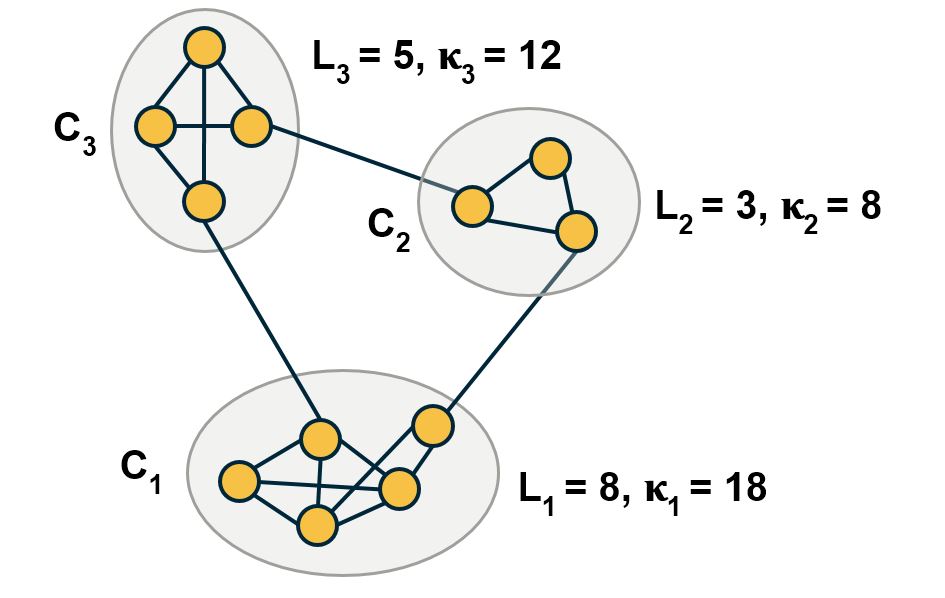
We can now derive a more useful formula for the modularity metric, starting from the definition we gave earlier:
\[M = \frac{1}{2L} \sum_{c=1}^C \sum_{(i,j) \in C_c} (A_{i,j} - \frac{k_i k_j}{2L})\]The first term can be re-written as:
\[\frac{1}{2L} \sum_{c=1}^C \sum_{(i,j) \in C_c} A_{i,j} = \sum_{c=1}^C \frac{L_c}{L}\]where $L_c$ is the number of internal edges in community $C_C$::
\[\frac{1}{2} \sum_{(i,j) \in C_c} A_{i,j}\]The second term can be re-written as:
\[\frac{1}{2L} \sum_{c=1}^C \sum_{(i,j) \in C_c} \frac{k_i k_j}{2L} = \frac{1}{4 L^2} \sum_{c=1}^C \sum_{(i,j) \in C_c} k_i k_j = \sum_{c=1}^C \left ( \frac{\kappa_c}{2L} \right )^2\]where $\kappa_c$ is the total number of stubs at the nodes of community c, i.e.,
\[\kappa_c= \sum_{i \in C_c} k_i\]If the last part of this equation is not clear, note that:
\[\kappa_c^2 = (\sum_{i \in C_c} k_i) \, (\sum_{j \in C_c}k_j) = \sum_{(i,j) \in C_c} (k_i k_j)\]Substituting these two terms back to the original modularity definition, we get an equivalent expression for the modularity metric:
\[M = \sum_{c=1}^C ( \frac{L_{c}}{L} - {(\frac{\kappa_c}{2L}})^2 )\]This expression is quite useful because it expresses the modularity of a given community assignment as a summation, across all communities, of the following difference:
the fraction of network edges that are internal to community $C_C$ MINUS the squared fraction of total edge stubs that belong to that community.
Food for Thought
Use this modularity formula to calculate the modularity of each of the following partitions:
- all nodes are in the same community,
- each node is in a community by itself,
- each community includes nodes that are not connected with each other,
- a partition in which there are no inter-community edges.
Modularity Metric – Selecting The Community Assignment
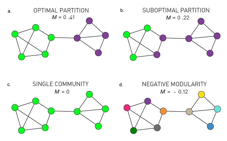 Four partitions of a network: a) optimal partition b) suboptimal partition c) single community d) negative modularity (Image 9.16) from networksciencebook.com
To get a better intuition about the modularity metric, consider the 9-node network shown in the visualization. Visually, we would expect this network to have two communities: the group of five nodes at the left and the group of four nodes at the right.
The visualization shows four possible community assignments.
The first two assignments have two communities. Assignment (a) is what we would expect visually and it has a modularity of M=0.41. It turns out that this is the highest possible modularity value for this network.
Assignment (b) is clearly a suboptimal community structure – and indeed it has a lower modularity value (M=0.22)
Assignment (c) assigns all nodes to the same community – resulting in a modularity value of 0. Clearly this is not a statistically significant community.
Finally, assignment (d) assigns each node to its own community, resulting in a negative modularity value.
Now that we have a way to compare different community assignments, we can return to the hierarchical clustering approaches we saw earlier (both divisive and agglomerative) and add an extra step, after the construction of the dendrogram:
Each branching point of the dendrogram corresponds to a different community assignment, i.e., a different partition of the nodes in a set of communities. So, we can calculate the modularity at each branching point, and select the branching point that leads to the highest modularity value.
Modularity Metric – For Directed and/or Weighted Networks
The modularity definition can be easily modified for directed and/or weighted networks.
Consider directed and unweighted networks first. Suppose that the out-degree of node i is $k_{i,out}$, and the in-degree of node $j$ is $k_{j,in}$
Further, suppose that $A_{i,j}=1$ if there is an edge from node i to node j – and 0 otherwise.
We can rewrite the modularity definition as:
\[M = \frac{1}{L} \sum_{c=1}^C \sum_{(i,j) \in C_c} (A_{i,j} - \frac{k_{i,out} k_{j,in}}{L})\]Similarly, if the network is both weighted and directed, suppose that the “out-strength” (i.e., the sum of all outgoing edge weights) of node $i$ is $s_{i,out}$, while the in-strength of node $j$ is $s_{j,in}$.
Further, suppose that $A_{i,j}$ is the weight of the edge from node i to node j – and 0 if there is no such edge.
\[M = \frac{1}{S} \sum_{c=1}^C \sum_{(i,j) \in C_c} (A_{i,j} - \frac{s_{i,out} s_{j,in}}{S})\]where S is the sum of all edge weights.
Food for Thought
Explain why the modularity formula for directed networks has the term L instead of 2L.
Modularity After Merging Two Communities
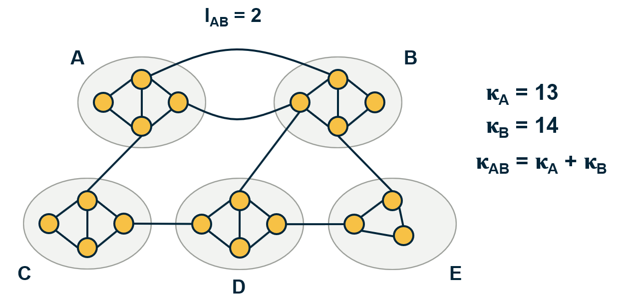
In the following pages, we will discuss a couple of algorithms that perform community detection by gradually merging smaller communities into larger communities.
Before we look at these algorithms, however, let us derive a simple formula that shows how the modularity of a network increases when we merge two communities into a new community.
In more detail, suppose that community A has a number of internal links $L_A$ and a total degree $\kappa_A$. Similarly for community B.
What happens if we create a new community assignment in which A and B are merged into a single community, call it {AB}, while all other communities remain the same?
The number of internal links in {AB} is $L_{AB}=L_{A}+ L_B + l_{AB}$, where $l_{AB}$ is the number of external links between communities A and B.
The total degree of community {AB} is $\kappa_{AB} = \kappa_A + \kappa_B$.
Using the modularity formula we derived earlier, we can now calculate the modularity difference after merging A and B:
\[\Delta M_{AB} = ( \frac{L_{AB}}{L} - (\frac{\kappa_{AB}}{2L})^2 ) - ( \frac{L_{A}}{L} - (\frac{\kappa_{A}}{2L})^2 + \frac{L_{B}}{L} -(\frac{\kappa_{B}}{2L})^2 )\]All the remaining terms, related to communities other than A and B, have not been changed after the merging and so they cancel out.
After some basic algebra in this expression, we can simplify the modularity difference after merging A and B to:
\[\Delta M_{AB} = \frac{l_{AB}}{L} - \frac{\kappa_A \kappa_B}{2 L^2}\]This is a useful expression, showing that the merging step results in higher modularity only when the number of links between A and B is sufficiently large for the first term to be larger than the second term. And the larger the communities A and B are, the larger the second term is. Otherwise, this merging operation causes a reduction in the modularity of the new community assignment.
Food for Thought
If the previous derivations are not clear, please do the algebra in more detail yourself.
Greedy Modularity Maximization
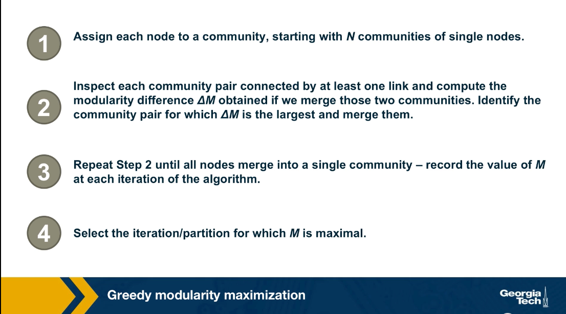
The problem of modularity maximization is NP-Hard, meaning that we cannot solve it efficiently unless if it turns out P is equal to NP. One of the most commonly used algorithms for community detection is the following greedy heuristic.
First, the algorithm starts by assigning a community to each node. Then in every iteration, we select the two communities A and B that when merged, they result in the largest modularity increase.
This is where we use the formula that we derived in the previous page. After this two communities are merged, the algorithm repeats the previous iteration until we have a single community. This process creates a dendrogram in a bottom-up manner, similar to the agglomerative hierarchical clustering algorithm we saw earlier. The difference is that in each step, we merge the two communities that result in the largest modularity increase. After the complete dendrogram is constructed, we select the branching point of the dendrogram that results in the maximum modularity.
Computational Complexity
Since the calculation of each ΔM can be done in constant time, Step-2 of the greedy algorithm requires $O(L)$ computations. After deciding which communities to merge, the update of the matrix can be done in a worst-case time $O(N)$. Since the algorithm requires N–1 community mergers, its complexity is $O[(L + N)N]$, or $O(N^2)$ on a sparse graph.
Optimized Greedy Algorithm
The use of data structures for sparse matrices can decrease the greedy algorithm’s computational complexity to $O(Nlog^2N)$. For more details please read the paper Finding community structure in very large networks by Clauset, Newman and Moore.
Louvain Algorithm
The Louvain algorithm is a more computationally efficient modularity maximization algorithm than the previous greedy algorithm.
Even if the original network is unweighted, the Louvain algorithm creates a weighted network (as described later), and for this reason, all modularity calculations are performed using the modularity formula for weighted networks we saw earlier.
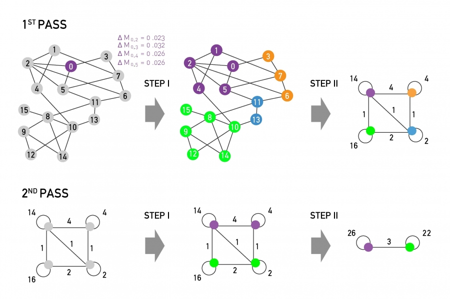 The main steps of the Louvain algorithm. Each pass consists of two distinct steps. The sum of Steps I & II are called a pass. The network obtained after each pass is processed again, until no further increase of modularity is possible. (Modified from Image 9.37 from networksciencebook.com)
The Louvain consists of two steps:
Step-I
Start with a network of N nodes, initially assigning each node to a different community. For each node i, we evaluate the modularity change if we place node i in the community of any of its neighbors j.
We move node i in the neighboring community for which the modularity difference is the largest – but only if this difference is positive. If we cannot increase the modularity by moving i, then that node stays in its original community.
This process is applied to every node until no further improvement can be achieved, completing Step-I.
The modularity change $\Delta M$ that results by merging a single node i with the community A of a neighboring node is similar to the formula we derived earlier – but for weighted networks:
\[\Delta M_{i,A} = ( \frac{W_{A,int}+2 \, W_{i,A}}{2\,W} - (\frac{W_{A}+W_{i}}{2 \, W})^2 ) - ( \frac{W_{A,int}}{2 \, W} - (\frac{W_{A}}{2 \, W})^2 - (\frac{W_{i}}{2\,W})^2 )\]where $W_A$ is the sum of weights of all links in A, $W_{A,int}$ is the sum of weights of all internal links in A, $W_i$ is the sum of weights of all links of node i,
$W_{i,A}$ is the sum of weights of all links between node i and any node in A, and W is the sum of weights of all links in the network.
Step-II We now construct a new network (a weighted network) whose nodes are the communities identified during Step-I. The weight of the link between two nodes in this network is the sum of weights of all links between the nodes in the corresponding two communities. Links between nodes of the same community lead to weighted self-loops.
Once Step-II is completed, we have completed the first pass of the algorithm.
Steps I – II can be repeated in successive passes. The number of communities decreases with each pass. The passes are repeated until there are no more changes and maximum modularity is attained.
The visualization shows the expected modularity change $\Delta M_{0,i}$ for node 0. Accordingly, node 0 will join node 3, as the modularity change for this move is the largest, being $\Delta M_{0,3}$=0.032.
This process is repeated for each node, the node colors corresponding to the resulting communities, concluding Step-I.
In Step-II, the communities obtained in Step-I are aggregated, building a new network of communities. Nodes belonging to the same community are merged into a single node, as shown on the top right.
This process generates self-loops, corresponding to links between nodes in the same community that is now merged into a single node.
Food for Thought
The description of the Louvain algorithm here is only at a high-level. We recommend you also read the original publication that proposed this algorithm. Also, show that the computational complexity of this algorithm is $O(L)$.
Modularity Resolution
You may be wondering: is the modularity metric always a reliable way to choose a community assignment? Does it ever fail to point us in the right direction?
The answer is yes. The modularity metric cannot be used to discover very small communities, relative to the size of the given network.
To see why recall the formula we derived earlier for the change in modularity after merging two communities A and B:
\[\Delta M_{AB} =\frac{l_{AB}}{L} - \frac{\kappa_A \kappa_B}{2 L^2}\]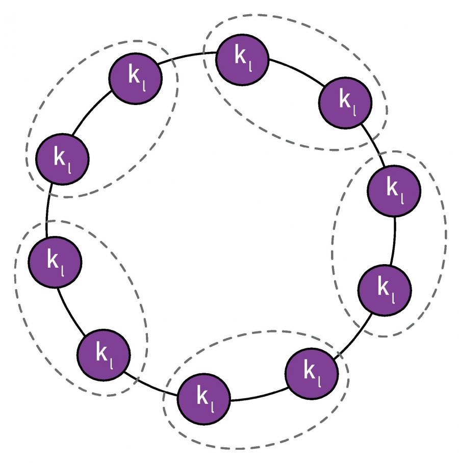 A partition in which pairs of neighboring cliques are merged into a single community, as indicated by the dotted lines. (Image 9.34) from networksciencebook.com
Suppose that a network consists of multiple communities, as shown in the visualization, with only a single link between any two communities. Clearly, a good community detection algorithm should not merge any of these communities
To simplify, suppose that the total degree of each community is $\kappa_l$. Based on the previous formula, if we merge any two of these connected communities the modularity difference will be:
\[\Delta M_{AB} = \frac{1}{L} - \frac{\kappa_l^2}{2 L^2} = \frac{1}{L} ( 1 -{\frac{\kappa_l}{2L}}^2)\]So, the merging of the two small communities will take place if $\Delta M_{AB} >0$ which is equivalent to
\[\kappa_l < \sqrt{2 \, L}\]In other words, a modularity maximization algorithm will always merge two communities if the total degree of each of those communities is smaller than the critical value $ \sqrt{2 \, L}$.
This critical value is referred to as modularity resolution because it is the smaller community size (in terms of total degree) that a modularity maximization algorithm can detect.
For example, for a network with a million links, the modularity resolution is 1414, which means that any two connected communities (even with a single link) with total degree less than this limit will be merged, and so they will not be correctly identified.
Food for Thought
How would you try to avoid the modularity resolution issue – and try to discover even small communities?
The Modularity Search Landscape
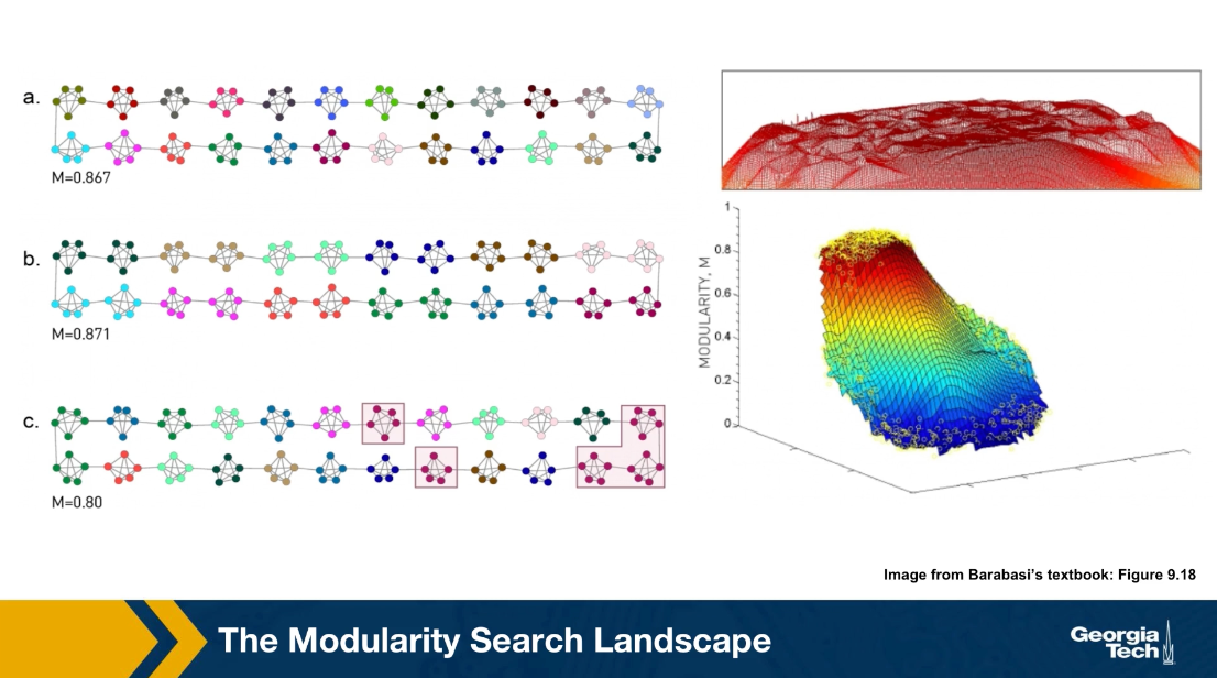
Here is an additional illustration of the modularity resolution HQ. Consider the network shown in the visualization, it is a ring network in which each member of the ring is a small community of five nodes, a small click.
In the community assignment A, each of these five node clicks is a separate community which is the most intuitive partitioning in this case. The modularity of this community assignment is 0.867. This is not, however, the maximum modularity value. The subsequent two assignments assignment b have even larger modularity. While that shown in B is the maximum possible, note that this assignment merges every two consecutive clicks into one community.
An interesting observation, however is that the modularity of A is not much lower than the maximum modularity. One is 0.867, the other is 0.871. It turns out that this is common in practice.
First, computing the maximum modularity value is very hard computationally. It is an NP-hard problem and second, the maximum modularity value may not correspond to the most intuitive community assignment due to this modularity resolution HQ. However, what often happens is that the maximum modularity value resides in a plateau, as we see here and it is not much higher than other local maxima that corresponds to different community assignments.
Consequently, even though we rarely know the optimal solution to the modularity maximization problem, the various heuristics we just saw earlier can typically compute reasonable solutions that also reside in the modularity plateau.
Communities Within Communities
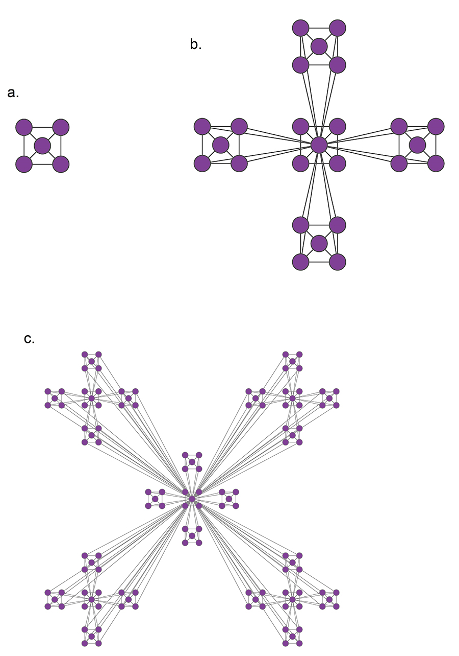 A hierarchical model that generates a scale-free network with degree exponent. (Image 9.13 from networksciencebook.com)
In many real-world networks, we observe communities within communities within communities, etc. For example, in a professional organization, we may observe small communities of 3-4 people that work together on a specific component of a large project, nested within a larger community of 20-30 members working on that the project, nested within an entire department of 100+ people, etc.
This is referred to as Hierarchical Modularity. Each module corresponds to a community of nodes. Smaller, more tightly connected communities can be members of larger but less tightly connected larger communities. This recursive process can continue for multiple levels until we reach a level in which the group of nodes is so loosely connected that they do not form a community anymore.
A prototypical example of such a hierarchically modular architecture is illustrated in this visualization. The most elementary community is a five-node clique module (part a). Note that the diagonal elements are also connected even though it is not very clear in the illustration.
At the next level (part b), we see a similar structure that is composed of five of those cliques, with the clique at the middle playing the role of the “connector” for the four peripheral cliques. Note that the network at this level is NOT a clique, and so it is less tightly connected than the five smaller communities it is composed of.
At the third level of the hierarchy (part c), we connect in a similar manner five instances of the part-b module. Again, the module at the center is the connector of the four peripheral modules, and again the density of the connections at that level is lower than the density at the previous level.
This is of course an extreme example of hierarchical modularity – the connections are deterministic and the connectivity pattern is the same at every layer. In practice, most networks have some degree of randomness and the depth of these hierarchies may not exceed a certain maximum level for practical reasons (for example: what is the maximum hierarchical depth in your professional organization or university?)
Nevertheless, the deterministic structure of this toy network allows us to derive mathematically an interesting property of this network: namely, the clustering coefficient of a node in this network drops proportionally to the inverse of the node’s degree:
\[C(k) \approx \frac{2}{k}\]We will not show the derivation here – it is simple however and you can find it in your textbook.
This is an interesting “signature” for this hierarchically modular network – the more connected a node is, the less interconnected its neighbors are. This is very different than random networks, without any community structure, in which the clustering coefficient is independent of the degree.
Food for Thought
Please go through the derivations for the above clustering coefficient in your textbook.
Clustering Coefficient Versus Degree in Practice
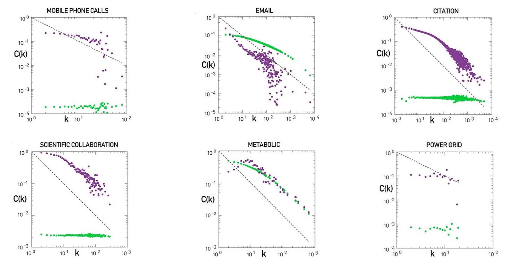 Hierarchy in Real Networks. (Image 9.36) from networksciencebook.com
Do we see this inversely proportional relationship between the clustering coefficient and degree in real-world networks? And if so, is it a reliable indicator of hierarchical modularity?
The visualization shows plots of the node clustering coefficient $C(k)$ versus node degree k for six real-world networks (purple dots). You can find additional information about these six datasets in your textbook.
The green dots refer to a corresponding degree-preserving randomized network – this is an important step of the analysis because by randomizing the network connections (without changing the degree distribution), we remove the community structure of the original network from the randomized network.
The black dotted line corresponds to the relation $C(k) = 1/k$. As we saw in the previous page, this is the slope of $C(k)$ versus k in the deterministic hierarchically modular network that we saw earlier.
Note that some networks, such as the network of scientific collaborations or the citation network show clearly an inverse relation between $C(k)$ and k, especially for nodes with degree k>10. Further, when we randomize the connections of those networks, removing the community structure, $C(k)$ becomes independent of k. So, we expect that such networks exhibit a hierarchically modular structure.
The situation is not always so clear, however. Some other networks, such as the metabolic network or the email network, show an inverse relation between $C(k)$ and k – but the same is true for the corresponding randomized networks! This raises the concern that the inverse relation between $C(k)$ and k may be caused in some cases at least by the degree distribution – and not by the community structure of the network.
Finally, there are also networks in which we do not see a decreasing relation between $C(k)$ and k, such as the mobile phone calls network or the power grid.
To summarize, hierarchical modularity is an important property of many (but not all) real-world networks, and when present, it exhibits itself with an inversely proportional between the clustering coefficient and the node degree. However, this relation is not sufficient evidence for the presence of hierarchical modularity.
Hierarchical Modularity Through Recursive Community Detection
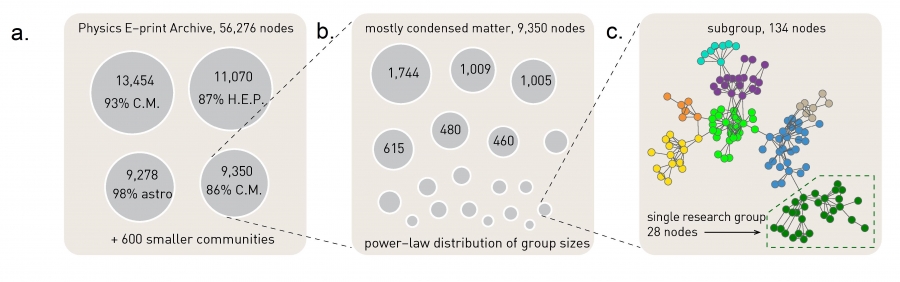 The Greedy Algorithm. (Image 9.17) from networksciencebook.com
Another approach to investigate the presence of hierarchical modularity is by applying a community detection algorithm in a recursive manner. The first set of discovered communities correspond to the top-level, larger communities. Then we can apply the same algorithm separately to each of those communities, asking whether there is a finer resolution community structure within each of those top-level communities. The process can continue until we reach a level at which a given community does not have a clear sub-community structure.
To illustrate this process, the visualization above refers to a collaboration network between about 55,000 physicists from all branches of physics who posted papers on arxiv.org. At the top-level (part a), the greedy modularity maximization algorithm detects about 600 communities and the modularity is M=0.713. The largest of those communities include about 13,500 scientists and 93% of them publish in condensed matter (C.M) physics. The second-largest community consists of about 11,000 scientists and 87% of those scientists publish in High Energy Physics (HEP).
If we apply the same community detection algorithm to the third-largest community, we identify a number of smaller communities, and the modularity of that community assignment is 0.807 (part b).
If we continue at a third level, applying the same algorithm to a community of 134 nodes we reach a point at which we identify research groups associated with scientists at different universities (part c).
Lesson Summary
This lesson introduced you to the concept of community in the context of networks.
We contrasted the problem of community detection to the ”cleaner” problem of graph partitioning, emphasizing that in the former we do not know the number of communities – or even if the network has any communities in the first place.
A key concept in the community detection problem has been the modularity of a network. This metric allows us to compare different community assignments on the same network – and to examine whether a network has a strong community structure in the first place.
We also saw however that the modularity metric has a finite resolution and that we cannot detect communities of a smaller size than that resolution.
We also saw a number of algorithms for community detection, including divisive and agglomerative hierarchical clustering algorithms, greedy modularity maximization, and the Louvain algorithm. The literature in this area includes 100s of algorithms but the most commonly used are those we covered here.
We also discussed the concept of hierarchical modularity – and how it relates to the relation between the clustering coefficient and node degree.
In the subsequent lesson, we will cover more advanced topics of community detection – including overlapping communities and dynamic communities. We will also cover how to compare and characterize different community structures.
L8 - Advanced Topics in Community Detection
Overview
Required Reading
- Chapter-9 from A-L. Barabási, Network Science , 2015.
Recommended Reading
- “Dynamic Community Detection”, by Rémy Cazabet, Frédéric Amblard, 05 October 2014.
- “δ-MAPS: from spatio-temporal data to a weighted and lagged network between functional domains” by Fountalis, I., Dovrolis, C., Bracco, A. et al., 2018
Overlapping Communities and CFinder Algorithm
Overlapping Communities
In practice, it is often the case that the network node may belong to more than one communities. Think of your social network. For instance, you probably belong to a community that covers mostly your family, another community of colleagues or classmates, a community of friends, and so on. This simple observation raises doubts about our fundamental assumption that we can partition the nodes of a network in non-overlapping communities.
 typo: intelligence community marked as Light and Light community marked as Intelligence.
For instance, look here at the network of words from the South Florida Free Association Network. Two words are connected here if their meaning is somehow related. For example, the word Einstein (above graph in purple) is associated with the word scientist, science, inventor, genius, gifted, smart and others. At the lower right part of hte figure, we see a dense community of those nodes in blue, most of them relate to colors. The green nodes, on the other hand, form another community, this time related to astronomy. It is important to note however, that there are few nodes that participate in more than one community. For example, the word bright is associated with the intelligence community, the astronomy community, the colors community and the light community. How can we identify communities in a network allowing the possibility that the node may belong to more than one community?
In the following, we will review a couple of algorithms that can do exactly that
CFinder Algorithm
The CFinder algorithm was one of the first community detection methods that can discover overlapping communities. Even though its worst case run time is exponential with the size of the network, it can be effective in networks with few thousands of nodes. The CFinder algorithm is not based on Modularity maximization. Instead it is based on the idea that the community is a dense sub graph of nodes that includes many overlapping small cliques. its main parameters is the size $k$ of the small cliques. For example, if k is equal to 3, the CFinder algorithm tries to identify all triangles, which is what we see here.
 typo: The bottom right should be d and not b
Two k cliques are considered overlapping if they share $k-1$ nodes. Two triangles for instance are overlapping if they share a link. Consider the network in this visualization, there are five k cliques for k equal to 3. The overlap matrix O, shows which of these k cliques are overlapping. For example cliques 1 and 2 are overlapping. if two k cliques share at least k minus one nodes, they are considered overlapping and the corresponding element of matrix O is 1 otherwise iet is 0.
Note that the green and purple k cliques are overlapping, as well as the gray, orange and blue cliques. The communities that the CFinder algorithm discovers are the connected components in this k cliques network, which is what we see in part c. Part d shows the two discovered communities projected back to the original network. Note that there is one node in this case that belongs to two communities. That node participates in three k cliques. One k clique the purple belongs to the red community, while the two other k cliques the green and orange, belong to the blue community.
Lets look now at a larger example, in part a, we said k=3 discovered all triangles in the network. Part c shows that when k=3, we identify three communities, the green, the gray, and the blue. Note that the green and the blue share a node.
What would happen if we set k=4? Now we first compute all the four node cliques, part b shows just one of them. Recall that two four nodes cliques are adjacent if they share three nodes.
This visualization (below) shows a different toy network and the resulting set of communities when we set k=4. After computing all four node cliques, we see that here that there are four connected components of four cliques, each of them corresponding to a community. The four orange nodes here belong to more than one community.
Food for Thought
Suppose we run CFinder on the network of part-a with k=4? Which communities would the algorithm detect? Would every node belong to one and only one community?
Critical Density Threshold in CFinder
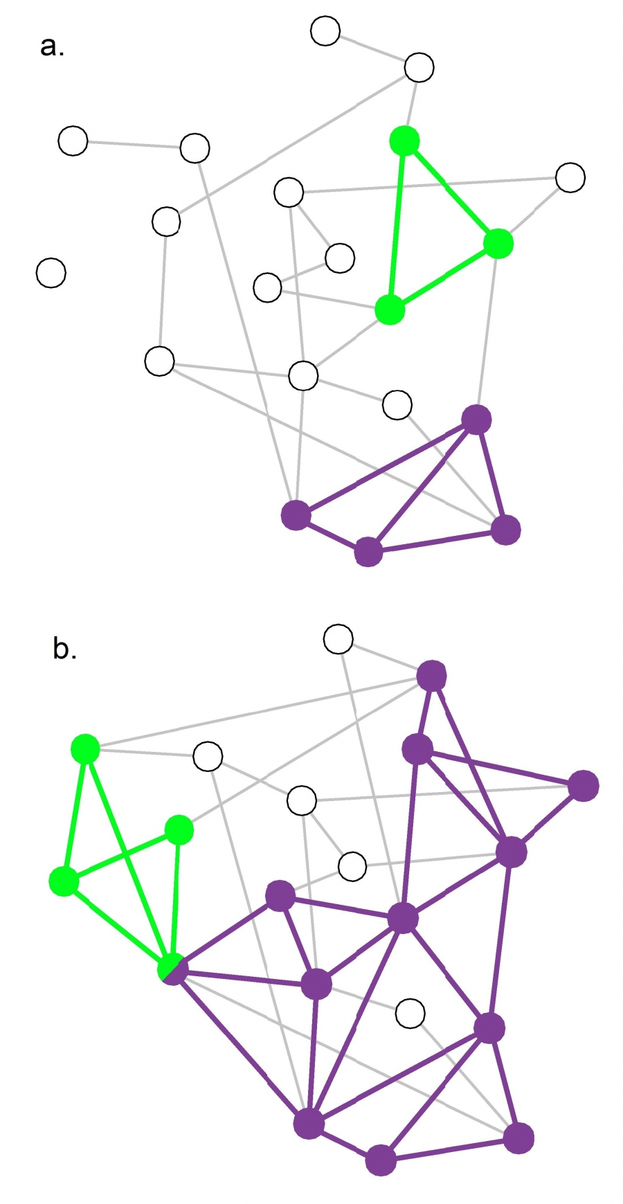 Figure 9.22 from Network Science by Albert-László Barabási
An interesting question about the CFinder algorithm is whether it would detect communities even in completely random networks. A completely random network should not have any community structure.
Suppose that k=3. If the network is sufficiently dense, it will have many triangles formed strictly based on chance, and so the algorithm would detect a number of communities even though the network structure is completely random.
So we can ask the following question: for a given network size n and value of k, what is the maximum density of a random network of size n so that the appearance of k-cliques is unlikely? Let’s call this density as the “critical density threshold”.
Obviously, the higher k is, the higher the critical density threshold should be.
It is not hard to prove that the critical density threshold is:
\[p_c(k) = {[(k-1)n]}^{\frac{-1}{k-1}}\]When the density is lower than $p_c(k)$ we expect only few isolated k-cliques. If the network density exceeds $p_c(k)$, we observe numerous cliques that form k-clique communities.
For k=2 the k-cliques are simply individual links and the critical density threshold reduces to $p_c(k) = 1/n$, which is the condition for the emergence of a giant connected component in Erdős–Rényi networks.
For k =3 the k-cliques become triangles and the critical density threshold is $p_c(k) = 1/\sqrt{2n}$
The visualization shows two random networks: one with density p=0.13 (part-a) and the other with density p=0.22 (part-b). For this network size (n=20) and for k=3, the critical density threshold is 0.16. This means that the network of part-a is below the threshold, and indeed there are only three triangles in that network. Cfinder would report in that case that most network nodes do not belong to any community.
The network of part-b on the other hand is above the critical density threshold and it includes many triangles. Cfinder would report that all but four nodes of that network belong to communities. From the statistical perspective, this would be an incorrect conclusion.
The moral of the story is that before we apply the Cfinder algorithm, we should also check whether the density of the network is below or above the critical threshold for the selected value of k. If it is larger than the threshold, we should consider larger values of k (even though this would make the algorithm more computationally intensive).
Food for Thought
Derive the previous expression for the critical density threshold.
Hint: To have a giant connected component of k-cliques, the average k-clique should have at least two adjacent k-cliques (this is known as Molloy-Reed criterion – further discussed in Lesson-11). Any lower network density than the critical threshold will result in a lower average than two adjacent k-cliques to a randomly chosen k-clique.
So, consider a given k-clique X and suppose it has an adjacent k-clique. At the critical density value the expected number of additional adjacent k-cliques to X should be one. So, start by deriving the expression for the expected number of additional adjacent k-cliques to X, as a function of k and p. Then set that expectation equal to 1, and solve for p to derive the critical density threshold. You can simplify the expression assuming that n is very large.
Link Clustering Algorithm
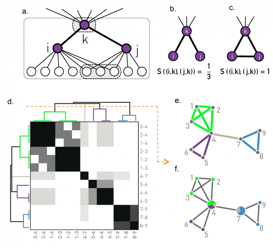 Figure 9.23 from Network Science by Albert-László Barabási
Another approach to compute overlapping communities is the link clustering algorithm. It is based on a simple idea: even though a node may belong to multiple communities, each link (representing a specific relation between two nodes) is usually part of only one community.
For example, a connection between you and a family member is probably only part of your family community, while a connection between you and a co-worker is probably only part of your professional community (unless if your family members are also your co-workers!)
So, instead of trying to compute communities by clustering nodes, we can try to compute communities by clustering links. However, how can we cluster links? We first need a similarity metric to quantify the likelihood that two links belong to the same community.
Recall that if two nodes i and j belong to the same community, we expect that they will have several common neighbors (because a community is a dense subgraph). So the similarity $𝑆((𝑖,𝑘),(𝑗,𝑘))$ of two links (i,k) and (j,k) that attach to a common node k can be evaluated based on the number of common neighbors that nodes i and j have – with the convention that the set of neighbors of a node i includes the node itself. We normalize this number by the total number of distinct neighbors of i and j, so that it is at most equal to 1 (when the two nodes i and j have exactly the same set of neighbors).
In other words, if N(i) is the set of neighbors of node i (including i) and N(j) is the set of neighbors of node j, then the link similarity metric is defined as:
\[S\left( (i,k),(j,k)\right) = \frac{N(i)\cap N(j)}{N(i)\cup N(j)}\]Now that we have a similarity metric for pairs of links, we can follow exactly the same hierarchical clustering process we studied in the previous lesson to create a dendrogram of links, based on their pairwise similarity.
Cutting that dendrogram horizontally gives us different partitions of the set of network links – with each partition corresponding to a community assignment.
These communities, however, even though they are non-overlapping in terms of links, they may be overlapping in terms of nodes.
This is shown in the toy example of part-e: there are four clusters of links, corresponding to three communities of nodes. Note that two of the nodes belong to more than one community.
The computational complexity of the link clustering algorithm depends on two operations;
- the similarity computation for every pair of links, and
- the hierarchical clustering computation.
The former depends on the maximum degree in the network, which we had derived earlier as $O(n^{2/{(\alpha-1)}})$[ in L4: Maximum Degree in a Power Law Network] for power-law networks with n nodes and degree exponent $\alpha$. The latter is $O(m^2)$, where m is the number of edges. For sparse networks, this last term is $O(n^2)$ and it dominates the former term.
Food for Thought
The link clustering algorithm follows a very different approach to perform community detection than all other algorithms we have discussed so far. Can you think of a potential issue with the interpretation of communities in this algorithm?
Application of Link Clustering Algorithm
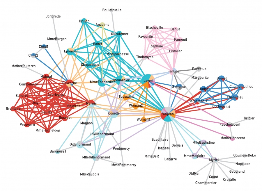 Figure 9.24 from Network Science by Albert-László Barabási
The visualization shows an application of the previous algorithm on the network that represents the pairwise interactions between the characters in Victor Hugo’s novel “Les Miserables”.
Nodes that belong to more than one community are shown as pie-charts, providing us with additional information about their degree of participation in each community.
The main character, Jean Valjean, participates in almost all communities, as we would expect.
GN Benchmark
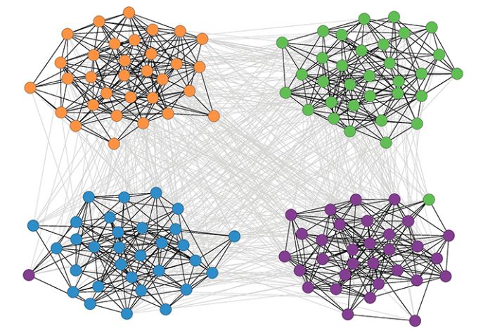 Figure 9.25 from Network Science by Albert-László Barabási
How can we test if a community detection algorithm can identify the right set of communities? In most real datasets and problems, we do not have such “ground truth” information.
So, a first task is to create synthetically generated networks with known community structure – and then to check whether a community detection algorithm can discover that structure.
Sometimes these synthetic networks are referred to as “benchmarks”.
The simplest benchmark is referred to as “Girvan-Newman (GN)”. In this model, all communities have the same size. Additionally, any pair of nodes within the same community has the same connection probability $p_{int}$, and any pair of nodes in two different communities also has the same connection probability $p_{ext}$. Consequently, the GN benchmark cannot generate a heavy-tailed degree distribution.
In more detail, we specify the number of communities $n_c$ and the number of nodes in each community $N_c$.
The total number of nodes is $N = n_cN_c$.
We also need to specify the following parameter $\mu$:
\[\mu = \frac{\mu^{ext}}{\mu^{ext}+\mu^{int}}\]where $k^{int}$ is the average number of internal connections in a community and $k^{ext}$ is the average number of external connections between communities.
If $\mu$ is close to 0 almost all connections are internal and the community is very clearly separated.
As $\mu$ increases, the community structure becomes weaker. After $\mu$ is greater than 0.5, it is more likely to see external connections that internal, meaning that there is no community structure.
The visualization shows a GN network with 128 nodes, four communities, and 32 nodes per community when $\mu$ is 40%.
Community Size Distribution
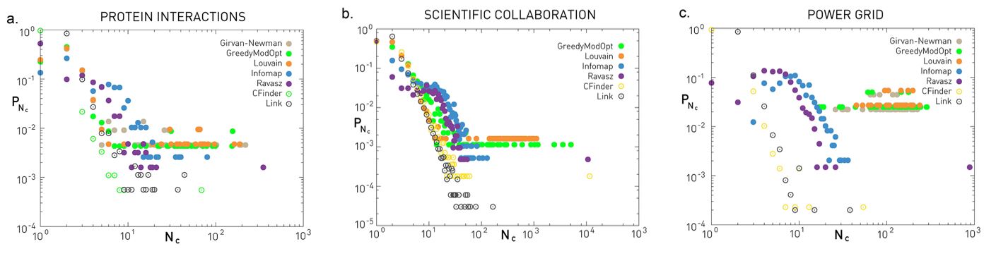 Figure 9.29 from Network Science by Albert-László Barabási
The GN benchmark creates communities of identical size. How realistic is this assumption, however?
Even though we typically do not have the ground-truth, there is increasing evidence that most networks have a power-law community size distribution.
This implies that most communities are quite small, maybe a tiny percentage of all nodes, but there are also few large communities with comparable size to the whole network.
The three plots shown here refer to three different networks (the same datasets we have seen many times in the past – discussed in your textbook).
The plots show the probability distribution of the discovered community sizes according to six different algorithms – we have discussed all of them except Infomap.
Even though there are major differences between the six algorithms (we will return to this point later in this lesson), they all tend to agree about the Protein Interaction network and the Scientific Collaboration network that the size distribution is heavy-tailed and it can be approximated by a power-law.
The situation is less clear with the Power Grid network – there are major differences between the six algorithms in terms of the shape of the community size distribution.
Food for Thought
The previous plots show several points with the same y-axis value at the right tail of the distribution. What does this mean about the number of communities with that size?
LFR Benchmark
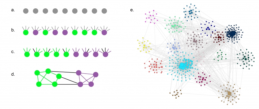 Figure 9.26 from Network Science by Albert-László Barabási
The LFR benchmark (Lancichinetti-Fortunato-Radicchi) is more realistic because it generates networks with scale-free degree distribution – and additionally, the community size follows a power-law size distribution.
We need to specify the total number of nodes n, the parameter $\mu$ that we also saw in the GN benchmark, two exponent parameters: $\gamma$ for the node degree distribution and $\zeta$ for the community size distribution, as well as the minimum and maximum values for the degree distribution and the community size distribution.
LFR starts with n disconnected nodes, giving each of them a degree (number of stubs) based on the degree distribution.
Also, each node is assigned to a community based on the community size distribution (see part-a and part-b).
The stubs of each node are then classified as either internal, to be connected to other internal stubs of nodes in the same community – or external, to be connected to available external stubs of nodes in other communities (see part-c). This stub partitioning process is controlled by the parameter 𝜇 of the GN benchmark.
The connections between nodes are then assigned randomly as long as a node has available stubs of the appropriate type (internal vs external) (see part-d).
The visualization part-e shows an LFR network with n=500, $\mu$=0.4, $\gamma$=2.5, and $\zeta$=2. Note that the 16 communities have very different sizes, and the nodes are also highly heterogeneous in terms of degree.
Normalized Mutual Information (NMI) Metric
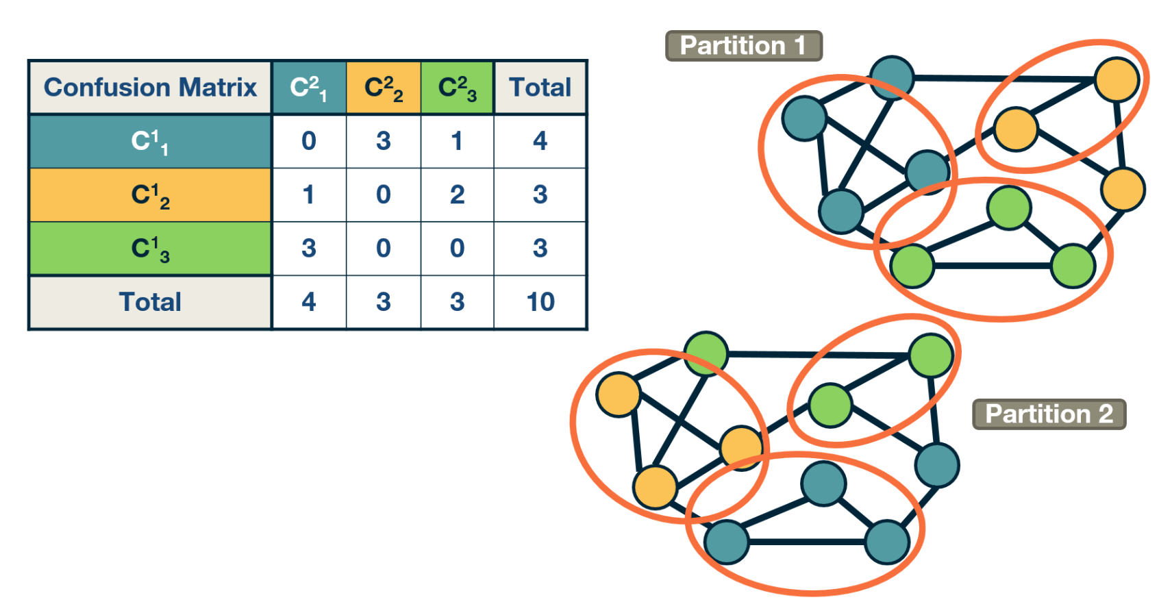 Example: Confusion matrix with two partitions.
Suppose that we have two community partitions, $P_1$ and $P_2$, of the same network. It may be that each partition was generated by a different community detection algorithm – or that one of the two partitions corresponds to the ground truth.
The question we now address is: how can we compare the two partitions?
To make such comparisons in a statistical manner, we need the joint distribution 𝑝$P(C_i^1, C_j^2)$ of the two partitions, i.e., the probability that a node belongs to the i’th community $C_i^1$ of the first partition and the j’th community $C_j^2$ of the second partition.
The marginal distribution $p(C_i^1)$ of the first partition represents the probability that a node belongs to community $C_i^1$ of the first partition. Similarly for the marginal $P(C_j^2)$ of the second partition.
The “confusion matrix” (see the visualization) can be used to calculate the previous joint distribution – as well as the two marginal distributions (last row and last column).
A common way to compare two statistical distributions in Information Theory is through the Mutual Information – this metric quantifies how much information we get for one of two random variables if we know the value of the other. If the two random variables are statistically independent, we do not get any information. If the two random variables are identical, we get the maximum information.
When the two random variables represent the two community partitions of the same network, the definition of Mutual Information is written as:
\[\sum_{i,j} p(C^1_i, C^2_j) \, \log_2 \frac{p(C^1_i, C^2_j) }{p(C^1_i) p(C^2_j)}\]To get a metric that varies between 0 (statistically independent partitions) and 1 (identical partitions), we need to normalize the mutual information with the average entropy of the two partitions,
\[\frac{1}{2} [H(p(C^1)) + H(p(C^2))]\]Recall that $H(p(X))$ is the entropy of the distribution p(X) of random variable X, defined as:
\[H(X) = - \sum_x p(x) \, \log_2 p(x)\]So, to summarize, the Normalized Mutual Information metric (NMI) is defined as:
\[\mbox{NMI} = I_n = \frac{\sum_{i,j} p(C^1_i, C^2_j) \, \log_2 \frac{p(C^1_i, C^2_j) }{p(C^1_i) p(C^2_j)}} {\frac{1}{2} [H(p(C^1)) + H(p(C^2))]}\]Food for Thought
Show that the minimum value of the mutual information metric results when the two partitions are statistically independent, and that the maximum value results when they are identical. Also, what is that maximum value?.
Accuracy Comparison of Community Detection Algorithms
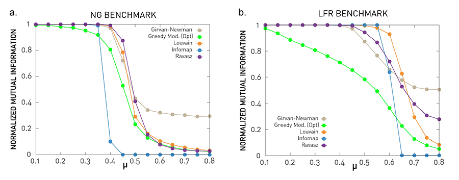 Figure 9.27 from Network Science by Albert-László Barabási
Let’s now compare some of the community detection algorithms we have seen so far (at least those that result in non-overlapping communities).
In the previous lesson, we covered the Girvan-Newman algorithm (top-down hierarchical clustering based on the edge betweenness centrality metric), the Ravasz algorithm (agglomerative hierarchical clustering), the greedy modularity optimization algorithm, and the Louvain algorithm (also based on modularity optimization). The plots also show results for Infomap, which is an algorithm that is based on the maximization of an information-theoretic metric of community structure rather than modularity.
The comparisons use the NMI metric, and the two benchmarks we introduced earlier: GN and LFR. Recall that the parameter $\mu$ quantifies the strength of the community structure in the network – when $\mu$ < 0.5 the network has clearly separated communities, while $\mu$ is close to 1 there is no real community structure.
The benchmark parameters are N=1,000 nodes, average degree: $\bar{k}$=20, degree exponent (LFR) $\gamma$=2, maximum degree (LFR): $k_{max}=50$, community size exponent (LFR) $\zeta$=1, maximum community size (LFR): 100, minimum community size (LFR): 20. Each curve is averaged over 25 independent realizations.
The Louvain algorithm and the Ravasz algorithm (cutting the dendrogram based on maximum modularity) seem to behave consistently well in both benchmarks. The Girvan-Newman algorithms seem to report communities even where are no real communities (for high values of $\mu$).
Food for Thought
The greedy modularity maximization algorithm is less accurate even for low values of $\mu$ , when the communities are quite clearly defined. What do you think causes this inaccuracy?
Run Time Comparisons
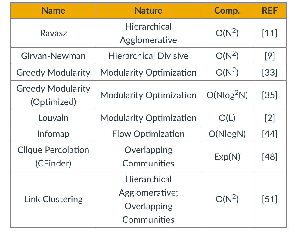
In terms of run-time, the table summarizes the worst-case run time of each of the algorithms we have reviewed so far (we have not covered Infomap in these lectures), including the two algorithms for overlapping community detection (Cfinder and Link Clustering). N is the number of nodes. The references refer to the textbook’s bibliography.
In sparse networks (where the number of links is $L=O(N))$ the Louvain algorithm is the fastest in terms of algorithmic complexity. In dense networks (where $L=O(N^2)$), the Infomap and greedy modularity maximization algorithms are faster.
Remember however that most networks are sparse in practice – and these are only worst-case asymptotic bounds. What happens in practice when we compare the run-time of these algorithms?
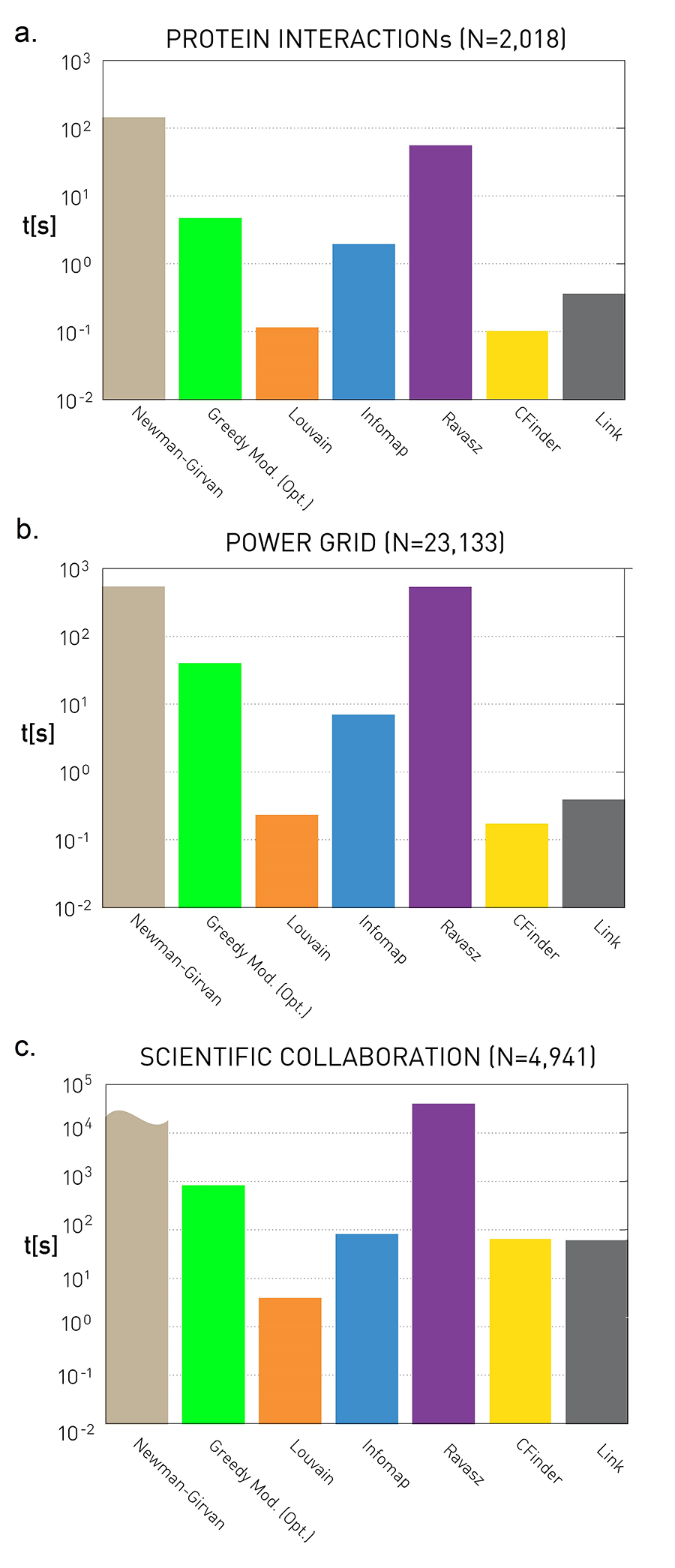 Figure 9.28 from Network Science by Albert-László Barabási
These plots quantify the empirical run-time of the previous community detection algorithms for three small/medium network datasets. The y-axis values are in seconds.
As expected, the fastest algorithm is Louvain. Surprisingly, even though the Cfinder algorithm has an exponential worst-case run-time, it performs quite competitively in practice. The Newman-Girvan algorithm is the slowest among the seven algorithms.
Food for Thought
Make sure that you know how to derive the worst-case run-time complexity of every community detection algorithm we have discussed.
Dynamic Communities
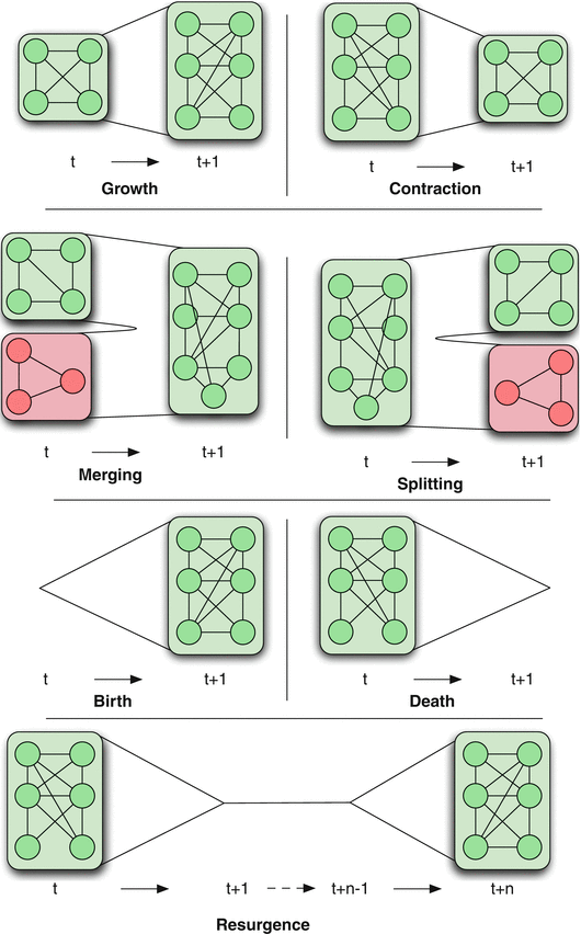 Figure 1 Dynamic Community Detection.by Cazabet R., Amblard F.
In practice, many networks change over time through the creation or removal of nodes and edges. This dynamic behavior also causes changes in the community structure of the network.
There are various ways in which the community structure may change from time t to time t+1, also shown in the visualization:
Growth: a community can grow through new nodes.
Contraction: a community can contract through node removals.
Merging: two or more communities can merge into a single community.
Splitting: one community can split into two or more communities.
Birth: a new community can appear at a given time.
Death: a community can disappear at any time.
Resurgence: a community can only disappear for a period and come back later.
The problem of detecting communities in dynamic networks is more recent and there is not a single method yet that is considered generally accepted. Most approaches in the literature follow one of the following three general approaches.
Dynamic Communities – Approach #1
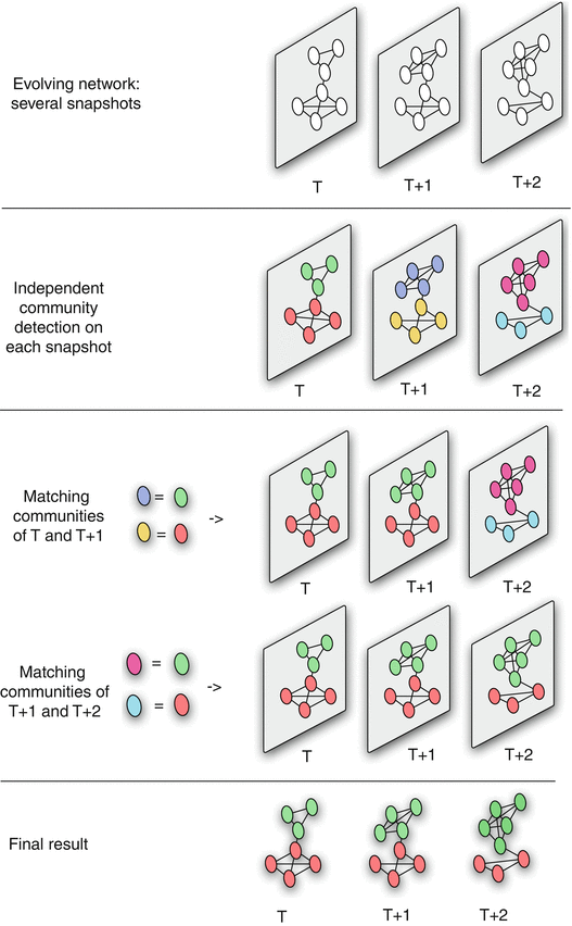 Figure 2 Dynamic Community Detection.by Cazabet R., Amblard F.
The first approach is that a community detection algorithm is applied independently on each network snapshot, without any constraints imposed by earlier or later network snapshots.
Then, the communities identified at time T+1 are matched to the communities identified at time T based on maximum node and edge similarity.
This process is illustrated in the visualization for three successive snapshots. Note that the green community experiences gradual growth while the red community experiences contraction.
The main advantage of this approach is its simplicity, given that we can apply any algorithm for community detection on static networks.
Its main disadvantage however is that the communities of successive snapshots can be significantly different, not because there is a genuine change in the community structure, but because the static community detection algorithm may be unstable, producing very different results even with minor changes in the topology of the input graph.
Dynamic Communities – Approach #2
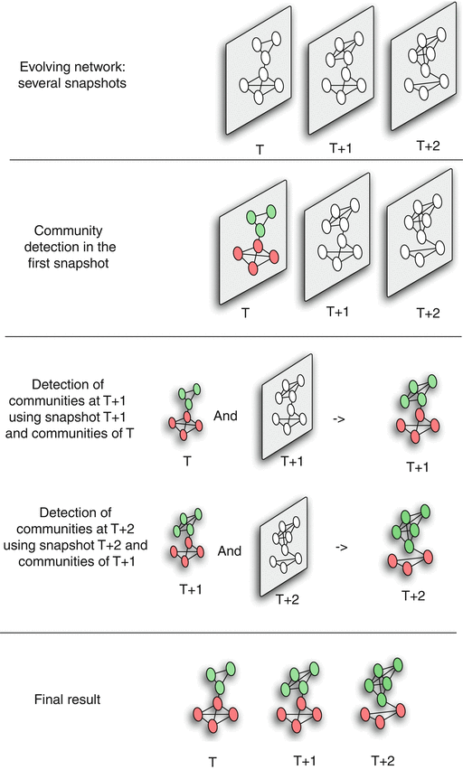 Figure 3 Dynamic Community Detection.by Cazabet R., Amblard F.
The second approach attempts to compute a good community structure at time T+1 also considering the community structure computed earlier at time T.
To do so, we need to modify the objective function of the community detection optimization problem: instead of trying to maximize modularity at time T+1, we aim to meet two goals simultaneously: have both high modularity at time T+1 and maintain the community structure of time T as much as possible.
This is a trade-off between the quality of the discovered communities (quantified with the modularity metric) and the ”smoothness” of the community evolution over time.
Such dual objectives require additional optimization parameters and trade-offs, raising concerns about the robustness of the results.
Food for Thought
Write down a mathematical expression for a dual optimization objective mentioned above. You know how modularity is defined. How would you define the smoothness of community evolution?
Dynamic Communities – Approach #3
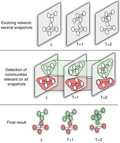 Figure 4 Dynamic Community Detection.by Cazabet R., Amblard F.
A third approach is to consider all network snapshots simultaneously. Or, a more pragmatic approach would be to consider an entire “window” of network snapshots $(𝑇,𝑇+1,𝑇+2,…𝑇+𝑊−1)$ at the same time,
Algorithms of this type create a single “global network” based on all these snapshots as follows:
- A node of even a single snapshot is also a node of the global network, and an edge of even a single snapshot is also an edge between the corresponding two nodes at the global network.
- Additionally, the global network includes edges between the instances of any node X at different snapshots (so if X appears at time T and at time T+1, there will be an edge between the corresponding two node instances in the global network).
- After creating the global network, a community detection algorithm is applied on that network to compute a “reference” community structure.
- Then, that reference community structure is mapped back to each snapshot, based on the nodes and edges that are present at that snapshot.
This approach usually produces the smoothest (or most stable) results – but it can miss major steps in the evolution of the community structure (such as communities that merge or split). This last point however also depends on the length of the window W.
Food for Thought
Write down a mathematical expression for a dual optimization objective mentioned above. You know how modularity is defined. How would you define the smoothness of community evolution?
Participation Coefficient
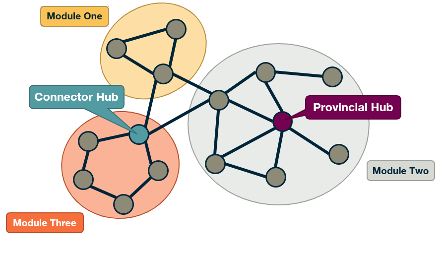
An interesting question is to examine the role of individual nodes within the community they belong to.
Is a node mostly connected to other nodes of the same community? Or is it connected to several other communities, acting as a “bridge” between its own community and others? A commonly used metric to answer such questions is the Participation Coefficient of a node, measuring the participation of that node in other communities.
Suppose that we have already discovered that the network has $n_c$ communities (or modules). Also, let $k_{i,s}$ be the number of links of node i that are connected to nodes of community s, and $k_i$ the degree of node i.
The participation coefficient is then defined as:
\[P_i = 1 - \sum_{s=1}^{n_c} \left(\frac{k_{i,s}}{k_i}\right)^2\]Note that if all the connections of node i are with other nodes in its own community, we have that $P_i=0$. An example of such a node is the highlighted node at module-two in the visualization.
On the other hand, if the connections of node i are uniformly distributed with all $n_c$ communities, the participation coefficient will be close to 1. This is the case with the highlighted node at module-three in the visualization.
The (loose) upper bound $P_i=1$ is approached for nodes with very large degree $k_i$, if their connections are uniformly spread to all $n_c$ communities.
Food for Thought
What is the rationale for the “squaring operation” at the previous formula? Why not just take the summation of those fractions?
Within-module Degree
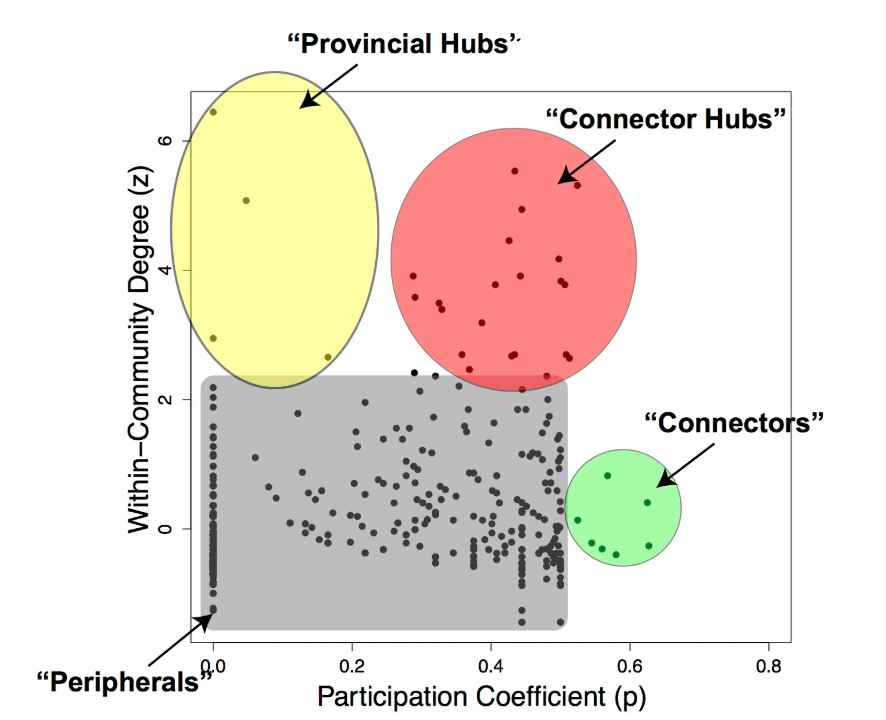 Figure from Worked Example: Centrality and Community Structure of US Air Transportation Network. by Dai Shizuka
Another important question is whether a node is a hub or not within its own community.
A metric to answer this question is the normalized “within-module degree”:
\[z_i = \frac{\kappa_i - \bar{\kappa}_{i}}{\sigma_{\kappa_i}}\]where $\kappa_i$ is the “internal” degree of node i, considering only connections between that node and other nodes in the same community, $\bar{\kappa_i}$ is the average internal degree of all nodes that belong in the community of node i, and $\sigma_{\kappa_i}$ is the standard deviation of the internal degree of those nodes.
So, if a node i has a large internal degree, relative to the degree of other nodes in its own community, we consider it a hub within its module.
If we combine the information provided by both the participation coefficient and the within-community degree, as shown in the visualization, we can identify four types of nodes, based on the nodes that have unusually high values of $P_i$ and $z_i$:
- Connector Hubs: nodes with high values of both $P_i$ and $z_i$. These are hubs within their own community that are also highly connected to other communities, forming bridges to those communities.
- Provincial Hubs: nodes with high value of $z_i$ but low value of $P_i$. These are hubs within their own community but not well connected to nodes of other communities.
- Connectors: nodes with high value of $P_i$ but low value of $z_i$. These are not hubs within their module – but they form bridges to other communities.
- Peripheral nodes: nodes with low values of both $P_i$ and $z_i$. Everything else – this is how the bulk of the nodes will be classified as.
Clearly, these four types are heuristically defined and there are always nodes that would fall somewhere between these four roles.
Case Study: Metabolic Networks
 Figure 3: Cartographic representation of the metabolic network of E. coli. from Functional cartography of complex metabolic networks. by Guimerà, R., Nunes Amaral, L.
To illustrate these concepts, let us review the main results of a research article (“Functional cartography of complex metabolic networks” by Guimera and Luis A. Nunes Amaral, Nature 2005) that analyzed the metabolic networks of twelve organisms. They identified an average of 15 communities (the maximum was 19 communities for Homo sapiens and the minimum was 11 for Archaeoglobus fulgidus).
The visualization shows the network of these communities in the case of E.Coli (19 communities). Each circle corresponds to a community. The colors within each community are associated with a specific type of metabolic pathways, classified based on the KEGG database (see upper left).
The triangles, hexagons, or squares within some communities identify specific metabolites that play the role of non-hub connectors, connector hubs, or provincial hubs, respectively. For example, L-glutamate is a provincial hub within the amino-acid metabolism module.
The network at the right shows the E.Coli metabolic network (473 nodes, 574 edges, using the KEGG color code).
δ-MAPS
We will now look at an application of community detection in the analysis of spatiotemporal data, and in climate change in particular. The method that we’ll be using to detect communities is called Delta maps and it was developed by the instructor and PhD student, llias Fountalis.
Delta maps is appropriate for any application in which we are given spatiotemporal data that show an activity time series of its point of a grid space. The goal delta maps is to detect contiguous blocks of space referred to as functional domains or simply domains. That behave in a very homogeneous manner over time. So its applications are common in climate science where the activity time series may be temperature, humidity, pressure at different points on the planet, or the atmosphere.
Delta maps can also be used to analyze spatiotemporal data that represents neural activity. Here the activity time may be EEG signals from different electrodes or FMRI measurements at different voxels. After delta maps detects the homogeneous communities or domains, it forms a weighted network between domains based on the strength of the statistical correlation between the aggregate signal of each domain pair.
δ-MAPS – Domain Homogeneity Constraint
In the following we simplify the presentation of the delta-MAPS method – the reader can find additional information in the following research paper:
δ-MAPS: From spatio-temporal data to a weighted and lagged network between functional domains.
The input is a timeseries $x_i(t)$ for each grid point i.
The similarity between two grid points i and j is quantified using Pearson’s cross-correlation $r_{i,j}$.
More advanced correlation metrics could be used instead (such as mutual information). Additionally, the correlation could be calculated at different lags. Links to an external site.
A domain A(s) with seed s (a specific grid point) is the largest possible spatially contiguous set of points including s such that their average pairwise correlation $\hat{r}(A)$ is greater than the parameter of the method $\delta$.
The objective of Delta-MAPS is to identify the minimum number of such maximal “domains” in the given data.
For example, the visualization shows the detected domains when Delta-MAPS is applied to Sea Surface Temperature (SST) monthly data (HadISST) for the time period of about 50 years (after removing the effects of seasonality). Each spatially contiguous region is a domain. You can think of a domain as a network community in which the nodes are grid points in space, and the edge weight between two nodes is equal to the cross-correlation of their activity time series.
Note that there are 18 such domains in this data. The red regions correspond to spatial overlaps between adjacent domains – Delta-MAPS allows for overlapping communities.
Another feature of the method is that not every node needs to belong to a community – as we see there are many grid points on the oceanic surface that do not belong to any domain.
Food for Thought
Can you think of different ways to state (not solve) the optimization problem that Delta-MAPS focuses on? What could be another way to define a spatially contiguous domain (instead of using a constraint on the average pairwise correlation)?
δ-MAPS: Algorithm Overview
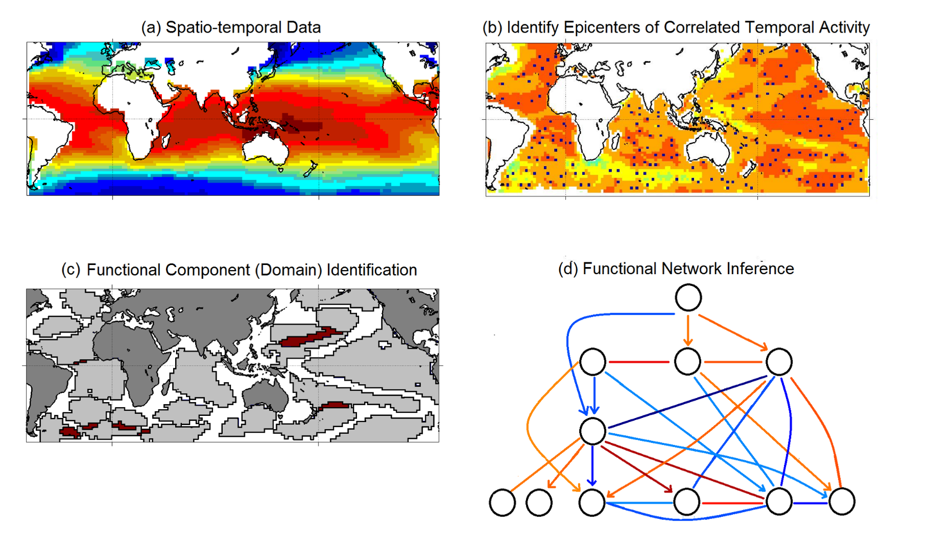 Figure from “δ-MAPS: from spatio-temporal data to a weighted and lagged network between functional domains” by Fountalis, I., Dovrolis, C., Bracco, A. et al., 2018
Here is a short overview of the Delta-MAPS algorithm:
The algorithm starts with a time series $x_i(t)$ for each point in space (part-a shows the average of that time series for each grid point).
Then, Delta-MAPS selects potential domain seeds. These points are local maxima of the spatial correlation field (part-b, “epicenters of correlated temporal activity”).
Then, the algorithm proceeds iteratively, identifying one domain at a time. The domain identification starts by selecting the next available seed of maximum spatial correlation. The algorithm then selects, in a greedy manner, as many points as possible around the chosen seed so that it forms a maximal spatially contiguous block of points that satisfy the homogeneity constraint $\delta$ (part-c, “domain identification”).
Finally, the algorithm identifies functional connections between domains, based on how strong their pairwise correlations are. These correlations can be positive (red) or negative (blue), and lagged (part-d, “functional network inference”).
Application in Climate Science
 Figure from “δ-MAPS: from spatio-temporal data to a weighted and lagged network between functional domains” by Fountalis, I., Dovrolis, C., Bracco, A. et al., 2018
Here is a summary of the results when Delta-MAPS was applied on the Sea-Surface Temperate (SST) monthly data mentioned earlier (time period 1956-2005).
The number of grid points is 6000. Delta-MAPS identified 18 domains, showing the great potential for dimensionality reduction using this method.
35% of the grid cells do not belong to any domain.
The largest and strongest (in terms of network connections) domain is the ENSO region at the Pacific ocean (domain E – see part-A and part-B).
The connections between the ENSO domain and other domains are shown in part-C. Some of these connections are positive correlations while others are negative. For instance, ENSO is positively correlated with the domain at the Indian ocean as well as the North Atlantic, while it is negatively correlated with the domain at the South Atlantic.
The complete functional network between domains is shown in part-D. Some edges are directional, meaning that the correlations are strongest at a certain lag. These lags are shown for each edge at part-E. For instance, the edge from Q to E means that the activity at domain Q precedes the activity of domain E with a time difference of about 10 months.
The network of part-D forms a 3-4 layer hierarchy. Even though ENSO (domain E) is the most connected domain, it is not at the root of this hierarchy. Instead, region Q, west of Africa in the South Atlantic, seems to be ”ahead” of all other domains and it can be used to predict, to some extent, the activity of other domains months in advance.
Finally, part-F shows a number of domain “triangles” in this network, showing that their lags are temporally consistent. For instance, Q is ahead of E by about 10 months, Q is ahead of F by about 8-10 months, while F and E do not have a clear precedence relation between them (the lag range is between -2 to +1 months).
Food for Thought
How would you identify the correct lag between two correlated timeseries? Why do you think Delta-MAPS report a range of such lags instead of a single value?
Lesson Summary
This lesson introduced you to several important topics about community detection:
- Overlapping communities
- Dynamic communities
- Synthetically generated communities
- Evaluating community detection algorithms using the Normalized Mutual Information (NMI) metric The notion of connector hubs and provincial hubs in the community structure of a network
- An application of overlapping community detection from spatio-temporal data in the context of climate science
- The area of community detection is still an active research topic, especially in the context of dynamic or temporal networks, multi-layer networks, and inter-dependent networks.
It also has many applications in a wide spectrum of disciplines, making it an excellent topic for applied research projects.
Module four
L9 - Spreading Phenomena on Networks and Epidemics
Overview
Required Reading
- Chapter-10 from A-L. Barabási, Network Science , 2015.
Recommended Reading
- Super-spreaders in infectious and Richard A.Stein, International Journal of Infectious Diseases, August 2011
- Cellular Superspreaders: An Epidemiological Perspective on HIV Infection inside the Body Kristina Talbert-Slagle et al., 2014
Spreading Phenomena on Networks & Epidemics
The COVID-19 pandemic has changed our world in ways that we can still not comprehend. Millions of people have been infected and hundreds of thousands have died. Epidemics and pandemics are not new, however. They have been a major threat to humanity since the beginning of recorded history. In the last few decades, however, they are becoming more frequent and they spread faster because of overpopulation, increased mobility through air travel, and the human invasion in wild-life habitats.
You may wonder: why study epidemics in a network science course? The pathogens that cause epidemics spread through networks of humans. These networks may refer to sexual partners, breathing the same air when in close proximity, or touching the same materials. In all cases, there is an underlying network however and how the epidemic will spread depends on the structure of that network, as will see in more detail in this lesson.
Various Classes of Epidemic Models
Epidemiologists use a wide spectrum of models to study the spread of epidemic and to evaluate different intervention strategies such as quarantines, travel restrictions or vaccinations. This visualization shows some of hte more common modeling strategy. First, the compartmental model, here the models assume that individuals belong to a small number of compartments such as susceptible, exposed, infected, or removed recovered.
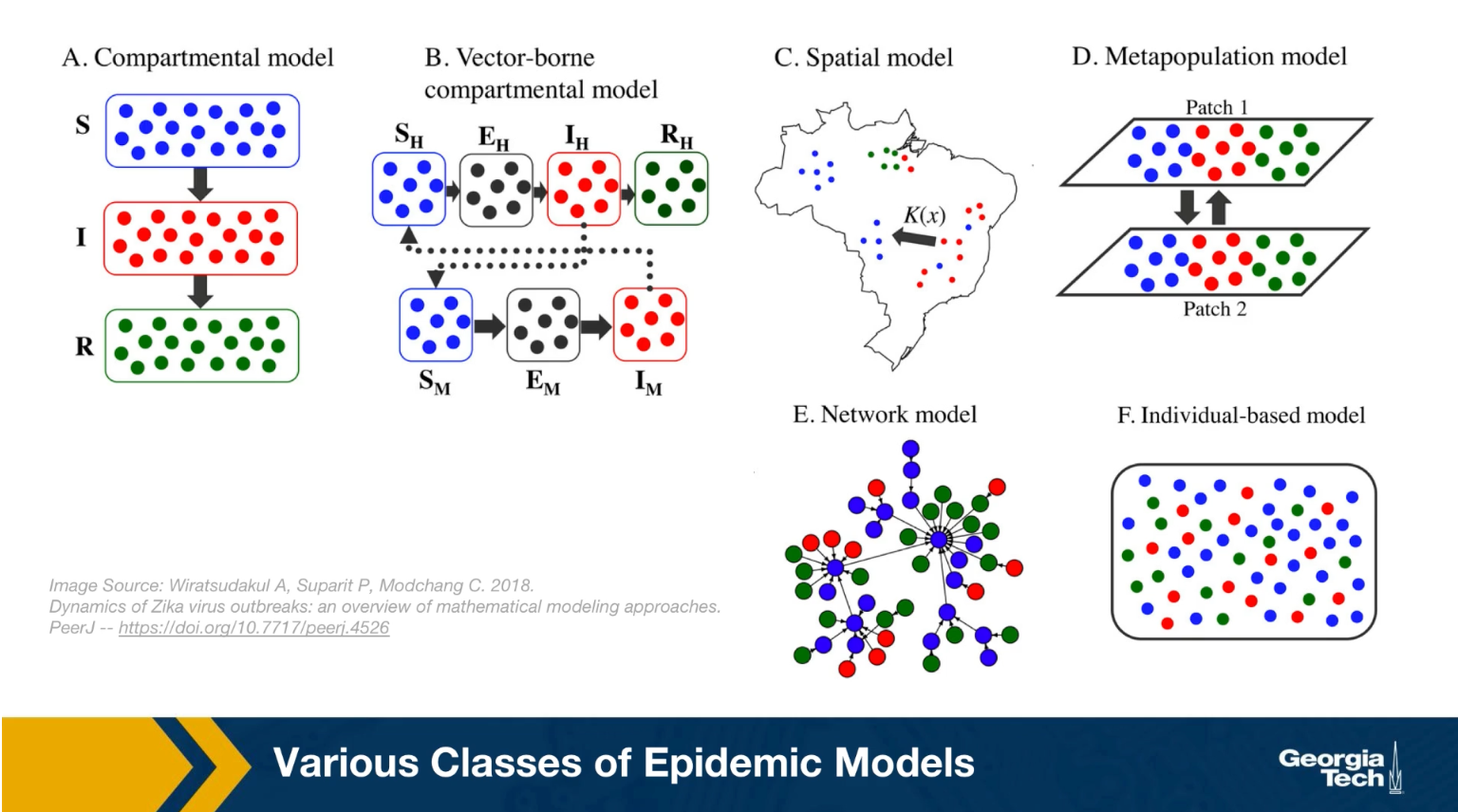
Some of the models we will study mathematically later in this lesson belong in this class. Such models do not capture the network structure of the population. Instead, they assume that all individuals have the same number of contacts. The only difference between individuals is their epidemiological state, their compartment.
The second one, is the vector-borne compartmental model. Here we consider both the vectors for example, the mosquitos and the hosts, the humans have an infectious disease and their epidemiological state.
In the third class the special models we also consider the population density at different locations. This is necessary when the goal of the model is to predict how an epidemic will spread in a country or city.
In the fourth class, the metapopulation models, here are the population is modeled with two or more subpopulations. It’s with difference mobility, location, or transmission characteristics. For example, we could have the heterosexual, the homosexual, the bisexual subpopulations as different parties in this kind of model.
And the firth one, is network models, here we mostly focus on the network of contacts between individuals. The properties of this network, for example, that degree distribution can have major implications on the spread of an epidemic. And finally, individual based models are the most detailed, but also the most computational intensive because here we have to capture what happens to each individual as he or she moves around. How the network neighbors change, and how the epidemiological state of those neighbors also changes
Other Spreading Processes on Networks
We should note that the biological pathogens epidemics are not the only spreading processes on networks. There are many other entities that can spread on a network. Some of them physical, but others can be digital such as computer viruses or informational, such as rumors or even fake news. Some of the models we will study next in the context of epidemics are also applicable in these different spreading processes. For example, it is possible to study the spread of a computer virus through a biological epidemic model.
We should be careful, however, to not over generalize because some of these spreading processes are fundamentally different than biological epidemics.
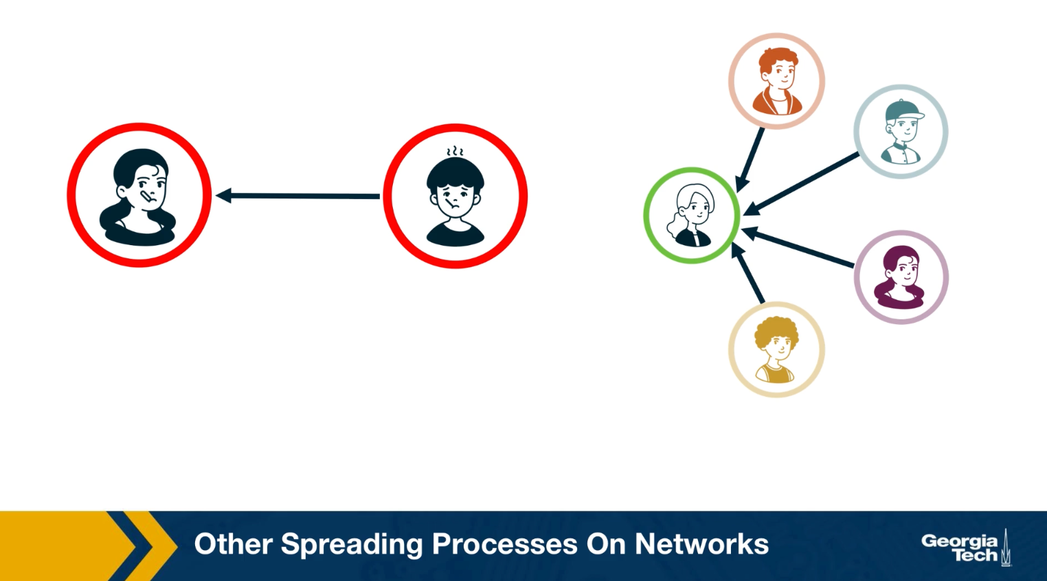
For example, in an epidemic, you can get infected simply because you came in close contact with a single infected individual once. In the context of information or meme spreading on the other hand, it is often the case that you need to come in contact multiple times and with multiple individuals before you adopt it yourself.
SI Model
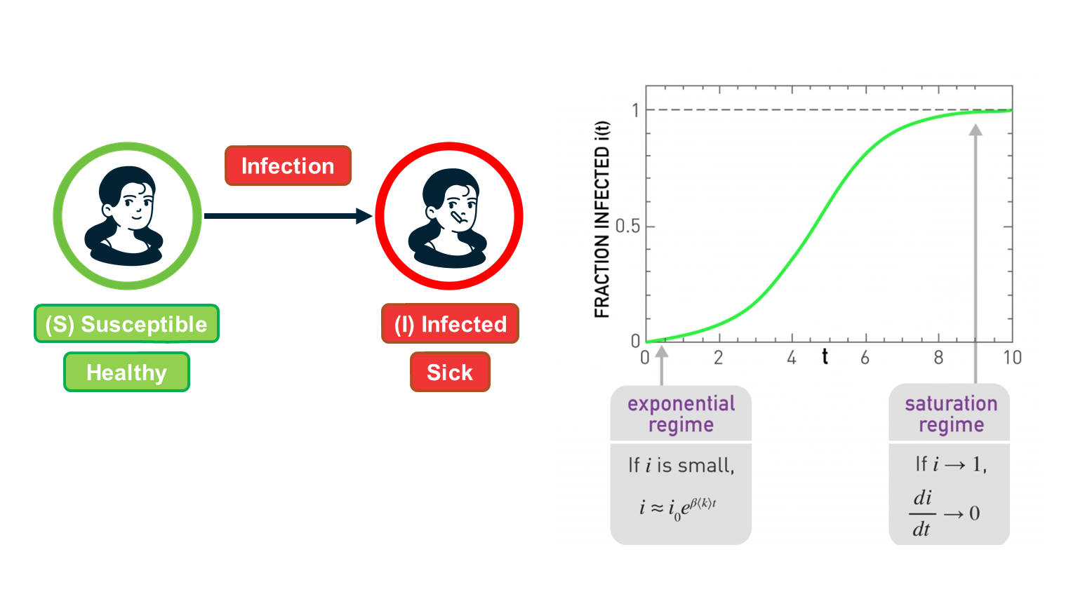 Figure 10.5 from Network Science by Albert-László Barabási
Suppose that we have $N$ individuals in the population and, according to the homogeneous mixing assumption, each individual has the same number of contacts $\bar{k}$ (this is shown as
In the SI model, there are two compartments: Susceptible (S) and Infected (I) individuals. To become infected, a susceptible individual must come in contact with an infected individual. If someone gets infected, they stay infected.
If $S(t)$ and $I(t)$ are the number of susceptible and infected individuals as functions of time, respectively, we have that $(S(t) + I(t) = N)$. We typically normalize these two functions by the population size, and we work with the two population densities: $s(t) = S(t)/N$ and $𝑖(𝑡)=𝐼(𝑡)/𝑁$, with $s(t) + i(t)= 1$.
The infection starts at time=0 with a single infected individual: $𝑖(0)=1/𝑁=𝑖_0$.
Suppose that an S individual is in contact with only one infected individual. Let us define the parameter $\beta$ as follows: $\beta dt$ is the probability that S will become infected during an infinitesimal time interval of length $dt$.
Given that the S individual is in contact with $\bar{k}$ infected individuals, this probability increases to $1-\left(1-\beta dt\right)^\bar{k} \approx 1-\left(1-\bar{k}\beta dt \right)= \bar{k} \, \beta \, {dt}$ because the infection can take place independently through any of the infected contacts (the approximation is good as long as this probability is very small).
If the density of infected individuals is $i(t)$, then the probability that the S individual becomes infected is $\bar{k} \beta i(t) dt$.
The infection process is always probabilistic but for simplicity, we can model it deterministically with a two-state continuous-time Markov process: an individual moves from the S to the I state with a transition rate $\bar{k} \beta i(t)$.
So, if the density of S individuals is $s(t)$, the increase in the density of infected individuals during $dt$ is:
\[di(t) = \bar{k} \, \beta \, i(t) \, s(t) \, dt\]Thus the SI model can be described with the differential equation:
\[\frac{di(t)}{dt} = \bar{k} \, \beta \, i(t) \, (1-i(t))\]with initial condition $𝑖(0)=𝑖_0$.
This is a nonlinear differential equation (because of the quadratic term) but it can be solved noting that
\[\frac{di}{i(1-i)} = \frac{di}{i} + \frac{di}{1-i} = \bar{k} \, \beta \, dt\]where we replaced $i(t)$ with 𝑖 for simplicity.
Integrating both sides, we get that:
\[\ln{i} - \ln{(1-i)} = \bar{k} \beta t + \mbox{constant}\]The initial condition gives us that this constant is equal to $\ln{i_0} - \ln{(1-i_0)}$.
So, if we exponentiate both sides of the previous equation we get that:
\[\frac{i}{1-i} = \frac{i_0}{1-i_0} \, e^{\bar{k} \beta t }\]- and so we get the closed-form solution for the density of infected individuals for 𝑡≥0
This function is plotted at the visualization.
There are some important things to note about this function:
- For small values of t, when the density of infected individuals is very small and the outbreak is only at its start, i(t) increases exponentially fast: $i(t) \approx i_0 e^{\bar{k} \beta t}$
- The time constant during that “exponential regime” is $\frac{1}{\bar{k}\beta}$ . This time constant is often used to quantify how fast an outbreak spreads. This time constant decreases with both the infectiousness of the pathogen (quantified by $\beta$) and the number of contacts $\bar{k}$.
- For large values of t, the density of infected individuals tends asymptotically to 1 – meaning that everyone gets infected.
Food for Thought
Perform the last derivation, showing how to get equation (1), in more detail.
SIS Model
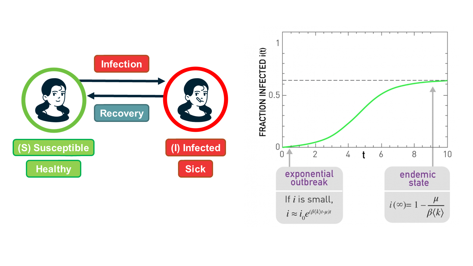 Figure 10.5 from Network Science by Albert-László Barabási
The SI model is unrealistic because it assumes that an infected individual stays infected. In practice, thanks to our immune system, we can recover from most infections after some time period. In the SIS model, we extend the SI model with an additional transition, from the I back to the S state to capture this recovery process.
The recovery of an infected individual is also a probabilistic process. As we did with the infection process, let us define as $\mu dt$ the probability that an infected individual recovers during an infinitesimal time period $dt$. If the density of infected individuals is $i(t)$, then the transition rate from the I state to the S state is $\mu i(t)$.
So, the differential equation that describes the SIS model is similar with the SI equation – but with a negative term that decreases the density of infected individuals as follows:
\[\frac{di(t)}{dt} = \bar{k} \, \beta \, i(t) \, (1-i(t)) - \mu \, i(t)\]The initial condition is, again, $i(0) = i_0$.
As in the case of the SI model, this differential equation be solved despite the quadratic term:
\[i(t) = (1-\frac{\mu}{\bar{k} \beta}) \frac{c \, e^{(\bar{k}\beta-\mu)t}}{1 + c \, e^{(\bar{k} \beta-\mu)t} }\]where c is a constant that depends on the initial condition as follows:
\[c= \frac{i_0}{(1-i_0)-\frac{\mu}{\bar{k} \beta}}\]Note that if we set $\mu=0$, we get the same solution we had previously derived for the SI model.
The SIS model can lead to two very different outcomes, depending on the magnitude of the recovery rate $\mu$ relative to the cumulative infection rate $\bar{k}\beta$:
If $\bar{k}\beta < \mu$, then the exponent in the previous solution is negative and the density of infected individuals drops exponentially fast from $i_0$ to zero. In other words, the original infection does not cause an outbreak. This happens when the recovery of the original infected individual takes place faster than the infection of his/her susceptible neighbors.
In the opposite case, when $\bar{k}\beta > \mu$, we have an exponential outbreak for small values of t (when the density of infected individuals is quite smaller than 1). In that regime, we can approximate the solution of the SIS model with the following equation: $i(t) \approx i_0 \, e^{(\bar{k} \beta-\mu)t}$
The time constant for the SIS model, during that exponential outbreak, is $\frac{1}{\bar{k} \beta-\mu}$
As time increases, when $\bar{k}\beta > \mu$ , we get that fraction of infected individuals tends to $1 - \frac{\mu}{\bar{k}\beta}$. In other words, we get a persistent epidemic in which even though individuals keep moving between the S and I states, the percentage of the population that remains sick is practically constant. This is referred to as the “endemic state”.
The ratio $\frac{\bar{k}\beta }{\mu}$ is critical for the SIS model: if it is larger than 1, the SIS model predicts that even a small outbreak will lead to an endemic state. Otherwise, the outbreak will die out. This is why we define that the epidemic threshold of this model is equal to one.
Food for Thought
Derive equation (1) in detail.
SIR Model
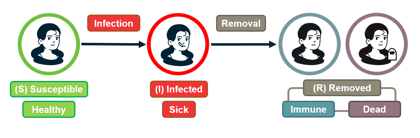
For some pathogens (e.g., the virus VZV that causes chickenpox), if an individual recovers he/she develops persistent immunity (through the creation of antibodies for that pathogen) and so the individual cannot get infected again.
For other pathogens, such as HIV, there is no natural recovery and an infected individual may die after some time.
To model both possibilities, the SIR model extends the SI model with a third state R referred to as “Removed”. The transition from I to R represents that either the infected individual acquired natural immunity or that he/she died. In either case, that individual cannot infect anyone else and cannot get infected again.
As in the case of the SIS model, we will denote as $\mu$ the parameter that describes how fast an infected individual moves out of the infected state (independent of whether this transition represents recovery/immunity or death).
There are now three population densities, one for each state, and they should always add up to one: $𝑠(𝑡)+𝑖(𝑡)+𝑟(𝑡)=1$.
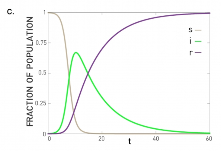 Figure 10.6 from Network Science by Albert-László Barabási
Similar with the SIS model, we can write a differential equation for the density of infected individuals:
\[\frac{di(t)}{dt} = \bar{k} \, \beta \, i(t) \, s(t) - \mu\, i(t)\]The only difference with SIR is that 𝑠(𝑡)=1−𝑖(𝑡)−𝑟(𝑡) .
The differential equation for the density of removed individuals is simply:
\[\frac{dr(t)}{dt} = \mu \, i(t)\]At this point we have a system of two differential equations, for $i(t)$ and $r(t)$, with the initial conditions: $𝑖(0)=𝑖_0$ and $𝑟(0)=0$.
If we solve these equations, the density of S individuals is simply $𝑠(𝑡)=1−𝑖(𝑡)−𝑟(𝑡)$.
The previous system of differential equations cannot be solved analytically, however. Numerically, we get plots such as the visualization (for the case $\bar{k}\beta > \mu$). In this case, the initial outbreak leads to an epidemic in which all the individuals first move to the infected state (green curve) and then to the removed state (purple line).
If $\bar{k}\beta<\mu$, the initial outbreak dies out as in the case of the SIS model, and almost the entire population remains in the S state.
So the epidemic threshold for the SIR model is also equal to one, as in the case of the SIS model.
Comparison of SI, SIS, SIR Models Under Homogeneous Mixing
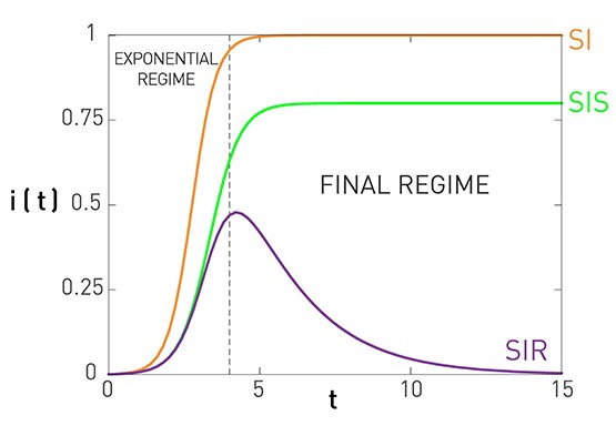 Figure 10.7 from Network Science by Albert-László Barabási
This figure summarizes the results for the SI, SIS, and SIR models, under the assumption of homogeneous mixing.
For the SI model there is no epidemic threshold and we always get an epidemic that infects the entire population.
For the SIS and SIR models we get an epidemic if the ratio $\frac{\bar{k}\beta}{\mu}$ is greater than the epidemic threshold, which is equal to one. In that case, both models predict an initial “exponential regime”. The difference between the SIS and SIR models is that the former leads to an endemic state in which a fraction $1-\frac{\mu}{\bar{k}\beta}$ of the population remains infected (if the epidemic threshold is exceeded).
There are more realistic models in the epidemiology literature, with additional compartmental states and parameters. A common such extension is to introduce an “Exposed” state E, between the S and I states, which models that individuals that are exposed to a pathogen stay dormant for some time period (until they develop enough viral load) before they become infectious. This leads to the SEIR model.
Another extension is to consider pathogens in which some infected individuals may acquire natural immunity while others may die. This requires to have two different Removed states, with different transition rates.
Number of Partners in Sexual Networks
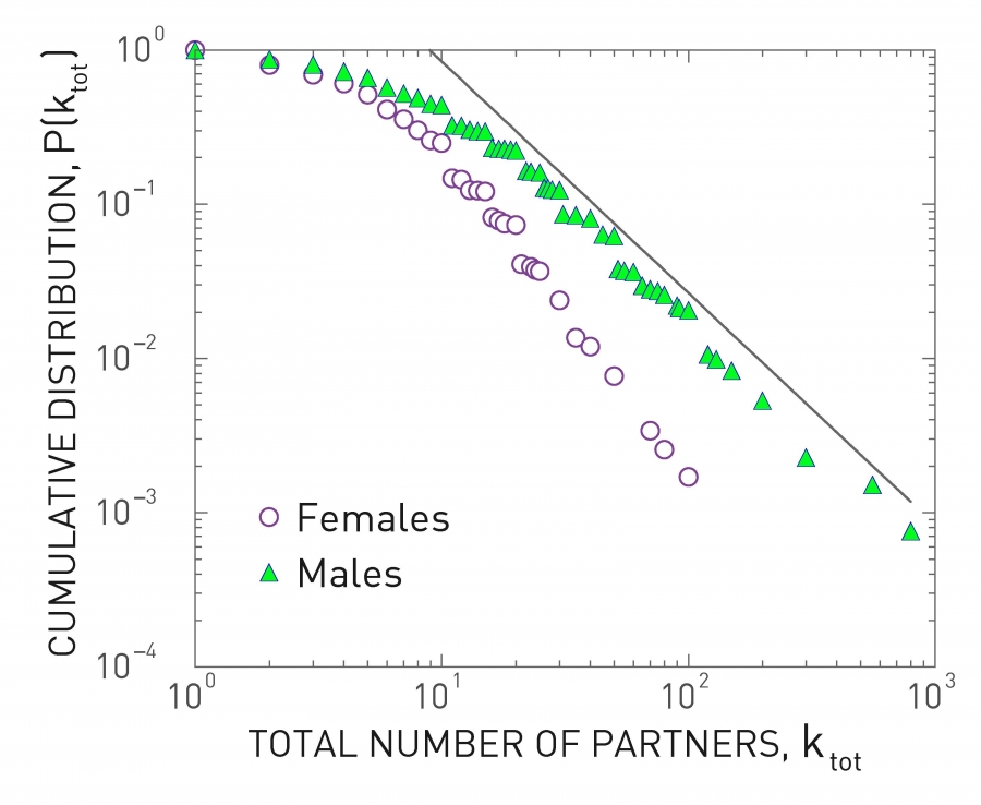 Figure 10.13 from Network Science by Albert-László Barabási
All previous derivations assume that each individual has the same number of contacts . This assumption makes the derivations simpler – but as we will see later in this lesson, it can also be misleading especially when the number of contacts of different individuals varies considerably.
Let us start with sexually transmitted diseases. The plot at the left shows the distribution of the number of sexual partners, separately for men and women, since sexual initiation in a 1996 survey in Sweden. Note that the plot is in log-log scale. The straight-line decay when the number of partners is larger than 20 suggests that the corresponding distribution follows a power-law. The exponent is about 3 for women and 2.6 for men. Even though most men had less than 10-20 partners, there are also individuals with 100s of partners
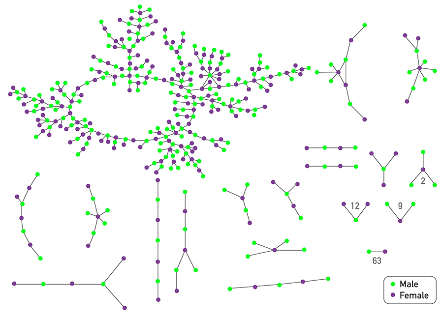 Figure 10.14 from Network Science by Albert-László Barabási
The plot at the top shows is based on a survey of high school students and “romantic relationships”. Note that even though there are 63 couples without any other connections and many other nodes with only 1-2 connections, there are also few nodes with a much higher number of such relationships (up to almost 10).
Assuming that every individual has the same number of contacts/partners would be very far from the truth at least in these two datasets. So, clearly, the homogeneous mixing assumption is very unrealistic.
Number of “Close Proximity” Contacts
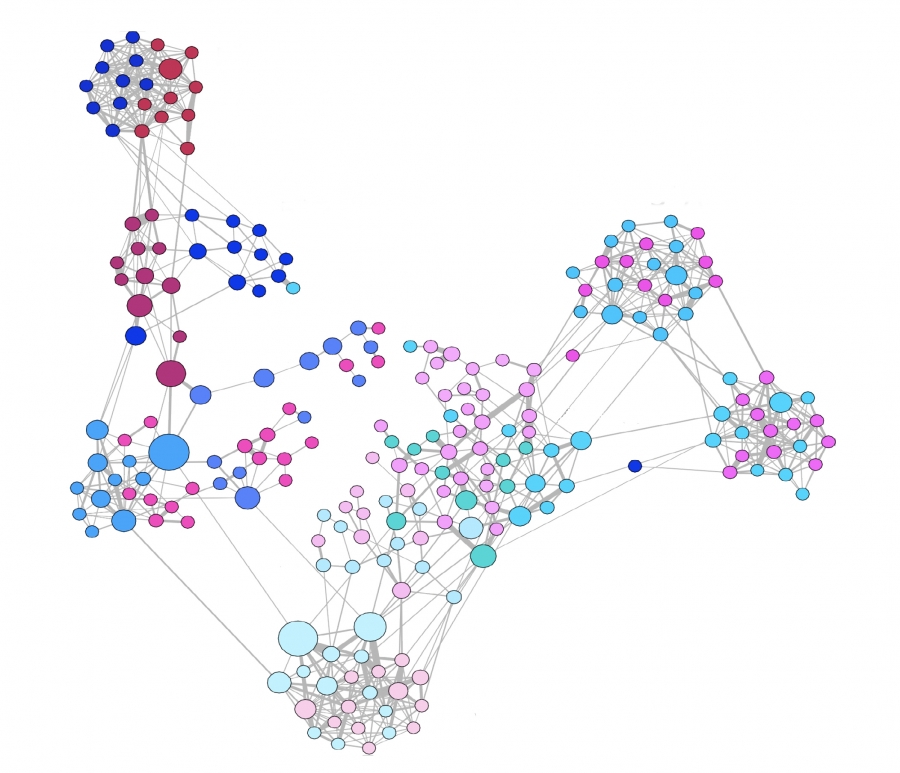 Figure 10.16 from Network Science by Albert-László Barabási
For airborne pathogens and respiratory diseases such as COVID-19, what matters more is the number of individuals we are in close proximity to. This cannot be measured with surveys but it can be measured with wireless technology such as RFID badges (Radio Frequency Identification) . Various studies have provided volunteers with RFID badges and asked them to wear them throughout the whole day (e.g., on university campuses, dorms, gyms) .
The visualization at the left refers to a network of contacts, mapped using RFID technology, between 232 students and 10 teachers across 10 classes in a school. It is also easy to see that there is a very strong community structure in this network, most likely associated with the different classes the students attend.
A common conclusion from these studies is that the number of people we come close to varies greatly across individuals. Most of us come physically close to only a small number of specific other people but some individuals interact with hundreds of other people in their daily life. RFID technology can also give us information about the duration of these interactions, which is also a very important factor in the transmission of a pathogen from an infected to a susceptible individual.
The statistical distribution of these durations is also heavy-tailed, typically following a power-law, meaning that most of our face-to-face interactions are very brief (e.g., saying hi at a corridor) but few interactions last for hours – and typically those are the most dangerous for the transmissions of viruses such as COVID-19, H1N1, influenza, etc.
Global Travel Network
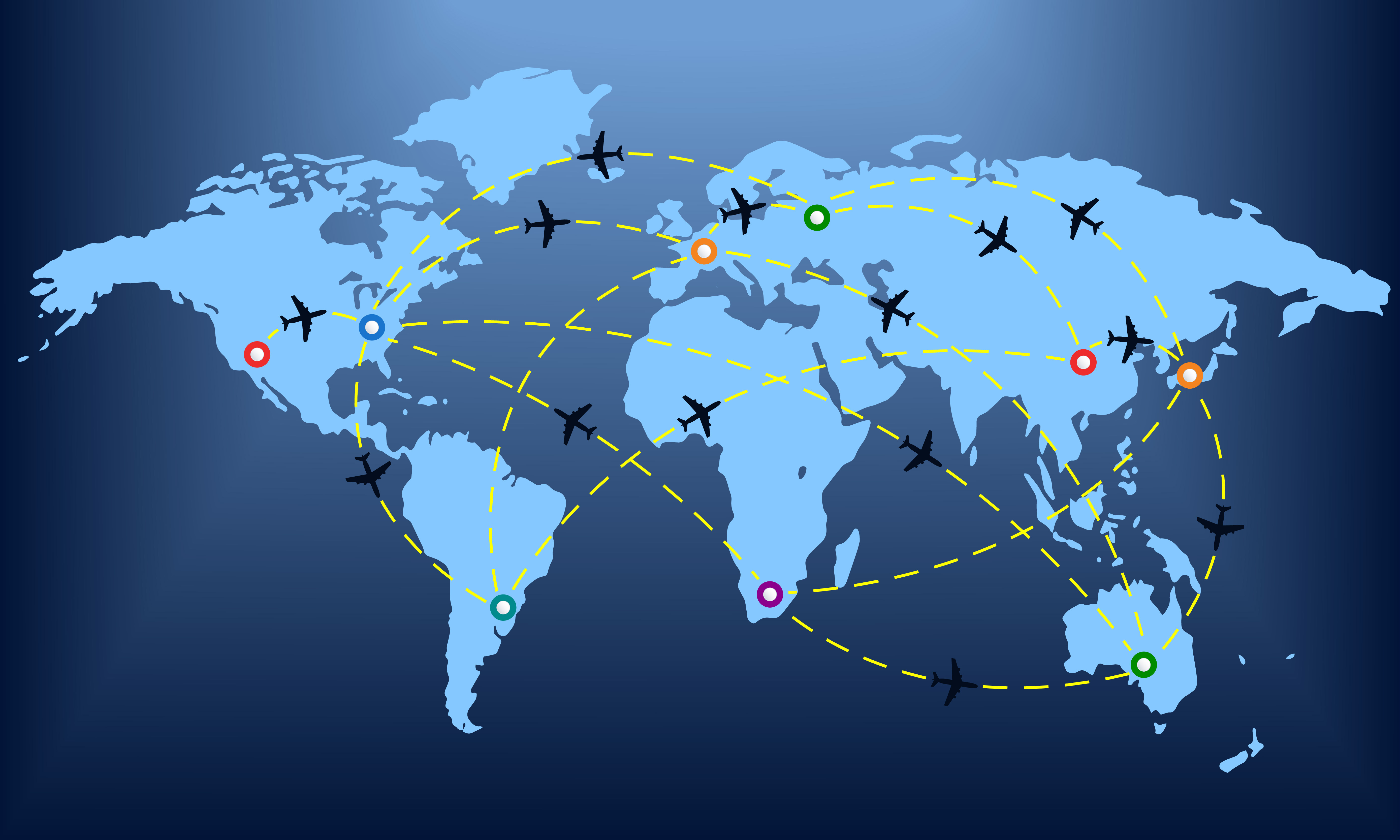
Another important factor in the spread of pathogens is the global travel network. Especially with air transportation, in the last few decades, it has become possible for an airborne virus to spread from one point of the planet to all major cities around the world within the first 24 hours.
Imagine, for instance, an infected individual sneezing while waiting at the security control line of a busy airport such as JFK. The passengers around him/her may be traveling to almost every other country on the planet.
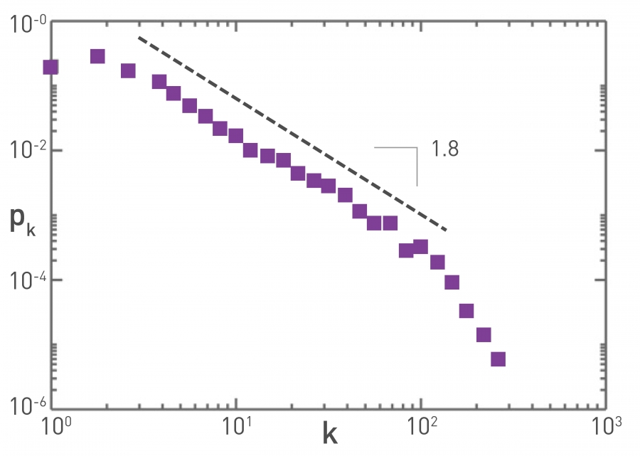 Figure 10.15 from Network Science by Albert-László Barabási
The plot at the top refers to the air transportation network, where the nodes are airports and the links refer to direct flights between airports: the degree distribution of this network is a power-law with an exponent close to 2. Atlanta’s airport is one of the most connected in the world and resides at the tail of this distribution.
Reproductive Number R0
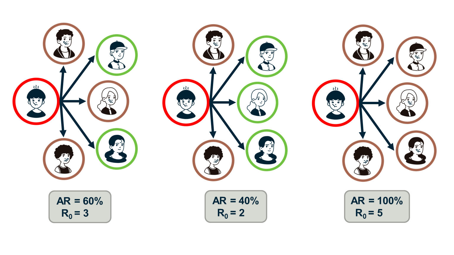
Epidemiologists often use the “reproductive number”, $R_0$, which is the average number of secondary infections that arise from a single infected individual in a susceptible population.
One way to estimate $R_0$ is to multiply the average number of contacts of an infected individual by the probability that a susceptive individual will become infected by a single infected individual (“attack rate AR”). So, the $R_0$ metric does not depend only on the given pathogen – it also depends on the number of contacts each individual has.
If the number of secondary infections from a single infected individual is $R_0$>1 then an outbreak is likely to become an epidemic, while if $R_0$<1 then an outbreak will not spread beyond a few initially infected individuals.
In the context of the SIS and SIR models, we can easily show that the reproductive number $R_0$ is equal to the ratio $\frac{\bar{k}\beta}{\mu}$.
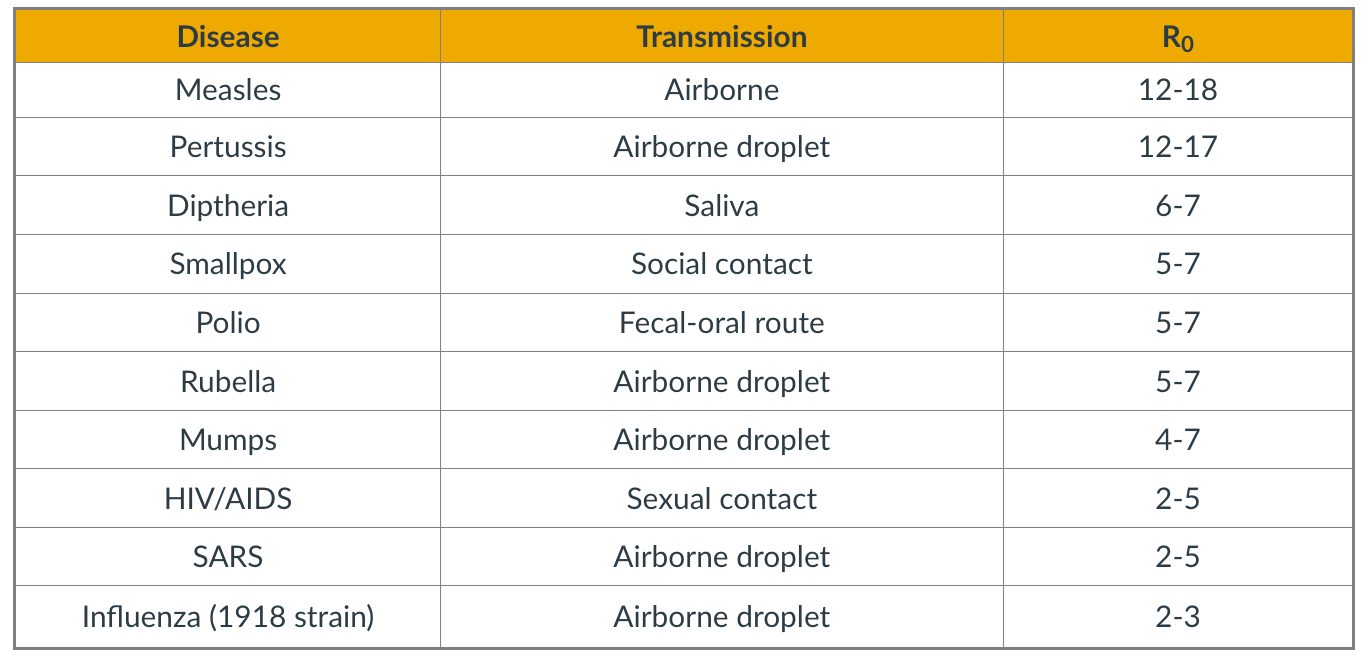 Figure 10.15 from Network Science by Albert-László Barabási
The table shows the estimated reproductive number for some common infectious diseases.
Note that $R_0$ also depends on the number of contacts – and so this metric can vary with time because of interventions such as quarantines, social distancing, or safe-sex practices. The estimates shown in this table should be interpreted as typical values in the absence of such interventions.
Regarding COVID-19, the debate about its actual $R_0$ is still raging. The first reported result from Wuhan, China was that $R_0=2.2$ – based on direct contact tracing. As of July 2020, there are estimates in the literature that vary from 2.0 to 6.5.
Food for Thought
Show that in the SIS and SIR models the reproductive number $R_0$ is equal to the ratio $\frac{\bar{k}\beta}{\mu}$.
The Fallacy of The Basic Reproductive Number
 Image Source: Super-spreaders in infectious diseases Richard A.Stein (Links to an external site.), International Journal of Infectious Diseases, August 2011.
It is important to realize however that $R_0$ is only an average – it does not capture the heterogeneity in the number of contacts of different individuals (and it also does not capture the heterogeneity in the “attack rate” or “shedding potential” of the pathogen at different individuals). As we know by now, contact networks can be extremely heterogeneous in terms of the degree distribution, and they can be modeled with a power-law distribution of (theoretically) infinite variance. Such networks include hubs – and hubs can act as “superspreaders” during outbreaks.
SARS (Severe Acute Respiratory Syndrome) was an epidemic back in 2002-3. It infected 8000 people in 23 countries and it caused about 800 deaths. The plot shown here shows how the infections progressed from a single individual (labeled as patient-1) to many others. Such plots result from a process known as “contact tracing” – finding out the chain of successive infections in a population.
It is important to note the presence of a few hub nodes, referred to as superspreaders in the context of epidemics. The superspreaders are labeled with an integer identifier in this plot. The superspreader 130, for example, infected directly dozens of individuals.
The presence of superspreaders emphasizes the role of degree heterogeneity in network phenomena such as epidemics. If the infection network was more “Poisson-like”, it would not have superspreaders and the total number of infected individuals would be considerably smaller.
Superspreaders in Various Epidemics
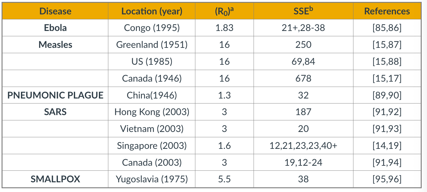 Table Source: Cellular Superspreaders: An Epidemiological Perspective on HIV Infection inside the Body.Kristina Talbert-Slagle et al., 2014,
The table above confirms the previous point about superspreaders for several epidemics.
The third column shows $R_0$ while the fourth column shows ”Superspreading events” (SSE). These are events during an outbreak in which a single infected individual causes a large number of direct or indirect infections. For example, in the case of the 2003 SARS epidemic in Hong Kong, even though $R_0$ was only 3, there was an SSE in which an infected individual caused a total of 187 infections (patient-1 in the plot above).
SSEs have been observed in practically every epidemic – and they have major consequences both in terms of the speed through which an epidemic spreads and in terms of appropriate interventions.
For example, in the case of respiratory infections (such as COVID-19) “social distancing” is an effective intervention only as long as it is adopted widely enough to also include superspreaders.
Degree Block Approximation
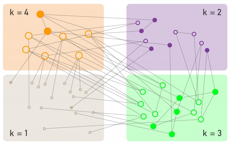 Figure 10.19 from Network Science by Albert-László Barabási
To avoid the homogeneous mixing assumption, one option would be to model explicitly the state (e.g., susceptible, infected, removed) of each node in the network, considering the degree of that node. That would result in a large system of differential equations that would only be solvable numerically.
Another approach is to group all nodes with a certain degree k together in the same “block”. Then, we can ask questions such as: what is the rate at which nodes of degree k move from the S to the I state? In other words, we will not be able to make specific predictions for individual nodes but will be able to characterize the compartmental dynamics of all nodes that have a certain degree. This is referred to as the “degree block approximation.”
This analytical method can be applied to networks with arbitrary degree distribution (including power-law networks). The degrees of neighboring nodes however should be independent. So, even though the degree block approximation is much more general than the homogeneous mixing assumption, it is still not be applicable in networks that have strong assortativity or disassortativity, clustering, or community structure.
SIS Model – With An Arbitrary Degree Distribution
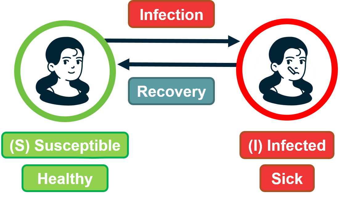 Figure 9.29 from Network Science by Albert-László Barabási
Let us go back to the SIS model.
With the degree block approximation, we model the density of susceptible $s_k(t)$ and infected $i_k(t)$ individuals that have degree $k$.
Of course, it is still true that $s_k(t) + i_k(t) =1 $ because any of these individuals is either in the S or I states.
We can also write that the density of all infected individuals is: $i(t) = \sum_k p_k i_k(t)$.
A susceptible individual of degree $k$ can become infected when he/she is in contact with an infected individual. For nodes of degree $k$, what is the fraction of their neighbors that are infected however? Under the homogeneous mixing assumption, this fraction is simply $i(t)$. We now need to derive this fraction more carefully, considering that different nodes have different degrees.
So, let us define as $\theta_k(t)$ as the fraction of infected neighbors of degree $k$ node.
If we manage to calculate this fraction, we can then write the differential equation for the SIS model under the degree block approximation as:
\[\frac{di_k(t)}{dt} = k \, \beta \, \theta_k(t)\, (1-i_k(t)) - \mu\, i_k(t)\]Note that the only real difference with the SIS differential equation under homogeneous mixing is that the term $\theta_k(t)$ has replaced the term $i(t)$. The reason is that susceptible individuals of degree k – their density is $(1-i_k(t))$ – get infected from a fraction $\theta_k(t)$ of their $k$ neighbors.
Now, let us derive $\theta_k(t)$.
Suppose we have a network with n nodes, m edges, and an arbitrary degree distribution $p_k$.
Recall that the average degree is given by $\bar{k} = \frac{2m}{n}$, and the average number of nodes of degree $k$ is $n_k = np_k$.
Consider a node of degree $k$. The probability that a neighbor of that node has degree $k’$ is the fraction of edge stubs in the network that belong to nodes of degree $k’$:
\[\frac{k' \, n_{k'}}{2 \, m} = \frac{k' \, p_{k'}}{\bar{k}}\]Note that this probability does not depend on $k$.
So, the probability that a node of degree k connects to an infected neighbor of degree $k’$ is:
\[\frac{k' \, p_{k'}}{\bar{k}} \, i_{k'}(t)\]Taking the summation of these probabilities across all possible values of k’ we get that the probability $\theta_k(t)$ that a node of degree k connects to an infected neighbor (of any degree) is:
\[\theta_k(t) = \sum_{k'} \frac{k' \, p_{k'}}{\bar{k}} \, i_{k'}(t)\]Note that $\theta_k(t)$ does not depend on k, and so we can simplify our notation and write $\theta(t)$ instead of $\theta_k(t)$.
This is important: the probability that any of your neighbors is infected does not depend on how many neighbors you have.
We can now go back to the original differential equation for the SIS model and re-write it as:
\[\frac{di_k(t)}{dt} = k \, \beta \, \theta(t) \, (1-i_k(t)) - \mu \, i_k(t)\]Early in the outbreak, when $i_k(t) \approx 0$, this (nonlinear) differentiation equation can be simplified as:
\[\frac{di_k(t)}{dt} = k \, \beta \, \theta(t) - \mu \, i_k(t)\]Additionally, we should consider that early in the outbreak, an infected individual x must have one infected neighbor y (the node that infected x) – y has not returned back to the pool of Susceptible individuals yet because we assume that we are early in the outbreak. With this correction in mind, we should modify the previous equation for the probability that a susceptible individual of degree-k gets infected from an individual of degree-k’ as follows:
\[\theta_k(t) = \sum_{k'} \frac{(k'-1) \, p_{k'}}{\bar{k}} \, i_{k'}(t)\]because one of the k’ links of the infected individual must connect to another infected individual.
To solve this equation, we can take the derivative of $\theta(t)$:
\[\frac{d \theta(t)}{dt} = \sum_{k'} \frac{(k' -1)\, p_{k'}}{\bar{k}} \, \frac{di_{k'}(t)}{dt}\]If we replace $k’$ with k (just a notational simplification) – and substitute the derivative of $i_k(t)$ from the SIS differential equation, we get:
\[\frac{\beta}{\bar{k}}\sum_kk^2\,p_k\,\theta(t)-\frac{\beta}{\bar{k}}\sum_kk\,p_k\,\theta(t)-\frac{\mu}{\bar{k}}\sum_k(k-1)\,p_k\,i_k(t)=\] \[\frac{\beta}{\bar{k}}\sum_kk^2\,p_k\,\theta(t)-\frac{\beta}{\bar{k}}\sum_kk\,p_k\,\theta(t)-\frac{\mu}{\bar{k}}\sum_k(k-1)\,p_k\,i_k(t)=\] \[= (\frac{\beta \, \bar{k^2}}{\bar{k}} - (\beta+\mu)) \, \theta(t)\]where $\bar{k^2}=\sum_k{k^2 p_k}$ is the second moment of the degree distribution.
This is a linear differential equation with solution:
\[\theta(t) = c \, e^{t \, (\beta \bar{k^2} - (\beta+\mu) \bar{k})/\bar{k}}\]where c is a constant that depends on the initial condition.
Now that we have solved for $\theta(t)$, we could go back and derive the fraction $i_k(t)$ of infected individuals of degree $k$.
For our purposes, however, we do not even need to take that extra step. The expression for $\theta(t)$ clearly shows that we will have an outbreak if and only if $\beta \, \bar{k^2} - (\beta+\mu)\, \bar{k} > 0$, or equivalently, $\frac{\beta}{\beta+\mu} > \frac{\bar{k}}{\bar{k^2}}$.
Contrast this inequality with the corresponding condition under homogeneous mixing, namely:$\beta \bar{k} - \mu > 0$, or equivalently, $\frac{\beta}{\mu} > \frac{1}{k}$
In other words, when we consider an arbitrary degree distribution, it is not just the average degree that affects the epidemic threshold. The second moment of the degree distribution also matters. And as the second moment increases relative to the first (i.e., the ratio $\frac{\bar{k}}{\bar{k^2}}$ decreases), it is easier to get an epidemic outbreak.
Food for Thought
Use the derived expression for $\theta(t)$ to derive the density $i_k(t)$ of infected individuals of degree k.
SIS Model – No Epidemic Threshold For Scale-Free Nets
Let us now examine the epidemic threshold for two-degree distributions we have studied considerably in the past.
-
For random networks with Poisson degree distribution (such as ER networks), the variance is equal to the mean, and so the second moment is: $\bar{k^2} = \bar{k}(1+\bar{k})$
So, we have an epidemic if $\frac{\beta}{\beta+\mu} > \frac{1}{\bar{k}+1}$, which is equivalent to the expression we derived under homogeneous mixing ($\frac{\beta}{\mu} > \frac{1}{\bar{k}}$).
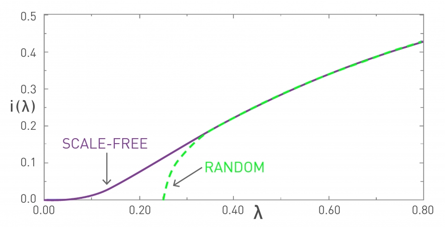 Figure 10.11 from Network Science by Albert-László Barabási
In the visualization, the x-axis parameter $\lambda$ refers to the ratio $\frac{\beta}{\beta + \mu}$. In the “random network” curve (green), if that ratio is larger than $\frac{1}{1+\bar{k}}$ an outbreak will lead to an epidemic. The y-axis value shows the steady-state fraction of infected individuals in the endemic state.
It is important to note that if $\lambda$ is less than the threshold $\frac{1}{1+\bar{k}}$, then the outbreak will die out and it will not cause an epidemic. -
For networks with a power-law degree distribution (“scale-free network” curve shown in purple), and with an exponent $\gamma$ between 2 and 3, the variance (and the second moment) of the degree diverges to infinity ($\bar{k^2} \rightarrow\infty$).
This means that the condition for the outbreak of an epidemic becomes:
\[\lambda > \frac{\bar{k}}{\bar{k^2}} \rightarrow 0\]This is a remarkable result with deep and practical implications. It states that if the contact network has a power-law degree distribution with diverging variance, then any outbreak will always lead to an epidemic, independent of how small $\lambda$ is. Even a very weak pathogen, with a very small $\lambda$, will still cause an epidemic.
The fraction of infected individuals in the endemic state still depends on this ratio – but whether we will get an endemic state or not does not depend on $\lambda$.
The reason behind this negative result is the presence of hubs – nodes with a very large degree. Such nodes get infected very early in the outbreak – and then they infect a large number of other susceptible individuals.
Food for Thought
Suppose that the ratio $\lambda$ is equal to 1/4. Plot the fraction of infected individuals of degree k in the endemic state as the ratio $\frac{\bar{k}}{\bar{k^2}}$ varies between 0 and 1/4.
Summary of SI, SIS, SIR Models with Arbitrary Degree Distribution
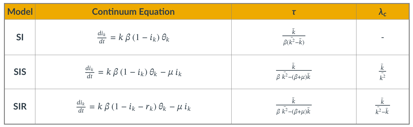
Even though we showed the derivations for the density function $\theta(t)$ only for the SIS model, it is simple to write down the corresponding equations for the SI and SIR models.
The table summarizes the differential equation and key results for each of the three models.
The parameter $\tau$ is the characteristic timescale.
The SI model always leads to an epidemic. For the two other models, however, the epidemic threshold depends on the ratio of the first two moments of the degree distribution. $\lambda_c$ is the minimum value of $\lambda$ for the emergence of an endemic state (only for SIS and SIR).
We suggest that you contrast these results with the corresponding formulas for the case of homogenous mixing.
Food for Thought
Repeat the derivations we performed in this lesson for the SIS model in the case of the SI and SIR models.
Computational Modeling of Epidemics
Epidemic Models in Practice
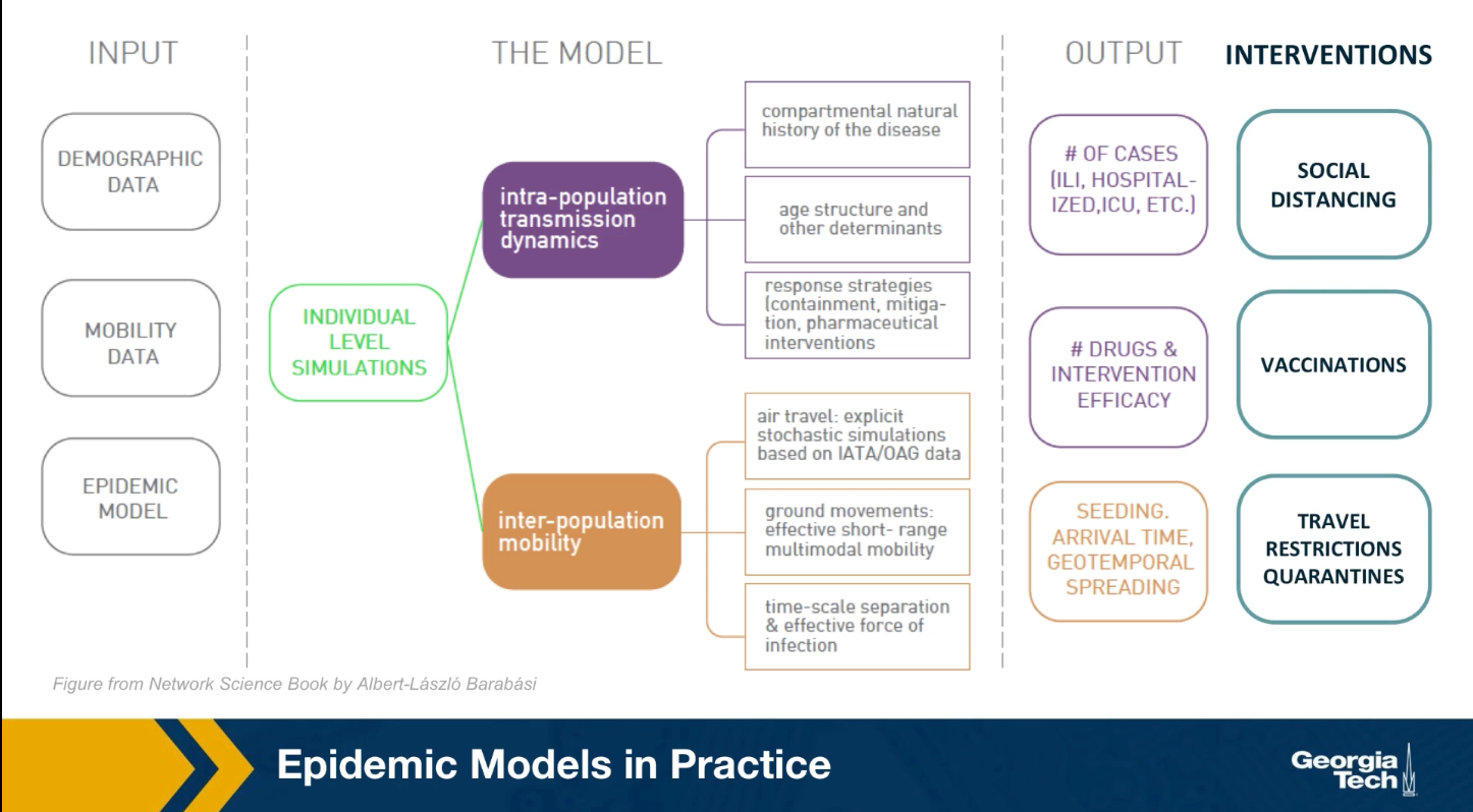
The mathematical models we studied earlier, are viable because they only depend on a few parameters and they provide clear insights. They are very simplified however, and they are based on very unrealistic assumptions. In practice, when public health agencies try to predict or mitigate the spread of an epidemic, they use more complicated models that can be solved numerically.
As shown in the visualization for the gleam model developed by Northeastern University, this model require many types of input data including demographic data about the density of the population, different neighborhoods, mobility data that describes how people move locally and over long distances. As well as any available data about the pathogen itself. All these detail data are then used to perform simulations at either level of individuals or small groups.
These simulations can predict how the epidemic will spread over time and space. How many people will get sick, how many will need hospitalization or even die. Additionally, SATs detailed computational models are used to examine the effect of various interventions such as travel restrictions, quarantines, social distancing, vaccinations and so on.
Modeling The 2009 H1N1 Pandemic
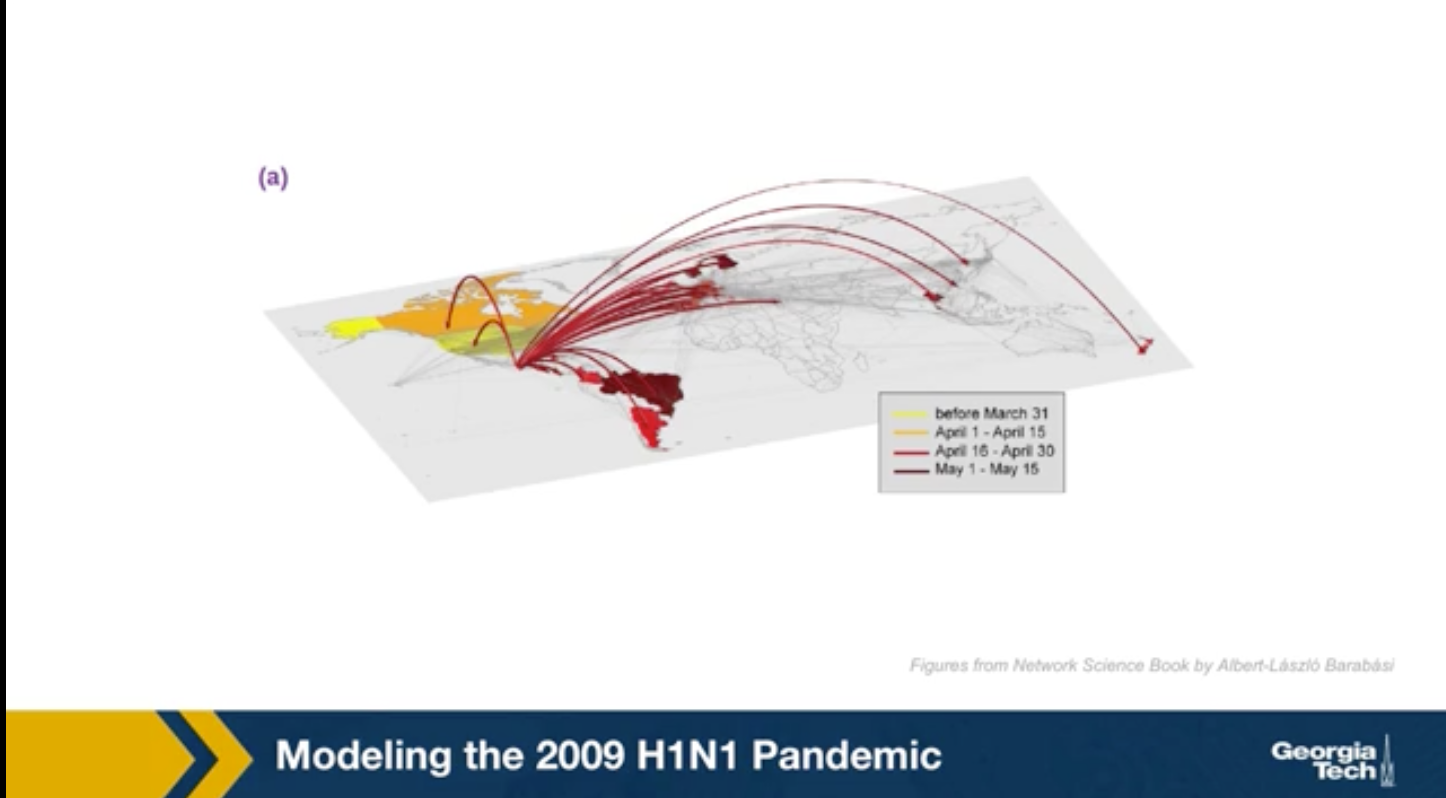
For instance, the GLEAM simulator has been used to model the spread of the 2009 H1N1 epidemic. This simulations were performed after the epidemic to evaluate the accuracy of the GLEAM model. The H1N1 pandemic started in Mexico in early 2009, lasted about 19 months and it killed almost 300,000 people worldwide. The GLEAM project use demographic mobility and epidemic data to predict the peak week of epidemic in its country. This means the week after the start of the epidemic at which we had the highest number of cases.
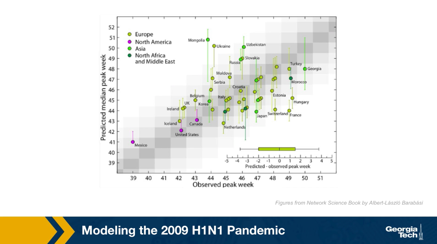
Here in this plot the x-axis shows the observed peak week for many candidates based on historic data. The y-axis shows the predicted peak week for each of these candidates based on the GLEAM model. Because the model is too high stick the results were produced from 2000 runs and they are reported here with confidence intervals. Ideally the center of the interval for each candidate should be on the diagonal. The model performs reasonably well, especially for candidates in which the demographic and mobility data are reliable. At the same time, there are some notable failures of the model such as the cases of France or Mongolia. Epidemic modeling is extremely hard not only because the data is often noisy, but also because people change their behavior and mobility during an outbreak.
Can Travel Restrictions Contain an Epidemic
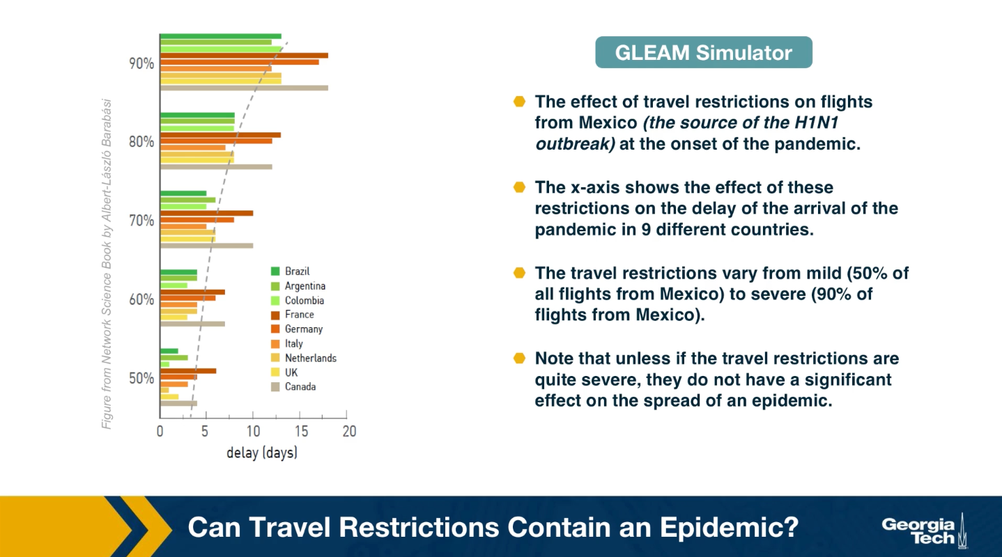
Another important use of epidemic models and simulators is in evaluating different intervention strategies, such as travel restrictions, quarantines, school and business closures, social distancing policies or even vaccination strategies, if a vaccine is available.
An example of such application is shown here. The visualization shows the effect of travel restrictions on flights from Mexico, which was the source of H1N1 outbreak at the onset of the pandemic. The x-axis shows the effect of these travel restrictions on the delay of the arrival of the pandemic in nine differnet countries. The travel restrictions varied from mild to severe. Note that unless the travel restrictions are quire severe, they do not have a significant effect on the spread of epidemic. When the flights are reduced by 90%, there is only a gain of couple of weeks for most countries. On the other hand, implementing a complete quarantine is very difficult in practice and it can cause major financial or humanitarian issues.
Effective Distance
Can we use geographical distance to predict the time that an epidemic will arrive at a state or country?
Again, we can use epidemic models such as GLEAM to answer such question
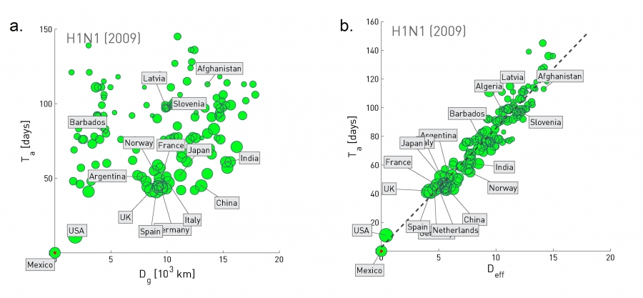 Figure 10.32 from Network Science by Albert-László Barabási
The plot at the left shows the geographic distance between Mexico and many other countries at the x-axis, while the y-axis shows the time that the H1N1 pandemic arrived in that country (defined as the number of days between the first confirmed case in that country and the beginning of the outbreak on March 17, 2009).
Clearly there is not any strong correlation between the two quantities.
Let us now define a different kind of distance, based on mobility data rather than geography:
Suppose that we have data from airlines, trains, busses, trucks, etc, showing how many travelers go from city i to city j.
The fraction of travelers that leave city i and arrive at city j is denoted by $p_{i,j}$.
The effective distance between the two cities is then calculated as $d_{i,j} = 1-ln p_{i,j}$.
The plot at the right replaces geographic distance with “effective distance”, and it shows that that the arrival day of this pandemic from Mexico was actually quite predictable based on strictly mobility data.
Lesson Summary
This lesson introduced you to several important points about epidemics on networks:
- Compartmental epidemic models such as SIS and SIR under the homogeneous mixing assumption
- The basic reproductive number and how it can be misleading in the presence of super-spreaders
- Epidemic threshold
- Real-world contact networks do not follow the homogeneous mixing assumption
- How the spread of an epidemic depends on the second moment of the degree distribution
- Power-law networks with diverging degree variance do not have an epidemic threshold
- Computational modeling of epidemics
We will continue our study of spreading processes on networks in the next Lesson, considering some more advanced topics about epidemics as well as the spread of other entities on networks such as information and memes.
L10 - Social Influence and Other Network Contagion Phenomena
Overview
Required Reading
- Chapter 19 - D. Easley and J. Kleinberg, Networks, Crowds and Markets , Cambridge Univ Press, 2010 (also available online).
Recommended Reading
- “The role of social networks in information diffusion” .by E.Bakhsy et al. WWW conference, 2012.
- “Everyone’s an influencer: quantifying influence on Twitter”. by E.Bakshy et al. WSDM conference, 2011.
- “Maximizing the spread of influence through a social network”. by D.Kempe et al. ACM SIGKDD, 2003.
- “.A simple rule for the evolution of cooperation on graphs and social networks” .by H. Ohtsuki et al, Nature, 2006.
- “Multisensory integration in the mouse cortical connectome using a network diffusion model”. by K.Shadi et al., Network Neuroscience, 2020.
Not Just Viruses Spread On Networks

“Word of mouth” is a powerful influence mechanism and it affects every aspect of our lives.
Think about behavior adoption: Do you like to exercise, eat healthy, party, smoke marijuana? It has been shown again and again that whether someone will adopt such behaviors or not mostly depends on his/her social network. And interestingly, it is not just strong contacts (such as family and close friends) that influence people. Our entire social network, including the crowd of acquaintances and indirect contacts that surround us, also have a strong effect on behavior adoption.
A great reference that summarizes many years of sociology research in this area is the book “Connected” by Christakis and Fowler.
Similar influence mechanisms are seen in other aspects of life. For example, in terms of technology adoption, will you buy an iPhone or an Android device? Think about your 10 closest people and ask: what phone do they own? You guessed right – your consumer and technology adoption choices are highly influenced by your social network.
Or, in the case of opinion formation: are you a Democrat or a Republican? What do you think about climate change? Abortion? Again, please think about your 10 closest people and ask the same question. Even though we like to think that we are the absolute owners of our opinions, the reality is that we would probably have very different opinions if we lived in a different social environment.
For centuries, the word-of-mouth mechanism required physical interaction between people. In the last few years, however, online social media such as Facebook, Twitter, or TikTok have provided us with the platform to influence not only the small number of people in our physical proximity – but potentially millions of people around the world.
YouTube or Twitter “influencers” today have tens of millions of followers – and it is often the case that their videos or tweets are being liked, commented on, or forwarded by millions of other people. Never before in the history of humankind, we found ourselves in the middle of so many sources of information (or misinformation), and never before every single one of us has at least the potential to influence pretty much any other person on the planet.
Diffusion, Cascades and Adoption Models
In sociology, a central concept is that of network diffusion. Given a social network and the specific node or nodes that act as the sources of some information, when will that information spread over the network?
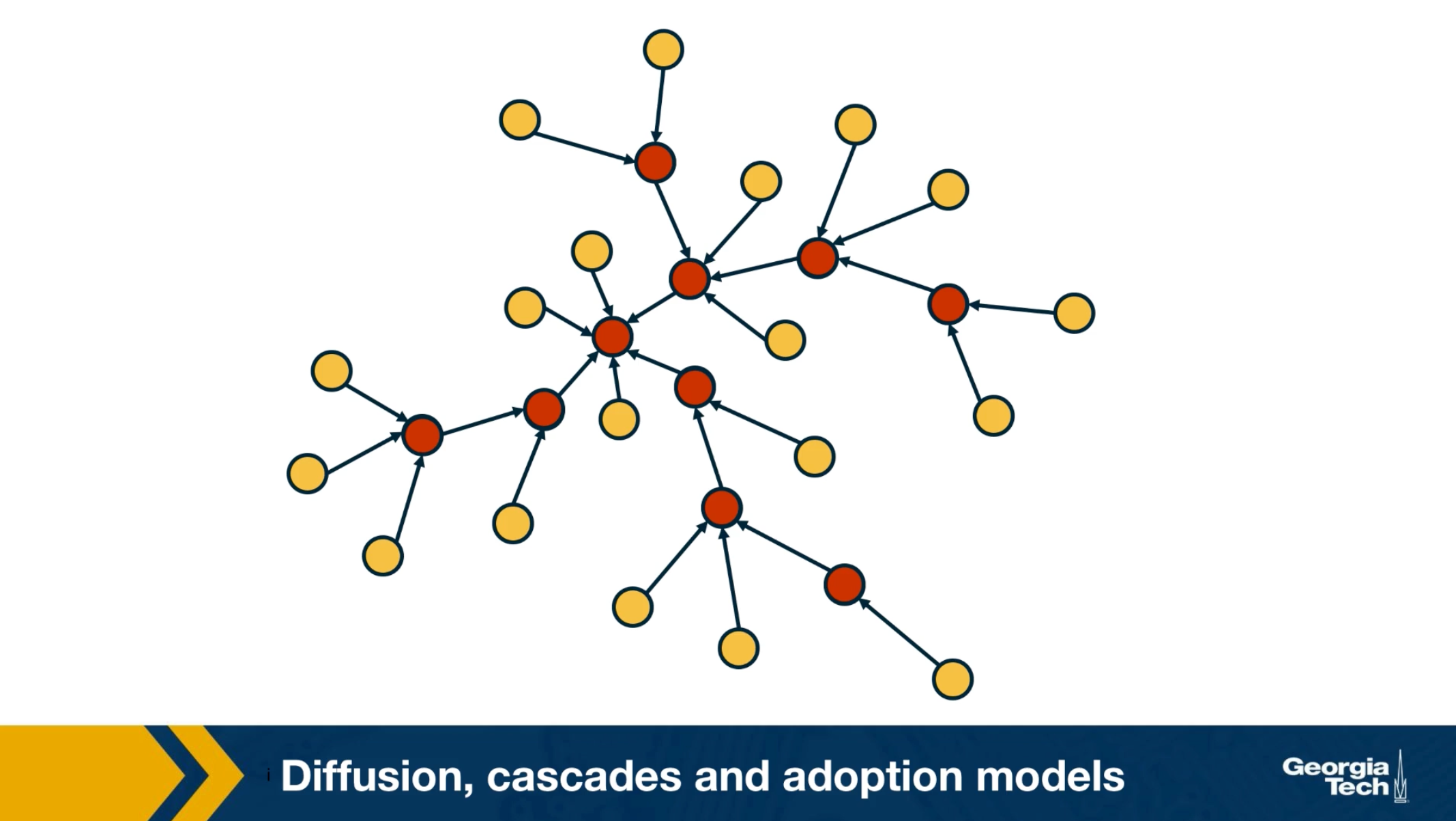
Which are the factors that determine whether someone will be influenced?What is the total number of influenced people? And how does that depend on the topology of the network? Suppose that the network is an online social network such as twitter, and the edges points from follows to followees. In other words, the information flows in the opposite directions than the edges. Imagine that the node at the center of the network with six followers tweet something. That information is received by all of his or her follows but only three of them decide to retweet. Some of the followers of those three nodes also retweet. This creates a network cascade which is shown by the red nodes. In this example the size of the cascade is ten nodes and the depth of the cascade which is the largest distance from the source to any other node of the cascade is three hops. How can we describe such influenced phenomenon in a statistical framework?
What is the probability that someone in a social network will adopt a certain information or behavior? The greatest sociologist of the 20th century, such as Granovetter or Schelling focused on this question and proposed interesting theoretical models of influence.
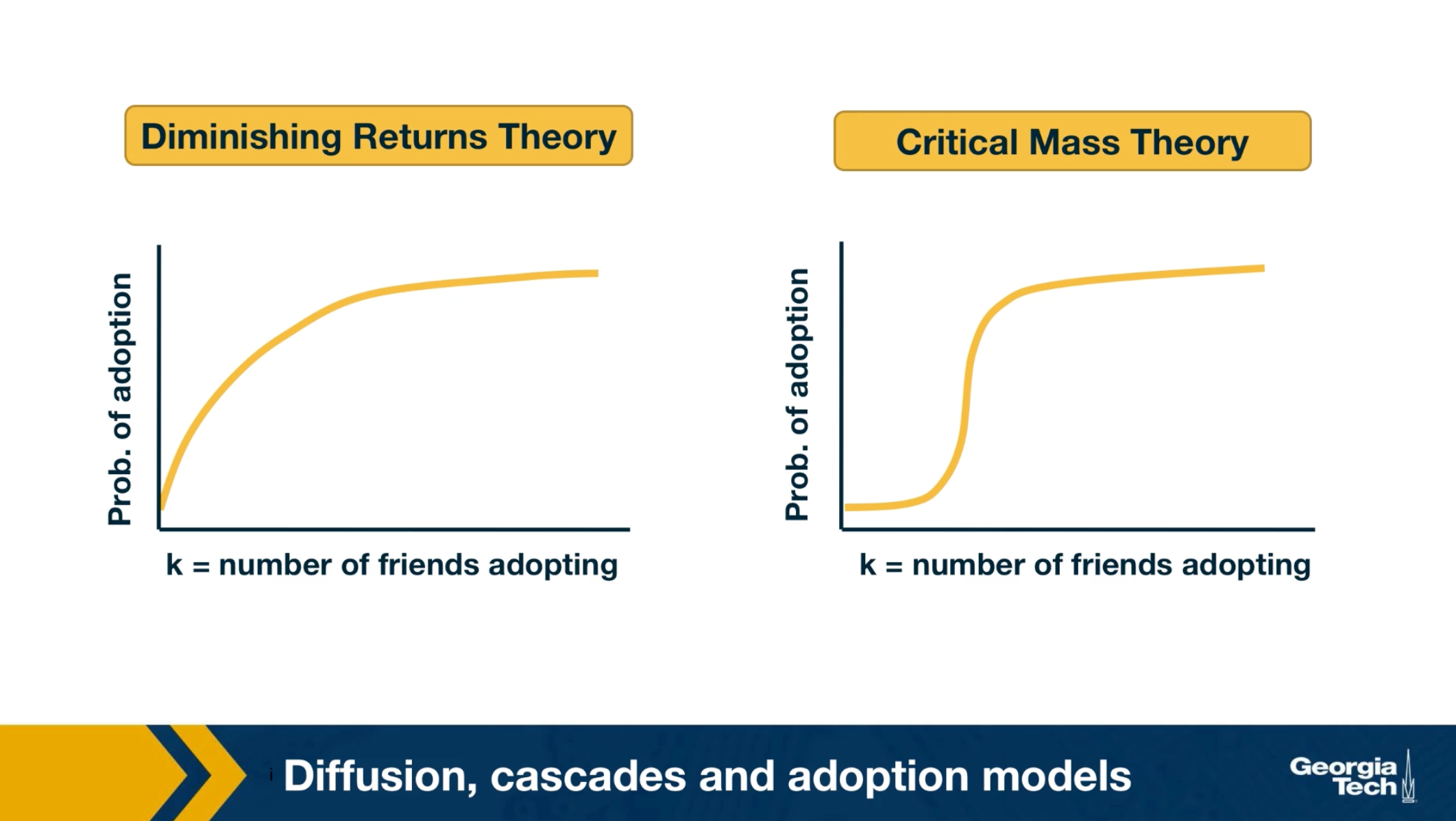
For instance, the visualization here shows two competing hypothesis the diminishing returns theory and the critical mass theory. They both postulate that the probability of adoption increases with the number of friends or direct social contacts that have adopted the same information. The diminishing returns theory, however, claims that this function is a concave function. On the other hand, the critical mass theory claims that the adoption probability remains small until we exceed a certain threshold of adopting friends. And that it quickly saturates after we pass that threshold. As you can imagine, these two models produce very different results in many cases, regarding the size, and depth of cascades. Unfortunately, the practical difficulties associated with monitoring large social networks in 70s or 80s did not allow the validation of these theoretical models with large data sets and controlled experiments. Only recently, in the last 20 years or so, the availability of online social networks have enabled sociologists to study influence and diffusion in more quantitative terms as we will see next.
Some Empirical Findings About Cascades
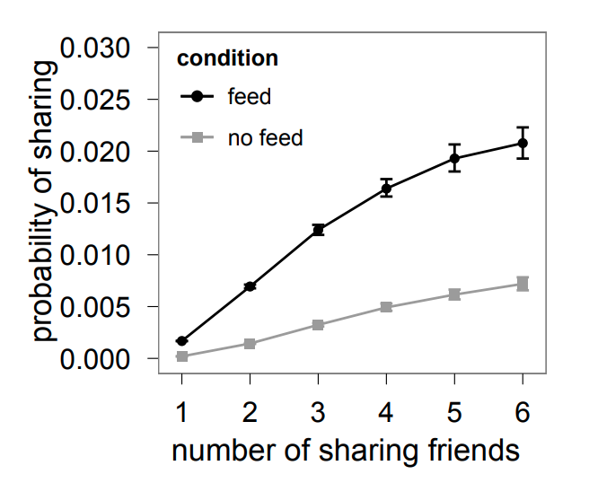 Image Source: “The role of social networks in information diffusion” by Bakhsy et al
We summarize here some general findings that have been observed repeatedly in the last few years in the context of different social networks and experiments of social influence
The first such finding is that the probability of adoption seems to follow, at least in most cases, the diminishing returns model.
For instance, we include here a result from a large-scale (253 million Facebook users) randomized study by Eytan Bakhshy and his collaborators. The main question was whether a user will share a Web link with his/her Facebook friends, depending on whether some of his/her friends also shared that link. The study also examined how this “probability of link sharing” depends on whether users were exposed to their friends’ link-sharing behavior (“feed”) versus those that were not exposed to such information (“no feed”).
Note that in both cases the probability of adoption increases in a concave manner, providing support to the diminishing returns model.
The authors also showed that those who are exposed to their friends’ link-sharing behavior are significantly more likely to spread information and do so sooner than those who are not exposed.
The study also examined the relative role of strong and weak ties in information propagation. Although stronger ties are individually more influential, it is the more abundant weak ties that are responsible for the propagation of novel information.
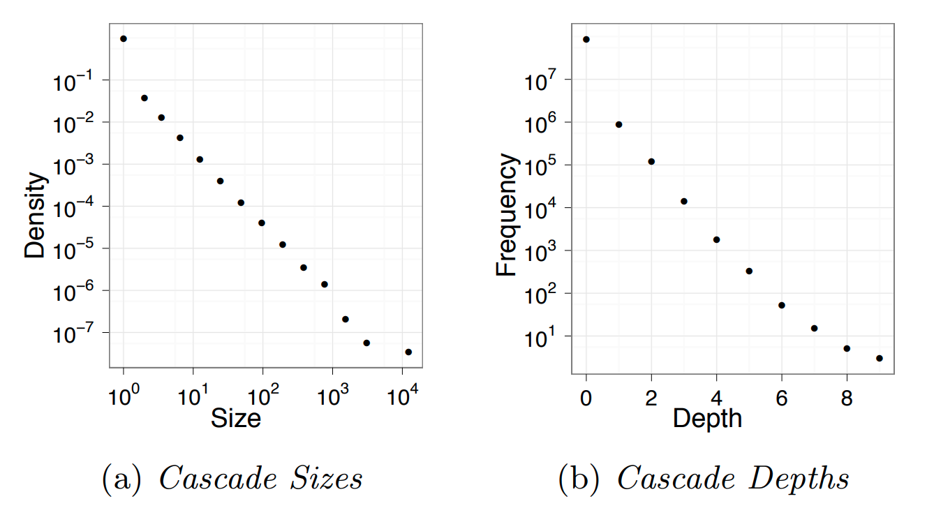 Image Source: “Everyone’s an influencer: quantifying influence on Twitter” by E.Bakshy et al.
Another empirical finding that has been repeatedly shown by many studies of online social networks relates to the size and depth of cascades.
For instance, an observational study of Twitter data analyzed 74 million tweet cascades that mention a URL. The tweets originated from 1.6 million “seed” users during a two-month period in 2009.
A first major observation is that the vast majority (90%) of tweets do NOT trigger a network cascade. They stop at the source. An additional 9% propagate only to one other user.
However, even though very few tweets trigger a significant network cascade, it is interesting that there are also tweets that cause major cascades, with a size that exceeds 1000 users and a depth of 8 or higher.
The distribution at the left shows that the cascade size follows a power-law distribution – note that both axes are logarithmic and the function decreases almost linearly.
The distribution at the right shows that the cascade depth follows an exponential decrease – note that the x-axis is linear while the y-axis is logarithmic and the decrease is almost linear.
These findings are not applicable only to Twitter cascades – similar results have been shown for most other diffusion phenomena in both offline and online social networks.
Food for Thought
- Read the original paper mentioned in this page to see how the authors quantified the effect of strong versus weak ties.
- The literature includes many more similar empirical results about the distribution of cascade size or cascade depth. Review the literature to find at least one more such reference.
Linear Threshold Model
Let us now see how we can model influence and social contagion with network models.
Consider a weighted (and potentially directed) network. The weight of the edge $w_{u,v}$ represents the strength of the relationship between nodes u and v. If the two nodes are not connected, we set $w_{u,v} = 0$.
The state of a node v can be either “inactive” $(s_v=0)$ or “active” $(s_v=1)$.
In the context of social influence, for example, an inactive node may not be exposed to a certain behavior (e.g., smoking) or it may be that it has been exposed but it has not adopted that behavior.
Initially, the only active nodes are the sources of the cascade.
Each node v has a threshold $\theta_v$. The Linear Threshold model assumes that a node v becomes active if the cumulative input from active neighbors of v is greater than the threshold $\theta_v$:
\[s_v=1 ~\mbox{if}~ \sum_u s_u w_{u,v} >\theta_v\]Note that nodes can only switch from inactive to active once.
The Linear Threshold model is appropriate in diffusion phenomena when the ”critical mass” theory of social influence applies.
An important question is: if we only activate a certain node $v_0$, which are the nodes that will eventually become active? These nodes define the “activation cascade” of $v_0$. Note that this cascade may cover the whole network, may include only $v_0$, or it may be somewhere in between. Of course, the cascade of $v_0$ includes nodes that are reachable from $v_0$.
A common simplification of the linear threshold is the homogeneous case in which all nodes have the same threshold $\theta$. In the visualization, the threshold is set to $\theta=1$ for all nodes. Note that the nodes x and z will not be part of the cascade.
There are also variations of the model in which two behaviors A and B are spreading at the same time, meaning that the state of a node can take three different values (inactive, A and B). In that case, the state of a node can switch between states A and B over time.
Another common variation is the “Asynchronous Linear Threshold” model. In that case, each edge has a certain delay. This means that different nodes can become active at different times.
The edge delays can affect the temporal order in which nodes join the activation cascade – but they cannot change the size of the cascade. We will review an application of this model on brain networks at the end of this lesson.
Note: Depending on the literature, the activation threshold model can be greater than or greater than or equal to - this can vary.
Food for Thought
Explain why the size of the cascade does not depend on edge delays.
Independent Contagion Model
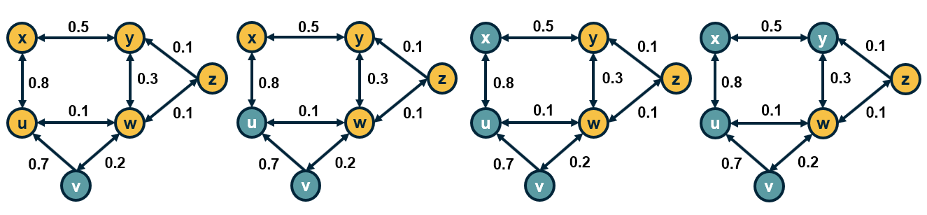
In some cases the activation of a node v can be triggered by a single active neighbor of v, independent of the state of other neighbors of v. The Independent Contagion model is more appropriate in such problems.
Again, the state of each node can be inactive or active. If there is an edge from u to v, then the weight $w_{u,v}$ of the edge in this model represents the probability that node u activates node v when the former becomes active.
Note that node u has a single chance to activate node v. Nodes stay in the active state after they have been activated.
An important difference with the Linear Threshold model is that the Independent Contagion model is probabilistic, and so the activation cascade of a seed node v has to be described statistically.
Food for Thought
Explain why the Independent Contagion model is consistent with the Diminishing Returns theory of social influence.
Deffuant Model For Opinion or Consensus Formation
In some cases, it is a gross oversimplification to represent the state of each node as a binary variable (active vs inactive).
Instead, we need a scalar to represent the state of each node.
For example, our opinion about the risk of a potential COVID-19 infection may vary anywhere between the two extremes “I am extremely worried” to “I do not care at all”.
Typically, our opinion about such matters depends on the opinion of our social contacts.
The Deffuant model of opinion (or consensus) formation assumes that the state of a node v at time t is a scalar $s_v(t)$ that falls between 0 and 1.
A key parameter of the model is the “tolerance threshold” $\delta$:
If the state of two connected nodes, say u and v, is greater than the threshold $\delta$: $|s_v(t)-s_u(t)| \geq \delta$, the two neighbors “disagree” so strongly that they do not influence each other, and their state remains as is.
Otherwise, if $|s_v(t)-s_u(t)| < \delta$, then they influence each other, changing their state at the next time instant as follows:
\[s_v(t+1) = s_v(t) + \mu [s_u(t) - s_v(t)]\]and
\[s_u(t+1)= s_u(t)- \mu [s_u(t) -s_v(t)]\]where $\mu$ is the “convergence” parameter of the model.
If $\mu$=1/2, then the state of the two nodes will become identical at time t+1. Typically $\mu$ is set to a value between 0 and ½ to capture that the two neighbors may not reach complete agreement.
The model proceeds iteratively, by selecting a randomly chosen pair of neighbors in each iteration. If the network is weighted then the order at which pairs of nodes interact may depend on the weight of the corresponding edge.
Note that whether two neighbors influence each other or not may change over time.
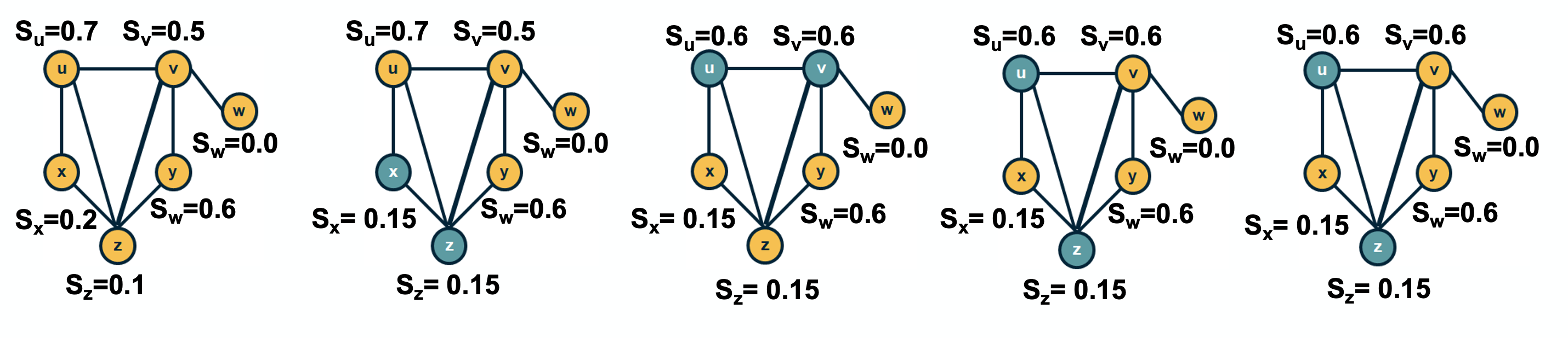
For example, consider the network shown in the visualization ($\mu$=1/2, $\delta$=0.45). Suppose that we select pairs of neighboring nodes in the following order:
- x and z: their opinion converges to $s_x = s_z = 0.15$
- u and v: their opinion converges to $s_u = s_v = 0.6$
- u and z: their opinion does not change
- v and y: their opinion converges to $s_v = s_y =0.6$
At that point, the opinion of every node has converged to a final value because any pair of adjacent nodes either have the same opinion, or their opinion differs by more than the threshold $\delta$.
Food for Thought
The Deffuant model can result in interesting dynamics. Suppose that we have a social network in which almost all individuals are moderates (say their initial opinion is close to 0.5). There are also few extremist nodes though, some of them with an opinion that is close to 0 and others with an opinion that is close to 1.
Can you construct a scenario in which the entire network will become polarized, with every node being very close to one extreme or the other? What kind of initialization and network topology would make such an outcome more likely?
Game Theoretic Diffusion Models
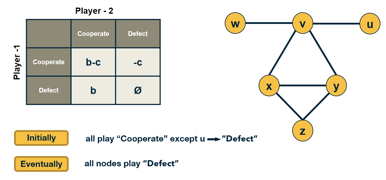
In some cases, the behavior of nodes in a social network can be captured more realistically with game-theoretic models: each node is a player that chooses rationally between a set of strategies. Crucially, the “payoff” of each strategy for player v also depends on the strategies chosen by the neighbors of v.
Let us illustrate this class of models with a simple coordination game. Each player can choose to either “Cooperate” (work with others) or “Defect” (act selfishly).
Cooperating with a neighboring player comes at a cost c (independent of the strategy of that neighbor). If two players cooperate, they both get a benefit b from their connection.
Of course, it only makes sense to cooperate if $b>c$.
The problem however is that some players may choose to Defect. In that case, they get the benefit b from every Cooperator they interact with – and they do not pay any cost. Think of the “friend” that will borrow things from you but he/she would never lend you anything.
The payoff matrix of this game for Player-1 is shown at the visualization.
Each player interacts only with its neighbors. Further, when a player chooses a strategy (say to be a Cooperator), that strategy applies to all bilateral interactions with its neighbors.
So, if a player v has k connections, and m of those neighbors are Cooperators, then if v chooses to be a Cooperator its payoff will be $bm - ck$. It obtains a benefit b from each neighbor, but pays an additional penalty c for every connection.
If it chooses to be a Defector, its payoff will just be $bm$.
If a node is surrounded by Cooperators, then it would benefit in the short-term by becoming a Defector. But its neighbors would also decide to do the same, and they would all become Defectors.
So eventually, the payoff of all players will be lower than if they had all remained Cooperators.
This illustrates how selfish behavior may quickly spread on a network, even if it is harmful to everyone in the long term.
Food for Thought
The model we described here is very simple and it predicts that even a single Defector is sufficient to turn the whole network into Defectors.
More sophisticated models, based on evolutionary game theory, predict that under certain conditions that depend on the network topology, the strategy of Cooperation will persist even in the presence of some Defectors.
We recommend you read the paper:“A simple rule for the evolution of cooperation on graphs and social networks” by H. Ohtsuki et al, Nature, 2006.
Seeding for Maximum Network Cascade
An important problem in the context of network diffusion is how to select a subset of k nodes that if activated, can collectively create the largest network cascade. In the context of marketing for instance, an advertising company may want to promote a certain product through an online social network, such as facebook.
Suppose that they can give the product for free to k users, they expect that these k users will then influence their neighbors, online friends to buy the same product and also influence their own friends, creating a network cascade. obviously, the marketing company would like to select the set of k nodes that can cause the maximum sites cascade.
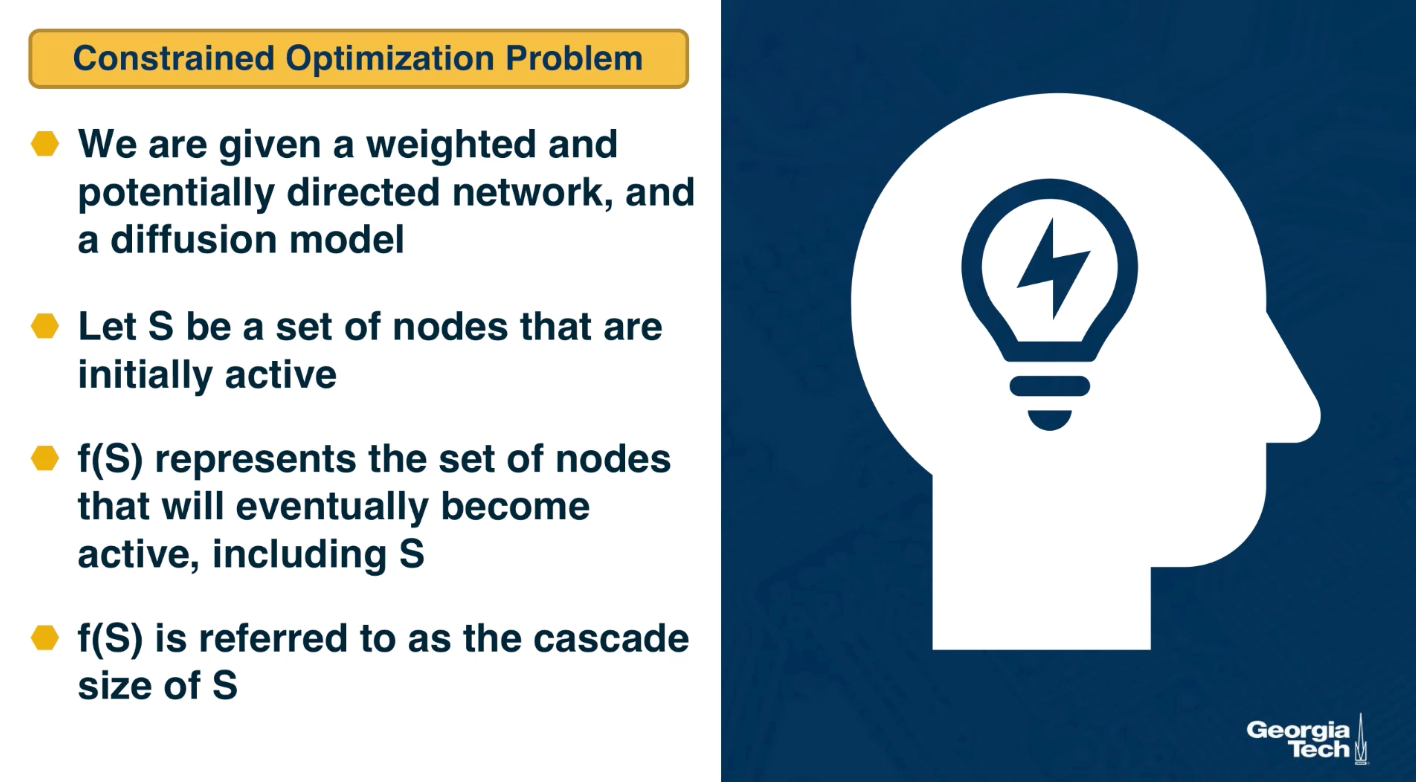
Mathematically this can be stated as a constrained optimization problem. We are given a weighted and potentially directed network and a diffusion model such as the linear threshold or the indpenedent cascade model.
Let S be a set of nodes thast we initially activate, the sources in other words. $f(S)$ represents the set of nodes that will eventually become active, including those in S. After the cascade, f(S) is referred to as the cascade size that started from the sources S. The objective here is to select set S such that $f(S)$ is maximum subject to the constraint that the size of S is at most k nodes. When the network diffusion model is probabilistic such as the independent cascade model, the objective is to maximize the expected value of $f(S)$.
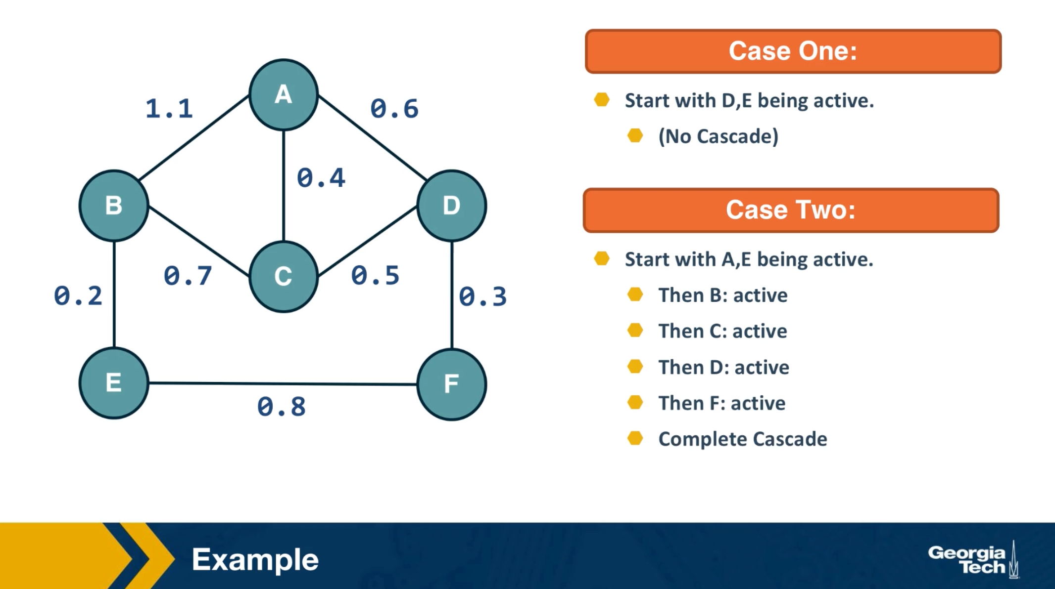
The visualization here shows two cases when k is equal to 2. In the first case, we initially activate nodes D and E and the cascade does not extend beyond those two nodes. In the second case, we activate initially nodes A and E. Here, the cascade eventually covers the whole network.
Submodularity of Objective Function
The function we try to maximize, $f(S)$, is nonlinear and it obviously depends on the topology of the network as well as on the specific diffusion model.
As we will see at the next page, however, the function $f(S)$ has an interesting property referred to as “submodularity”.
In this page, we first define submodularity – and then state an important result on how to optimize such functions.
Suppose that a function $f(X)$ maps a finite subset $X$ of elements from a ground set $U$ to non-negative real numbers.
The function $f(X)$ is called monotone if $f(v \cup X) \geq f(X) ~~\mbox{for any}~ v \in U ~\mbox{and any subset}~ X$.
The function $f(X)$ is called submodular if it satisfies the following “diminishing returns” property:
\[f(v \cup X) - f(X) \geq f(v \cup T) -f(T) ~\mbox{for any subsets}~ X ~\mbox{and}~ T ~\mbox{of}~ U ~\mbox{such that}~ X \subset T.\]In other words, the marginal gain from adding an element v to a set X is at least as high as the marginal gain from adding the same element to a superset $T$ of $X$.
Dr. Nemhauser (a professor at Georgia Tech) and his colleagues proved the following facts about monotone and submodular functions:
- The bad news: optimizing such functions, subject to the constraint that $X$ includes k elements, is an NP-Hard problem, and so it cannot be solved efficiently by any algorithm (unless if $P=NP$).
- The good news: Consider an iterative greedy heuristic that adds one element in X in each iteration, selecting the element that gives the maximum increase in $f(X)$. This simple algorithm has an approximation ratio $(1-\frac{1}{e})$. This means that the greedy solution cannot be worse than about 63% of the optimum value of $f(X)$.
The previous result is very important in practice because it means that, even though the greedy algorithm is suboptimal, we have a reasonable bound on its distance from the optimal solution.
Food for Thought
Prove that a non-negative linear combination of a set of submodular functions is also a submodular function.
Monotone and Submodular Function
Now that we know how to optimize, at least approximately, monotone and submodular functions, we can go back to the problem of maximizing network diffusion. Suppose that S is one or more initially active nodes, and $g(S)$ is the resulting cascade of active nodes. Is the cascade function $g(S)$ monotone and submodular?
The fact that the cascade size is monotone is obvious: if we increase the number of initially active nodes, we cannot decrease the size of the cascade.
It is also possible to show that the cascade size is a submodular function, for both the Linear Threshold and the Independent Cascade model. Let us focus on the latter here.
With the Independent Cascade model, we can first randomly choose for every edge of the network whether it is “live” or ”blocked”, based on its activation probability.
The set of live edges for such a specific random assignment can then be used to determine the set of active nodes at the end of the cascade.
The important point is that a node w will be part of the cascade if and only if there is a path of live edges from the initially active node(s) to w.
To prove the submodularity of the cascade size, we need to show that the number of NEW nodes that become active after we add a node v in the set of active nodes is larger for $S$ than for its superset $T$.
Please refer to the above diagram. $S$ is a subset of $T$, and $g(S)$ and $g(T)$ are the corresponding sets of active nodes.
There are two cases:
- The new nodes that become active after the activation of $v$ are neither in $g(S)$ nor in $g(T)$.
- The new active nodes are in $g(T)$ but not in $g(S)$.
Note that it cannot be that the new active nodes are in $g(S)$ but not in $g(T)$.
So, more nodes are activated when $v$ is added to $S$ compared to when $v$ is added to $T$.
The previous argument holds for the random assignment of live edges we started from.To show that the expected value of the cascade size is also submodular, we need to use the fact that: if a set of functions $f_1,f_2,f_3,…$ are submodular, then any non-negative linear combination of those functions is also submodular (non-negative because the scaling coefficients are probabilities). Recall that this was the “food-for-thought” question at the previous page.
Cascades in Networks with Communities
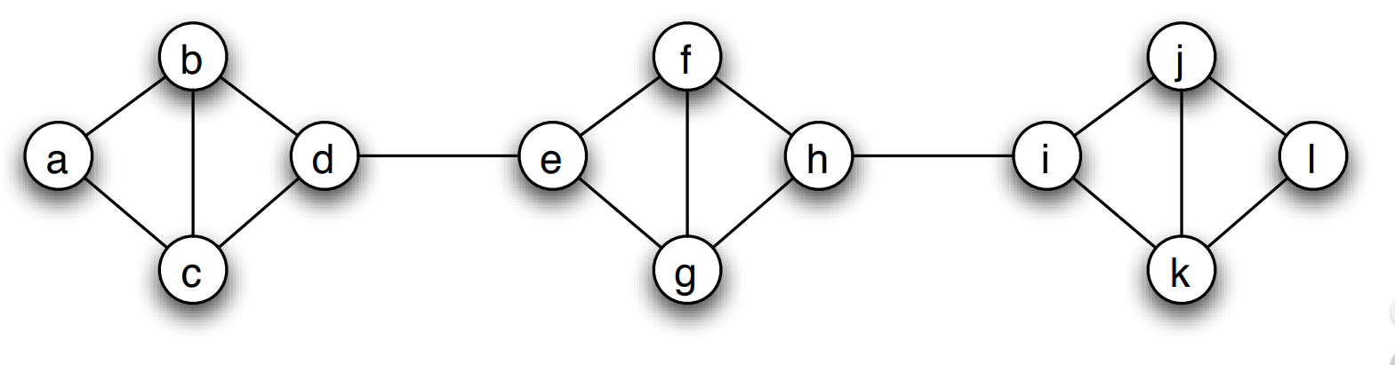 Image source: Textbook “Networks, Crowds and Markets” book, by Easley and Kleinberg, Chapter 19
We have already established in earlier lessons that most real-world networks have clusters of strongly connected nodes that we refer to as communities.
How do such communities affect the extent of diffusion processes, such as those discussed earlier in this lesson?
Is it that the community structure facilitates or inhibits the diffusion of information on networks?
To make this analysis more concrete, let us start with a quantitative definition of a network community structure:
We say that a set of nodes C forms a cluster (or community) of density p if every node in that set has at least a fraction p of its neighbors in the set C.
The visualization shows three such clusters of nodes, each of them containing four nodes, with density p=2/3.
Cascades in Networks with Communities-2
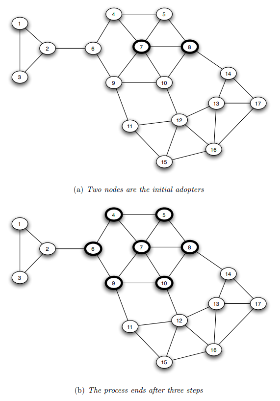 Image source: Textbook “Networks, Crowds and Markets” book, by Easley and Kleinberg, Chapter 19
Suppose that we model the diffusion process with the Linear Threshold Model. To keep things simpler, let us consider the homogeneous version of this model in which all edge weights are the same.
If the threshold is $\theta$ then a node becomes active if and only if at least a fraction $\theta$ of its neighbors are active.
The visualization shows an example in which the cascade starts from two nodes (nodes 7 and 8). If the threshold $\theta$ is larger than 2/3, the cascade will not expand beyond those initial nodes.
If $\theta=2/5$, then the cascade in this example will expand to the seven nodes that are highlighted within 3 steps. In the first step, nodes 5 and 10 will become active. In the second step, nodes 4 and 9 will become active. And in the third step, node 6 will become active. The cascade will stop at that point.
Note that these 7 highlighted nodes form a cluster of density p=2/3.
Is there a relation between the density of the cluster p, and the maximum value of the activation threshold $\theta$ that is required for the establishment of a complete cascade in the network?
This is the main result we will establish on the next page.
How do Dense Clusters Affect Cascades?
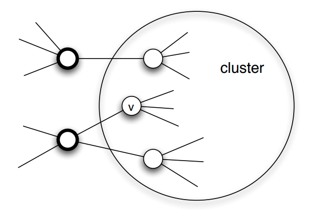 Image source: Textbook “Networks, Crowds and Markets” book, by Easley and Kleinberg, Chapter 19
We will first prove the following result:
Suppose that we model the diffusion process using the Linear Threshold Model with threshold value $\theta$.
If the set of initially active nodes is A, then the cascade will NOT cover the whole network if the network includes a cluster of initially inactive nodes with density greater than $1-\theta$.
Proof: We will prove this by contradiction - we start with an assumption, then following a series of steps which leads to a result that cannot be true. Consider such a cluster of initially inactive nodes with density greater than $1-\theta$. Assume the opposite of what we want to prove, i.e., that one or more nodes in this cluster eventually become active. Let v be the first such node in the cluster.
At the time v became active, its only active neighbors could be outside the cluster. But since the cluster has density greater than $1-\theta$, at least a fraction $1-\theta$ of v’s neighbors are in the cluster. So, less than a fraction $\theta$ of v’s neighbors are outside the cluster. Even if all of those neighbors were active, that would not be enough to activate v. This leads to a contradiction, and so it cannot be that the cluster eventually includes an active node.
Moreover, we can show the following related result:
If a network cascade that starts from a set of initial nodes A does not cover the whole network, then the network must include a cluster of density greater than $1-\theta$.
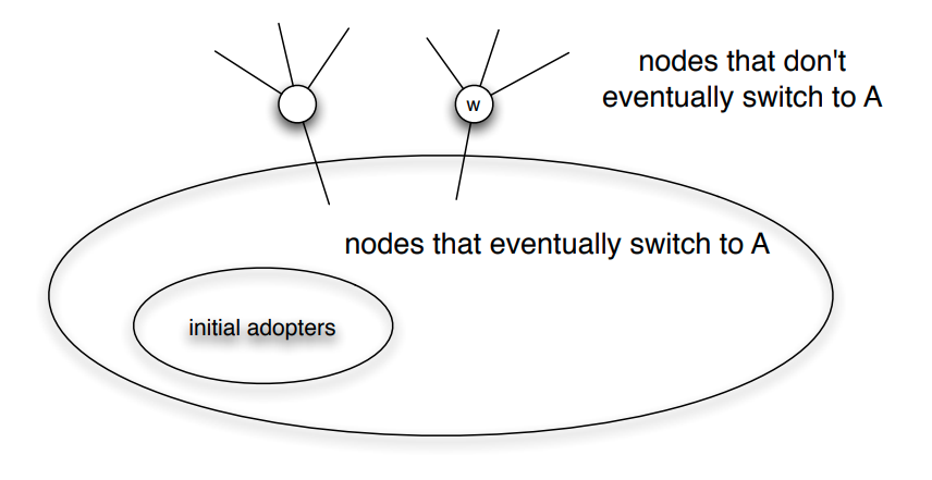
Food for Thought
Prove the last result stated above. The visualization at the right will help you to think about the proof.
Network Diffusion in the Brain
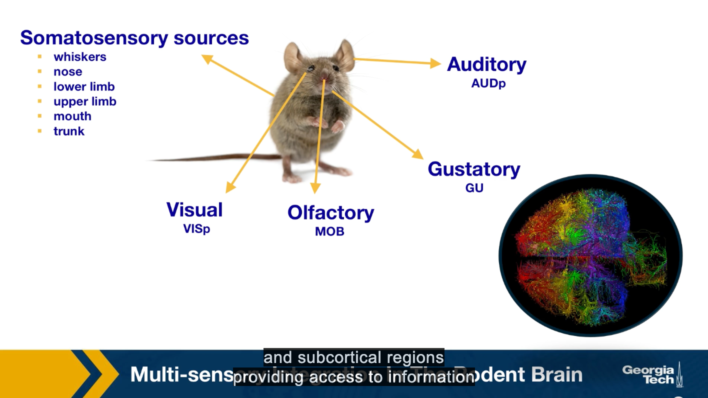
Perception requires the integration of multiple sensor inputs like gross distributed areas throughout the brain. While sensory integration at the behavioral level has been extensively studied in neuroscience, the network, and system-level mechanisms that underlie multi-sensory integration are still not well understood. The traditional view of primary cortical sensory areas as processing as a single sensory modality is rapidly changing. The somatosensory visual, laudatory, gustatory, and other sensory streams come together and separate to be processed at different parts of the brain.
Here we present the main results of the study by Kamal Sadi, and colleagues that applied a variation of the linear threshold model to study the diffusion of sensory information in the brain. In particular, we focus on how information propagates through the brain, starting from different primary sensory regions. These regions are the sources of the cascades. We have one cascade for each of these sources. Asynchronous linear threshold model is applied to the mouse connectivity Atlas, which was provided by the Allen Institute for Brain Science. This connectome has been available since 2014, and it consists of estimates of the connection density between both cortical and subcortical regions providing access to information about whole brain connectivity across different functionality and structurally distinct brain regions.
Reference: “Multisensory integration in the mouse cortical connectome using a network diffusion model” by K.Shadi et al., Network Neuroscience, 2020.
Asynchronous Linear Threshold (ALT) Model
The unweighted Linear Threshold model assumes that a “node” (brain region in this case) becomes active when more than a fraction of the neighboring nodes it receives incoming connections from being active.
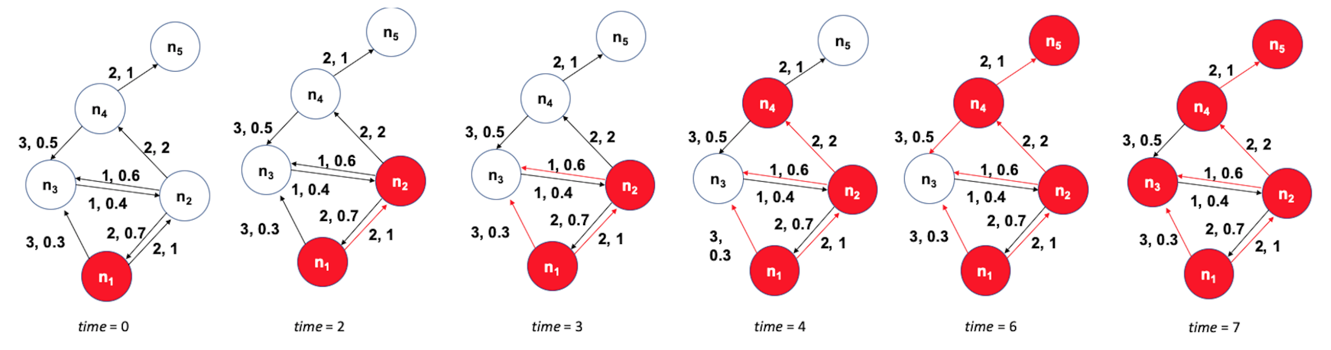 Figure 10.32 from Network Science by Albert-László Barabási
Here, we use a variation of this model with
- weighted connections, where the weights are based on the connection density of the projections, and
- connection delays, where the delays are based on the physical distance between connected brain regions.
The state of a node-i is initially $s_i(t)=0$. It becomes equal to 1 when:
\[\sum_{j \in N_{in}(i)} w_{ji}\, s_j(t- t_{ji}) > \theta\]where $N_{in}(i)$ is the set of nodes that node-i receives incoming connections from. $w_{ji}$ and $t_{ji}$ are the weight and delay of the connection from node-j to node-i, respectively, and $\theta$ is the activation threshold.
The ALT model is simple yet it incorporates information about distances between brain regions (to model connection delays) and uses local information (a thresholding nonlinearity) to potentially gate the flow of information.
The previous visualization shows a toy example with five nodes. The source of the cascade is node $n_1$. Each edge shows two numbers, the first is its delay, and the second is its weight. The activation threshold is set to $\theta=1$. The cascade takes 7-time units to propagate throughout the whole network.
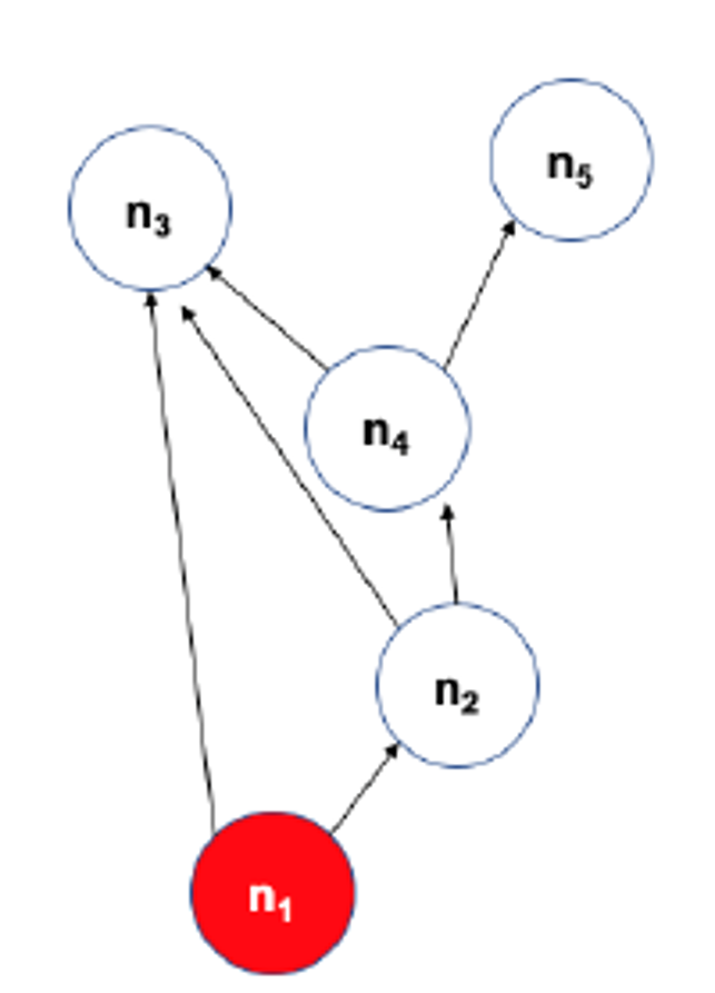
The visualization at the left shows the DAG that represents the activation cascade. For example, the activation of node $n_3$ takes place only after nodes $n_1,n_2$ and $n_4$ become active.
Experimental Validation of ALT Model
After stimulating a specific sensory modality, for example, the visual. Suppose that the model predicts that the region X gets activated before a brain region Y. Is it true that X also gets activated before Y in the experimental data? When this is the case, we count this pair X Y as a temporal agreement between the model and the results. When X gets activated before Y in the model but the opposite is true for the experimental results then we count XY as a temporal disagreement. And of course, we can also have cases where X and Y appear to be activated at the same time in the experiment because of the limited temporal resolution. Such cases are referred to as insufficient temporal resolution.
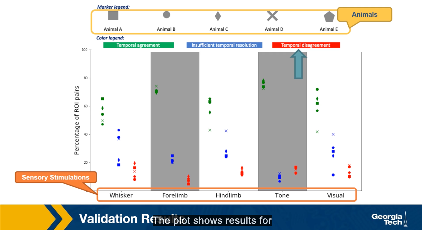
The plot shows the results of such comparisons for five different sensory stimulations and five different animals. The y-axis shows the percentage of XY brain regions that so either temporal agreement, insufficient temporal resolution or the temporal disagreement between the activation order of these brain regions.
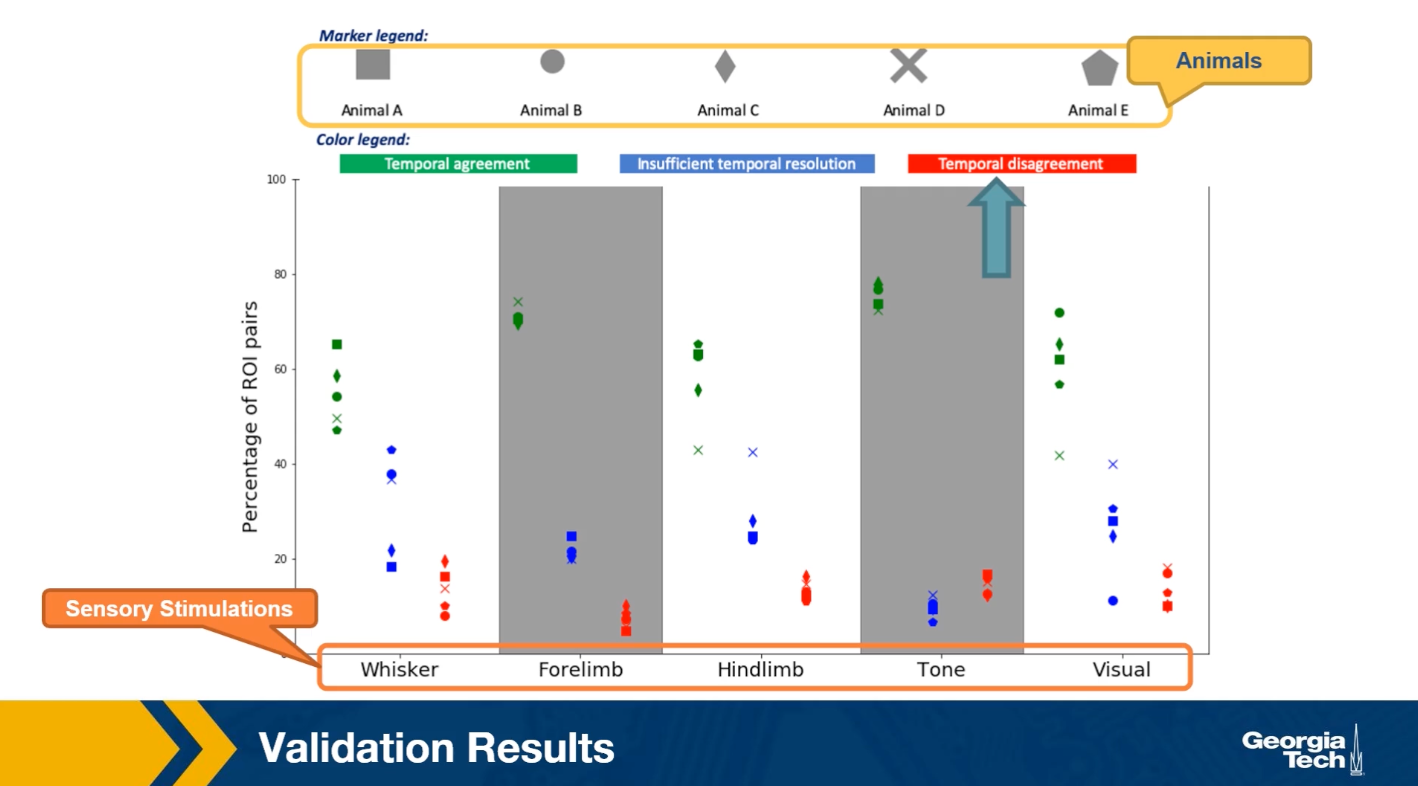
The plot shows results for five animals and five sensory stimulation even though the variability across animals is considerable, we observe that the percentage of temporal agreement pairs average that grows the five animals is higher than 50% and it varies between 50-80% depending on the sensory modality.
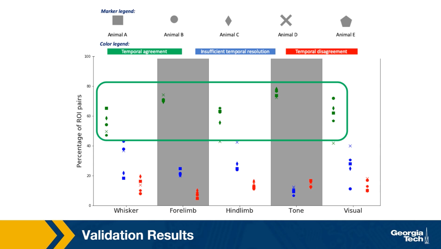
On the other hand, the corresponding percentage of temporal agreements is less than 10% of 20% depending on the stimulation. In the rest of the cases, the temporal resolution is not sufficient. This suggests that despite the simplicity of the linear threshold model, it can provide a useful approach for studying communication dynamics in brain networks.
Lesson Summary
This lesson focused on information diffusion processes on networks.
We started with some common empirical findings about the size and depth of the cascades that these diffusion processes create .
Then, we reviewed some common mathematical models, such as the Independent Cascade model, that are often used to study such network diffusion processes.
Then, we examined an important optimization problem in the context of network diffusion: if we can start a cascade from say k nodes, which nodes should we select to maximize the size of the cascade?
We also considered the effect of community structure on the extent of the diffusion process on a network.
Finally, we presented a case study of a network diffusion process on brain networks, in the context of multi-sensory integration.
L11 - Other Network Dynamic Processes
Overview
Required Reading
- Chapter-8 (sections 8.1-8.3) from A-L. Barabási, Network Science, 2015.
- Chapter 20 - D. Easley and J. Kleinberg, Networks, Crowds and Markets, Cambridge Univ Press, 2010 (also available online)
- Chapter 21 (section 21.5) - D. Easley and J. Kleinberg, Networks, Crowds and Markets, Cambridge Univ Press, 2010 (also available online)
Recommended Reading
- Synchronization in complex networks by A.Arenas et al., 2008
- Adaptive coevolutionary networks: a review by T.Gross and B.Blasius, 2008
- Co-evolutionary dynamics in social networks: A case study of twitter by D.Antoniades and C.Dovrolis, 2015
Inverse Percolation On Grids and G(n,p) Networks
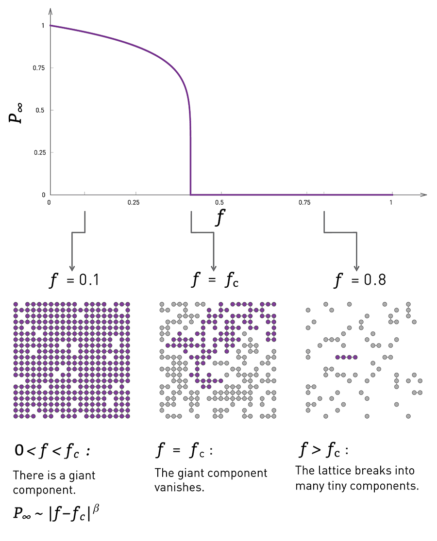 Image Source: Network Science by Albert-László Barabási.
Let’s start with a process of network dynamics in which the topology changes over time due to node (or link) removals.
This happens often in practice as a result of failures (e.g., Internet router malfunctions, removal of species from an ecosystem, mutations of genes in a regulatory network) or deliberate attacks (e.g., destroying specific generators in the power distribution network, arresting certain people in a terrorist network).
Consider the simpler case in which instead of a network we have a two-dimensional grid, and a node is placed at every grid point. Two nodes are connected if they are in adjacent grid points.
In the context of random failures, we can select a fraction f of nodes and remove them from the grid, as shown in the visualization at the left. The y-axis in that visualization shows the probability that a randomly chosen node belongs in the largest connected component on the grid.
When f is low, the removals will not affect the grid much in the sense that most of the remaining nodes still form a single, large connected component (referred to as giant component).
As f increases however the originally connected grid will start “breaking apart” in small clusters of connected grid points.
Further, as the visualization shows, this transition is not gradual. Instead, there is a sudden drop in the size of the largest connected component as f approaches (from below) a critical threshold $f_c$.
At that point the giant component disappears, giving its place to a large number of smaller connected components.
In physics, this process is referred to as inverse percolation and it has been extensively studied for both regular grids as well as random G(n,p) networks.

The visualization at the top shows simulation results of a G(n,p) network with n=10,000 nodes and average degree $\bar{k}=3$.
The y-axis shows, again, the probability that a node belongs in the largest connected component of the graph after we remove a fraction f of the nodes, normalized by the same probability when f=0.
In the case of random failures, note that the critical threshold $f_c$ is about 0.65-0.70. After that point, the network is broken into small clusters of connected nodes and isolated nodes.
The same plot also shows what happens when we attack the highest-degree nodes of the network. We will come back to this curve a bit later in this Lesson.
On the next page, we will see an animation for power-law networks, in which the degree distribution has infinite variance. In that case, the process of random node removals behaves very different than the process of node attacks.
Then, after that animation, we will derive and show some mathematical results for the critical threshold –for the case of random failures as well as for the case of higher-degree node attacks.
Food for Thought
Compare the inverse percolation process described here with what we studied in Lesson-3 about G(n,p) networks, namely the emergence of a giant connected component when the average degree exceeds one. In both cases we have a phase transition. What is common and what is different in the two processes?
Random Removals (Failures) vs Targeted Removals (Attacks)
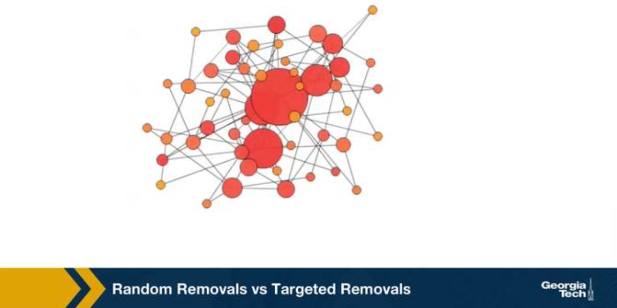
We consider two ways of removing nodes from a network, random removals or failures, and targeted removals of the highest degree nodes. We refer to those as attacks. The visualization shows a network with 50 nodes and about 100 edges. The network was created with the preferential attachment model, and so, that the degree distribution is approximately a power law with exponent 3 as we learn in lesson four. Note that the size of its node is proportional to its degree. The animation shows the case of random removals, in iteration, we select a random node and remove it, This changes the degree of all nodes connected to the remove node. The question we focus is, how many nodes do we need to remove until the network’s largest connected component folds apart to just a small fraction of the initial network size?
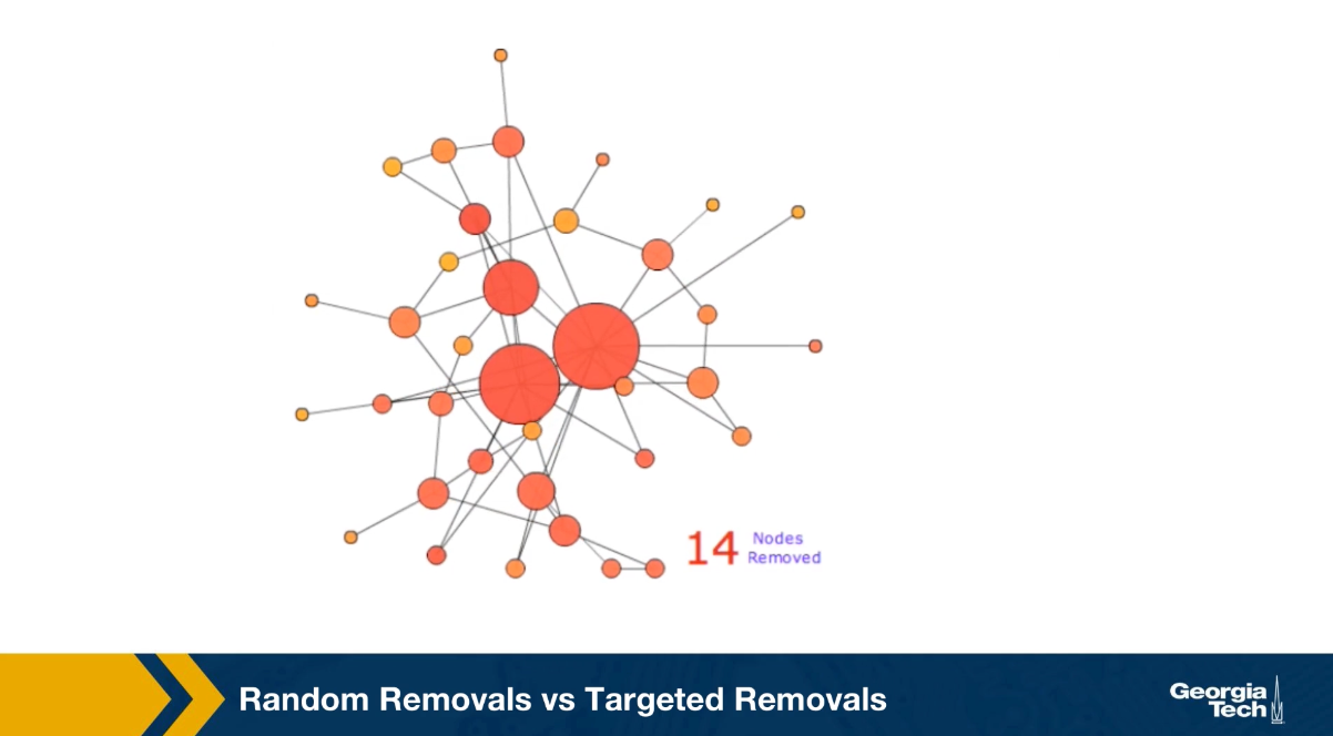
In this animation, this happens after we remove about 40 to 45 out of the 50 nodes. Note that the four to five hubs keep the network connected because of the remaining connections. The largest connected component breaks down, only when we have removed so many nodes, but the original hubs are no longer high degree nodes. Let us now switch to targeted removals or attacks.
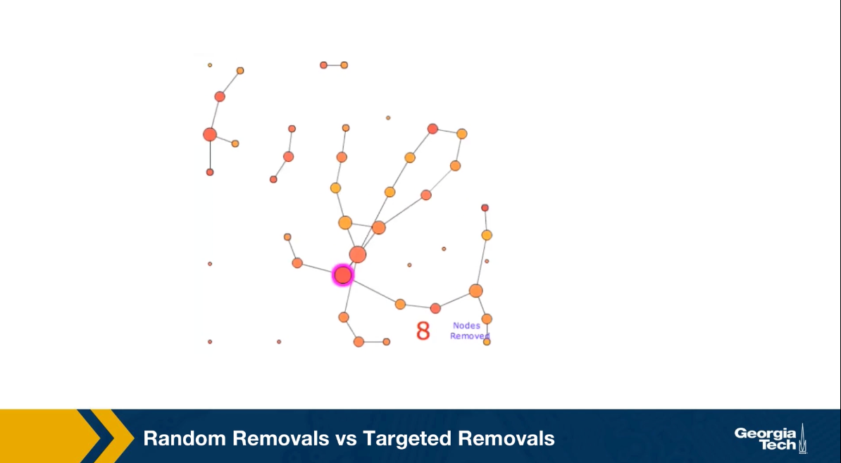
The animation shows here what happens if we remove the node with the highest degree in each iteration. Such an attack on the network would require that the attack has some information about the topology of the network, or the degree of its node. In this case, it takes only the removal of about 10 nodes before the largest connected component falls apart to disconnected individual nodes, and few small connected components.
The qualitative conclusion from these two animation is that the networks with power law degree distribution, and that’s with hubs are quite robust to random failures but they are also very vulnerable to targeted attacks on their highest degree nodes.
Molloy-Reed Criterion
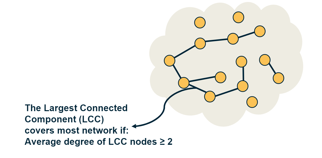
If the largest connected component (LCC) of a network covers almost all nodes, we refer to that LCC as the giant component of the network.
To derive the critical threshold of an inverse percolation process, we need a mathematical condition for the emergence of the giant component in a random network (including power-law networks). This condition is referred to as Molloy-Reed criterion (or principle):
Consider a random network that follows the configuration model with degree distribution p(k) (i.e., there are no degree correlations). The Molloy-Reed criterion states that the average degree of a node in the giant component should be at least two.
Intuitively, if the degree of a node in the LCC is less than 2, that node is part of the LCC but it does not help to expand that component by connecting to other nodes. So, in order for the LCC to expand to almost all network nodes (i.e., in order for the LCC to be the giant component), the average degree of a node in the LCC should be at least two.
To express the Molloy-Reed criterion mathematically, let us first derive the average degree of a node in the LCC, as follows:
Suppose that j is a node that connects to the LCC through an LCC node i.
Let $P[k_j=k | A_{i,j}=1]$ be the probability that node j has degree k, given that nodes i and j are connected.
From Bayes’s theorem, we have that:
\[P[k_j=k | A_{i,j}=1] = \frac{P[k_j=k, A_{i,j}=1] }{P[A_{i,j}=1] } = \frac{P[k_j=k] \, P[A_{i,j}=1| k_j=k]}{P[A_{i,j}=1] } \quad (1)\]For a network with n nodes and m edges, the denominator is simply:
\[P[A_{i,j}=1] = \frac{2m}{n(n-1)}= \frac{\bar{k}}{n-1},\]where $\bar{k}$ is the average node degree.
Also, $P[A_{i,j}=1 | k_j=k] = \frac{k}{n-1}$ because j chooses between n-1 nodes to connect to with k edges (recall that the configuration model allows for multiple edges between nodes).
Returning to Equation-(1), we can now derive the average degree of nodes in the LCC:
\[\sum_{k} {k \, P[k_j=k | A_{i,j}=1]} = \sum_{k} {k \, \frac{P[k_j=k] \, P[A_{i,j}=1| k_j=k]}{P[A_{i,j}=1] }} = \frac{\sum_{k} k^2 p(k)}{\bar{k}} = \frac{\bar{k^2}}{\bar{k}} \]So, returning to the Molloy-Reed criterion, we can now state it mathematically, as follows:
In a random network that follows the configuration model with degree distribution p(k), if the first and second moments of the degree distribution are $\bar{k}$ and $\bar{k^2}$ respectively, the network has a giant connected component if
\[\frac{\bar{k^2}}{\bar{k}} \geq 2\]Food for Thought
How does the Molloy-Reed criterion relate to the following result in Lesson-3 about G(n,p) networks: a giant connected component emerges if the average node degree $\bar{k}$ is more than one? And how does it relate to the average neighboring node degree $\bar{k}_{nn}$, we derived in Lesson-2?
Robustness of Networks to Random Failures
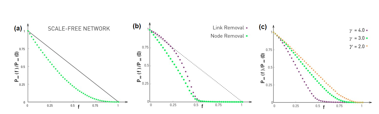 Image Source: Network Science by Albert-László Barabási
We will now present the critical threshold under random node failures. The detailed proof of this result can be found in the textbook (Advanced Topics 8.C). The key points of the proof however are the following:
A. When we remove a fraction f of the nodes, the degree distribution changes. A node that had degree k in the original network, will now have a degree $\kappa \leq k$ with probability
\[\binom{k}{\kappa} \, f^{k-\kappa} \, (1-f)^{\kappa}\]because each of the $k-\kappa$ neighbors of that node is removed with probability $f$, and there are $\binom{k}{\kappa}$ ways to choose $\kappa$ from $k$ neighbors.
B. If the probability that a node has degree k at the original network is $p_k$, the probability that the node has degree $\kappa$ in the reduced network (the network that results after the removal of a fraction f of the nodes) is:
\[p'_{\kappa} = \sum_{k=\kappa}^{\infty} p_k \binom{k}{\kappa} f^{k-\kappa} (1-f)^{\kappa}\]C. The average degree of the reduced network is a fraction (1-f) of the average degree of the original network:
\[\bar{\kappa} = (1-f) \, \bar{k}\]D. Similarly, the second moment of the degree distribution of the reduced network is:
\[\bar{\kappa^2} = (1-f)^2 \bar{k^2} + f (1-f) \bar{k}\]where $\bar{k^2}$ is the second moment of the degree distribution of the original network.
Going back to the Molloy-Reed criterion, the reduced network has a giant connected component if
\[\frac{\bar{\kappa^2}}{\bar{\kappa}} \geq 2\]Substituting the previous expressions for the first and second moments of the reduced network, we get that the critical threshold for random node failures is
\[f_c = 1 - \frac{1}{\frac{\bar{k^2}}{\bar{k}} -1}\]For G(n,p) networks, the degree variance is equal to the average degree, and so $\bar{k^2}=\bar{k}(\bar{k}+1)$. This means that the critical threshold for a G(n,p) network is
\[f_{c,G(n,p)} = 1 - \frac{1}{\bar{k}}\]So, if the average degree of a large G(n,p) network is 2, we expect that the giant connected component of the network will disappear when the fraction of removed nodes exceeds about 50%, as shown in Figure (b).
What happens with power-law networks in which the degree exponent is between 2 and 3? As we saw in Lesson-4, in that case the first moment is finite but the degree variance and the second moment diverge. So, $f_c$ converges to 1, at least asymptotically,
\[f_{c, \, 2<\gamma\leq 3}\to 1\]Figure (a) illustrates this point with simulation results on a power-law network n=10,000 nodes, degree exponent $\gamma=2.5$, and minimum degree $k_{min}=1$. As n tends to infinity, the green curve will asymptotically converge to zero at $f=1$.
This is a remarkable result that needs further discussion: it means that such networks stay connected in a single component even as we remove almost all their nodes. Intuitively, this happens because networks with diverging degree variance have hubs with very large degree. Even if we remove a large fraction of nodes, it is unlikely that we remove all the hubs from the network, and so the remaining hubs keep the network connected.
The situation is not very different if we randomly remove links instead of nodes, as shown in Figure (b). Here, we remove a fraction f of all links in the network. It can be shown that the network’s giant connected component disappears at the same critical threshold as in the case of node removals. The visualization in Figure (b) refers to a G(n,p) network in which n=10,000 nodes and the average degree is $\bar{k}=2$. As predicted by the critical threshold equation, the giant component disappears when we remove 1-(1/2)=50% of all edges. For lower values of f, the effect of random node removals is more detrimental than the effect of random link removals (why?).
What happens with power-law networks in which the degree exponent $\gamma$ is larger than 3? In that case the degree variance is finite, and so we can use the critical threshold equation to calculate the maximum value of f that does not break the network’s giant component. Figure (c ) shows numerical results of three values of $\gamma$– the network size is n=10,000 and the minimum node degree $k_{min}=2$.
Food for Thought
How do you explain that the random removal of a fraction f of nodes causes a larger decrease in the size of the largest component than the random removal of a fraction f of links (when $f<f_c$>)?
Robustness of Networks to Attacks
What happens in the case of attacks to the higher-degree nodes? What is the critical threshold $f_c$ in that case?
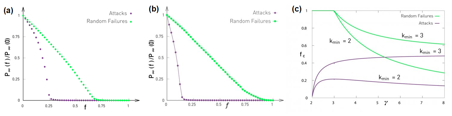 Image Source: Network Science by Albert-László Barabási
Let us start with some simulations. Figure (a) contrasts the case of random failures and attacks in a G(n,p) network with n=10,000 nodes and average degree $\bar{k}=3$. The y-axis shows, as in the previous page, the probability that a node belongs in the largest connected component of the graph after we remove a fraction f of the nodes, normalized by the same probability when f=0. In the case of random failures, the critical threshold $f_c$is about 0.65-0.70 – the theoretical prediction for an infinitely large network is $1-1/\bar{k}=2/3$.
The same plot shows what happens when we “attack” the highest-degree nodes of the network. Specifically, we remove nodes iteratively, each time removing the node with the largest remaining degree, until we have removed a fraction f of all nodes.
This “attack” scenario destroys the LCC of the network for an even lower value of f than random removals. The critical threshold for attacks is about 0.25 in this network. The fact that the critical threshold for attacks is lower than for random failures should be expected – removing nodes with a higher degree makes the LCC sparser, increasing the chances that it will be broken into smaller components.
As we know from Lesson-4 however, G(n,p) networks do not have hubs and the degree distribution is narrowly concentrated around the mean (Poisson distribution). What happens in networks that have hubs – and in particular what happens in power-law networks in which the degree variance diverges?
Figure (b) contrasts random failures and attacks for a power-law network n=10,000 nodes, degree exponent $\gamma=2.5$, and minimum degree $k_{min}=1$. Even though the case of random failures does not have a critical threshold ($f_c$ tends to 1 as the network size increases), the case of attacks has a critical threshold that is actually even lower (around 0.2 in this example) than the corresponding threshold for G(n,p) networks. Power-law networks have hubs, and attacks remove the hubs first. So, as the network’s hubs are removed, the giant component quickly gets broken into many small components.
The moral of the story is that even though power-law networks are robust to random failures, they are very fragile to attacks on their higher degree nodes.
The mathematical analysis of this attack process is much harder (you can find it in your textbook in “Advanced topics 8.F”) and it does not lead to a closed-form solution for the critical threshold $f_c$.
Specifically, if the network has a power-law degree distribution with exponent $\gamma$ and with minimum degree $k_{min}$, then the critical threshold $f_c$ for attacks is given by the numerical solution of the equation:
\[f_c^{\frac{2-\gamma}{1-\gamma}} = 2 + \frac{2-\gamma}{3-\gamma} \, k_{min} \, \left(f_c^{\frac{3-\gamma}{1-\gamma}} -1 \right)\]Figure (c ) shows numerical results for the critical threshold as a function of the degree exponent $\gamma$, for two values of $k_{min}$, and separately for failures and attacks.
The key points from this plot are:
- In the case of random failures, $f_c$ decreases with $\gamma$ – this is expected because as $\gamma$ decreases towards 3, the degree variance increases, creating hubs with higher-degree.
- In the case of attacks, however, the relation between $f_c$ and $\gamma$ is more complex, and it also depends on $k_{min}$. In the case of $k_{min}=3$, as $\gamma$ decreases, $f_c$ decreases because the degree variance increases, the hubs have an even greater degree, and removing them causes more damage in the network’s giant component.
- As expected, for given values of $\gamma$ and $k_{min}$, attacks always have a smaller $f_c$ than random failures.
- As $\gamma$ increases, and for a given value of $k_{min}$, the critical threshold $f_c$ for attacks approaches the critical threshold for random failures. The reason is that as $\gamma$ increases, the variance of the degree distribution decreases. In the limit, the degree variance becomes zero and all nodes have the same degree. In that case, it does not matter if we remove nodes randomly or through attacks.
Food for Thought
How would you explain the way that the critical threshold $f_c$ depends on the minimum degree $k_{min}$, for a given value of the exponent $\gamma$ ? Answer separately for random failures and attacks.
Small-world Networks and Decentralized Search
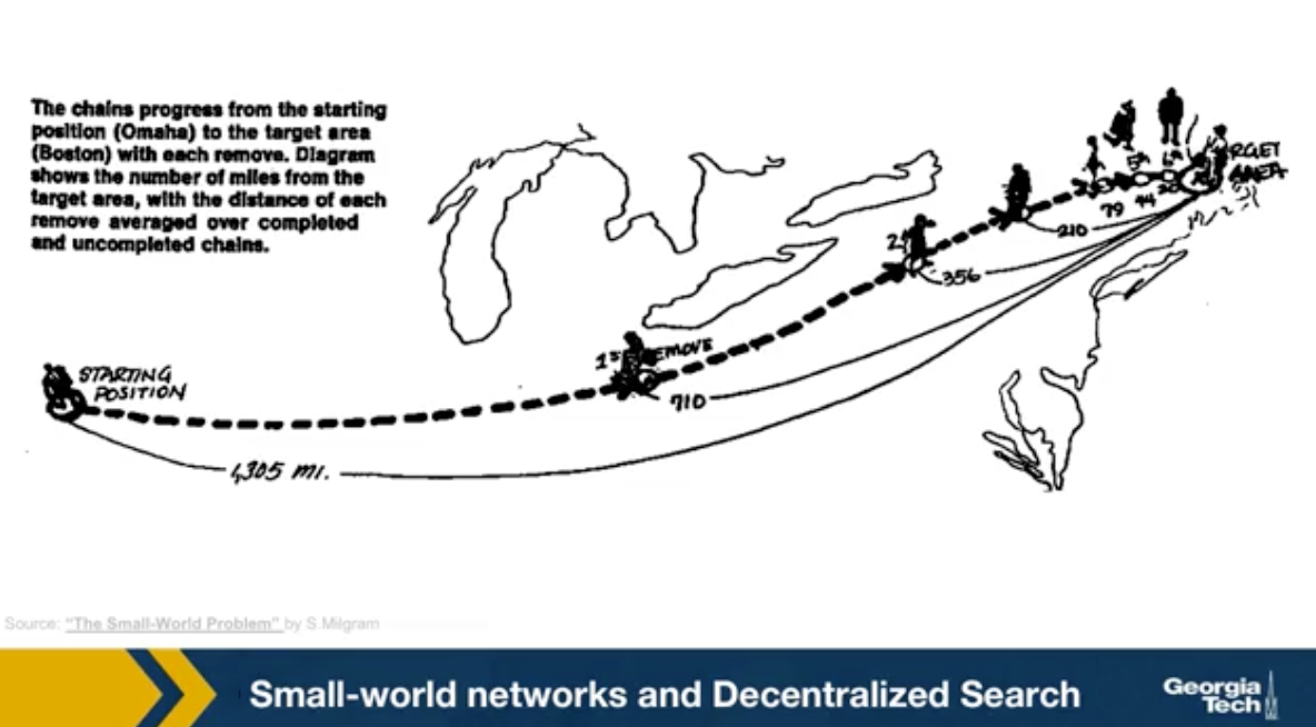
Back in the late 60s, the famous sociologist Stanley Milgram, decided to study the small world phenomenon. Until then, this was only a fascinating anecdote. People would find it amusing every time it was discovered that two random individuals know hte same person. Nobody had studied this empirically however, and the six degrees fo separation principle was just an expression. Milgram asked several individuals in Nebraska to forward the letter to a target person in Boston. He gave participants the name, address, and occupation of the target. But the participants could not just send the letter directly to the target. They had to forward the letter to a person they knew on a first name basis with a goal of reaching the target as soon as possible. Most participants chosen acquaintances based on geographical and occupational information. It is reasonable to expect that these letters would never reach their destination. Because finding such a path between two random individuals, one in Nebraska and another in Boston would require a very long number of intermediates. Besides, it could be that even if there are short paths between these two individuals, their immediate people would not know that short path exists.
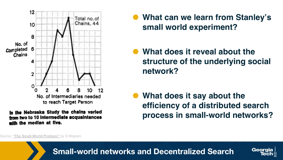
And so the letters would keep getting forwarded in the vicinity of the target but never actually reaching the target. Surprisingly, one third of the letters made it to the target. The histogram that you see here from Milgram original paper shows that the median distance was six steps just as the six degree of separation principle detected.
What can we learn Stanley Milgram’s small world experiment? What does it reveal about the structure of hte underlying social network? And what does it say about the efficiency of a distributed search process in small-world-networks? These are questions that we answer in the next few pages using an elegant mathematical model that was developed by John Kleinberg at Cornell University.
Food for Thought
It is interesting to read the original paper by Milgram (1967). Here is the link
Decentralized Search Problem
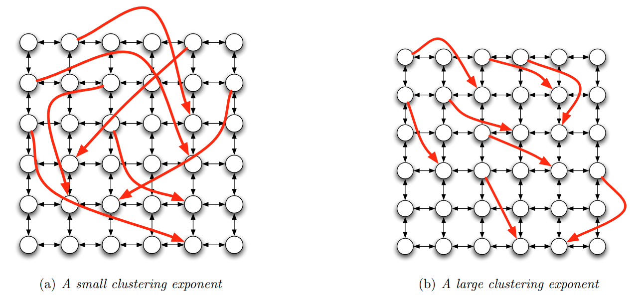 Image Source: Textbook “Networks, Crowds and Markets”.by Easley and Kleinberg. Figure 20.5
Milgram’s experiment has been repeated by others, both in offline and online social networks. These studies show two points:
Even global social networks (Facebook has around one billion users) have multiple short paths to reach almost anyone in the network (typically around 5-6 hops, and almost always less than 10 hops).
It is possible to find at least one of these short paths with strictly local information about the name and location of your neighbors, without having a global “map” (topology) of the network – and without a central directory that stores everyone’s name and location in the network.
The first point should not be surprising to us by now. Recall what we learned about Small World networks in Lesson-5. A network can have both strong clustering (i.e., many triangles, just as a regular network) and short paths (increasing logarithmically with the size of the network, just as G(n,p) networks). The way this is achieved in the Watts-Strogatz model is that we start from a regular network with strong clustering and rewire a small fraction (say 1%) of edges to connect two random nodes. These random connections connect nodes that can be anywhere in the network – and so for large networks, these random connections provide us with “long-range shortcuts”. If you do not recall these points, please review Lesson-5.
Let us now focus on the second point: how is it possible to find a target node in a network with only local information, through a distributed search process? First, let us be clear about the information that each node has: a node v knows its own location in the network (in some coordinate system), the locations of only the nodes it is connected to, and the location of the target node.
The metric we will use to evaluate this distributed search process is the “expected delivery time”, i.e., the expected number of steps required to reach the target, over randomly chosen source and target nodes, and over a randomly generated set of long-range links.
To answer the previous question, we will consider an elegant model developed by Jon Kleinberg. Suppose that we start with a regular grid network in k-dimensions (the visualizations shown refer to k=2 but you can imagine mesh networks of higher dimensionality). Each node is connected to its nearest neighboring nodes in the grid. Note that this network does not have cliques of size-3 (triangles) but it still has strong clustering in groups of nodes that are within a distance of two hops from each other.
Let $d(v,w)$ be the distance between nodes v and w in this grid. Kleinberg’s model adds a random edge out of v, pointing to a node w with a probability that is proportional to $d(v,w)^{-q}$ – the exponent q is the key parameter of the model as we will see shortly.
The value of q controls how “spread out” these random connections actually are. If q=0, the random connections can connect any two nodes, independent of their distance (this is the case in the Watts-Strogatz model) – and so they are not very useful in decentralized search, when you try to “converge” to a certain target in as few steps as possible. If q is large, on the other hand, the random connections only connect nearby nodes – and so they will not provide the long-range shortcuts that are necessary for Small World property.
The visualization contrasts the case of a small q and a large q. What do you think would be the optimal value of q, so that the decentralized search process has the minimum expected delivery?
Food for Thought
Try to think of either an application of decentralized search in technological/social networks – or of an instance of decentralized search in natural networks. For example, back in the early 2000s, when peer-to-peer applications such as Gnutella were popular for sharing music files, decentralized search was at the “peak of its glory”.
The Optimal Search Exponent in Two Dimensions
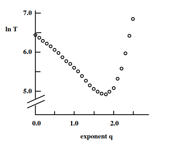 Image Source: Textbook “Networks, Crowds and Markets”.by Easley and Kleinberg. Figure 20.6
Let us start with some simulation results. The plot shows the exponent q at the x-axis, when the initial grid has k=2 dimensions. The y-axis shows the logarithm of the expected delivery time in a grid with 400 million nodes. Each point is an average across 1000 runs with different source-target pairs and different assignments of random edges.
As expected, values of q that are either close to 0 or quite large result in very slow delivery times. The random edges are either ”too random” (when q is close to 0) or ”not random enough” (when q is large).
It appears that the optimal value of the exponent q is when it is close to 2 – which, remember, is also the value of the dimension k in these simulations. Is this a coincidence?
The answer is that we can prove that the optimal value of q is equal to k. In other words, if we want to maximize the speed of a decentralized search in a k-dimensional world, we should have random “shortcut links” the probability of which decays as $d(v,w)^{-k}$ with the distance between two nodes. This surprising result was proven by Kleinberg in 2000.
You can find the proof, at least for k=1 and 2, in the online textbook “Networks, Crowds and Markets” by Easley and Kleinberg (section 20.7). On the next page, we give the basic intuition behind this result.
Food for Thought
Why do you think that the average delivery time increases much faster when q>2 than when q<2?
Why The Optimal Value of q is Equal to Two in a Two-Dimensional World?
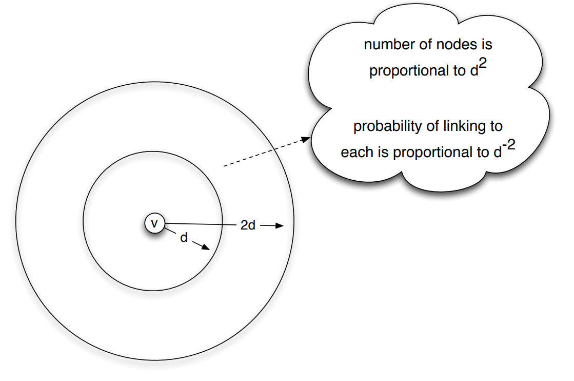 Image Source: Textbook “Networks, Crowds and Markets”.by Easley and Kleinberg. Figure 20.7
We can organize distances into different “scales of resolution”: something can be around the world, across the country, across the state, across town, or down the block.
Suppose that we focus on a node v in the network – and consider the group of nodes that are at distances between d and 2d from v in the network, as shown in the visualization.
If v has a link to a node inside that group, then it can use that link to get closer to the set of nodes that are within that scale of resolution.
So, what is the probability that v has a link to a node inside that group? And how many nodes are expected to be in that distance range?
In a two-dimensional world, the area around a certain point (node v) grows with the square of the radius of a circle that is centered at v. So, the total number of nodes in the group that are at a distance between d and 2d from v is proportional to $d^2$.
On the other hand, the probability that node v links to any node in that group scales as $d(v,w)^{-2}$, when $q=k=2$. So, if node w is at a distance between d and 2d from v, the probability that it is connected to v is proportional to $d^{-2}$.
Hence, the number of nodes that are at a distance between d and 2d from v, and the probability that v connects to one of them, roughly cancel out. This means that the probability that a random edge links to a node in the distance range [d,2d] is independent of d.
In other words, when q=k=2, the long-range links are formed in a way that “spreads them out” roughly uniformly over all different resolution scales. This is the key point behind Kleinberg’s result.
If the exponent q was lower than k=2, the long-range links would be spread out non-uniformly in favor of larger distances, while if q was larger than k=2, the long-range links would be spread out non-uniformly in favor of shorter distances.
Food for Thought
The proof of the previous result, at least for for k=1 and k=2, is clearly written in sections 20.7 and 20.8 of the Easley/Kleinberg textbook. I recommend you go through it.
Decentralized Network Search in Practice
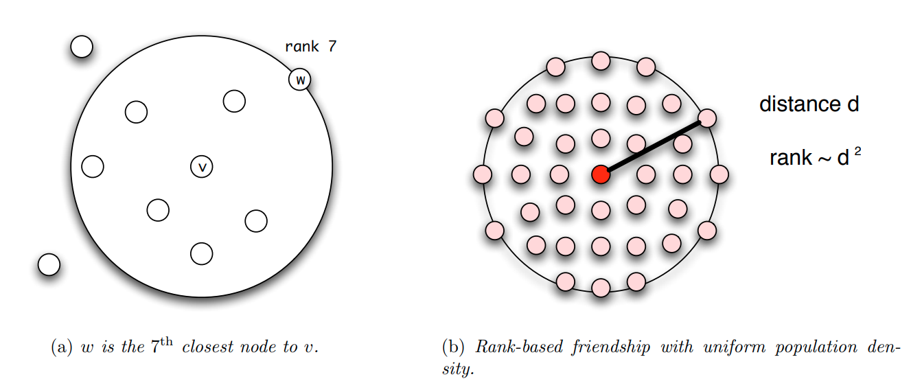 Image Source: Textbook “Networks, Crowds and Markets”.by Easley and Kleinberg. Figure 20.9
In the last few years, researchers have also investigated the efficiency of decentralized search empirically, mostly doing experiments in online social networks. There are a number of practical issues that have to be addressed however when we move from Kleinberg’s highly abstract model to the real world.
First, in practice, people do not “live” on a regular grid. In the US, for instance, the population density is extremely nonuniform, and so it would be unreasonable to expect that the q=k=2 result would also hold true about real social networks. One way to address this issue is to work with “rank-based links” rather than “distance-based links”. The rank of a node w, relative to a given node v, is the number of other nodes that are closer to v than w – see Figure (a).
We can now modify Kleinberg’s model so that the random links are formed based on node ranks, rather than rank distances. In Figure (b), we see that when nodes have a uniform population density, a node w at distance d from v will have a rank that is proportional to $d^2$, since all nodes inside a circle of radius d will be closer to v than w.
In fact, it can be proven that, for any population density – not just uniform – if the random links are formed with a probability that is proportional to $\frac{1}{\mbox{rank}_v(w)}$, the resulting network will have minimum expected delivery time – note that the exponent, in this case, is 1, not 2.
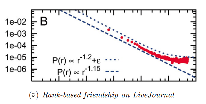
This result has been empirically validated with social experiments on an earlier social networking application called LiveJournal – but similar experiments have been also conducted on Facebook data. Figure-c shows the probability of a friendship as a function of geographic rank on the blogging site LiveJournal. Note that the decay is almost inversely proportional to the rank.
Another way to generalize decentralized network search is by considering that people can belong to multiple different groups (family, work, hobbies, etc), and so the distance (or rank) between two network nodes can be defined based on the group at which the two nodes are closest. This group is referred to as the ”smallest focus” that contains both nodes. This generalized distance metric has allowed researchers to examine more realistically whether real social networks have the optimal “shortcut links” to minimize the delivery time of the decentralized search, in terms of the corresponding exponent.
An interesting question, that is still largely an open research problem, is: why is it that real social networks, both offline and online, have such optimal “shortcut links”? Clearly, when people decide who to be friends with on Facebook or in real life, they do not think in terms of distances, ranks, and exponents!
One plausible explanation is that the network is not static – but instead, it evolves over time, constantly rewiring itself in a distributed manner, so that searches become more efficient. For instance, if you find at some point that you want some information about a remote country (e.g., Greece), you may try to find someone that you know from that country (e.g., the instructor of this course) and request that you get connected on Facebook. That link can make your future searches about that country much more efficient.
Synchronization of Coupled Network Oscillators
Synchronization is a very important property of both natural and technological system. In broad terms, synchronization refers to any phenomenon in which several distinct but coupled, dynamic element have a coordinated dynamic activity. For example, all the devices that are connected to the internet have synchronized clock using a distributed protocol called NTP, network time protocol. Interestingly, this protocol works quite well despite the fact that internet delays are unknown and time varying and the complete topology of the internet is not known.
A classic example of emergent synchronization is shown in this youtube video. Five metronomes are placed on a moving bar so that the motion of its metronome is loosely coupled with the motion of others. The metronomes start from a random phase and under certain conditions that we discuss later in this lesson, they can get completely synchronized after some time as this video shows. Note that in this case, the communication between the five dynamic elements is only indirect.
The metronomes do not exchange any messages, instead, each of them affects to a small degree, the movement of the underlying board and that board affects hte movement of every metronome. Another example of self organized synchronization in nature is when many fireflies gather close together as this image shows. Note that each firefly cannot see all other fireflies such global communication is not necessary in synchronized systems. Instead, the remarkable effect is that a large number of systems can get synchronized at least a period of time even if each of them can only communicate locally with other nearby systems.
Similar distributed synchronization phenomena also take place with flock of birds, and school of fish, forming fascinating dynamic patterns. In technology, similar problems emerge when we have a group of robots, autonomous vehicles or drones that need to coordinate without having a centralized controller. Our brains also rely on short term synchronization between thousands of neurons, so that different brain regions can communicate. This type of synchronization, referred to as coherence is shown at this video.
The video shows three views from the lateral and dorsal of the zebrafish brain using calcium imaging. Whenever a cluster of neurons fires, the corresponding part of hte brain lights up. Note how different brain regions get active at about the same time, occasionally producing large avalanches of neural activity throughout most of the brain. Synchronization is not always a desirable state, however. For example, too much synchronization in the brain can cause seizures. This image shows EGG recordings during the onset of an epileptic seizure. The scissor start at about the middle of the blood, and it shows major waves discharges at the Frequency of about three hertz over most of the patient’s cortical surface.
Food for Thought
Can you think of other systems, closer to your interests, that can show spontaneous synchronization?
Coupled Phase Oscillators – Kuramoto Model
Collective synchronization phenomena can be complex to model mathematically. The class of models that have been studied more extensively focuses on coupled phase oscillators.
Suppose that we have a system of N oscillators. The j’th oscillator is a sinusoid function with angular frequency $\omega_j$. To simplify suppose that the amplitude of all oscillators is the same (set to 1).
If the oscillators were decoupled, the dynamic phase $\phi_j(t)$ of oscillator j would be described by the differential equation:
\[\frac{d\phi_j}{dt} =\omega_j\]Things get more interesting however when the oscillators are coupled (the exact mechanism that creates this coupling does not matter here) so that the angular velocity of each oscillator depends on the phase of all other oscillators, as follows:
\[\frac{d\phi_i}{dt} = \omega_i+ \frac{K}{N} \sum_{j=1}^N \sin(\phi_j-\phi_i)\]where K>0 is the coupling strength. In other words, the angular velocity of oscillator i is not just its “natural” frequency $\omega_i$ – instead the angular velocity is adjusted by the product of K and the average of the $\sin(\phi_j-\phi_i)$ terms.
This model was introduced by Yoshiki Kuramoto, and it carries his name (Kuramoto model). Suppose we only have N=2 oscillators, i and j. If the j’th oscillator is ahead of the i’th oscillator at time t (i.e., $\phi_j(t) >\phi_i(t)$, with $\phi_j(t) - \phi_i(t)< \pi$ ), then the j’th oscillator adds a positive term in the angular velocity of the i’th oscillator, accelerating the latter and pulling it closer to the j’th oscillator. Similar, the i’th oscillator adds a negative term in the angular velocity of the j’th oscillator causing it to slow down, and also pulling it closer to the i’th oscillator. Will the two oscillators end up synchronized, i.e., having $\phi_i(t) = \phi_j(t)$ for all time?
That depends on the magnitude of K, relative to the magnitude of the difference of the two natural frequencies $|\omega_i - \omega_j|$. Intuitively, the larger the difference of the two natural frequencies, the larger the coupling strength should be so that the two oscillators synchronize.
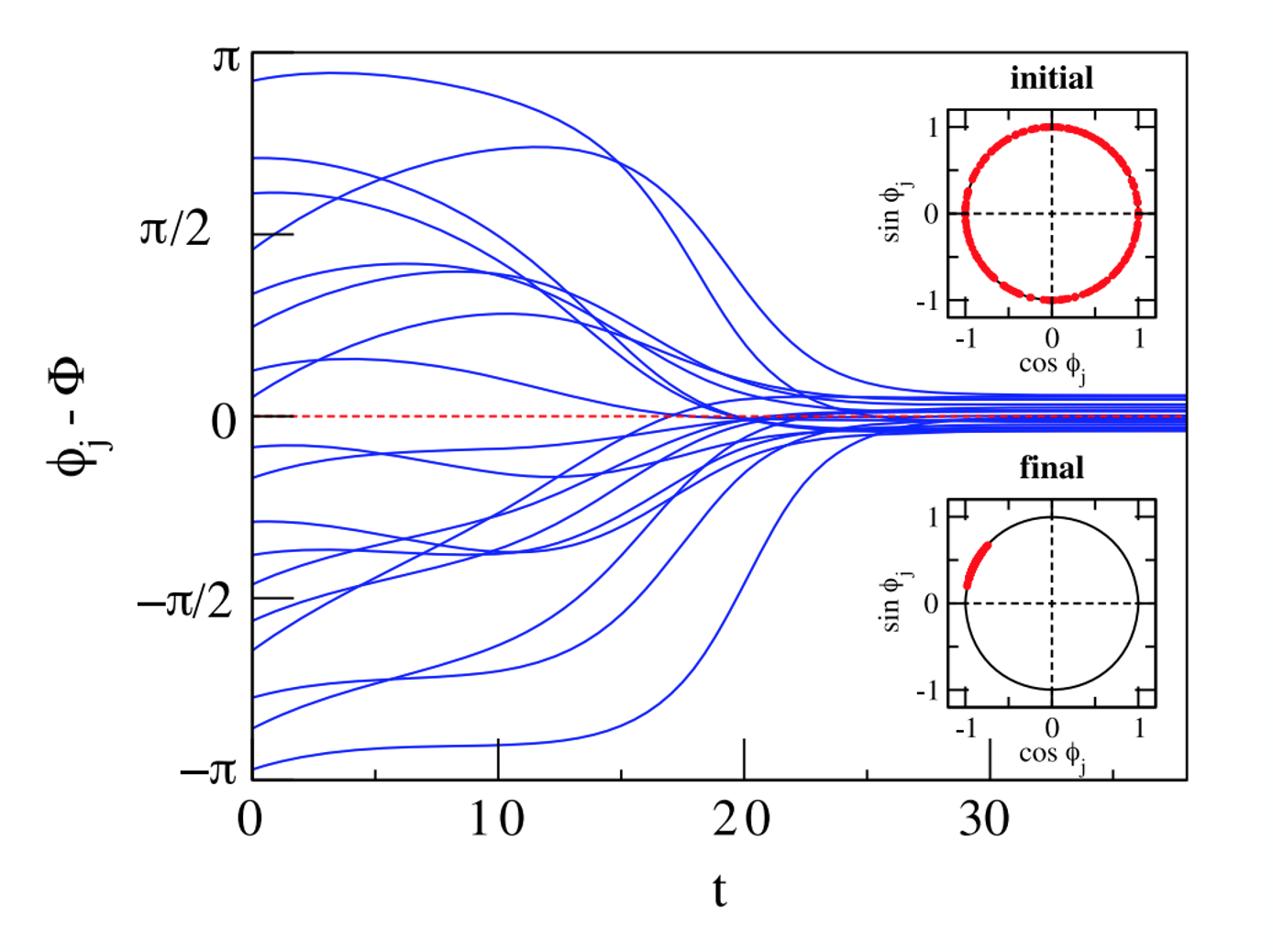
Actually, it is not hard to see that in this simple model the two oscillators cannot synchronize if $K < |\omega_i - \omega_j|$ because in that case, the velocity adjustment added by the other oscillator is always lower than the difference of the two natural frequencies.
What happens when we have more than two oscillators, however? To illustrate, look at these simulation results with N=100 oscillators.
The plot shows the phase difference between individual oscillators (only 18 out of 100 curves are shown) and their average phase $\Phi(t)$. In this case, K is large enough to achieve complete synchronization.
The two smaller plots inside the left figure show the initial state (the 100 oscillators are uniformly distributed on the unit cycle of the complex plane) as well as the final state in which the oscillators are almost perfectly synchronized.
Let us now introduce a synchronization metric that will allow to measure how close N oscillators are to complete synchronization. Recall from calculus that a sinusoidal oscillator with phase $\Phi(t)$ and unit magnitude can be represented in the complex plane as $e^{i\phi(t)}$, where i is the imaginary unit.
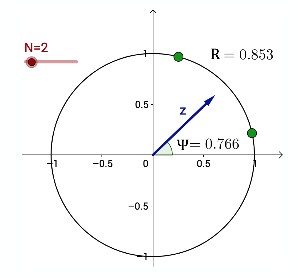
The average of these N complex numbers is another complex number $r(t)$ with magnitude $R(t)$ and phase $\Phi(t)$:
\[r(t) = R(t) \, e^{i\, \Phi(t)} = \frac{1}{N} \sum_{j=1}^N e^{i\, \phi_j(t)}\]The magnitude R(t) is referred to as synchronization order parameter. Its extreme values correspond to complete synchronization when R(t)=1 (all oscillators have the same phase) and complete de-coherence when $R(t)=0$ (that happens when each oscillator has a phase difference $2\pi/N$ from its closest two oscillators).
The visualization at the right shows the unit cycle in the complex plane. Two oscillators are shown as green dots on the unit cycle. The vector z represents the average of the two oscillators. The order parameter in this example is 0.853 (shown as R in this plot), and the phase of z is shown as $\Psi=0.766$ .
Food for Thought
Show mathematically that:
\(\frac{d\phi_i}{dt} = \omega_i + K \, R(t) \sin \left(\Phi(t) -\phi_i\right)\)
Kuramoto Model on a Complete Network
The Kuramoto model has been studied in several different variations:
- Is the number of oscillators N finite or can we assume that N tends to infinity? (the former is harder to model)
- Do the oscillators have the same natural frequency or do their frequencies follow a given statistical distribution? (the latter is harder to model)
- Is each oscillator coupled with every other oscillator or do these interactions take place on a given network? (the latter is harder to model)
- Is the coupling between oscillators instantaneous or are there coupling delays between oscillators? (the latter is much harder to model)
In the next couple of pages we will review some key results for the asymptotic case of very large N, and without any coupling delays.
Let us start with the simpler case in which each oscillator is coupled with every other oscillator:
\[\frac{d\phi_i}{dt} = \omega_i + \frac{K}{N} \sum_{j=1}^N \sin(\phi_j-\phi_i)\]The initial phase of each oscillator is randomly distributed in $[0,2\pi)$. The coupling network between oscillators, in this case, can be thought of as a clique with equally weighted edges: each oscillator has the same coupling strength with every other oscillator.
Further, let us assume that the natural angular velocities of the N oscillators follow a unimodal and symmetric distribution around its mean $E[\omega_i]=\Omega$.
When do these N oscillators get synchronized? It all depends on how strong the coupling strength K is relative to the maximum difference of the oscillator natural frequencies.
If K is close to 0 the oscillators will move at their natural frequencies, while if K is large enough, we would expect the oscillators to synchronize.
Intuitively, we may also expect an intermediate state in which K is large enough to keep smaller groups of oscillators synchronized – but not all of them.
The visualization shows the asymptotic value of the order parameter R(t) (as t tends to infinity), as a function of the coupling strength K.
For smaller values of K, the oscillators remain incoherent (i.e., not synchronized).
As K approaches a critical value $K_c$ (around 0.16 in this case), we observe a phase transition that is referred to as the “onset of synchronization”.
For larger values of $K > K_c$, the order parameter R increases asymptotically towards one, suggesting that the oscillators get completely synchronized.
For the asymptotic case of very large N, Kuramoto showed that as K increases, the system of N oscillators shows a phase transition at a critical threshold $K_c$.
At that threshold, the system moves rapidly from a de-coherent state to a coherent state in which almost all oscillators are synchronized (and so the order parameter R increases rapidly from 0 to 1).
A necessary condition for the onset of complete synchronization is that
\[K \geq K_c= \frac{2}{\pi \Omega}\]This visualization shows numerical results from simulations with N=100 oscillators in which the average angular frequency is $\Omega=4$ rads/sec, and $K_c \approx 0.16$.
Food for Thought
Try to derive the Kuramoto critical coupling threshold given on this page.
Kuramoto Model on Complex Networks
What happens when the N oscillators are coupled through a complex network? How does the topology of that network affect whether the oscillators get synchronized, and the critical coupling strength?
This problem has received significant attention in the last few years – and there are limited results but only for special cases and only under various assumptions.
First, in the case of an undirected network with adjacency matrix A, the Kuramoto model can be written as follows,
\[\frac{d\phi_i}{dt} = \omega_i + K \sum_{j=1}^N A_{i,j} \sin(\phi_j-\phi_i)\]A common approximation (referred to as “degree block assumption” – we have also seen it in Lesson-9) is to ignore any degree correlations in the network, and substitute $A_{i,j}$ with its expected value according to the configuration model:
\[A_{i,j} \approx k_i \frac{k_j}{2m} = \frac{k_i k_j}{N \bar{k}}\]where $\bar{k}=2m/N$ is the average node degree, and m is the number of edges.
Under this approximation, the Kuramoto model can be written as:
\[\frac{d\phi_i}{dt} = \omega_i + \frac{K}{\bar{k}} \sum_{j=1}^N \frac{k_i k_j}{N} \sin(\phi_j-\phi_i)\]Note that as $N \to \infty$, the summation remains finite – and non-zero.
Under this approximation, a necessary condition for the onset of synchronization is that the coupling strength $\frac{K}{\bar{k}}$ is larger than the following critical threshold:
\[K_c = \frac{2}{\pi \Omega} \frac{\bar{k}}{\bar{k^2}}\]where $\bar{k^2}$ is the second moment of the degree distribution.
This formula predicts a very interesting result: for power-law networks with degree exponent $2 < \gamma \leq 3$, the network will always get synchronized, even for a very small K, because the second moment $\bar{k^2}$ diverges.
 Image Source: “Synchronization in complex networks” by Arenas et al.
The visualization shows simulation results of heterogeneous oscillators on power-law networks with degree exponent $\gamma =3$ (the networks are constructed with the Preferential Attachment model). The natural frequencies of the oscillators vary uniformly in the interval [−1/2,1/2]. The onset of synchronization is not exactly at 0 – but close to 0.05. The small deviation from the theoretically predicted result does not seem to be a consequence of finite N because the critical threshold remains close to 0.05 even as N increases.
We have seen this ratio of the first two moments of the degree distribution several times earlier in the course, including in the friendship paradox, the epidemic threshold, and the critical threshold for random failures. When the second moment diverges, we saw in Lesson-9 that the epidemic threshold goes to 0, and earlier in this Lesson that the critical threshold for random failures goes to 1. Something similar happens here: networks with major hubs get easily synchronized, even with very minor coupling strength.
Adaptive (or Coevolutionary) Networks
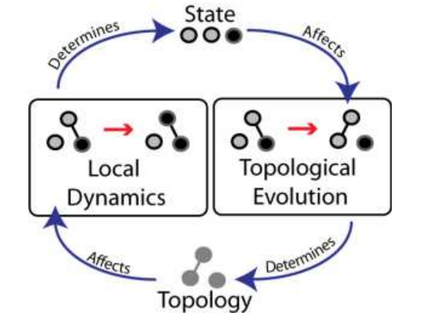 Image Source: “Adaptive coevolutionary networks: a review”by Gross and Blasius
The most challenging class of problems in network dynamics is related to Adaptive or Coevolutionary networks.
Here, there are two dynamic processes that are coupled in a feedback loop, as shown in this illustration:
- The topology of the network changes over time, as a function of the dynamic state of the nodes,
- The state of the nodes and/or edges changes over time, as a function of the network topology.
In the illustration, we see a small network of three nodes. Each node can be in one of two states: grey and black. The state of a node depends on the state of its neighbor(s). But also whether two nodes will connect or disconnect depends on their current state.
Adaptive network problems are common in nature, society, and technology. In the context of epidemics, for instance, the state of an individual is dynamic (e.g., Susceptible, Exposed, Infectious, Recovered), depending on the individual’s contacts. That contact network is not static, however – infectious people (hopefully) stay in quarantine, while recovered people may return back to their normal social network.
Closing the feedback loop, such changes in the contact network can also affect who else will get exposed.
Another example of an adaptive network is the brain. The connections between our neurons are not fixed. Instead, they change through both short-term mechanisms (such as Spike-Timing-Dependent Plasticity or STDP) and longer-term mechanisms (such as axon pruning during development), and they affect both the strength of existing connections and the presence of synapses between nearby neurons. Importantly, these synaptic changes are largely driven by the activity of neurons. The Hebbian theory of synaptic plasticity, for instance, is often summarized as “neurons that fire together, wire together” – a more accurate statement would be that if neuron A often contributes to the activation of neuron B, then the synaptic connection from A to B will be strengthened. The connection from A to B may be weakened in the opposite case.
A key question about adaptive networks is whether the two dynamic processes (topology dynamics and node dynamics) operate in similar timescales or not.
In some cases, the topology changes in much slower timescales than the state of the network nodes. Think of a computer network, for instance: routers may become congested in short timescales, depending on the traffic patterns. The physical connectivity of the network however only changes when we add or remove routers and links, and that typically happens in much larger timescales. When this is the case we can apply the “separation of timescales” principle, and study the dynamics of the network nodes assuming that the topology remains fixed during the time period that our model focuses on.
In the more challenging cases, however, the two dynamic processes operate in similar timescales and we cannot simplify the problem assuming that either the topology or the state of the nodes is fixed. We will review a couple of such models in the following pages.
A major question in adaptive network problems is whether the network will, after a sufficient time period, “converge’’ to a particular equilibrium in which the topology and the state of the nodes remain constant. In the language of dynamical systems, these states are referred to as point attractors – and there can be more than one. Other types of attractors are also possible, however. In limit cycles, for instance, the network may keep moving on a periodic trajectory of topologies and node states, without ever converging to a static equilibrium.
Additionally, fixed points in the dynamics of adaptive networks can be stable or unstable. In the latter, small perturbations in the network topology or state of nodes (e.g., removing a link or changing the state of a single node) can move the system from the original fixed point to another.
Food for Thought
Think about the various networks you are familiar with. Are they adaptive or not? Can you study them with the separation of timescales principle? Do you think they have some point attractors or do they exhibit more complex dynamics?
Consensus Formation in Adaptive Networks
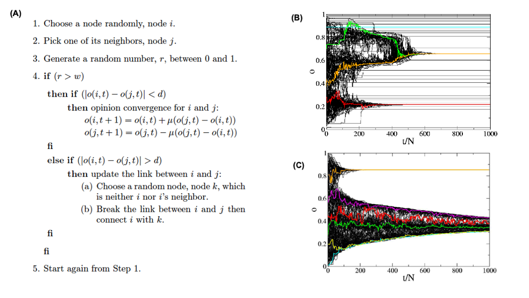 Image Source: “Consensus formation on adaptive networks”. by Kozma and Barrat.
Correction: The indentation of the second else if should match the first if statement.
In the following, we describe a consensus formation model for adaptive networks that was proposed by Kozma and Barrat. The model is based on the Deffuant model that we studied in Lesson-10.
N agents are endowed with a continuous opinion o(t) that can vary between 0 and 1 and is initially random.
Two agents, i and j can communicate with each other if they are connected by a link.
Two neighboring agents can communicate if their opinions are close enough, i.e., if $|o(i, t) - o(j, t)| < d$, where d is the tolerance range or threshold.
In this case, the communication tends to bring the opinions even closer, according to the following “update rule”:
\[o(i, t + 1) = o(i, t) + \mu \left(o(j, t) - o(i, t)\right)\]and
\[o(j, t + 1) = o(j, t)- \mu (o(j, t) - o(i, t)) \]where $\mu \in [0,1/2]$ is a convergence parameter. Consider the case of μ = ½ that corresponds to i and j adopting the same intermediate opinion after communication.
The model considers two coexisting dynamical processes: local opinion convergence for agents whose opinions are within the tolerance range, and a rewiring process for agents whose opinions differ more.
The relative frequencies of these two processes is quantified by the parameter $w \in [0,1]$.
At each time step t, a node i and one of its neighbors j are chosen at random.
With probability w, an attempt to break the connection between i and j is made: if $|o(i, t) - o(j, t)|> d$, a new node k is chosen at random and the link (i, j) is rewired to (i, k).
With probability 1 − w on the other hand, the opinions evolve according to the previous update rule. if they are within the tolerance range.
If w > 0, the dynamics stop when no link connects nodes with different opinions. This can correspond either to a single connected network in which all agents share the same opinion, or to several clusters representing different opinions.
For w = 0 on the other hand, the dynamics stops when neighboring agents either share the same opinion or differ of more than the tolerance d.
The model is described with the pseudocode shown in Figure (A).
Figures (B) and (C ) show simulation results for N=1000 agents, a tolerance d=0.15, and average node degree $\bar{k}=5$.
Figure (B) refers to the case of a static network without any rewiring, while Figure (C ) refers to the adaptive model we described above (with w=0.7).
The evolution of the opinion of a few individuals is highlighted with color.
When the interaction network is static, local convergence processes take place and lead to a large number of opinion clusters in the final state, with few macroscopic size opinion clusters and many small size groups: agents with similar opinions may be distant on the network and not be able to communicate.
Figure (C), which corresponds to an adaptive network is strikingly in contrast with the static case: no small groups are observed.
The study of Kozma and Barrat showed the following results:
In the case of the static interaction network, two transitions are found: at large tolerance values, a global consensus is reached. For intermediate tolerance values, we see the coexistence of several extensive groups or clusters of agents sharing a common opinion with a large number of small (finite-size) clusters. At very small tolerance values finally, a fragmented state is obtained, with an extensive number of small groups.
In the case of the adaptive interaction network, i.e. when agents can break connections with neighbors with far apart opinions, the situation changes in various ways.
At large tolerance values, the polarization transition is shifted since rewiring makes it easier for a large connected cluster to be broken in various parts. The possibility of network topological change, therefore, renders global consensus more difficult to achieve.
On the other hand, for smaller tolerance values, the number of clusters is drastically reduced since agents can more easily find other agents with whom to reach an agreement. A real polarized phase is thus obtained, and the transition to a fragmented state is even suppressed: extensive clusters are obtained even at very low tolerance.
Food for Thought
Many people believe that online social networks such as Twitter lead to extreme polarization and the formation of “echo chambers”. How would you explain this phenomenon using the previous model?
Coevolutionary Effects in Twitter Retweets
 Image Source: “Co-evolutionary dynamics in social networks: a case study of Twitter” by Antoniades and Dovrolis
Coevolutionary effects have also been observed empirically, on social networks.
Think about Twitter. Consider three users: S (speaker), R (repeater) and L (listener) – see the visualization. Initially, R follows S and L follows R. Suppose that R retweets a post of S. The user L receives that message and it may decide to follow user S. When L starts following S, the network structure changes as a result of an earlier information transfer on the network.
Additionally, this structural change will influence future information transfers because L will be directly receiving the posts of S.
How often does this happen? The study by Antoniades and Dovrolis referenced here analyzed a large volume of Twitter data, searching for the addition of new links from L to S shortly after the retweeting of messages of S from R.
In absolute terms, the probability of such events is low: between $10^{-4}$ to $10^{-3}$, meaning that only about 1 out of 1000 to 10000 retweets of S lead to the creation of new links from a listener L to S.
Even though these adaptation events are infrequent, they are responsible for about 20% of the new edges on Twitter.
Additional statistical analysis showed that the probability of such network adaptations increases significantly (by a factor of 27) when the reciprocal link, from S to L, already existed.
Another factor that increases the probability (by a factor of 2) that L will follow S is the number of times that L receives messages of S through any repeater R.
Such network adaptation effects have profound effects on information diffusion on social networks such as Twitter because they create “echo chambers” – a positive feedback loop in which a group of initially loosely connected users retweet each other, creating additional links within the group, and thus, making future retweets and new internal links even more likely.
Lesson Summary
This lesson focused on additional network dynamic processes – dynamics of networks (failures and attacks on nodes), on networks (search and synchronization), and coevolutionary network phenomena.
There are many more network dynamical processes that have been studied in the literature. We briefly mention some of them here:
- Network control: how to select the minimum set of nodes that, if externally controlled, can “drive” the network to the desired state?
- Network densification: are networks getting denser over time? If so, why and how?
- Network congestion: in networks where there is some flow of “traffic” and a limited capacity on each link (or node), how does congestion cascade from one bottleneck to the rest of the network?
- Network games: if we think of each node as a “rational agent”, what happens to the entire network if each node optimizes its connections to maximize a “selfish” objective? (e.g., minimize the number of connections while being within a short distance from every other node)
In all these problems, the common question that network science focuses on is the following: how does the structure of the network affect the dynamic process that is taking place on the network? And if the network is adaptive, how does this dynamic process affect the structure of the network? The structure and the function of a network are always intertwined – and the link between the two always relates to dynamic network processes.
Module five
L12 - Network Modeling
Overview
Required Reading
- Chapter-5 from A-L. Barabási, Network Science, 2015.
- Chapter-18 (mostly sections 18.3 and 18.7) - from D. Easley and J. Kleinberg, Networks, Crowds and Markets, Cambridge Univ Press, 2010 (also available online)
- Hierarchical structure and the prediction of missing links in networks, by A.Clauset et al. Nature, 2008
Recommended Reading
- “Heuristically Optimized Trade-Offs: A New Paradigm for Power Laws in the Internet”, by Fabrikant et al., 2002
Why Network Modeling?
lets start with a fundamental question. Why do we need network models? where can we use them in practice. Where to use models instead of the actual data that describe real world network.
For instance, consider this two networks. The network at the right relates to human malaria parasite which killed some one million people globally every year. We also saw that adjacency matrix of these network ordered so that the existence of the communities (blue green red) are clearly shown. If we want to ask questions about these specific network, we can work with this specific data and not rely any model.
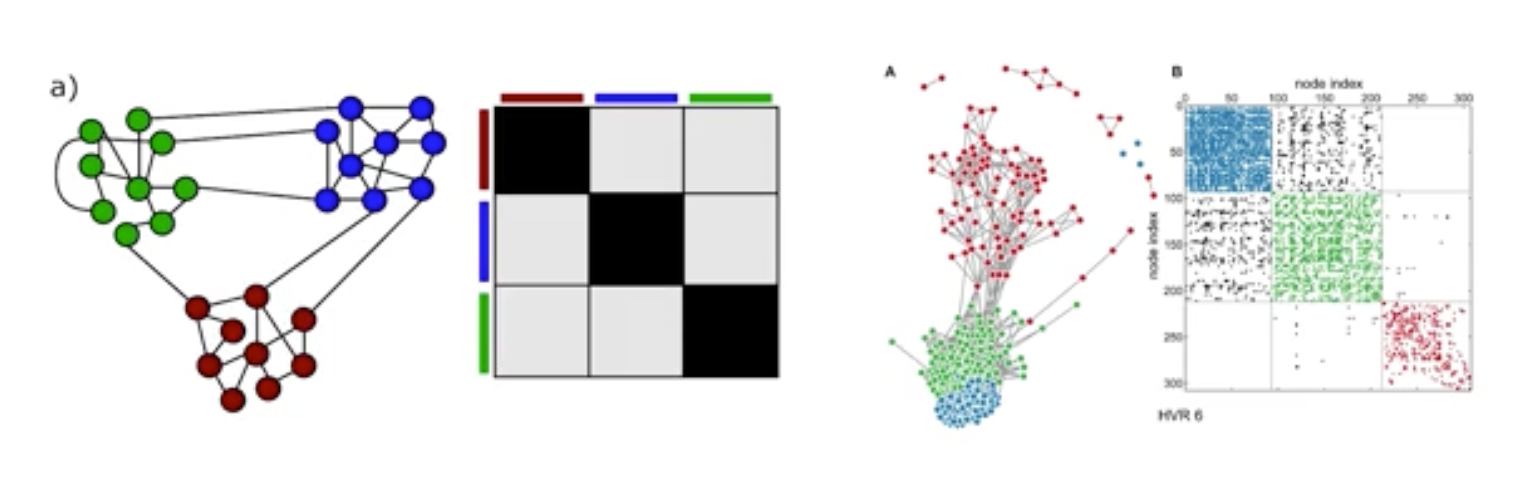
What do we want however, is to ask more general questions about other parasites or larger/smaller instance of this network. The figure at the left shows a network model. It also ahs three communities. This is a stochastic block matrix model and to describe it we need to specify the number of communities, the size and the probability of intra and inter community edges. We can choose these parameters so that these models can product networks that are similar structurally with the malaria network we see at the right. Or we can use the model to create either larger or smaller networks than the malaria network but still with 3 communities. OR we can use this model to generate 100s of network instances, all of them having the size, edge density, same number of communities but different topology.
So, when can we use such an abstract network model instead of the data that specified a given network. A model allows us to describe a given network in a parsimonious manner, with fewer parameters than having to specify the complete adjacency matrix.
It also allows us to create an ensemble of many network instances, all of them having the same characteristics. With a model, we can examine various network properties and dynamic behaviors if the network was smaller, larger, denser, etc.
Also, when working with noisy data, we can infer whether some of the links in the given network are missing or they do not actually exists using a model.
Finally if a model is mechanistic, it can provide a plausible explanation on how the network came to be in its current structure. there are also many other reasons to use network models that are often application specific.
Preferential Attachment Model
Most real world network show dynamic growth and preferential connections in spite the simple model called the Barabasi Albert model or the preferential attachment. It can generate networks with a power law degree distribution. The model is described as follows:
We start with an initial number of nodes that links between them are chosen arbitrary as long as the node has at least one link. From that point on, the network develops follow two steps at a time.
In the growth step, a new node is added with m lengths. In this animation m is equal to two and in the preferential attachment step, the probability that a link of the new node connects to a node i is proportionate to the degree of node i. Preferential attachment is a probabilistic mechanisms. A new node is free to connect any node in the network, whether it is a hub or it has only one link.
The preferential attachment bias however, implies that if a new node has a choice between for example a degree 2 and a degree 4 node, it is twice as likely that the new node will connect to the node of degree 4 rather than the node of degree 2. While most nodes in the network have only few links, a few nodes gradually become hubs. These hubs are a result of rich get richer phenomenon due to preferential attachment. New nodes are more likely to connect to more connected nodes than to the smaller nodes. Hence the larger nodes will acquire links at the expense of the small nodes, eventually becoming hubs.
In the following pages, we will study these models mathematically.
Mathematical Analysis of PA Model
Let us now derive mathematically the degree distribution of the Preferential Attachment (PA) model. There are different ways to do these derivations, depending on how rigorous we want to be. Here, we will use the “rate-equation” approach because it is quite general and you can also use it to derive the degree distribution of other growing networks.
Suppose that we add a new node in each time unit, starting from one node at time t=1. So, if N(t) represents the number of nodes at time t, we have that N(t)=t for t >0.
Let $N_k(t)$ denote the number of nodes of degree k at time t. The probability that a node has degree-k at time t is $p_k(t) = \frac{N_k(t)}{N(t)}$– the degree distribution changes with time as we add more nodes and edges.
Recall that in the PA model every new node adds m edges to existing nodes. At time t, the total number of edges is $m \times t$ and the sum of all node degrees is twice as large.
The PA model states that the probability $\pi(k)$ that a new node at time t connects to a specific node v that has degree-k is proportional to k:
\[\Pi(k) = \frac{k}{\sum_j k_j} = \frac{k}{2mt}\]After we add a new node at time t, the average number of edges that are expected to connect to degree-k nodes is:
\[m \, \frac{k}{2mt} \, N(t) p_k(t) = \frac{k}{2} \, p_k(t)\]because a new node brings m new edges, and the average number of nodes of degree-k is $N(t) \, p_k(t)$.
This is also the average number of nodes of degree-k that get a new edge and become nodes of degree-(k+1) – assuming that each node gets at most one new edge.
Similarly, some nodes of degree-(k-1) will get a new edge and they will become nodes of degree-k.
Using the previous expression again, the expected number of such nodes is $\frac{k-1}{2} \, p_{k-1}(t)$.
So, considering how many nodes of degree-k we have at time t, how many nodes of degree-(k-1) become nodes of degree-k at time t+1, and how many nodes of degree-k become nodes of degree-(k+1) at time t+1, we can write that the expected number of degree-k nodes at time t+1 as:
\[(N+1) \, p_k(t+1) = N\, p_k(t) + \frac{k-1}{2} p_{k-1}(t) - \frac{k}{2} p_k(t)\]The previous expression applies to all degrees k>m – but it cannot be used for the minimum possible degree m because there are no nodes with degree m-1 (remember that even a newly born node has m edges).
Instead of having nodes of degree-(m-1) that are “promoted” to nodes of degree-m, we add exactly ONE node of degree-m at each time step.
So the expected number of degree-m nodes at time t+1 is:
\[(N+1) \, p_m(t+1) = N\, p_m(t) + 1 - \frac{m}{2} p_m(t)\]Note that the previous two expressions give us a recursive process for computing $p_k(t)$ for any value of $k\geq m$ and for any time $t>0$.
What happens asymptotically, as the network size N increases? It can be shown that the probability distribution $p_k(t)$ becomes stationary, meaning that it does not change with time (we will not prove this step however). We will also see some numerical results that support this claim shortly.
So, instead of $p_k(t)$ we can write that $\lim_{t \to \infty} p_k(t) = p_k$.
The expression for nodes of degree-m becomes asymptotically:
\[(N+1) \, p_m(t+1) - N\, p_m(t) \to p_m = 1 - \frac{m}{2} p_m\]which is equivalent to:
\[p_m = \frac{2}{m+2}\]And the expression for nodes of degree-k with $k > m$ becomes asymptotically:
\[(N+1) \, p_k(t+1) - N\, p_k(t) \to p_k = \frac{k-1}{2} p_{k-1} - \frac{k}{2} p_k\]which is equivalent to:
\[p_k = \frac{k-1}{k+2} p_{k-1}, \quad \mbox{for }k>m\]or
\[p_{k+1} = \frac{k}{k+3} p_{k}, \quad \mbox{for } k\geq m\]when $k \to k+1$.
We now have a recursive formula that we can easily solve using induction to show that the probability of degree-k nodes is:
\[p_k = \frac{2m(m+1)}{k(k+1)(k+2)} \quad \mbox{for } k \geq m \quad (1)\]This is the degree distribution equation for the PA model, at least for large networks.
Note that for large degrees (large k), this expression becomes a power-law with exponent 3, i.e., $p_k \approx ck^{-3}$,where $c=2m(m+1). This is the main result of these derivations.
The PA model generates power-law networks – but with a fixed exponent. Further, this exponent is equal to 3, which means that the first moment (mean) of the degree distribution is finite – but any higher moment (including the variance) diverges.
Additionally, note that the degree exponent does not depend on the parameter m. That parameter only controls the minimum degree of the distribution.
Let us now look at some numerical results to get a better insight in the previous results.
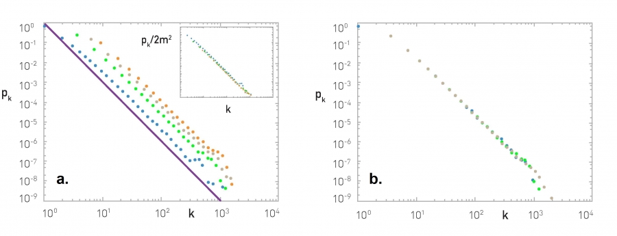
Figure (a) shows what happens as we vary the value of m (blue: m=1, green: m=3, grey: m=5, orange: m=7). The distributions are parallel to each other, having the same exponent. The inset plot shows what happens if we plot $\frac{p_k}{2m^2}$ – the effect of m disappears, meaning that $p_k$ is proportional to $2m^2$, as also predicted by our earlier mathematical derivation.
Figure (b) shows what happens when we vary the size of the network N (blue: N=50,000, green: N=100,000, grey: N=200,000) – all of the plots have m=3. The resulting degree distributions are practically indistinguishable, supporting our earlier claim that the degree distribution becomes stationary (independent of time) at least for large networks.
Figure (c) shows the degree distribution of the PA network with N=100,000 nodes and m=3. The purple dots are the linearly-binned plot of the empirical degree distribution, while the green dots represent the log-binned version of the same plot. Note that the latter shows more clearly that the degree distribution behaves as a power-law with exponent 3.
Food for Thought
- Solve the recursive equations given above to show Equation (1).
- Use the same analytical approach to derive the degree distribution for a version of the PA model that applies to directed networks, as follows:
The probability that a new node connects with a directed edge to a specific node of in-degree $k_{in}(i)$ is:
$\Pi [k_{in}(i)] = \frac{k_{in}(i)+A}{\sum_j [k_{in}(j)+A]}$
where A is the same constant for all nodes. Each new node brings m directed links.
Degree Dynamics in PA Model
How does the degree of a node change over time in the PA model, as the network grows?
An analytical approach that simplifies the problem considerably is to make two approximations:
- ignore the discrete-time increments of the model and use a “continuous-time approximation” instead,
- ignore the probabilistic nature of the model and consider a deterministic growth process in which the degree of all nodes increases in a continuous manner based on the PA formula.
Specifically, consider a node i with degree $k_i$ at time t. The rate at which the degree of that node increases at time t is:
\[\frac{dk_i}{dt} = m \, \Pi(k_i) = m \frac{k_i}{2mt}\]The differential equation becomes:
\[\frac{dk_i}{k_i} = \frac{dt}{2t}\]By integrating both sides, we get that:
\[\ln {k_i} = \frac{1}{2} \ln{t} + c\]where c is a constant. Exponentiating both sides:
\[k_i = t^{1/2} \, e^c\]The initial condition is that $k_i(t_i) = m$, where $t_i$ is the time instant that node-i is born.
So, the degree of node i increases with time as follows, for $t > t_i$:
\[k_i(t) = m(\frac{t}{t_i})^{1/2}\]This simple derivation predicts a couple of interesting facts:
First, the degree of all nodes is expected to increase with the square-root of time, i.e., sublinearly. The sublinearity is expected because each new node brings the same number of links m but it has to distribute those links to a growing number of nodes.
Second, older nodes (nodes that were added earlier in the model), accumulate a larger degree over time. In fact, the maximum degree is expected to be the degree of the first node added in the network, i.e., $k_{max}(t) \approx \sqrt{t}$. So, the PA model can capture the “first-mover advantage” that is often seen in economy, especially when companies compete for new products or services.
This last point also highlights a shortcoming of the PA model: it cannot capture that different nodes may have different “attractiveness” for new links. The only node feature that matters is the time at which the node is born.
There are several variations of the PA model that introduce additional node parameters (such as a “quality” factor for each node), and/or different network processes (such as removal of existing nodes or edges, or rewiring of existing edges).
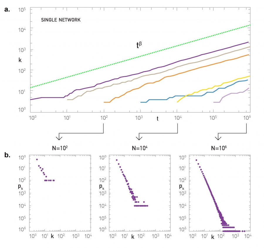
The visualization shows numerical results for nodes born at different times (purple for the node born at t=1, orange for the node born at t=100, etc). All curves increase approximately with an exponent of $\beta = \frac{1}{2}$ (note the log scale of the x and y axes).
Of course there are statistical fluctuations because these numerical results do not use the deterministic approximation of the previous derivations. The green curve represents the function $t^{1/2}$.
The lower plots show the degree distribution at three different snapshots of the growth process.
Food for Thought
Use the same deterministic and continuous-time approach to derive the degree of a node as a function of time under the following two scenarios:
Consider the scenario when we have network growth but no preferential attachment. Suppose that the network grows by one node at a time but the new node adds m links to randomly chosen nodes, instead of using preferential attachment.
Consider the scenario when we have preferential attachment but no network growth. Suppose that the network size remains constant (equal to N nodes). At each time step, a node is selected randomly and connects to a node i of degree $k_i$ with the PA probability $\pi (k_i)$. If a node does not have any edges, we set arbitrarily that k=1 so that it can potentially get some edges.
Nonlinear Preferential Attachment
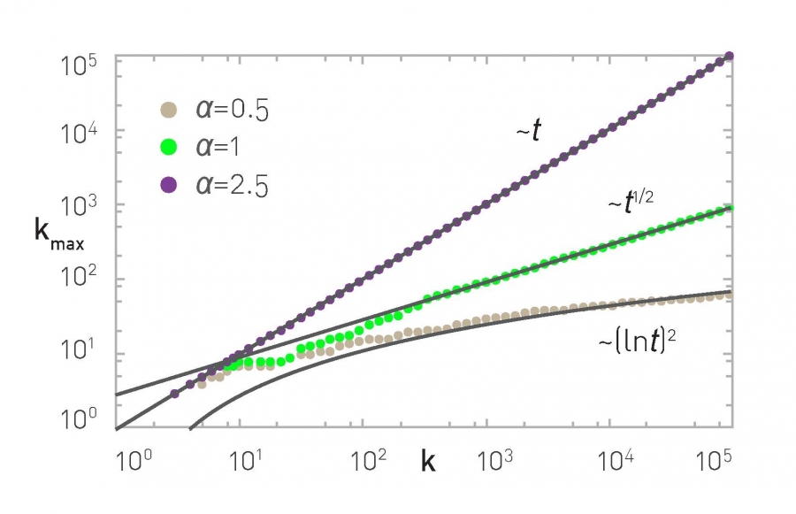
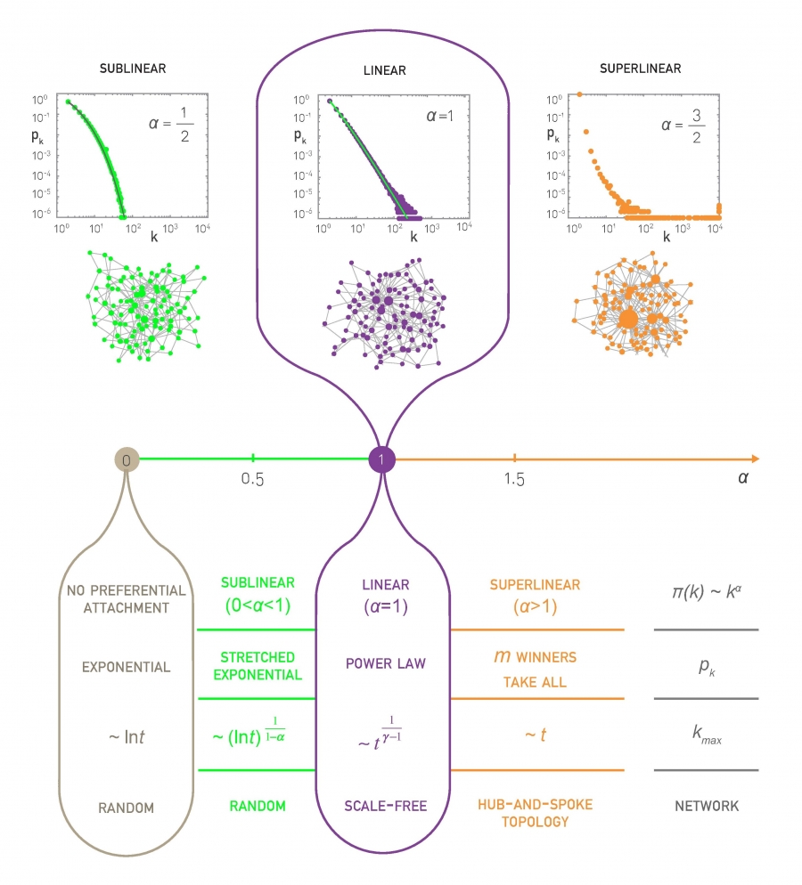
There are many variations of the PA model in the literature. Some of them generate special types of networks (such as directed or bipartite) while others include additional processes such as the removal or rewiring of edges or the aging of nodes.
Here, we present a nonlinear variation of the PA model in which the probability $\pi(k)$that a new node at time t connects to a specific node v that has degree-k is, not proportional to k, but proportional to:
\[\Pi(k) = c \, k^\alpha\]where c is a constant (calculated so that $\sum_k p_k = 1$) and $\alpha$ is a positive exponent that may be larger or smaller than one. Of course the basic PA model results from $\alpha=1$.
This nonlinear PA model can be analyzed mathematically using the same methodology we studied earlier (the rate-balance approach) – you can try it yourself or look at the textbook (Advanced Topics 5.C).
If $\alpha < 1$, the bias to connect to higher-degree nodes still exists but it is weaker than in the linear PA model. This changes the degree distribution qualitatively – it becomes the product of the power-law term $k^{-\alpha}$ and an exponential-decay term:
\[p_k \approx k^{-\alpha} \, e^{- m_\alpha k^{1-\alpha}}\]where $m_\alpha$ is a constant that depends on $\alpha$ and m (the number of edges that each new node brings). This distribution is referred to as “stretched exponential” – the exponential term dominates for large values of k. The variance of the stretched exponential distribution does not diverge – such networks do not have large hubs and they do not exhibit the extreme properties of power-law networks we have seen in earlier lessons (such as the lack of an epidemic threshold).
Let’s also compare the degree dynamics of this model with the basic PA model we studied in the previous page. Recall that, when $\alpha=1$, we saw that $k_{max} \approx \sqrt{t}$. When $0 < \alpha < 1$, we can show that $k_{max}$ increases logarithmically,$k_{max}\approx {(\ln t)}^{1/(1-\alpha)}$
What happens when $\alpha>1$? Intuitively, the bias to connect to higher-degree nodes comes stronger. The resulting networks have fewer but larger hubs than $\alpha=1$ – and the vast majority of the nodes connect only to those hubs. If $\alpha$ is sufficiently high all new nodes will connect to the first node because the degree of that node is higher, creating a hub-and-spoke (or “star topology”) network.
The maximum degree, in that case, increases linearly with ”time”, $k_{max} \approx t$, because all new edges connect to the same node.
The previous results are illustrated with numerical results in the visualizations at the top of the page, showing the degree distribution for three values of $\alpha$ (0.5, 1 and 1.5 with N=10,000 nodes) and the maximum degree dynamics for $\alpha$ = 0.5, 1 and 2.5.
Food for Thought
What happens when $\alpha$ tends to 0? What is the resulting degree distribution and how does $k_{max}$ increase with time?
Link-Copy Model
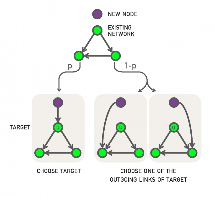
The PA model is simple (it has only one parameter) and it can generate a power-law degree distribution. However, the exponent of that distribution is fixed (equal to 3) and so the PA model does not give us the flexibility to adjust the exponent of the degree distribution to the same value that a given network has.
Let us now study another simple model that can also generate power-law networks but with any exponent we want. Additionally, this model can be used to create directed or undirected networks (we present it here in the context of directed networks).
The model is probabilistic and it also generates a growing network (one new node at a time) – as in the case of PA. Specifically, every time we add a new node v, it connects (with an outgoing edge) to an existing node as follows:
- With probability p, v connects to a randomly chosen existing node u.
- With probability q=1-p, v connects to a random node w that u connects to. In other words, v “copies” an outgoing edge of u (if u does not have any outgoing edges, v chooses another node. If no node has an outgoing edge, v connects to a random node).
The previous model is referred to as “link-copy” process. An equivalent way to describe the model is that, with probability q=1-p, node v selects a random edge in the network, say from a node u to a node w, and v connects to w.
The previous process can be repeated for m>1 new outgoing edges of node v. For simplicity, let us analyze the model for m=1 new edge.
Let us denote as $x_j(t)$ the in-degree of node j at time t. How does $x_j(t)$ increase with time?
There are two cases:
- node-j is selected randomly (with probability p) from a new node and it gains one incoming edge. At time t, there are N=t nodes (recall that we add one node at each time unit), and so the probability that a node-j will get a new incoming edge at time t in this manner is p/t.
- an incoming edge of node-j is selected with probability q – and node-j gains again one incoming edge. The probability of that happening at time t is $\frac{q_j(t)}{t}$ because node-j has $x_j(t)$ incoming edges at that time.
The following analysis will rely on the same assumptions we used in the PA model, i.e., continuous-time approximation and deterministic degree dynamics.
So, we can write a (deterministic) differential equation that expresses the rate at which node-j gains edges:
\[\frac{dx_j}{dt} = \frac{p}{t} + \frac{q\, x_j}{t} = \frac{p+q\,x_j}{t}\]The initial condition for each node-j is that $x_j(t_j)=0$, where $t_j$ is the time that j was born.
If we index the nodes based on their time of birth (so that node-1 is born at time t=1, node-2 is born at time t=2, etc), we can write that $x_j(j)=0$ for all j.
The previous differential equation is easy to solve if we rewrite it as
\[\frac{dx_j}{p+q x_j} = \frac{dt}{t}\]and integrate both sizes, we get:
\[\frac{1}{q} \ln{(p+q x_j)} = \ln t + c\]where c is a constant. Exponentiating both sides of the equation, we get
\[p+q x_j = e^{cq} t^q\]and so: $x_j(t) = \frac{1}{q} \left( e^{cq} t^q -p\right)$. The initial condition $x_j(j) = 0$ gives us that $e^{cq} = p/ j^q$. So the solution for the in-degree dynamics is:
\[x_j(t) = \frac{p}{q} [\left({\frac{t}{j}}\right)^q - 1]\]Note that the in-degree increases with time as a power-law with exponent q – contrast that with the PA model in which this exponent is fixed to 1/2.
But what is the in-degree distribution for this model? Let us calculate first the complementary cumulative degree distribution $P[X_j > k]$, i.e., for a given in-degree k and a time t, what is the fraction of the t nodes in the network that have $x_j(t) > k$? In other words, we are asking what is the maximum value of j for which
\[x_j(t) = \frac{p}{q} [{\frac{t}{j}}^q -1] > k\]which is equivalent to
\[j < t {(\frac{q}{p}k +1)}^{-1/q}\]So, the fraction of nodes with degree larger than k is:
\[P[X_j > k] = {(\frac{q}{p}k +1)}^{-1/q}\]To find the probability that a node has in-degree equal to k, we can differentiate the previous expression with respect to k:
\[p_k = P[X_j=k] = - \frac{dP[X_j>k]}{dk} = \frac{1}{p} {(\frac{q}{p}k +1)}^{-(1/q + 1)}\]This shows that the link-copy model creates a power-law degree distribution with exponent:
\[\frac{1}{q}+1 = \frac{2-p}{1-p}\]Note that when p approaches 1, the new node connects to random existing nodes and so there is no bias to connect to nodes with higher in-degree. In that case, the previous exponent diverges and the in-degree distribution decays exponentially fast with k.
As p approaches 0, on the other hand, the power-law exponent approaches 2, which means that both the first and second moment of the degree distribution diverge. The network acquires a hub-and-spoke topology in that case, with every new node connecting to the first node.
For intermediate value of p, we can get any desired exponent larger than 2. For example, for p=1/2, we get that the exponent is equal to 3, as in the PA model. This does not mean, however, that the networks generated by the PA model are identical with the networks generated by the link-copy model for p=1/2.
The link-copy model has been used to explain the emergence of power-law networks in directed networks such as the Web, citation networks or gene regulatory networks. In all such networks there are “copy-edge” mechanisms.
For example, when someone creates a new Web page, it is often the case that he/she copies links of other relevant web pages.
Similarly, when writing the bibliography of a research article, authors are often “tempted” to copy references of other relevant articles (hopefully after they have read them!).
And in biology, the process of gene duplication creates multiple copies of the same gene. Those genes have the same promoters, and so, at least initially, they can be regulated by the same transcription factors.
Over time, mutations may change the promoter of a gene, creating regulatory differences in the incoming edges of different gene copies.
Food for Thought
Compare the network topology of the PA model with the undirected version of a Link-Copy network when p=1/2. Both models generate the same power-law degree distribution in that case. How are the two networks different however?
Generating Networks with Community Structure
In the previous models, our focus has been on the degree distribution. That is an important property of a network – but it is not the only key feature.
As we saw earlier, another common property of many real-world networks is clustering and the presence of communities.
There is no reason to expect that the PA model and its many variants can generate any non-trivial community structure.
In fact we have already seen some models earlier that can generate clustering and/or communities. Recall the Watts-Strogatz model from Lesson-5: it can generate strong clustering (similar to that in regular mesh networks) – but it cannot generate communities and its degree distribution is not a power-law.
Additionally, in Lesson-8 we presented two methods to generate networks with a given community structure: the Girvan-Newman (GN) model and the LFR method. Recall that the latter can generate networks with both a power-law degree distribution and a power-law community size distribution.
Here, we briefly present one more model to construct networks with strong clustering and community structure: the Stochastic Block Model (SBM). The model description is very simple: we are given the number of nodes n, the number of edges m, the number r of communities and their sizes $n_1,n_2, …,n_r$ (with $\sum_{i=1}^r n_i = n$), and a symmetric r-by-r probability matrix P.
The (i,j) element of P is the probability that a node of community i connects with a node of community j, i.e., $P\left(u\longleftrightarrow v \;\middle|\; u \in i, v \in j \right)$. The diagonal elements of P represent the probability that nodes of the same community connect to each other – those elements are typically larger than the non-diagonal elements. The rows and columns of P are not probability distributions, hence they do not necessarily sum to one.
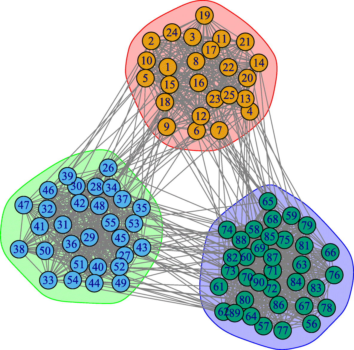
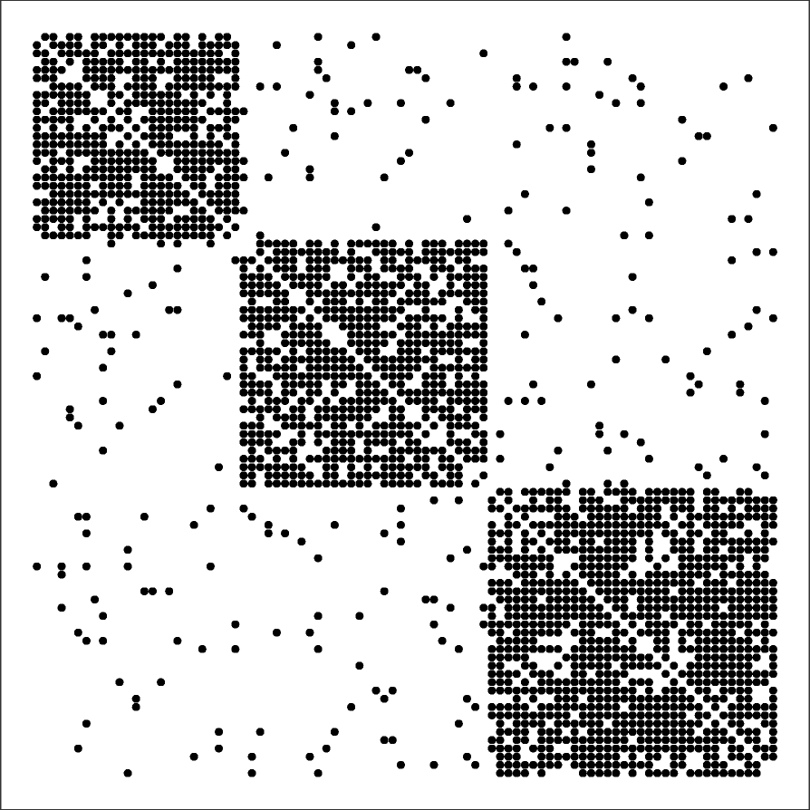
The visualization shows a network with r=3 communities and n=90 nodes ($n_1=25, n_2=30, n_3=35$) generated by a SBM model. The visualization also includes the 3-by-3 probability matrix P and the 90-by-90 adjacency matrix of the resulting network.
Note that SBM models can generate a clearly defined community structure and strong clustering within each community – but it does not control the degree distribution or other network properties. Additionally, the communities are “flat” – without any hierarchical structure.
There is a rich literature, mostly in statistics and machine learning, that focuses on the estimation of the SBM model parameters from network data.
Later in this lesson we will study a more general approach, referred to as Hierarchical Random Graph (HRG) model, and we will present there a statistical approach to estimate the model parameters.
Food for Thought
Identify the similarities and differences between the SBM, GN, and LFR models in terms of their network properties.
Generating Networks with Degree Correlations
Another important network property is the presence of correlations in the degrees of adjacent neighbors. As we have seen in Lesson-3, in assortative networks nodes tend to connect to nodes with similar degree, while in disassortative networks the opposite happens. How can we create networks that exhibit assortative or disassortative behavior?
Suppose that we are given a network (it could be a network that is generated from another model). We can apply the procedure shown in the following visualization:
- Select two random links. Let us call the corresponding four end-points (stubs) as (a,b,c,d), ordered based on their degree so that $k_a \geq k_b \geq k_c\geq k_d$.
- If we want to create an assortative network, we can rewire the two links so that the two higher-degree nodes connect, adding the edge (a,b) if that edge does not already exist. Also, we connect the two lower-degree nodes, adding the edge (c,d) if that edge does not already exist.
- If we want to create a disassortative network, we do the opposite: we connect the highest-degree node (node a) with the lowest-degree node (node d), and node b with node c.
The previous process is applied iteratively until we cannot find pair of edges that can be rewired.
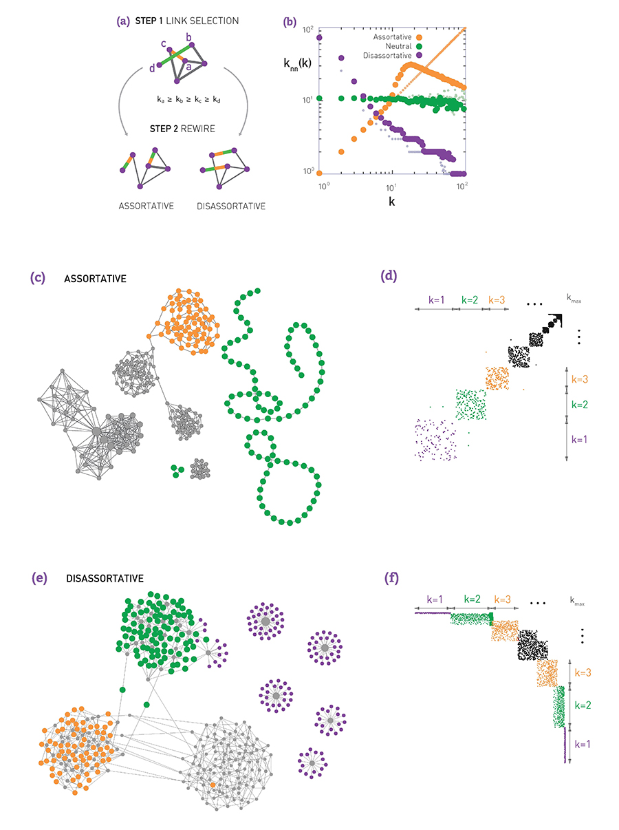
The visualization (b) shows what happens when we apply the previous process on a network generated with the preferential attachment model (with N=1000 nodes, and L=2500 edges). The plot shows the average neighbor node degree $k_{nn}(k)$ as a function of the degree k (see Lesson-3 if you do not recall such plots). Without applying the previous algorithm, the original network is “neutral”, without any significant degree correlations.
When we apply the previous algorithm to create a disassortative network, the degree correlation between a node and its neighbors become strongly negative (purple points).
On the other hand, when we apply the previous algorithm to create an assortative network, the degree correlations become positive at least up to a certain degree (the reason that the degree correlations become negative for higher degrees is related to the constraint that two nodes can connect with only a single link – the high-degree nodes are few and to maintain a positive degree correlation for high-degree nodes would require several links between the same pair of nodes).
Visualizations (c and d) show an example of an assortative network generated by the previous algorithm and the corresponding adjacency matrix. Note that nodes of degree-1 connect to other nodes of degree-1, while nodes of higher degree connect to other nodes of similarly high degree.
Similarly, visualizations (e and f) show an example of a disassortative network generated by the previous algorithm, and the corresponding adjacency matrix. In this case, nodes of degree-1 connect to the highest degree nodes, while there is also a large number of intermediate-degree nodes that connect to other intermediate-degree nodes.
The previous approach produces maximal assortativity or disassortativity because it keeps rewiring edges to maximize the extent of the degree correlations. Another approach is to apply the previous process probabilistically: with some probability p we perform the previous rewiring step, and with the complementary probability 1-p we leave the two randomly selected edges unchanged. The higher the value of p, the stronger the degree correlations will be. The following visualization illustrates this process, shows two networks generated in this manner, and it gives average neighbor node degree plots for various values of p.
Food for Thought
Explain mathematically the reason we get negative degree correlations even in assortative networks, when we require that two nodes can be connected by at most one edge. Hint: In the configuration model, what is the expected number of edges between two nodes with degree $k_i$ and $k_j?$
Optimization-based Network Formation Model
The models we examined so far are all probabilistic in nature. In practice, and especially in the technological world, networks are not designed randomly. Instead, they are designed to maximize a certain objective function (e.g., minimize cost) subject to one or more constraints. For example, the topology of a computer network may be designed so that it requires few links (routers and their interfaces can be costly) and it offers short paths (and thus small delays).
In social networks, some form of optimization may also be going on “under the surface”. For instance, maintaining a friendship requires time and effort – and so we all (maybe subconsciously) try to have a manageable number of social connections, while at the same time we meet our social need for communication.
Even in biological networks, we may have some underlying optimization through evolutionary mechanisms that gradually select the genotypes with the fittest phenotypes.
So, what happens when a network is designed through an optimization process, without any randomness? What kind of network topologies do we get through that process? We will study here only one such optimization model (out of many different formulations, especially in the literature of communication networks).
Suppose that we design a growing communication network. Nodes arrive one at a time on a given “spatial map”. For simplicity, let us assume that that map is an one-by-one square.
Every new node i connect to one of the existing nodes. If node-i chooses to connect with node-j, the cost of that connection is proportional to $d_{i,j}$, i.e., the Euclidean distance between the two nodes.
This link cost is not our only consideration however. We also want to keep the path length between any pair of nodes short. One way to quantify this objective is the following: Suppose that the very first node represents the “center” of the network – and let $h_j$ be the path length (in number of hops or links) between node-j and the center. If we keep $h_j$ short for all nodes, then the path length between any two nodes will also be short.
Note that because a new node connects to only one existing node, the resulting topology is a tree (and so there is only one path between any two nodes). A tree allows the network to be connected with the minimum number of links (n-1 links for n nodes).
So, on one hand, we want to minimize the cost of the new connection, which is proportional to $d_{i,j}$, and on the other hand, we want to connect to a node j with the smallest possible $h_j$. How can we combine the previous two objectives? Note that they can be conflicting – the node with the smallest $h_j$ may be quite far away from the new node-i.
One approach is to minimize a linear combination of these two metrics. So, when node-i arrives, it connects to the node-j that minimizes the following cost:
\[C_j = \delta \, d_{i,j} + h_j\]where $\delta$ is a model parameter that determines how much weight we give to the cost of the new connection versus the path length objective.
The visualization (a) shows the value of h for the first five nodes in the network. Plot (b) shows the Euclidean distance between the new node (shown in green) and every other node. The plots (c through e) show the optimal selection for node-j for three different values of $\delta$.
If $\delta$ is very low, the new node will prefer to connect directly to the center because the distance-related cost does not matter much.
If $\delta$ is very large, the new node will prefer to connect to the nearest existing node in the unit square.
For intermediate values of $\delta$, both objectives matter and the new node connects with the node that optimizes that trade-off, at least heuristically, based on the nodes that are already in the network.
Plot (f) shows that for a given value of $\delta$, and for each node-j, we can identify a “basin of attraction”, i.e., a region of the unit square in which any new node would decide to connect to node-j.
Now that you have some intuition about this model, think before you move to the next page: what kind of network topology do you expect from this model when $\delta$ is very small? What if $\delta$ is very large? And what may happen for intermediate values of $\delta$?
Food for Thought
ManThink about other network optimization formulations that present a trade-off between network cost, network efficiency, network reliability, and potentially other properties.
Optimization-based Network Formation Model (cont’)
The previous model (and some variants of it) has been studied extensively. The mathematical analysis of the model is quite lengthy, however, at least for our purposes, and so let us focus on numerical results and some basic insight.
First, what happens when $\delta$ is so low that the distance term does not matter? The maximum possible distance between two nodes in a unit square is $\sqrt{2}$. If $\delta < 1/\sqrt{2}$, we have that $\delta \, d_{i,j}<1$. So, for any new node, it is cheaper to connect directly to the center (which has $h_j = 0$) rather than any node with $h_j \geq 1$. In other words, when $\delta < 0.707$, the resulting network has a hub-and-spoke topology because every node connects directly to the center node (see leftmost plots in the visualization – N=10,000 nodes).
On other hand, what happens if $\delta$ is so large that the distance term dominates over the path length $h_j$? When we have N random points on a unit square, the average distance between a point and its nearest neighbor scales with $1/\sqrt{N}$ (do you see why?). The path length to the central node, on the other hand, scales slowly with N (logarithmically with N – recall that the network is a tree). So if $\delta \gg \sqrt{N}$, we have that $\delta d_{i,j}$ dominates over the $h_j$ term. In that case, a new node-i will choose to connect to the nearest node-j. The resulting network in this case has an exponential degree distribution, as it is highly unlikely that a node will be the nearest neighbor to many other nodes.
When $\delta$ is between these two extremes ($1/\sqrt{2}$ and $\sqrt{N}$), the model produces topologies with a strong presence of hubs. The hubs connect to many other nearby nodes (i.e., the cost of those connections is quite low) and additionally the few hubs connect either directly to the center node or indirectly, through another hub node, to the center (i.e., the hubs have low $h_j$ value). This hierarchical structure allows almost all nodes in the network to have a very low cost value $C_j$. The resulting degree distribution can be a power-law – even though the exact shape of the distribution depends on the value of N and 𝛿.
We have seen several models so far that are very different with each other – but they can all create power-law degree distributions. What does this mean?
It is possible that very different mechanisms (e.g., preferential attachment, link-copy, optimization of cost versus path-length, etc) can all create the same network statistics – in terms of the degree distribution or even other properties (clustering, diameter, etc). So we should be careful to not jump into conclusions about the mechanism that has generated a given network, just because that network exhibits a certain statistical property.
Food for Thought
If you are mathematically inclined, you can study the following paper that presents a rigorous analysis of a variant of the previous model:
“Heuristically Optimized Trade-Offs: A New Paradigm for Power Laws in the Internet” by Alex Fabrikant, Elias Koutsoupias and Christos H. Papadimitriou.
Hierarchical Graph Model
The previous models are ”stylized” – in the sense that they have only 1-2 parameters and their main goal is to show how a certain network property (e.g., a power-law degree distribution) can be achieved through a simple mechanism (e.g., preferential attachment).
What if we want to create a network model that meets many of the properties of real-world networks, including:
- heavy-tailed degree distribution,
- strong clustering,
- presence of communities, and
- hierarchical structure (small and tight communities embedded in larger but looser communities)?
We will now present a model that can meet, to some extent, all these properties. The model is referred to as Hierarchical Random Graph (HRG) and it was proposed by Aaron Clauset and his colleagues.
As opposed to the previous models in this lesson, HRG requires many parameters. Further, these parameters can be calculated algorithmically based on network data, so that the resulting model matches closely the hierarchical density structure of the given network.
First, let us describe the HRG model – without considering the parameter estimation problem. We will examine that problem in the next few pages.
So, suppose we want to create a graph G with n nodes, using the HRG model. The model is described by a dendrogram D, which is a binary tree with n leaves (and so the number of internal nodes in D is n-1).
Each internal node r is associated with a probability $p_r$ – this is the probability that two nodes are connected if r is their lowest common ancestor in D. So, if two graph nodes i and j have the same parent r in D, the two nodes are connected with probability $p_r$.
On the other extreme, if r is the root of D, the probability $p_r$ represents the probability that any node of G at the left subtree of r connects with any node at the right subtree of r.
So, the complete description of the HRG model requires:
- The specification of a dendrogram D with n leaves
- An (n-1)-dimensional vector of probabilities $p_r$.
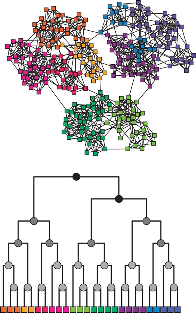
The HRG model is very flexible and it can encompass many different graph models. For instance, if all probabilities $p_r$ are equal to the same value p, we get the G(n,p) model. On the other hand, if we want to create a graph with a strong community structure (as shown in the visualization) we can set $p_r$ to a high value for all internal nodes in D that are lowest common ancestors (LCA) of nodes in the same community.
For example, consider the green community in the visualization – the internal nodes that are LCAs to only green nodes can have a high value of $p_r$ – at least relative to the value of $p_r$ for nodes that are LCAs of nodes that belong to different communities. Similarly for the other communities.
Additionally, if we want to create hierarchical communities, we can have that the lower internal nodes in D have higher values of $p_r$ than the higher nodes in D. This pattern can also generate strong local clustering.
Food for Thought
- Can the HRG model generate networks with degree correlations? (assortative or disassortative)
- How would you set the vector of $p_r$ probabilities to create a skewed degree distribution?
Maximum Likelihood Estimation of HRG Probabilities
In the previous page, we assumed that the dendrogram D and the vector $\{p_r\}$ of the HRG model are given. In that case, we can easily create many random graphs G that follow the corresponding HRG model.
What if we do not know these parameters but we are given a (single) network G, and our goal is to statistically estimate the parameters D and $\{p_r\}$ so that the HRG model can produce graphs that are similar to G?
Let us first show how to calculate the probabilities $\{p_r\}$ from a given network G, assuming that the dendrogram D is given (we will remove this assumption at the next page).
We will do so using the well-known Maximum Likelihood Estimation (MLE) approach in statistics.
Suppose that r is an internal node in D, and consider all node pairs for which r is the LCA. Let $E_r$ be the number of edges in G that connect those node pairs.
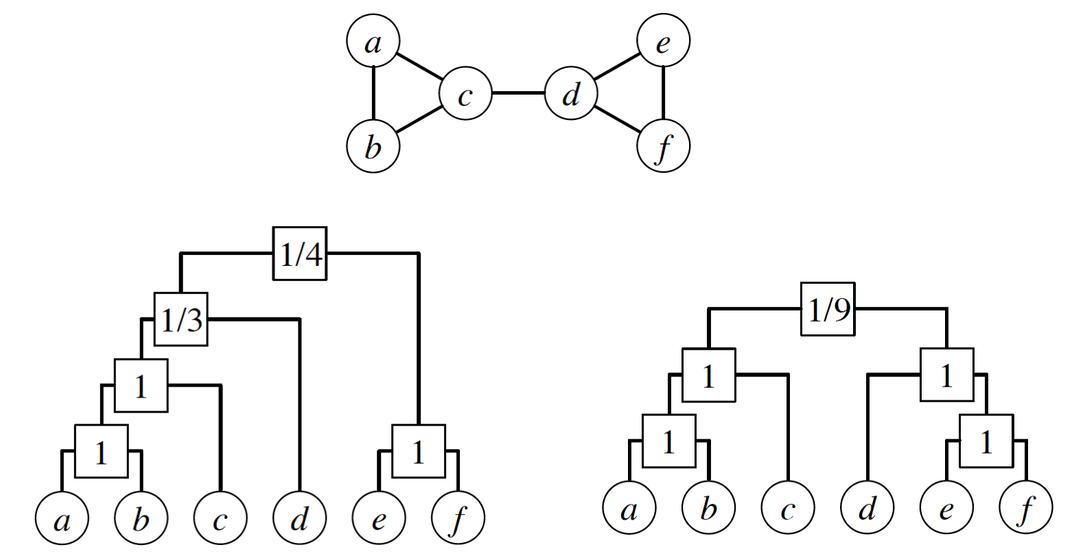
In the left dendrogram of the visualization, the internal node r that is labeled as “1/3” is the LCA of the following node pairs: (a,d), (b,d), (c,d) – and only one of those node pairs is connected (c with d). So $E_r =1$.
Further, let $L_r$ and $R_r$ be the number of leaves in the left and right subtrees rooted at r.
In the previous example, $L_r = \{a,b,c\}$ and $R_r =\{d\}$.
Suppose that someone gives us a vector of probabilities $\{p_r\}$. Recall that the likelihood of a model is the probability that that model will produce the given data. So, the model likelihood is:
\[\mathcal{L}(D,\{p_r\}) = \Pi_{r \in D} \, p_r^{E_r} (1-p_r)^{L_rR_r -E_r}\]with the convention that $0^0 = 1$.
So, if D is fixed, what is the vector $\{p_r\}$ of the HRG model that will result in maximum likelihood?
If we differentiate the previous expression with respect to $p_r$ and set the derivative to zero, we can easily calculate that the optimal value of each $p_r$ is:
\[\hat{p}_r = \frac{E_r}{L_r R_r}\]which is simply the fraction of potential edges between the two subtrees of r that actually exist in G.
For these optimal values of $p_r$, we can easily show that the model likelihood is:
\[\mathcal{L}(D) = \Pi_{r \in D} \, [{\hat{p}_r}^{\hat{p}_r} (1-\hat{p}_r )^{1-\hat{p}_r } ] ^ {L_r R_r}\]It is common to work instead with the logarithm of the likelihood:
\[\log\mathcal{L}(D) = -\sum_{r \in D} L_r R_r h(\hat{p}_r)\]where $h(p)=-p\log p - (1-p)\log(1-p)$.
As an exercise, use this last formula to show that the likelihood of the left dendrogram shown in this visualization is approximately 0.00165. Then, show that the likelihood of the right dendrogram is higher (approximately 0.0433).
Food for Thought
Write down the derivations of this page in more detail yourself.
How to Find the Optimal Dendrogram?
How can we determine the optimal dendrogram D from data?
Unfortunately, it is not possible to derive a closed-form solution for the optimal dendrogram, as we did for the optimal $p_r$ values.
One option would be to construct an iterative search algorithm that samples random dendrograms and tries to find the dendrogram with the highest likelihood $\mathcal{L}(D)$. That may take too long, however, given the super-exponential number of possible dendrograms when n is large (see “food for thought” questions).
It would be much better to sample dendrograms in a biased manner with a probability that is proportional to the likelihood $\mathcal{L}(D)$ – so that dendrograms with higher $\mathcal{L}(D)$ are more likely to be sampled by our search algorithm. We will see how to do so, using a stochastic optimization approach that is known as Markov Chain Monte Carlo (MCMC).
Suppose that an iteration of the algorithm starts with a dendrogram D (e.g., the dendrogram shown at the left of the visualization). We pick an internal node r uniformly at random (other than the root). As shown in the visualization, r identifies three subtrees: the left child-subtree of r (called s), the right child-subtree of r (called t), and the sibling-subtree of r (called u). We can now create two more dendrograms by replacing either s or t with u (as shown in the visualization). Note that these two new dendrograms have preserved the internal relationships in the subtrees s, t and u. We now choose one of the two new dendrograms with equal probability – let us call the new dendrogram D’.
The process we described above describes a Markov Chain, i.e., a probabilistic way to move from one dendrogram to the next, such that only the last dendrogram matters – a Markov Chain does not remember its history.
Now that we have generated the new dendrogram D’, we calculate its likelihood $\mathcal{L}(D’)$.
We accept D’ as the new state of the Markov Chain if the likelihood has not decreased (i.e., if $\Delta\mathcal{L}=\mathcal{L}(D’) - \mathcal{L}(D) \geq 0$).
If the likelihood has decreased, we may still accept D’ but we do so with probability $e^{\log \Delta \mathcal{L}} = \frac{\mathcal{L}(D’)}{\mathcal{L}(D)}$.
If we do not accept D’, then we remain with the dendrogram D and pick again a random internal node r.
This process of choosing whether to accept the new state D’ or not is referred to as the Metropolis-Hastings rule.
The interesting property of the previous Markov Chain is that it is ergodic (i.e., we can go from any dendrogram to any other dendrogram with a finite series of the kind of transformation shown in the visualization).
Together with the use of the Metropolis-Hastings rule, this means that the MCMC algorithm presented here ensures that any dendrogram D will be sampled, at least asymptotically, with a probability that is proportional to the likelihood of that dendrogram $\mathcal{L}(D)$.
The algorithm terminates when the maximum observed likelihood has reached a “plateau” (meaning that we cannot improve $\mathcal{L}(D)$ over a number of iterations).
The previous process is stochastic, and so we may not get the same dendrogram each time we run the algorithm. In practice, however, it has been observed that all resulting dendrograms have roughly the same likelihood.
Food for Thought
- Show that the number of possible dendrograms with n leaves is $𝑛!(𝑛−1)!/2𝑛−1$
- If you are intrigued about MCMC, read more about Markov Chains, the ergodicity property, and the asymptotic sampling property mentioned above.
Hierarchical Graph Model Applications
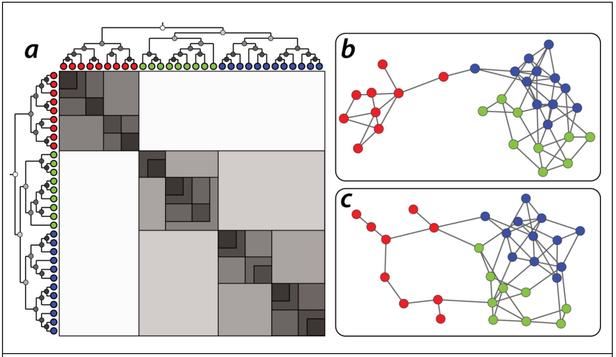
One application of the HRG model is to generate a large ensemble of networks – all of them following the same probabilistic model estimated based on a single given network.
These networks can then be used in simulation studies. For instance, imagine testing a new routing algorithm on many different “Internet topologies” that have been generated from a single snapshot of the current Internet topology.
Another application may be that this ensemble of networks is used as the ”null model” in testing whether a given network follows a certain model or not. For instance, suppose that we have generated an HRG model based on a sample of healthy brain networks – and we have also generated an HRG model based on a sample of brain networks from schizophrenia patients. We can then use these two models to test whether a given brain network belongs in one or the other group.
The following visualization shows two different networks (b and c) that were both generated using the HRG model shown at the left (a). The model has 30 nodes. Note that the shading of the internal dendrogram nodes is such that darker means higher probability values. Together with the dendrogram, this visualization also shows the corresponding adjacency matrix, Note that the blue and green communities belong to a larger community that is more loosely connected – and they are less likely to be connected to the red community.
Another application of the HRG model is to detect the presence of false-positive or false-negative edges. This is important in practice because the measured network data is often incorrect or incomplete – especially in the context of biology of neuroscience. So, suppose that we are given a single network $G$ and we construct an HRG model $G$ based on $G$.
If $G$ predicts that there is a high probability that two nodes X and Y are connected, while these two nodes are not connected in 𝐺 , we may have a missing edge (false negative) in $G$.
On the other hand, if $G$ predicts that there is a low probability that two nodes X and Y are connected, and these two nodes are connected in $G$, we may have a spurious edge (false positive) in $G$.
Food for Thought
Can you think of other applications of the HRG model?
Lesson Summary
This lesson focused on network models.
Some models are simple, with only one or two parameters, and they show how a simple mechanism can produce an important property seen in many real-world networks. For example, the preferential attachment model produces networks with a power-law degree distribution.
Other models are more parameter-intensive and they can produce realistic networks that exhibit more than one real-world properties. For example, the HRG is such a model and it can produce a hierarchical community structure, clustering, and a skewed degree distribution.
When using a network model – or potentially when you design your own network model – it is important to ask first: what is the goal of the model?
A famous aphorism in science is that “all models are wrong but some are useful” (attributed to the statistician George Box).
So, asking whether “the model is realistic” is not usually the right question. The goal of a model is never to just copy reality (another aphorism in science is that “the best model of a cat is the same cat”). The goal of a model is to create one, or usually many, networks that exhibit certain properties.
We can use these networks to examine how the given properties affect the function of those networks. For example, we can examine how a family of networks with power-law degree distribution affect the spread of an epidemic.
There are 100s of network models in the literature – and of course, we could only study a small number of them. Nevertheless, this lesson gave you sufficient background to understand and use any other model you encounter in the future.
L13 - Statistical Analysis of Network Data
Overview
Required Reading
- Sampling and estimation in network graphs, by Eric D.Kolaczyk, 2009
- Network inference with confidence from multivariate time series, by Mark Kramer et al, 2009
- Network topology inference, by Eric D.Kolaczyk, 2009
Recommended Reading
- What is the real size of a sampled network? The case of the Internet by Fabian Viger et al., 2007
Introduction to Network Sampling
It is often the case that we do not know the complete network. Instead, we only have sampled network data, and we need to rely on that sample to infer properties of the entire network. The area of statistical sampling theory provides some general approaches and results that are useful in this goal.
Let us denote the complete network as $G=(V,E)$ – we will be referring to it as the population graph.
Additionally, we have a sampled graph $G^* = (V^*, E^*)$, which consists of a subset of nodes $V^*$ and edges $E^*$ from the population graph.
To illustrate the challenges involved in network sampling, consider the following problem.
Suppose we want to estimate the average degree of the population graph, defined as
\[E[k]= \frac{\sum_{i \in V}k_i}{N}, \quad N=|V|\]where $k_i$ is the degree of node-i and N is the number of nodes in the population graph.
The obvious approach is to estimate this with the average degree of the sampled graph $G^*$ as follows:
\[\bar{k}= \frac{\sum_{i \in V^*}k_i}{n},\quad n=|V^*|\]where n is the size of the sample.
Now, consider two different network sampling strategies, or “designs”. In both of them we start with a random sample $V^*$ of n nodes:
Design-1: for each $i \in V^*$, copy all edges that are adjacent to node i in the set of sampled edges $E^*$.
Design-2: for each pair of sampled nodes $(i,j) \in V^* \times V^*$, examine if they are connected with an edge, i.e., if $(i,j) \in E$. If they are, copy that edge in $E^*$.
Note that Design-1 requires that we know all neighbors of each sampled node, even if those neighbors are not sampled – while Design-2 only observes the adjacencies between sampled nodes. In practice, this means that Design-2 would be simpler or less costly to conduct. Imagine, for example, that we construct a social network based on who is calling whom. Design-1 would require that we know all phone calls of the sampled individuals. Design-2 would require that we only know whether two sampled individuals have called each other.
Which of the two Designs will result in a better estimate of $E[k]$ in your opinion? Please think about this for a minute before you look at the answer below.
If you answered Design-1, you are right. With Design-2, we underestimate the degree of each node by a factor of roughly $\frac{n}{N}$ because, on the average, we only “see” that fraction of nodes of the population graph.
That does not mean however that Design-2 is useless. As we will see later in this Lesson, we could use Design-2 and get a reasonable estimate of the average degree as long as we add an appropriate “correction factor”. For example, we could get a better estimate with Design-2 if we use the following correction:
\[\bar{k}= \frac{N}{n} \frac{\sum_{i \in V^*}k_i}{n}\]This can be a useful approach if Design-2 is simpler or cheaper to apply than Design-1.
Here is another example of how statistical sampling theory can be useful: imagine that you want to estimate the number N of nodes in the population network G. For practical reasons however, it is impossible to identify every single node in G – you can only collect samples of nodes. How would you estimate N? Please think about this for a minute before you read the following.
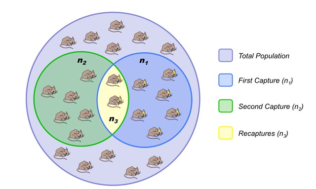 Image source: http://www.old-ib.bioninja.com.au/options/option-g-ecology-and-conser/g5-population-ecology.html
We could use a statistical technique called capture-recapture estimation. The simplest version is that we first select a random sample $S_1$ of $n_1$ nodes, without replacement. The important point is that we somehow “mark” these nodes. For instance, if they have a unique identifier, we record that identifier.
Then, we collect a second sample $S_2$ of $n_2$ nodes, again without replacement. Let $n_3$ be the number of nodes that appear in both $S_1$ and $S_2$, i.e., $n_{3} = | S_1 \cap S_2|$.
If $n_3>0$, we can estimate the size of the population graph as follows:
\[\hat{N}=\frac{n_1 \, n_2}{n_{3}}\]What is the rationale behind this estimator? The probability that a node is sampled in both $S_1$ and $S_2$ can be estimated as:
\[\frac{n_{3}}{N} = \frac{n_1}{N} \, \frac{n_2}{N}\]because the two samples are independently collected. Solving for N gives us the previous capture-recapture estimator.
In sampling theory, two important questions are:
- Is the estimator unbiased, meaning that its expected value is equal to the population-level metric we try to estimate. In the previous example, is it that $E[\hat{N}]=N$, across all possible independent samples $S_1$ and $S_2$?
- What is the variance of the estimator? Estimators with large variance are less valuable in practice.
For instance, it is not hard to show that the variance of the estimator $\hat{N}$ is:
\[V({\hat{N}}) = \frac{n_1 n_2 (n_1-n_3)(n_2-n_3)}{n_3^3}\]Suppose that $𝑛_1=𝑛_2=1000$ and $𝑛_3=1$. Our estimate of the population graph size will be $\hat{N}=10^6$ – but that is also the value of the standard deviation of $\hat{N}$, making the estimate useless!
If $𝑛_3=100$, however, we get that $\hat{N}=10,000$ and the standard deviation of this estimate is 900, which is much more reasonable.
Food for Thought
For the previous estimator $\hat{N}$, show that if $n_1$ and $n_2$ are fixed, the variable $n_3$ follows the hypergeometric distribution. Use this result to derive the previous expression for the variance of $\hat{N}$.
Network Sampling Strategies
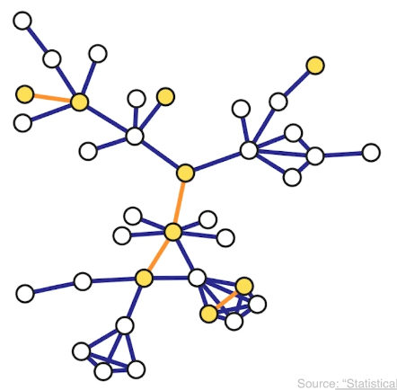
There are various ways to sample from a network and they result in subgraphs with very different properties. here we introduce four of the most common network sampling strategies. Suppose that the network has n nodes and we want to sample k of them. The simplest sampling strategy is to choose randomly and without replacement k out of n nodes and nodes of the original network is included in the sample only if both its end points are sampled. In this example, the yellow nodes are the k sampled nodes, but the only sampled edges are those highlighted in orange. This is referred to as induced subgraph sampling.
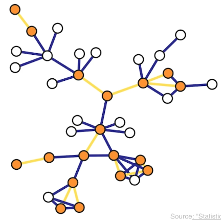
Suppose now that the network has m edges and we want to sample k of them. Another simple sampling strategy is to select randomly and without replacement k edges. A node is included in therefore sample as long as it is adjacent or incident to a sampled edge. This is why this method is referred to as incident subgraph sampling. In this visualization the yellow edges have been sampled white while hte orange nodes are included in hte sample because they are adjacent to at least one sampled edge. Note that higher degree nodes are more likely to be sampled this way. In other words, this is a biased sampling strategy in terms of node sampling probabilities.
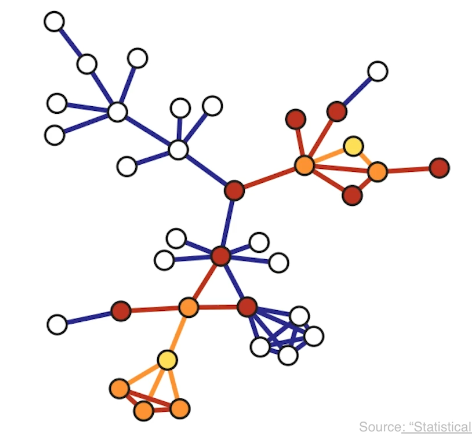
Another sampliung strategy referred to as snowball sampling is to start from a set of randomly selected nodes referred to as seeds shown in yellow here. In the first wave of the process, we include in the sample all the nodes and edge hte edges that are adjacent to the seeds. These are shown in orange. In the second wave we include all the nodes and edges that are adjacent to the nodes of the first wave and that have not been sampled already. These are shown in red. This process continues until we have included in the sample the desirable number of nodes or edges or we have reached the point in which we cannot sample anymore. The special case of a single sampling wave is referred to as star sampling.
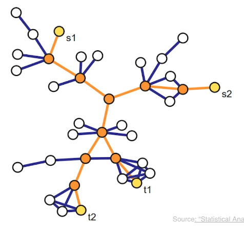
Another family of sampling strategies is referred to as link tracing. It is similar with snowball sampling in the sense that we start from some seed nodes but here we do not sample all the adjacent nodes. Instead there is a criterion that specifies the which adjacent node to sample at each step. For instance in computer networks, we can perform traceroute sampling. Here, the seeds that are shown in yellow as S1 and S2 are referred to as the source nodes of the traceroutes. And we are also given a set of target nodes shown here as t1 and t2. The network uses a specific route to connect a source to the target. And that is exactly the sequence of nodes and edges we included in the sample shown in orange. The sample in this case depends both on the chosen sources and targets, but also on the routing strategy that is deployed in that network.
Inclusion Probabilities with Each Sampling Strategy
An important question for each sampling strategy is: what is the probability that a given sampling strategy includes a node or an edge in the sample? As we will see later, these probabilities are essential in deriving important network estimators.
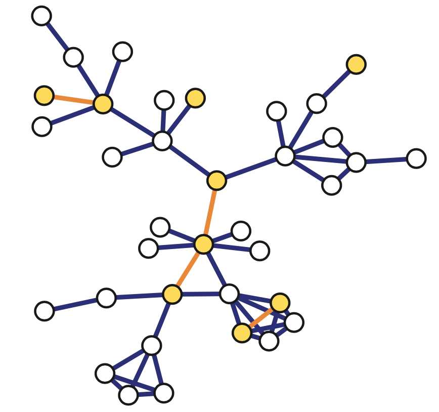 Image source: Kolaczyk, Eric D. Statistical Analysis of Network Data: Methods and Models (2009) Springer Science+Business Media LLC.
For induced subgraph sampling (see above), the node and edge inclusion probabilities are, respectively:
\[\pi_i = \frac{n}{N}, \quad \pi_{(i,j)}=\frac{n(n-1)}{N(N-1)}\]where n is the number of sampled nodes – because each node of the population graph is sampled uniformly at random without replacement, and each edge of the population graph is sampled if the two corresponding nodes are sampled. Note that the node inclusion probability is the same for all nodes (and the same is true for the edge inclusion probability).
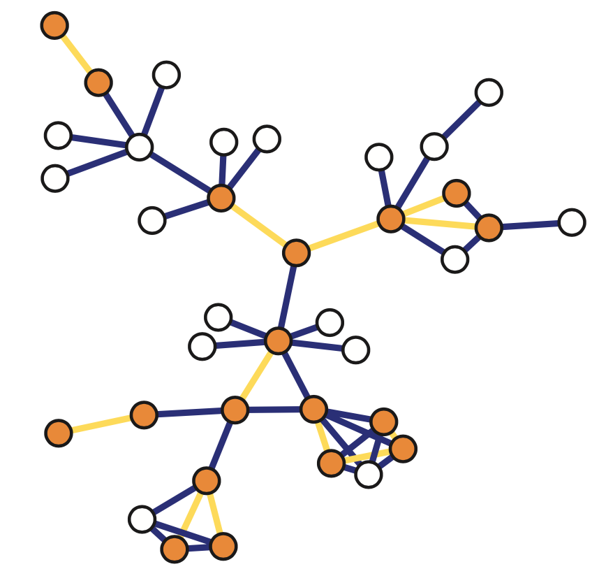
For incident subgraph sampling (see above), recall that we sample n edges randomly and without replacement. The inclusion probability for edges is simply: $\pi_{(i,j)} = n/|E|$, where $|E|$ is the number of edges in the population graph. The inclusion probability for node i is one minus the probability that none of the $k_i$ edges of node i is sampled:
\[\pi_i = 1 - \frac{\binom{|E|-k_i}{n}}{\binom{|E|}{n}},\quad \mbox{if }n\leq |E|-k_i\]Of course if $n < |E| - k_i$ then $\pi_i =1$. Note that, with incident subgraph sampling, nodes of higher degree have a higher inclusion probability.
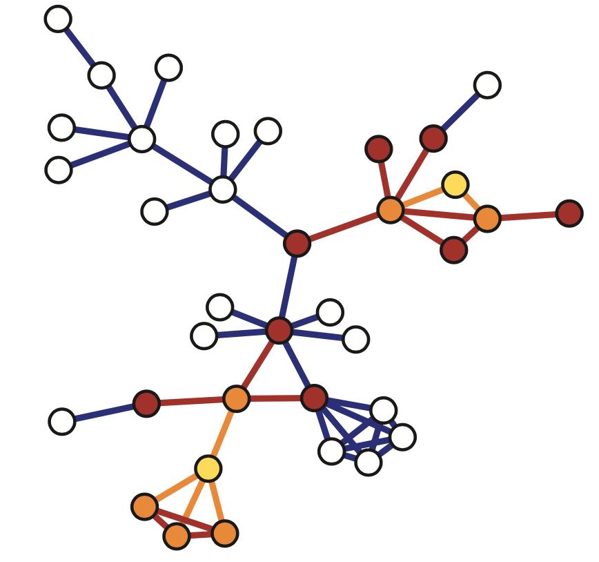
With snowball sampling (see above – the yellow nodes are the seeds and the process has two stages: first orange nodes and then brown nodes) , the inclusion probabilities are harder to derive, especially when the snowball process includes multiple stages. The statistical literature provides some approximate expressions, however.
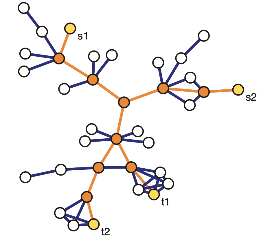
With link tracing (including traceroute sampling – see above), the inclusion probabilities are also harder to derive. Suppose however that the “traceroutes” (sampled paths from source nodes to target nodes) follow only shortest-paths, a fraction $\rho_s$ of nodes is marked as sources while another fraction $\rho_t$ of nodes is marked as targets. and $b_i$ is the betweenness centrality of node i while $b_{(i,j)}$ is the betweenness centrality of edge $(i,j)$. Then, the node and edge inclusion probabilities are approximately:
\[\pi_i \approx 1-(1-\rho_s-\rho_t)e^{-\rho_s\rho_t b_i}, \quad \pi_{(i,j)}\approx 1 - e^{-\rho_s\rho_t b_{(i,j)}}\]Food for Thought
Search the literature to find at least an approximate expression for the inclusion probability of nodes and edges in two-step snowball sampling.
Horvitz-Thompson Estimation of “Node Totals”
Let us now use the previous inclusion probabilities to estimate various “node totals”, i.e., metrics that are defined based on the summation of a metric across all nodes.
Specifically, suppose that each node i has some property $y_i$. We often want to estimate the total value of that property across the whole network:
\[\tau=\:\sum_{i\in V}y_i\]For instance, if $y_i$ is the degree of each node, then we can use $\rho$ to calculate the average node degree (just divide $\rho$ by the number of nodes).
Or, if $y_i$ represents whether a node of a social network is a bot or not (a binary variable), then $\rho$ is the total number of bots in the network.
Or, if $y_i$ represents some notion of node capacity, then $\rho$ is the total capacity of the network.
Suppose that we have a sample S of n network nodes, and we know the value $y_i$ of each sampled node.
An important result in statistics is the Horvitz-Thompson estimator. It states that we can estimate $\rho$ as follows:
\[\hat{\tau} = \sum_{i \in S}\frac{y_i}{\pi_i}\]where $\pi_i$ is the inclusion probability of node-i, as long as $\pi_i>0$ for all nodes in the sample S.
In other words, to estimate the “total value” we should not just add the values of the sampled nodes and multiply the sum by N/n (that would be okay only if $\pi_i =\frac{n}{N}$ for all i). Instead, we need to normalize the value of each sampled node by the probability that that node is sampled.
A key property of the Horvitz-Thompson estimator is that it is unbiased, as shown below. Let us define as $Z_i$ an indicator random variable that is equal to one if node i is sampled in S – and 0 otherwise. Then,
\[E[\hat{\tau}] = E\left[\sum_{i \in S}\frac{y_i}{\pi_i}\right]= E\left[\sum_{i \in V}\frac{y_i\, Z_i}{\pi_i}\right]=\sum_{i \in V}\frac{y_i\, E[Z_i]}{\pi_i}= \sum_{i \in V} y_i = \tau\]An estimate of the variance of this estimator can be calculated from the sample S as follows:
\[V(\hat{\tau}) \approx \sum_{i\in S}\sum_{j\in S}y_i y_j\left(\frac{\pi_{i,j}}{\pi_i \pi_j}-1\right)\]where $\pi_{i,j}$ is the probability that both nodes i and j are sampled in S (when i=j, we define that $\pi_{i,j} = \pi_i$).
Food for Thought
Suppose that i and j are sampled independently. How would you simplify the previous expression for the variance of the Horvitz-Thompson estimator?
Estimating the Number of Edges and the Average Degree
We can also apply the Horvitz-Thompson estimator to “totals” that are defined over all possible node pairs. Here, each node pair $(i,j)\in V\times V$ is associated with a value $y_{i,j}$, and we want to estimate the total value:
\[\tau = \sum_{(i,j)\in V \times V}y_{i,j}\]For instance, if $y_{i,j}$ is one when the two nodes are connected and zero otherwise, the total $\rho$ is twice the number of edges in the population graph.
Another example: it could be that $y_{i,j}$ is one if the shortest path between the two nodes traverses a given node-k (and zero otherwise). Then, the value $\rho$ is related to the betweenness centrality of node-k.
Suppose that we have a sample S of n node pairs, with the corresponding values $y_{i,j}$ of the sampled node pairs. The Horvitz-Thompson estimator tells us that an unbiased estimator of $\rho$ is:
\[\hat{\tau}=\sum_{(i,j)\in S\times S} \frac{y_{i,j}}{\pi_{i,j}}\]Let us first apply this framework in estimating the number of edges in the population graph. Suppose that we perform induced subgraph sampling, starting with n nodes chosen without replacement. Then, the probability of sampling a node pair (i,j) of the population graph is
\[\pi_{i,j} = \frac{\binom{n}{2}}{\binom{N}{2}} = \frac{n(n-1)}{N(N-1)}\]So, our estimate for the number of edges in the population graph is:
\[\hat{\tau}=1/2\,\sum_{(i,j)\in S\times S}\frac{y_{_i,j}}{\pi_{i,j}}=|E^*|\frac{N(N-1)}{n(n-1)}\]which means that we just need to multiply the number of sampled edges $|E^*|$ by a correction factor (the inverse of the fraction of sampled node pairs).
 Image source: Kolaczyk, Eric D. Statistical Analysis of Network Data: Methods and Models (2009) Springer Science+Business Media LLC.
To put these results in a more empirical setting, the plot shows the results of estimating the network density (and thus the number of edges) in the Yeast protein-protein interaction network, when using induced subgraph sampling. The actual number of edges is 31,201 (and the number of nodes is 5,151). The plots at the left show the empirical distribution of the sampled number of edges |$E^*$| for three node sampling fractions: p=0.10, 0.20 and 0.30 of the total number of nodes. The plots at the right show the empirical distribution of the standard error (estimate of standard deviation of |$E^*$|). All distributions are based on 10,000 trials.
Let us now use this result to also estimate the average degree $E[k]$ in the population network. Recall that the average degree is related to the number of nodes N and the number of edges $|E|$ as follows:
\[E[k]= \frac{2\, |E|}{N}\]Using the previous estimate for the number of edges at the sampled graph, we get the following estimate for the average degree of the network:
\[\bar{k}_{\mbox{induced_subgraph}} = \frac{2}{N}\, |E^*|\frac{N(N-1)}{n(n-1)}= \frac{2\, |E^*|}{n} \, \frac{N-1}{n-1}\]It is interesting to compare this with the average degree estimate if we sample the network using single-stage snowball sampling (also known as star sampling). In that case, we sample all the neighboring edges of each sampled node. So, we know the exact degree $k_i$ of each sampled node. Additionally, the inclusion probability for each node is $n/N$. So, the Horvitz-Thompson estimator for the total number of edges in the population graph is $\frac{1}{2}\sum_{i \in S}\frac{k_i}{n/N}$ . Thus, the star-sampling estimate for the average degree is:
\[\bar{k}_{\mbox{star_sampling}} = \frac{2}{N} \left( \frac{1}{2}\sum_{i \in S}\frac{k_i}{n/N} \right)=\frac{2 \, |E^*|}{n}\]Note that the induced-subgraph estimator differs from the star-sampling estimator by a factor $\frac{N-1}{n-1}$. That factor aims to correct for the extent to which the degree of each node is under-sampled when we use induced subgraph sampling.
Food for Thought
Recall that the Transitivity of a graph requires us to calculate the number of connected node triplets and triangles. How would you apply the previous framework to estimate these quantities from a sample of the graph, using induced subgraph sampling?
Estimating the Number of Nodes with Traceroute-like Methods
Let us now see how we can use a traceroute-like sampling strategy to estimate the number of nodes in a large network. Suppose that we have a set of sources $S={s_1,s_2, \dots s_{n_S}}$ and a set of targets $T={t_1,t_2, \dots t_{n_T}}$. Each traceroute starts from a source node and it traverses a network path to a target node, also “observing” (sampling) the intermediate nodes in the path. Note that an intermediate node may be observed in more than one traceroute path. The number of observed nodes is denoted by $N^*$, while the number of nodes in the population network is denoted by $N$. How can we use $N^*$ to estimate $N$?
Here is the key idea in the following method: suppose that we drop a given target node $t_j$ from the study. Would that target be observed in the traceroute paths to the remaining targets? We can easily measure the fraction of targets that would be observed in this manner. Intuitively, the lower this fraction is, the larger the population network we are trying to sample. Is there a way we can use this fraction to “inflate” $N^*$ so that it gives us a good estimate of $N$? As we will see next, the answer is yes through a simple mathematical argument.
Let us introduce some notation first. Suppose that $V^*_{(-j)}$ is the set of observed nodes when we drop $t_j$ from the set of targets. The number of such nodes is:
\[N^*_{(-j)}=|V^*_{(-j)}|\]The binary variable $\delta_j$ is equal to one if $t_j$ is NOT observed on sampled paths to any other target – and zero otherwise. The total number of such targets (that can be observed only if we traceroute directly to them) is $X=\sum_j \delta_j$.
The probability that $t_j$ is not observed on the paths to any other target, however, is simply the ratio between the number of nodes that are not observed after we remove $t_j$, and the number of non-source and non-target nodes:
\[P\left(\delta_j=1|V^*_{(-j)}\right) = \frac{N-N^*_{(-j)}}{N-n_S-(n_T-1)}\]assuming that the targets are chosen through random sampling without replacement from the set of all non-source nodes in the population graph.
The expected value of $N^*_{(-j)}$ is the same for all j however, simply due to symmetry (j can be any of the targets). Let us denote that expected value as:
\[E\left[N^*_{(-j)}\right] = E\left[N^*_{(-)}\right]\]So, the expected value of X is:
\[E[X]=\sum_{j=1}^{n_T} P\left(\delta_j=1|V^*_{(-j)}\right) = n_T \, \frac{N-E\left[N^*_{(-)}\right]}{N-n_S-(n_T-1)}\]We have now reached our goal: we can solve the last equation for the size of the population graph N:
\[N = \frac{n_T E\left[N^*_{(-)}\right] - (n_S+n_T-1)E[X]}{n_T - E[X]}\]The expected value $E[X]$ of the targets that can be observed only if we traceroute to them can be estimated by X, which is directly available from our traceroute data.
And the expected value $E[N^*_{(−)}]$ can be estimated, again directly from our traceroute data, as the average of \(N^\ast_{(-j)}\) across all targets j.
Let us now see what happens when this method is applied to estimate the size of an older snapshot of the Internet that included N=624,324 nodes and 1,191,525 edges. The number of sources was $n_S=10$. The “target density”, defined as $\rho_T=n_T/N$, is shown as the x-axis variable in the following graph. The y-axis shows the fraction of the estimated network size over the actual network size (ideally it should be equal to 1). The solid dots show the estimates from the method we described above (including intervals of $\pm$ one standard deviaton around the mean). The open dots show the same fraction if we had simply estimated the size of the network based on $N^*$.
 Image source: Kolaczyk, Eric D. Statistical Analysis of Network Data: Methods and Models (2009) Springer Science+Business Media LLC.
Note that the previous method is fairly accurate even if the target density is as low as 0.005 (i.e., about 3,100 targets).
On the contrary, if we had estimated the size of the network simply based on the number of observed nodes we would grossly underestimate how large the network is (unless if our targets pretty much cover all network nodes).
Food for Thought
If you could place the $n_S$ sources anywhere you want, where would you place them to improve this estimation process?
Topology Inference Problems
Let us now move from network sampling to a different problem: topology inference. How can we estimate the topology of a network from incomplete information about its nodes and edges?
The problem of topology inference has several variations, described below. The following visualization helps to illustrate each variation. The top-left figure shows the actual (complete) network, which consists of five nodes and five edges (shown in solid dark blue) – the dotted dark blue lines represent node pairs that are NOT connected with an edge. The topology inference problems we will cover in the following pages are:
 Image source: Kolaczyk, Eric D. Statistical Analysis of Network Data: Methods and Models (2009) Springer Science+Business Media LLC.
- Link prediction: As shown in the top-right figure, in some cases we know that certain node pairs are connected with an edge (solid dark blue) or that they are NOT connected with an edge (dotted dark blue) – but we do not know what happens with the remaining node pairs. Are they connected or not? In the top-right figure those node pairs are shown with solid light blue and dotted light blue, respectively. We have already mentioned the link prediction problem in Lesson-12, in the context of the Hierarchical Random Graph (HRG) model. Here, we will see how to solve this problem even if we do not model the network using HRG.
- Association networks: As shown in the bottom-left figure, in some cases we know the set of nodes but we do not have any information about the edges. Instead, we have some data about various characteristics of the nodes, such as their temporal activity or their attributes. Imagine, for instance, that we know all the characteristics, hobbies, interests, etc, of the students in a class, and we try to infer who is friend with whom. We can use the node attributes to identify pairs of nodes that are highly similar according to a given metric. Node pairs that are highly similar are then assumed to be connected.
- Network tomography: As shown in the bottom-right figure, in some cases we know some nodes (shown with red) but we do not know about the existence of some other nodes (shown in pink) – and we may not know the edges either. This is clearly the hardest topology inference problem in networks but sufficient progress has been made in solving it as long as we can make some “on-demand path measurements” from the nodes that we know of. Additionally, the problem of network tomography is significantly simpler if we can make the assumption that the underlying network has a tree topology (this is not the case in the given example).
Link Prediction
Let us introduce the Link Prediction problem with an example. The following network refers to a set of 36 lawyers (partners and associates) working for a law firm in New England. Two lawyers are connected with an edge if they indicated (through a survey) that they have worked together in a case. We know several attributes for each lawyer: seniority in the firm (indicated by the number next to each node), gender (nodes 27, 29, 34 are females), office location (indicated by the shape of the node – there are three locations in the dataset), and type of practice (red for Litigation and cyan for Corporate Law).
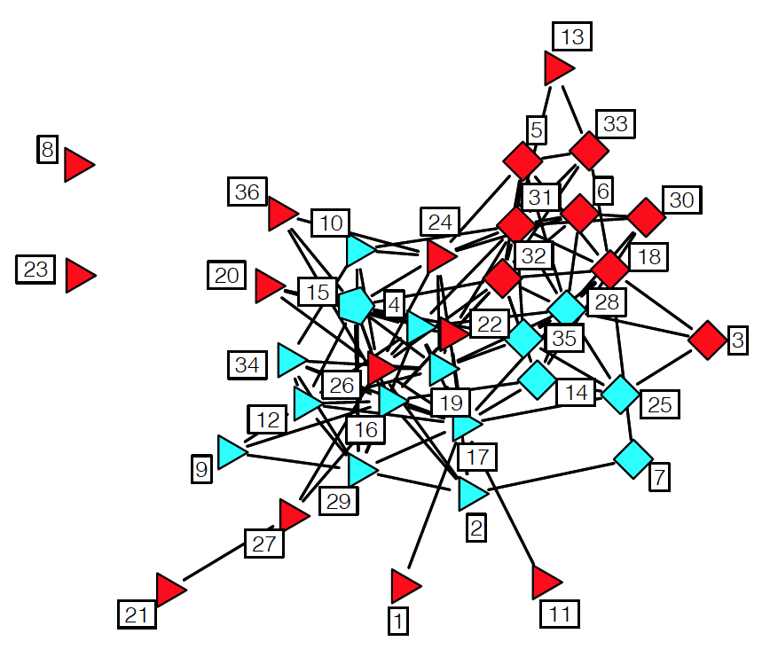 Source: “Statistical analysis of network data” by E.D.Kolaczyk. http://math.bu.edu/ness12/ness2012-shortcourse-kolaczyk.pdf
Suppose that we can observe a portion of this graph – but not the whole thing. How would you infer whether two nodes that appear disconnected are actually connected or not? Intuitively, you can rely on two sources of data:
- The first is the node attributes – for instance, it may be more likely for two lawyers to work together if they share the same office location and they both practice corporate law.
- The second is the topological information from the known edges. For instance, if we know that A and B are two nodes that do not share any common neighbors, it may be unlikely that A and B are connected.
Let us start by stating an important assumption. In the following, we assume that the missing edges are randomly missing – so, whether an edge is observed or not does not depend on its own attributes. Without this assumption, the problem is significantly harder (imagine solving the link prediction problem in the context of a social network in which certain kinds of relationships are often hidden).
Let us first define some topological metrics that we can use as “predictor variables” or “features” in our statistical model. Consider a node i, and let $N^{obs}_i$ be the set of its observed neighbors. As we have seen, many networks in practice are highly clustered. This means that if two nodes have highly overlapping observed neighbors, they are probably connected as well.
A commonly used metric to quantify this overlap for nodes i and j is the size of the intersection $|N_i^{obs}\cap N_j^{obs}|$. The normalized version of this metric is the Jaccard similarity,
\[s(i,j)=\frac{|N_i^{obs}\cap N_j^{obs}|}{|N_i^{obs}\cup N_j^{obs}|}\]which is equal to one if the two nodes i and j have identical observed neighbors.
Another topological similarity metric, more relevant to network analysis, is the following:
\[s(i,j) = \sum_{k \in N_i^{obs} \cap N_j^{obs}} \frac{1}{\log|N_k^{obs}|}\]Here, node k is a common neighbor of both i and j. The idea is that if k is highly connected to other nodes, it does not add much evidence for a connection between i and j. If k is only connected to i and j though, it makes that connection more likely. This metric is sometimes referred to as “Adamic-Adar similarity”.
There are several more topological similarity metrics in the literature – but the previous two give you the basic idea.
Together with topological similarity scores s(i,j), we can also use the node attributes to construct additional predictor variables for every node pair. Returning to the lawyer collaboration example, we could define, for instance, the following five variables:
- $𝑍^{(1)}_{𝑖,𝑗}=seniority_𝑖+seniority_𝑗$
- $𝑍^{(2)}_{𝑖,𝑗}=practice_𝑖+practice_𝑗$
- $𝑍^{(3)}_{𝑖,𝑗}=1 \text{ if ($practice_𝑖=practice_𝑗$) and 0 otherwise}$
- $𝑍^{(4)}_{𝑖,𝑗}=1 \text{ if ($gender_𝑖=gender_𝑗$) and 0 otherwise}$
- $𝑍^{(5)}_{𝑖,𝑗}=1 \text{ if ($office_𝑖=office_𝑗$) and 0 otherwise}$
We can also represent with the same notation any topological similarity score between node pairs. For instance,
\[Z_{i,j}^{(6)} = |N_i^{obs} \cap N_j^{obs}|\]Many other such predictor variables can be defined, based on the node attributes and topological similarity metrics.
Now that we have defined these predictor variables for each pair of nodes, we can design a binary classifier using Logistic Regression.
Suppose that Y is the (complete) adjacency matrix of the network. The binary variables we want to model statistically are the adjacency matrix elements \({\bf Y}_{i,j}\) (equal to one if there is a connection and zero otherwise). Our training dataset consists of the set of observed node pairs \({\bf Y}^{obs}\) – these are the node pairs for which we know whether there is an edge \(({\bf Y}^{obs}_{i,j}=1)\) or not \(({\bf Y}^{obs}_{i,j}=0)\).The remaining node pairs of Y are represented by \({\bf Y}^{miss}\) and we do not know whether they are connected (\({\bf Y}^{miss}_{i,j}=1\)) or not (\({\bf Y}^{miss}_{i,j}=0\)).
The equation that defines the Logistic Regression model is:
\[\log\left[ \frac{P(Y_{i,j}=1|{\bf Z}_{i,j}={\bf z})}{P(Y_{i,j}=0|{\bf Z}_{i,j}={\bf z})} \right] = \bf{\beta^T \, z}\]where $Y_{i,j}=1$ means that the edge between nodes i and j actually exists (observed or missing) – while $Y_{i,j}=0$ means that the edge does not exist. The vector z includes all the predictor variables for that node pair (we defined six such variables above). Finally, the vector $\beta$ is the vector of the regression coefficients, and it is assumed to be the same for all node pairs.
A logistic regression model can be trained based on the observed data ${\bf Y}^{obs}$, calculating the optimal vector of regression coefficients $\beta$. If you want to learn how this optimization is done computationally, please refer to any machine learning or statistical inference textbook.
After training the model with the observed node pairs (connected or not), we can use the logistic regression model to predict whether any missing node pair is actually connected using the following equation:
\[P(Y_{i,j}^{miss}=1|{\bf Z}_{i,j}={\bf z})= \frac{e^{\beta^T\bf{z}}}{1+e^{\beta^T\bf{z}}}\]This equation follows directly from the logistic regression model. For instance, if the previous probability is larger than 0.5 for a node pair (i,j), we can infer that the two nodes are connected.
The link prediction problem is very general and any other binary classification algorithm could be used instead of logistic regression. For example, we could use a support vector machine (SVM) or a neural network.
Food for Thought
In the link prediction framework we presented here, the logistic regression coefficients are the same for every node pair. What does this mean/assume about the structure of the network? How would you compare this approach with link prediction using the HRG modeling approach we studied in Lesson-12?
Association Networks
In some cases we know the nodes of the network – but none of the edges! Instead, we have some observations for the state of each node, and we know that the state of a node depends on the state of the nodes it is connected with.
For instance, in the context of climate science, the nodes may represent different geographical regions. For each node we may have measurements of temperature, precipitation, atmospheric pressure, etc over time. Further, we know that the climate system is interconnected, creating spatial correlations between different regions in terms of these variables (e.g., the sea surface temperate at the Indian ocean is strongly correlated with the sea surface temperature at an area of the Pacific that is west of central America). How would you construct an “association network” that shows the pairs of regions that are highly correlated in terms of each climate variable?
Recall that we had examined this problem in Lesson-8, when we discussed the 𝛿 -MAPS method. Our focus back then however was on the community detection method to identify regions with homogeneous climate variables (i.e., the nodes of the network) – and not on the association network that interconnects those regions.
To introduce the “association network” problem more formally, suppose that we have N nodes, and for each node i we have a random vector $X_i$ of independent observations. We want to compute an undirected network between the N nodes in which two nodes i and j are connected if $X_i$ and $X_j$ are sufficiently “associated”.
To solve this problem, we need to first answer the following three questions:
- How to measure the association between node pairs? What is an appropriate statistical metric?
- Given an association metric, how can we determine whether the association between two nodes is statistically significant?
- Given an answer to the previous two questions, how can we detect the set of statistically significant edges while we also control the rate of false positives? (i.e., spurious edges that do not really exist)
Let us start with the first question: which association metric to use?
The simplest association metric between $X_i$ and $X_j$ is Pearson’s correlation coefficient:
\[\rho_{i,j} = \frac{E[(X_i-\mu_i)(X_j-\mu_j)]}{\sigma_i \, \sigma_j}\]where $\mu_i$ and $\sigma_i$ are the mean and standard deviation of $X_i$, respectively. As you probably know, this coefficient is more appropriate for detecting linear dependencies because its absolute magnitude is equal to 1 if the two vectors are related through a (positive or negative) proportionality. If $X_i$ and $X_j$ are independent, then the correlation coefficient is zero (but the converse may not be true).
Instead of Pearson’s correlation coefficient, we could also use Spearman’s rank correlation (it is more robust to outliers), mutual information (it can detect non-linear correlations) or several other statistical association metrics. Additionally, we could use partial correlations to deal with the case that both $X_i$ and $X_j$ are affected by a third variable $X_k$ – the partial correlation of $X_i$ and $X_j$ removes the effect of $X_k$ from both $X_i$ and $X_j$.
To keep things simple, in the following we assume that the association between $X_i$ and $X_j$ is measured using Pearson’s correlation coefficient.
Second question: when is the association between two nodes statistically significant?
The “null hypothesis” that we want to evaluate is whether the correlation between $X_i$ and $X_j$ is zero (meaning that the two nodes should not be connected) or not:
\[H_0: \rho_{i,j}=0~~\mbox{versus}~~H_1:\rho_{i,j}\neq 0\]To answer this question rigorously, we need to know the statistical distribution of the metric $\rho_{i,j}$ under the null hypothesis $H_0$.
First let us apply the Fisher transformation on $\rho_{i,j}$ so that, instead of being limited in the range [-1,+1], it varies monotonically in $(-\infty, \infty)$:
\[z_{i,j}=\frac{1}{2}\log\left[ \frac{1+\rho_{i,j}}{1-\rho_{i,j}}\right]\]Here is a relevant result from Statistics: if the two random vectors $(X_i,X_j)$ are uncorrelated (i.e., under the previous null hypothesis $H_0$) and if they follow a bivariate Gaussian distribution, the distribution of the Fisher-transformed correlation metric $z_{i,j}$ follows the Gaussian distribution with zero mean and variance $1/(𝑚−3)$, where m is the length of the $X_i$ vector.
Now that we know the distribution of under the null hypothesis, we can easily calculate a p-value for the correlation between $X_i$ and $X_j$. Recall that the p-value represents the probability that we reject the null hypothesis $H_0$ even though it is true. So, we should state that $X_i$ and $X_j$ are significantly correlated only if the corresponding p-value is very small – typically less than 1% or so.
To illustrate what we have discussed so far, the following figure shows a scatter plot of m=445 observations for the expression level of two genes at the bacterium Escherichia coli (E. coli). The two genes are tyrR and aroG. The expression levels were measured with microarray experiments (log-relative units). The correlation metric between the two expression level vectors is $\rho=0.43$. Is this value statistically significant however?
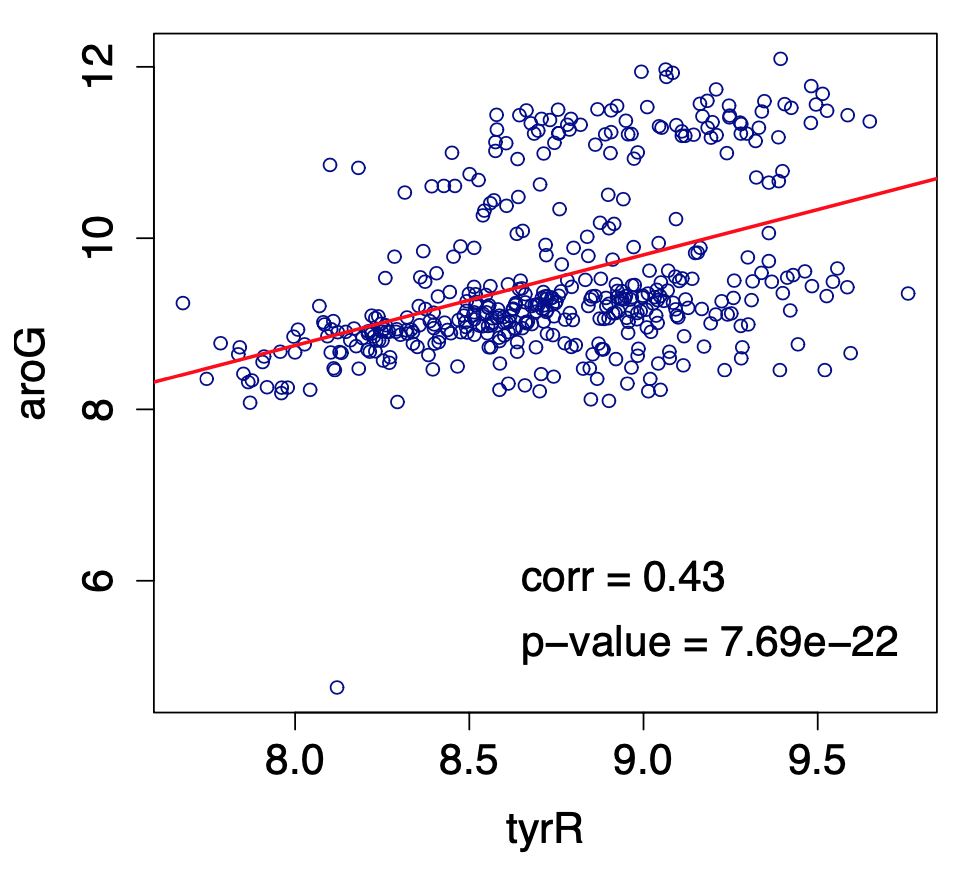 Image source: Kolaczyk, Eric D. Statistical Analysis of Network Data: Methods and Models (2009) Springer Science+Business Media LLC.
If we apply the Fisher transformation on $\rho$, we get that $𝑧=0.4599$. The probability that a Gaussian distribution with zero mean and variance $1/(445−3) \approx 0.0023$ gives a value of 0.4599 is less than $7.69×10^−22$, which is also the p-value with which we can reject the null hypothesis $H_0$. So, clearly, we can infer that the two genes tyrR and aroG are significantly correlated and they should be connected in the corresponding association network.
Third question: how to control the rate of false positive edges?
You may be thinking that we are done – we now have a way to identify statistically significant correlations between node pairs. So we can connect nodes i and j with an edge if the corresponding p-value of the null hypothesis for $\rho_{i,j}$ is less than a given threshold (say 1%). What is the problem with this approach?
Suppose that we have $𝑁=1000$ nodes, and thus $𝑚=𝑁(𝑁−1)/2=499,500$ potential edges in our network. Further, suppose that a correlation $\rho_{i,j}$ is considered significant if the p-value is less than 1%. Consider the extreme case that none of these pairwise correlations are actually significant. This means that if we apply the previous test 499,500 times, in 1% of those tests we will incorrectly reject the null hypothesis that $\rho_{i,j}=0$. In other words, we may end up with 4,995 spurious edges that are false positives!
This is a well-known problem in Statistics, referred to as the Multiple Testing problem. A common way to address it is to apply the False Discovery Rate (FDR) method of Benjamini and Hochberg, which aims to control the rate $\alpha$ of false positives. For instance, if $\alpha=10^{−6}$, we are willing to accept only up to one-per-million false positive edges.
Specifically, suppose that we sort the p-values of the $𝑚=𝑁(𝑁−1)/2$ hypothesis tests from lowest to highest, yielding the sequence $p_{(1)}\leq p_{(2)} \leq \dots p_{(m)}$. The Benjamini-Hochberg method finds the highest value of $k \in {1\dots m}$ such that
\[p_{(k)}\leq \frac{k}{m}\alpha\]if such a p-value exists – otherwise 𝑘=0.
 Image source: “The power of the Benjamini-Hochberg procedure”, by W. van Loon, http://www.math.leidenuniv.nl/scripties/MastervanLoon.pdf
The null hypothesis for the tests with the k lowest p-values is rejected, meaning that we only “discover” those k edges. All other potential edges are ignored as not statistically significant. Benjamini and Hochberg proved that if the m tests are independent, then the rate of false positives in these k detections is less than $\alpha$.
In our context, where the m tests are applied between all possible node pairs, the test independence assumption is typically not true however. There are more sophisticated FDR-control methods in the statistical literature that one could use if it is important to satisfy the $\alpha$ constraint.
Food for Thought
- Explain why the m tests are probably not independent in the context of association network inference.
- What would you do if the Benjamini-Hochberg method gives k=0 for the value of $\alpha$ that you want. You are not allowed to increase $\alpha$.
Topology Inference Using Network Tomography
Let us now focus on topology inference using network tomography. In medical imaging, “tomography” refers to methods that observe the internal structure of a system (e.g., brain tissue) using only measurements from the exterior or “periphery” of the system. In the context of networks, the internal structure refers to the topology of the network (both nodes and edges), while the “periphery” is few nodes that are observable and that we can utilize to make measurements.
For instance, in the following tree network the observable nodes are the root (blue) and the leaves (yellow) – all internal nodes (green) and the edges that interconnect all nodes are not known.
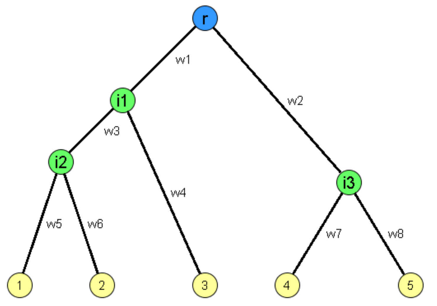 Image source: Kolaczyk, Eric D. Statistical Analysis of Network Data: Methods and Models (2009) Springer Science+Business Media LLC.
To simplify, we will describe network tomography in the context of computer networks, where the nodes represent computers or routers and the edges represent transmission links. Please keep in mind however that network tomography methods are quite general and they are also applicable in other contexts, such as the inference of phylogenetic trees in biology.
Let us first review a basic fact about computer networks. When a packet of size L bits is transmitted by a router (or computer) on a link of capacity C bits-per-second, the transmission takes L/C seconds. So, if we send two packets of size L at that link, the second packet will have to wait at a router buffer for the transmission of the first packet – and that waiting time is L/C.
We can use this fact to design a smart measurement technique called “sandwich probing”. Consider the previous tree network. Suppose that the root node sends three packets P1,P2,P3 at the same time. Packets P1 and P3 are small (the minimum possible size) and they are destined to one of the observable nodes, say $R_i$, while the intermediate packet P2 is large (the largest possible size) and it is destined to another observable node $R_j$. The packets are timestamped upon transmission, and the receiving node $R_i$ measures the end-to-end transfer delay that the two small packets experienced in the network.
If the destinations $R_i$ and $R_j$ are reachable from the root through completely different paths (e.g., such as the leaves 1 and 5 in the previous tree), packet P3 will never be delayed due to packet P2 because the latter follows a different path. So, the transfer delays of the two small packets P1 and P3 will be very similar. The absolute difference of those two transfer delays will be close to 0.
On the contrary, if $R_i$ and $R_j$ are reachable through highly overlapping paths (such as the leaves 1 and 2 in the previous tree), packet P3 will be delayed by the transmission delay of packet P2 at every intermediate router in the overlapping segment of the two paths. The more the intermediate routers in the common portion of the paths to $R_i$ and $R_j$, the larger the extra transfer delay of packet P3 relative to the transfer delay of packet P1.
Let us denote by $d_{i,j}$ the difference between the transfer delays of packets P1 and P3 when they are sent to destination $R_i$, while the large packet P2 is sent to destination $R_j$ . This metric carries some information about the overlap of the network paths from the root node to $R_i$ and $R_j$. In practice, we would not send just one “packet sandwich” for each pair of destinations – we would repeat this 1000s of times and measure the average value of $d_{i,j}$.
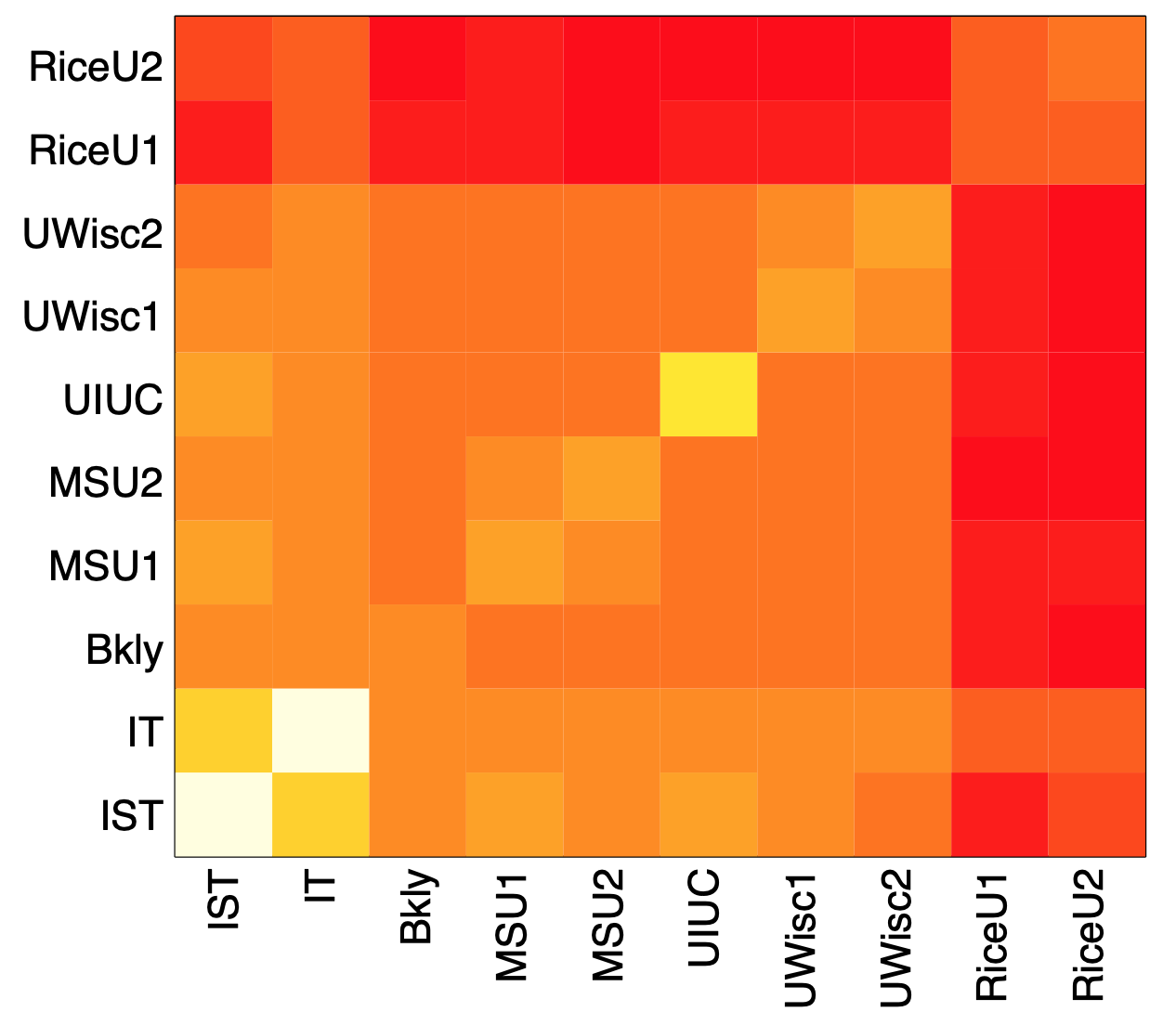 Image source: Kolaczyk, Eric D. Statistical Analysis of Network Data: Methods and Models (2009) Springer Science+Business Media LLC.
The previous figure visualizes these average delay differences for an experiment in which about 10,000 “packet sandwiches” were sent from a computer at Rice University in Texas to ten different computers: two of them also at Rice, others at other US universities and two (IST and IT) in Portugal. The darker color represents lower values (closer to 0), while the brighter color represents higher values. Note, for instance, that when we send the small packets to one of the Rice destinations and the large packet to a destination outside of Rice, the delay difference is quite low (relative to the case that both destinations are outside of Rice).
Now that we understand that we can use $d_{i,j}$ as a metric of “path similarity” for every pair of destinations, we can apply a hierarchical clustering algorithm to infer a binary tree, rooted at the source of the packet sandwiches, while all destinations reside at the leaves of the tree. Recall that we used hierarchical clustering algorithms in Lesson-7 for community detection. Here, our goal is to identify the binary tree that “best explains” the delay differences $d{i,j}$, across all possible pairs i and j.
The algorithm proceeds iteratively, creating a new internal tree node in each iteration. At the first iteration, it identifies the two leaves i and j that have the largest delay difference (i.e., the two destinations that appear to have the highest network path overlap), and it groups them together by creating an internal tree node $a_{i,j}$ that becomes the parent of nodes i and j. Then, the delay difference between the new node $a_{i,j}$ and any other leaf k is calculated as the average of the delay differences $d_{i,j}$ and $d_{j,k}$ (i.e., we use “average linking”). The two leaves i and j are marked as “covered”, so that they are not selected again in subsequent iterations.
The algorithm proceeds until all nodes, both the original leaves and the created intermediate nodes, are “covered”.
In the following figure we show what happens when we apply this method in the previous delay difference data. The top visualization shows the actual network paths from the source node at Rice to the ten destinations. The bottom visualization shows the result of the hierarchical clustering algorithm we described earlier.
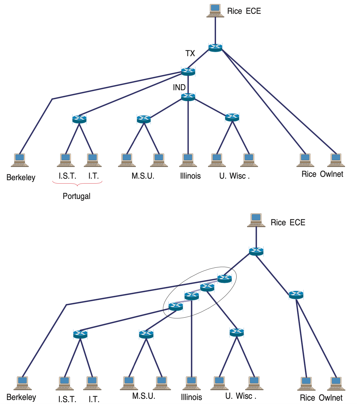 Image source: Kolaczyk, Eric D. Statistical Analysis of Network Data: Methods and Models (2009) Springer Science+Business Media LLC.
Note that a first difference between the “ground truth” network and the inferred network is that the latter is a binary tree, while the former includes branching nodes (routers) with more than two children. There is also a router (IND) that is completely missing from the inferred network, probably because it is so far that it does not cause a measurable increase in the delay of packet P3.
Food for Thought
- The metric we have introduced here is based on delay variations using “packet sandwiches”. Can you think of other ways to probe a network in order to measure the topological overlap of different paths?
- The network inference method we used here is based on hierarchical clustering. Can you think of other network inference methods we could use instead? (Hint: remember what we did in Lesson-12 with the dendrogram of the HRG model)
Other Network Estimation and Tomography Problems
There are several other interesting problems in the network tomography literature. Here we simply mention a couple of them. In a computer network, links can be in a congested state, causing performance problems such as queuing delays or packet losses. In every end to end path goes through these links. Suppose that we have a number of sensors and we can monitor the performance of several end to end paths shown here in red between those sensors. If none of the links are congested then all of the paths will appear as not congested.
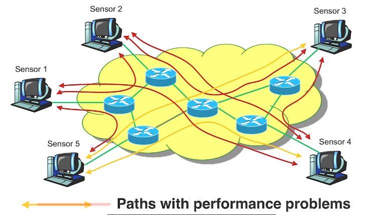
If however, one link becomes congested then the paths that go through that link will also appear in the path measurements as congested. In this visualization the two orange paths are congested and they may be introducing large queuing delays and packet losses. Which link do you think is the cause of these problems? If we assume that there is only one congested link and congestion can only take place between routers not between sensors and routers then the most parsimonious explanation in this scenario here is that the link that is shared by both congested paths shown here in red, is also congested. In general, as long as wek now the topology of the network and they are out between every pair of sensor nodes, we can usually identify the link or sequence of links that may be congested.
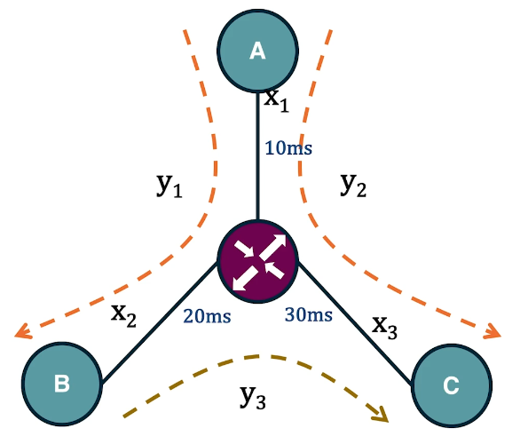
In the context of communication networks, each link is associated with the propagation delay. Suppose that we want to estimate these link delays given end-to-end delay measurements. The delay of a path is equal to the sum of the link delays in that path. For instance, in this small network we see here we have three links with unknown delays. Suppose that we measure using a software tool such as Pink, that the delay in the path between A and B is 30 milliseconds, between A and C is 40 milliseconds, and between B and C is 50 milliseconds. Further, suppose that we know the topology of the network and the route of sequence of links in its path, we can express this problem as a system of linear equation in which the unknowns are the link delays and each equation corresponds to a distinct path. In this case, the linear system has a unique solution for the delay of each link shown here in the visualization. In practice, however, such systems are often under constraint because the number of unknowns, the number of links, is more than the number of equations or paths. In such cases, we need to make additional assumptions about the links in order to be able to solve the linear system.
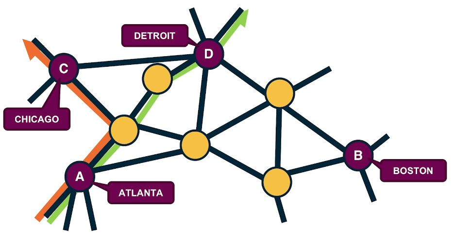
Another interesting tomography problem in the context of transportation or communication networks is to estimate the amount of flow or traffic between every pair of end-points. This is also known as the traffic matrix inference problem. For instance, in this visualization we have four antinodes, the cities Atlanta, Boston, Chicago and Detroit. The directed flows between these four cities may refer to the number of trucks driving between the cities every day. Suppose that we know the underlying road network and the route that is followed between every pair of cities. Further, suppose that we know for each of these links the traffic volume on that link, it could be the number of trucks per day on that highway segment. How would you use such link level volumes to estimate the unknown paths level directed flows? Try to write down a system of linear equations for this network so that each of the directed flows between two cities corresponds to an unknown and its network link gives us an equation. AS you will see in many cases, we have more unknowns than equations meaning that again we’re dealing with an under specified problem.
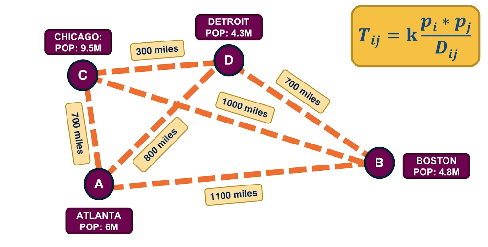
As we just saw the traffic matrix inference problem is often under-constrained because the number of unknowns is typically larger than the number of equations. One way to add some more structure into the problem is to consider a model that describe traffic flow between two-end nodes based on certain properties of those nodes such as the population or the distance between them. A common such model is the traffic gravity model. This model assumes that the traffic between two cities is proportional to the product of the populations $P_i$ and $P_J$ of the two cities and inversely proportional to the distance between the two cities shown as $d_{i,j}$. The proportionality coefficient is a variable that we can estimate based on the link level travel volume measurements. Additional constraints are typically sufficient to solve the traffic matrix estimated problems we have in practice.
Lesson Summary
This lesson focused on the use of statistical methods in the analysis of network data. This is a broad area, with many different topics. We mostly focused on two of them:
- network sampling: design of different sampling strategies and inference of network properties from those samples,
- topology inference: detecting the presence of missing links, creating association networks, and using tomography methods to discover the topology of the network.
Here is a list of other topics in the statistical analysis of network data:
- Statistical modeling and prediction of dynamic processes on networks (i.e., applying statistical methods such as Markov Random Fields or Kernel-Based Regression on dynamic processes on networks such as epidemics)
- Analysis and design of directed and undirected graphical models
- Efficient algorithms for the computation of network motifs from sampled network data
- Efficient algorithms for the computation of centrality metrics and communities.
In parallel, some of these problems are also pursued by the Machine Learning community, as we will see in the next lesson.
L14 - Machine Learning in Network Science
Overview
Required Reading
- “Representation learning on graphs: Methods and applications”, by W.L.Hamilton et al. 2017
Recommended Reading
- “Deep learning on graphs: A survey”, by Z.Zhang et al. 2020
- “Temporal networks”, by P.Holme and Z.Saramaki, 2012
- “The structure and dynamic of multilayer networks”, by S.Boccaletti et al., 2014
Embedding Nodes in a Low-dimensional Space
Machine Learning (ML) is a mature discipline with powerful methods to solve classification, clustering, regression and many other problems in data science. Most ML methods however require a vector representation of the inputs. This is easy to do with structured data that already come in the form of vectors or matrices. Even in the case of images, we can easily create a vector of pixel intensities (or RGB colors), scanning the image row by row.
How can we represent a graph (or network), however, with a vector? A graph can have an arbitrary structure, with some nodes being much more connected than others.
One option would be to represent each node v with an N-dimensional binary vector, where N is the number of nodes: element i is one if node-i is a neighbor of node v and zero otherwise. That vector representation however would be of high dimensionality for large networks. The sampling efficiency of most ML algorithms (i.e., how much training data they need in order to learn a model) is determined by that dimensionality. So, we are interested in graph representation methods that will map each node to a d-dimensionality vector, with $d \ll N$. The d-dimensional vector that corresponds to a node u is referred to as the “embedding” $f(u)$ of that node (see Figure below).
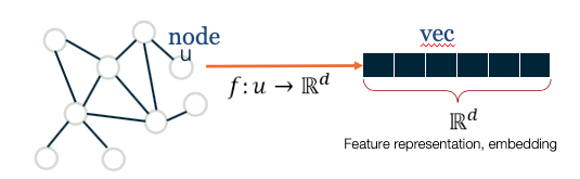 Images ( a,b ) from Jure Leskovec , “Representation Learning on Networks” tutorial, WWW 2018
Consider, for instance, the well-known Zachary’s karate club network (we had also examined that network in Lesson-7), and suppose that we want to represent each node with a two-dimensional vector, i.e., with a point in the Euclidean plane. How would you choose those N points?
One approach would be to map any two nodes that are “close to each other” in terms of network distance (e.g., directly connected with each other, or having a relatively large number of common neighbors) to two nearby points in the plane. And similarly, any two nodes that have a large network distance should be mapped to points with relatively large distance in the plane. The following figure shows a particular embedding of the nodes in Zachary’s network using the DeepWalk algorithm, which will be covered later in this Lesson.
 Image from: Perozzi et al. 2014. DeepWalk: Online Learning of Social Representations. KDD.
Why is it reasonable to create node embeddings based on the network distance between two nodes? The basic idea is that the network distance between two nodes in a graph is usually related to the similarity between those two nodes. For instance, in the context of social networks, two individuals that have strong ties between them and/or many common friends, would typically be similar in terms of interests. At the same time, many ML methods (such as classifiers based on the K-nearest neighbors algorithm or based on Support Vector Machines) are based on the assumption that the similarity between two inputs is reflected by the distance between their two embeddings.
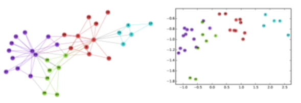
For example, if our goal is to classify “politically unlabeled” people in a social network (say whether they are Democrats, Republicans, Independent, etc), the idea of creating embeddings based on the network connectedness of two nodes makes a lot of sense: individuals that belong in the same social groups will be mapped to nearby embeddings.
Another example would be in the context of community detection. If the node embeddings are based on network distance, we can use any ML clustering algorithm (such as K-means) to identify clusters of nearby points in the d-dimensional embedding space.
As you can imagine, there are many way to compute embeddings from a graph so that well-connected nodes are mapped to nearby (or similar) vectors. In the next few pages we will examine more closely some popular methods to compute node embeddings.
Food for Thought
The Karate club embeddings are deliberately shown here in low-resolution so that the label of the nodes is not clear. Can you identify at least five of the nodes from their embeddings?
Shallow Encodings and Similarity Metrics
In this page we discuss some simple approaches to compute node embeddings. They are referred to as “shallow” because the computation of the embeddings does not require to train a deep neural network.
If we have n nodes and the dimensionality of the embeddings is d, the node embeddings can be “encoded” in a $d\times n$ matrix ${\bf Z}$ (see figure below). If v is an $n \times 1$ “one-hot” vector (all elements are zero except the element that represents node v, which is one), then the embedding of node v is given by the following matrix multiplication:
\[{\bf\mbox{ENC}} (v)=\bf{Z}\,\bf{v}\]which simply extracts the i’th vector of matrix ${\bf Z}$.
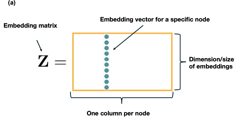 Images from Jure Leskovec, “Representation Learning on Networks” tutorial, WWW 2018
Let us now see how to compute the matrix ${\bf Z} based on different notions of “node similarity”.
The simplest approach is to define that two nodes are similar only if the are directly connected. Further, if the network is weighted, the similarity of two nodes can be equal to the weight of their connecting edge. Specifically, if A is the (possibly weighted) $n \times n$ adjacency matrix of the network, we can compute the matrix Z so that the dot-product of the embeddings $z_u$ and $z_v$ of any two nodes u and v is equal to the element $A_{u,v}$ of the adjacency matrix. Recall that the dot-product of two vectors with unit magnitude is equal to the cosine of the angle between them – and so it quantifies the distance between the two vectors.
One way to compute the matrix ${\bf Z}$ then, is to minimize the following “loss function” through any numerical optimization method (such as Stochastic Gradient Descent):
\[\mathcal{L}=\sum_{(u,v)\in V\times V} \|{\bf z}_u^T \, {\bf z}_v-{\bf A}_{u,v}\|\]If the previous loss cannot be minimized exactly to zero, the node embeddings would only approximate the previous relation with the adjacency matrix. An obvious drawback of this approach is that two nodes are considered “not similar” if they are not directly connected, even if they have many common network neighbors.
A more general approach is to consider that a node v is “similar”, not only to its direct neighbors, but also to any node that is at most k-hops away from v (for a small value of k, say 2 or 3). For example, in the following figure, the red node would be considered “similar” to only the green nodes if k=1, also the blue nodes if k=2, and all shown nodes if k=3. Then, we can compute the embedding matrix ${\bf Z}$ using the previous loss function, but replacing the adjacency matrix ${\bf A}$ with a k-hop adjacency matrix ${\bf A_k}$ in which two nodes are considered neighbors even if they are at most k-hops away from each other. Another approach is to use the first k powers of the adjacency matrix ${\bf A^k}$. Recall from Lesson-2 that this matrix gives the number of k-hop paths between any two nodes (for unweighted graphs).
 Images from Jure Leskovec, “Representation Learning on Networks” tutorial, WWW 2018
Another approach is to consider the overlap between the network neighborhood of two nodes. For instance, in the following network the blue and red nodes are not directly connected but they have two common neighbors (out of 3 neighbors for the red node, and out of 4 neighbors for the blue node).
 Images from Jure Leskovec, “Representation Learning on Networks” tutorial, WWW 2018
Recall that we had defined such a node similarity metric in Lesson-7. Specifically, the similarity $S_{i,j}$ between any pair of nodes i and j can be defined as:
\[S_{i,j} = \frac{N_{i,j}+A_{i,j}}{\min\{k_i,k_j\}}\]where $N_{i,j}$ is the number of common neighbors of i and j, $A_{i,j}$ is the adjacency matrix element for the two nodes (1 if they are connected, 0 otherwise), and $k_i$ is the degree of node i. Note that $S_{i,j}=1$ if the two nodes are connected with each other and every neighbor of the lower-degree node is also a neighbor of the other node. On the other hand, $S_{i,j}=0$ if the two nodes are not connected to each other and they do not have any common neighbor. There are several such node similarity metrics in the literature with minor differences between them.
Given such a similarity metric, the node embeddings can be then computed numerically based on the following loss function:
\[\mathcal{L}=\sum_{(u,v)\in V\times V} \|{\bf z}_u^T \, {\bf z}_v-{\bf S}_{u,v}\|\]All three approaches that we have seen in this page have some common characteristics. First, they are rather computationally expensive because the loss function considers every possible pair of nodes, even if the similarity between the two nodes is quite weak. This drawback can be addressed using appropriate regularization terms in the previous loss functions that ignore node pairs with very weak similarity.
A second drawback is that these methods require a separate embedding vector for each node, increasing the number of parameters of the resulting machine learning model proportionally to the network size. Ideally, we would prefer a node embedding scheme in which the number of model parameters is either constant or it scales sub-linearly with the network size. We will see such schemes later in this lesson.
Food for Thought
- The previous loss functions rely on the dot-product of embedding vectors. How would you modify these loss functions so that they rely instead on the L2-distance of embedding vectors?
- Which of the previous methods would you prefer if the network is weighted and directed?
Random-walk Encodings and Node2vec
The previous methods to compute node embeddings are deterministic in nature. More recent embedding methods rely instead on stochastic notions of “neighborhood overlap” between pairs of nodes.
In particular, DeepWalk (a misnomer – because it does not use deep learning) and node2vec are the most popular in this category. Both of them construct node embeddings based on random walks: two nodes u and v have similar embeddings ($z_u \approx z_v$) if the two nodes tend to co-occur on short random walks over the graph.
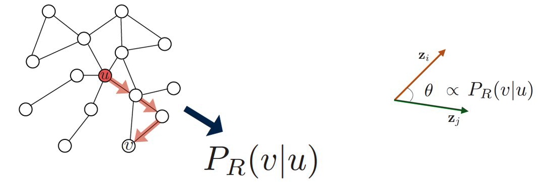 Images from Jure Leskovec, “Representation Learning on Networks” tutorial, WWW 2018
Specifically, assume that we have an undirected network, and suppose that $P_{R}(v|u)$ is the probability of visiting node v on random walks of length-T starting at node u, where T is typically a small positive integer (say between 2 to 10, depending on the size of the network). If that probability is high, the two nodes are “close” and they should have similar embeddings. Otherwise, their embeddings should be quite different.
Based on this insight, we can parameterize the probability $P_{R}(v|\bf{z_u})$ using the following “softmax” ratio (which is always between 0 and 1) of the node embeddings:
\[\frac{e^{ {\bf z}^T_u {\bf z}_v}}{\sum_{n\in V}e^{z^T_u {\bf z}_n}} \approx P_R(v|{\bf z}_u)\]We can now compute the node embeddings by minimizing the following cross-entropy loss function
\[\mathcal{L} = \sum_{u \in V}\sum_{v \in {N_R}(u)} -\log{P(v|{\bf z}_u})\]where ${\bf N_R(u)}$ is the multi-set of nodes in the ensemble of random walks of length T that start from u (it is a multi-set because we can have repeated elements – nodes can be visited multiple times on each random walk). So, a node v that appears multiple times in ${\bf N_R(u)}$ will contribute more in the previous sum than a node v’ that appears only once in ${\bf N_R(u)}$.
| If you are not familiar with cross-entropy loss functions, the goal here is to adjust the model parameters (i.e., the node embeddings) so that the terms $P_{R}(v | \bf{z_u})$ are close to 1 when v is in NR(u) and close to 0 when v is not in ${\bf N_R(u)}$. |
Algorithmically, we can think about the previous process as follows:
- We run short random walks of length T starting from each node u on the graph using a given random walk strategy R(T).
- For each node u, we compute ${\bf N_R(u)}$, defined as the multi-set of nodes visited on random walks starting from u.
- We optimize the embeddings ${\bf z_v}$ for every node v based on the previous loss function, given that we know ${\bf N_R(u)}$ for every node u. Different methods in this literature use various approximations to minimize the previous loss functions, resulting in different computational complexity. For instance, node2vec also uses a set of “negative samples” to approximate the denominator of the softmax term so that the corresponding summation does not need to consider all pairs of nodes.
Another difference between node2vec and earlier methods is that it introduces two parameters, p and q, that bias the random walk process. Specifically, p controls the probability that the walk will return to the previous node, while q controls the probability that the walk will visits a node’s neighbor that it has not visited before. The following example illustrates these random walk strategies.
Suppose that a random walk started at u and is now at w. The neighbors of w can be: closer to u (s1), farther from u (s3), same distance to u (s2). We remember where that walk came from. Where to go next? The two parameters that control that decision are:
- p … return parameter (BFS-like walk: Low value of p)
- q … ”walk away” parameter (DFS-like walk: Low value of q)
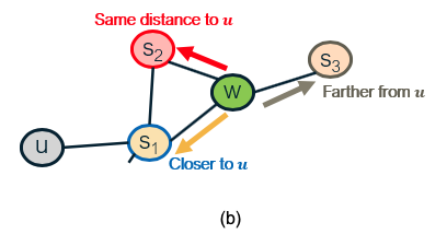 Images from Jure Leskovec, “Representation Learning on Networks” tutorial, WWW 2018.
Random walk approaches are more expressive than the deterministic embedding methods we discussed in the previous page because the notion of “similarity” between node pairs is stochastic and it can incorporate information about both local and more distant neighbors. They are also more efficient because the training process only needs to consider node pairs that co-occur on short random walks – instead of all possible node pairs.
Food for Thought
Suppose that we do not use the previous softmax ratio to parameterize the probabilities $P_{R}(v \bf{z_u})$. Can you think of another way to parameterize these probabilities as a function of the node embedding vectors?
Applications of Node Embeddings
 Images from Jure Leskovec, “Representation Learning on Networks” tutorial, WWW 2018
How can we use node embeddings to answer important questions about the original network?
If you are familiar with machine learning, you know that some classical ML tasks are to perform classification, clustering, regression, anomaly detection, feature learning, etc. All of these tasks have their counterparts in network analysis.
For instance, ML classifiers (based on algorithms such as neural nets, decision trees, SVMs, etc) can be directly applicable to classify the nodes of a network in different types (e.g., male versus female, humans versus bots, political affiliation). To perform this task we need a training dataset that consists of pairs (zv, cv), where zv is the embedding vector of node v and cv is the class (or type) of that node, at least for some nodes of the graph.
Another ML application on networks is link prediction. As we have discussed before, network data are often noisy and we may have both false positives (spurious edges) and false negatives (missing edges). If have computed node embeddings based on a (potentially noisy) estimate of the adjacency matrix, we can then train a binary classifier to predict whether any two given nodes are connected or not. Again, we need a training dataset that consists of pairs of nodes for which we are confident that they are either connected – or not connected. That classifier can then be applied on other pairs of nodes for which we do not have high-quality data.
A third application is community detection. Even though we have already discussed several algorithms to solve that problem, the use of node embeddings allows us to apply any clustering algorithm on those vectors. If we use an embedding scheme that considers the network distance between any two nodes, each resulting cluster will consist of a group of nodes that are within a short network distance from each other. The ML literature includes 100s of clustering algorithms, and so using this approach for community detection provides us with a very large “toolbox”.
A fourth application is the visualization of networks, relying on the dimensionality reduction provided by node embeddings. Suppose for instance that the node embeddings are two-dimensional. Then, we can represent the nodes of the network in the Euclidean plane, which is much easier for humans to visualize and understand. Nodes with shorter network distance will have more similar embeddings.
There are many other applications of node embeddings in the analysis of networks – and the list keeps growing. As we will see in the next page, however, the use of shallow embeddings has some fundamental limitations. For this reason, we will discuss next the use of deep neural networks to represent graphs.
Deep Embeddings and Graph Neural Networks
Deep Learning (i.e., the use of neural networks with several layers of hidden units) gives us models that can learn quite complex nonlinear and hierarchical input-output functions.
The node embedding methods we discussed so far are “shallow” in the sense that they are not computed using such deep neural networks. There are several problems with shallow embeddings:
- The model parameters include a different embedding vector for each node. For huge graphs, this can be an issue. Ideally, we would like to compute the embedding vector of any node using a single model, sharing the model parameters across all nodes.
- Models based on shallow embeddings do not have inductive capability, i.e., they cannot generalize beyond the training data that we use to learn the model. An embedding vector is computed for every node of the given graph – but it is not clear how to compute embedding vectors for nodes that may join the graph later (think of dynamic graphs) or for nodes that are not visible (we may only have a partial view of the compete graph). Ideally, we would like to learn a model that can generalize beyond the portion of the graph it has used in the training process.
- The shallow embedding methods we have discussed are based strictly on connectivity (i.e., the graph adjacency matrix) and so they cannot model arbitrary node attributes. For instance, in a social network the nodes may have additional attributes that relate to their gender, age, salary, etc.
We will now present one way to apply deep learning in the problem of node embedding and graph representation: Graph Neural Networks (or GNNs). We emphasize that there are many other similar methods, such as Graph Convolutional Networks or Graph Recurrent Neural Networks. If you are interested to learn more, please refer to the reading list at the start of the Lesson.
Suppose that we are given a graph G with:
- ${\bf V}$: the set of n nodes.
- ${\bf A}$: the adjacency matrix.
- ${\bf x_v}$: an m-dimensional vector for each node v, representing arbitrary node attributes (e.g., gender, age, salary)
A GNN is a neural network in which we compute an embedding vector for each node at each layer of the network. Let us represent by ${\bf h_v^k}$ the embedding of node ${\bf v}$ at layer ${\bf k}$. At the input layer, we have that ${\bf h_v^0 = x_v}$, i.e., the given node attributes.
At the ${\bf k’}$th hidden layer ${\bf k>0}$, the embedding ${\bf h_v^k}$ of node ${\bf k}$ depends on both the embedding of the same node at the previous layer ${\bf h_v^{k-1}}$ as well as on the embedding ${\bf h_u^{k-1}}$ of every neighbor u of v at the previous layer. More specifically, if ${\bf N(v)}$ represents the set of all neighbors of node v in the given graph, the embedding ${\bf h_v^k}$ depends on the average of ${\bf h_u^{k-1}}$ across all u in ${\bf N(v)}$. This average represents the contribution of the “local neighborhood” of node v to its embedding.
For example, consider the graph at the left of the following figure. The neural network at the right shows that the embedding of node-A at the second hidden layer depends on the layer-1 embeddings of nodes B, C and D (the neighbors of A). Similarly, the embedding of node B at layer-1 depends on the layer-0 embeddings of nodes A and C (the neighbors of B), the embedding of node C at layer-1 depends on the layer-0 embedding of nodes A, B, E and F, and the embedding of node D at layer-1 depends on the layer-0 embedding of node A.
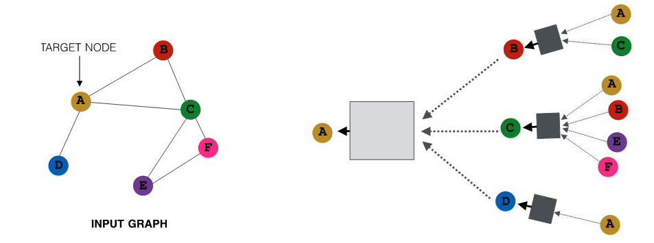 All images in this page are from Jure Leskovec , “Representation Learning on Networks” tutorial, WWW 2018
The previous figure only showed the neural network for computing the embedding of node-A (the yellow node) at layer-2. The following figure shows the corresponding networks for all other nodes, using the same color code. Of course in practice all these networks would be integrated in the same neural network model.
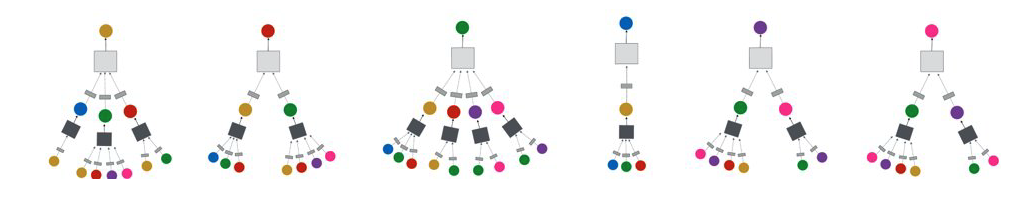
What is the specific mathematical form of these functional dependencies? As in most artificial neural networks, the output of a hidden-layer unit with inputs ${\bf x}$ (a ${\bf d}$-dimensional vector) is given by a nonlinear activation function $\sigma()$ of the weighted sum of the inputs:
\[\sigma\left(\sum^d_{i=0}w_i x_i\right)\]where ${\bf w}$ is the vector of model parameters (the weight of each input) that we will learn in the training process. The model potentially includes a “bias” term ${\bf w_0}$ for ${\bf x_0}=1$. The nonlinear function $\sigma()$ could be a sigmoid. function between 0 and 1 – but recently most models use the ReLU. function, which is simpler to compute.
The input weights at layer-k are represented by the matrices ${\bf W_k}$ (applied on the average neighbor embedding from the previous layer) and ${\bf B_k}$ (applied on the embedding of the node at the previous layer). We will see how to compute these matrices in the next page, when we discuss how to train GNN models.
We are now ready to present the complete equation for the embedding of node ${\bf v}$ at layer ${\bf k}$ – this is exactly what the GNN computes for each node and at each layer:
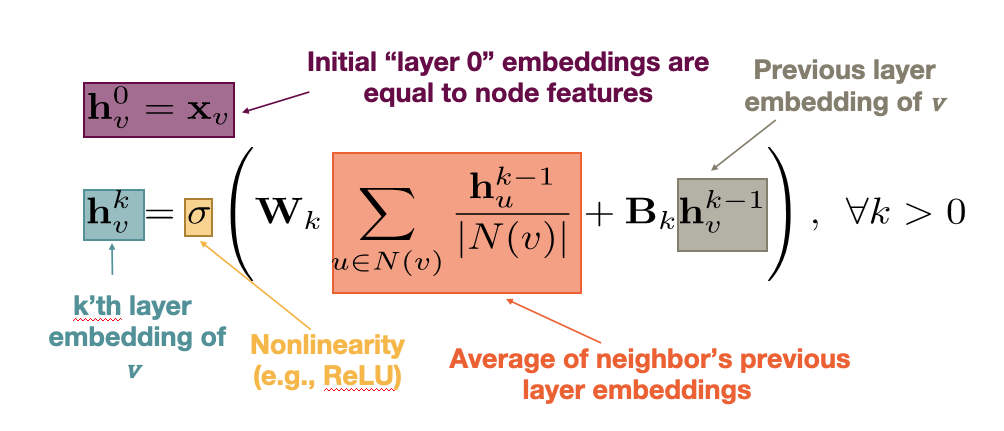
Note that the model captures the topology of the graph through the local neighborhood ${\bf N(v)}$ of each node. At the first hidden layer, the model only “knows” about the direct neighbors of each node. At layer-2, however, it also knows about the neighbors of the neighbors. If the neural network is sufficiently deep (large ${\bf k}$), the model can learn quite subtle structural properties of the graph because it has information about all neighbors of each node within a broader neighborhood that is ${\bf k}$-hop wide.
Another important point in the previous equation is that the parameters of the model, given by the matrices ${\bf W_k}$ and ${\bf B_k}$ for each layer, are shared across nodes at layer-${\bf k}$, i.e., we do not need to learn different parameters for each node. This is how GNNs accomplish two important goals: first, significant reduction in the complexity of the model (because they do not need to learn different parameters for each node) and second, the model has inductive capabilities because it can apply these matrices even on nodes that are not in the training dataset.
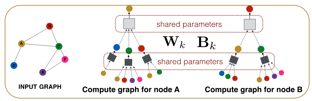
Food for Thought
- There is a “hidden assumption” behind the idea of using the same parameters for all nodes at each layer. How would you precisely state that assumption?
- What is the rationale for NOT using the same shared parameters at every layer?
GNN Training and Decoders
Let us now see how to train a GNN, i.e., how to compute the model parameters given some training data.
For simplicity, let us consider a binary node classification task in which we aim to distinguish whether each node of an online social network is human (class-0) versus bot (class-1). Classification tasks with a larger number of classes, or non-classification tasks (such as node clustering, link prediction, etc) can be performed similarly, with minor modifications in the following loss function.
Suppose that the neural network consists of ${\bf K}$ hidden layers. The final embedding of each node ${\bf v}$ is denoted by ${\bf z_v=h_v^K}$.
We need to also design the “decoder” part of the neural network, which maps the embedding vector ${\bf z_v}$ to the corresponding class of node ${\bf v}$. The simplest decoder is a “softmax” operator with parameters ${\bf D}$, where ${\bf D}$ is a vector of the same dimensionality as the embedding vector. The output of the softmax is given by the activation function of the dot-product between the transpose of the embedding vector ${\bf z_v}$ and ${\bf D}$:
\[\sigma\left(z_v^T D\right)\]So, if the softmax output for node ${\bf v}$ is closer to 0, we predict that node ${\bf v}$ is in class-0, and if it is closer to 1 we predict that node ${\bf v}$ is in class-1.
How can we compute all the parameters of the GNN model, including both the encoder (the part of the network that computes the embeddings with parameters ${\bf W_k}$ and ${\bf B_k}$ for k=1,2,…K) and the decoder (with parameters ${\bf D}$)?
Suppose that we are given some training data: the actual class ${\bf y_v}$ (0 or 1) for a set ${\bf V’}$ of nodes in the network. We can then compute the following loss function, which is known as cross-entropy loss:
\[\mathcal{L}=-\sum_{v \in V'} \left[y_v \log\left(\sigma(z_v^T D)\right) + (1-y_v) \log\left(1-\sigma(z_v^T D)\right)\right]\]Note that when the softmax output for node ${\bf v}$ is close to the actual class of that node, i.e., when $y_v \approx \sigma\left(z_v^T D\right)$, the contribution of node v in the loss is almost 0. Otherwise, when the model predicts the wrong class for node ${\bf v}$, i.e., when $y_v + \sigma\left(z_v^T D\right) \approx 1$,node ${\bf v}$ contributes significantly to the loss.
So, we can train the neural network to minimize the previous loss function by selecting appropriate model parameters: $W_k, B_k (k=1,2,…K)$ and D. This optimization is not convex, and so all neural network learning algorithms rely on numerical approaches such as variations of Stochastic Gradient Descent (SGD).
After we have computed the previous parameters, we can use the GNN model to classify any node in the network, including those for which we do not have training data.
Additionally however, we can compute embeddings (and then classify) even for nodes that were not present in the original network. The following figure illustrates this application of GNNs in the context of dynamic graphs. Suppose that the GNN was trained based on the grey portion of the graph. At some point later, node u joins the network. We can still use the same GNN, without retraining it, to compute the embedding of node u – and then to classify it. Obviously this approach will only work as long as the new nodes that join the network follow the same structural properties that the original network had.
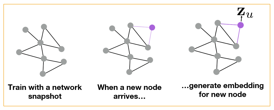 All images in this page are from Jure Leskovec , “Representation Learning on Networks” tutorial, WWW 2018
Another application of GNNs is to generalize from one or more given graphs to entirely new graphs – as long as we have reasons to believe that the new graphs have the same structural properties with the given graphs. For instance, in the context of protein-protein interaction networks, we may have such graphs from closely related bacterial species (e.g., Salmonella typhi and Salmonella typhimurium). We can then learn a GNN model based on these known graphs and apply that GNN to predict properties of proteins in novel Salmonella species, as shown in the following Figure.
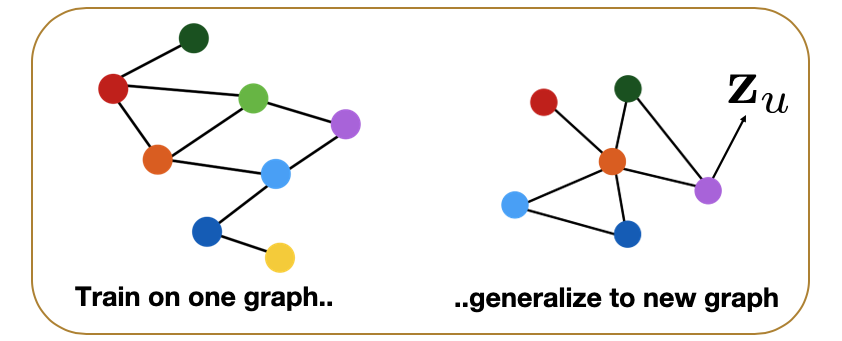
Food for Thought
- How would you modify the previous loss function in the case of multiple classes (multinomial classification)?
- Suppose that the task is not how to classify nodes – but to predict the presence of links between nodes. How would you train the GNN model in that case given a training graph?
Application: Polypharmacy
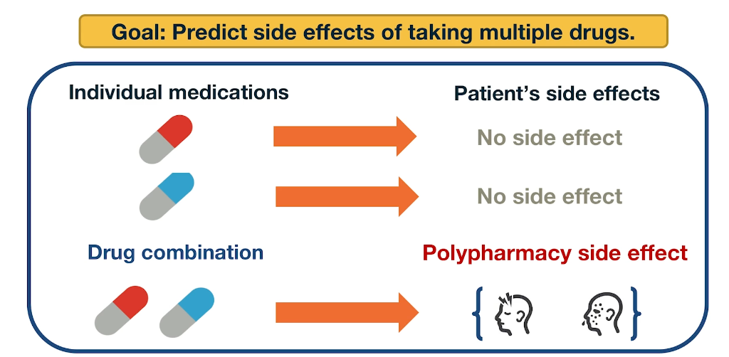
Polypharmacy means that a patient receives multiple medications at the same time. It is common with complex diseases and coexisting conditions but it has high risk of side effects due to drug interactions. 15% of the US population is affected by Polypharmacy and the annual costs exceed 177 billion. It is also difficult to identify manually because it is rare. It occurs only in a small subset of patients and it is not observed during clinical testing.
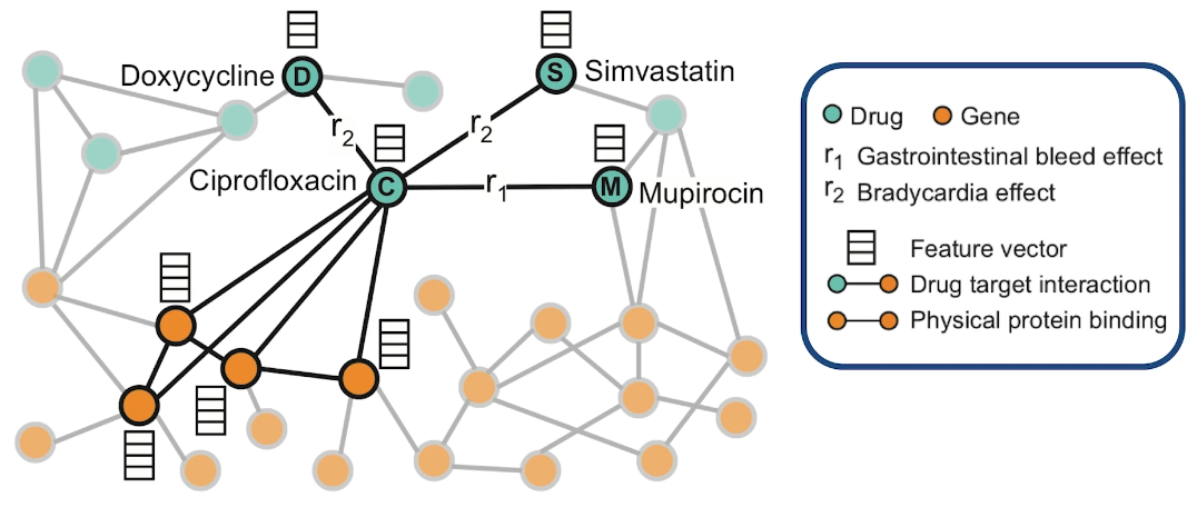
Here is an example of how to model Polypharmacy with a network. The network is multimodal because there are different types of nodes and edges. The green nodes represent drugs, while the orange node represent genes and the corresponding proteins that are encoded by these genes. The edge is between genes represent protein-protein interactions and edge between a gene and the drug means that drug targets the corresponding protein. And the edges between two drugs represent interactions between these two drugs. Those edges are labeled as you see with $r_1$ and $r_2$ and so on. The label of such an edge represents the side effect that would be cause if those two medications are taken together. Such networks can be constructed based on genomic data, patient population data and known side effects of different drug combinations. If we have any additional information about proteins or drugs, it can be included in hte model as different node features.
In this visualization the neighbors of the antibiotic called ciprofloxacin node C indicate that this drug targets four proteins and it interacts with three other drugs. Ciprofloxacin which is node C, taken together with doxycycline which is node D, or with Simvastatin node S increase the risk of bradycardia. Bradycardia side effect is represented in this graph with the edges that are labeled with $r_2$. The combination of Ciprofloxacin with mupirocin which is the mode M, on the other hand, increases the risk of gastrointestinal bleeding which is represented by the edge labeled as $r_1$. The goal of this graph neutral network model called decagon, is to predict unknown edges between drugs. Decagon predicts associations basically between pairs of drugs with a goal of identifying side effects that cannot be attributed to either individual drug in the pair.
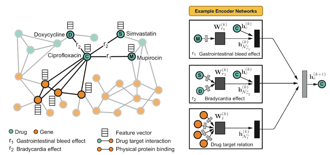
Here is an example of neural networks encoder. What you see at the right is the per layer update for a single graph node. The node representing ciprofloxacin node C, the hidden state activations from neighboring nodes are gathered and then transformed for each relation tie specifically. The top-left rectangle shows the contribution of the $r_1$ edge on the activation of node C at layer k plus 1. The activation depends on the activation of node C at the previous layer, layer k as well as the activation of node M at layer k. Similarly the middle rectangle at the right shows the contribution of the $r_2$ edges on the activation of node C. The bottom rectangle shows the contribution of the four target genes on the activation of node C. These three representations are accumulated in a normalized sum and then passed through a non-linear activation functions such as a Relu to product the hidden state of node C at layer k plus 1. Sets per node update are computed in parallel across the whole network with shared parameters for each type of edge.
Let us now see how Decagon can predict the existence of unknown side effects for a pair of drugs. This is the decoder part of the Decagon network. Suppose for example, that we want to examine if two drugs, C and S have the side effect represented by each relation type $r_1$, $r_2$, all the way to $r_n$. For each of these relations, the Decagon decoder takes the pair of embeddings for nodes C and S, and it produces a score for every potential relation edge between these two nodes through a fully connected neural layer that is unique for each relation. This type of inductive inference is possible because even though the Decagon neural network is different for each node, all of these networks says the same trainable parameters for each type of edge. So the trainable parameters that refer to the relation $r_2$ which is bradycardia are the same independent of whether those parameters are used for the side effects of drug C, or S or D.
Advanced Topics: Deep Generative Models for Graphs
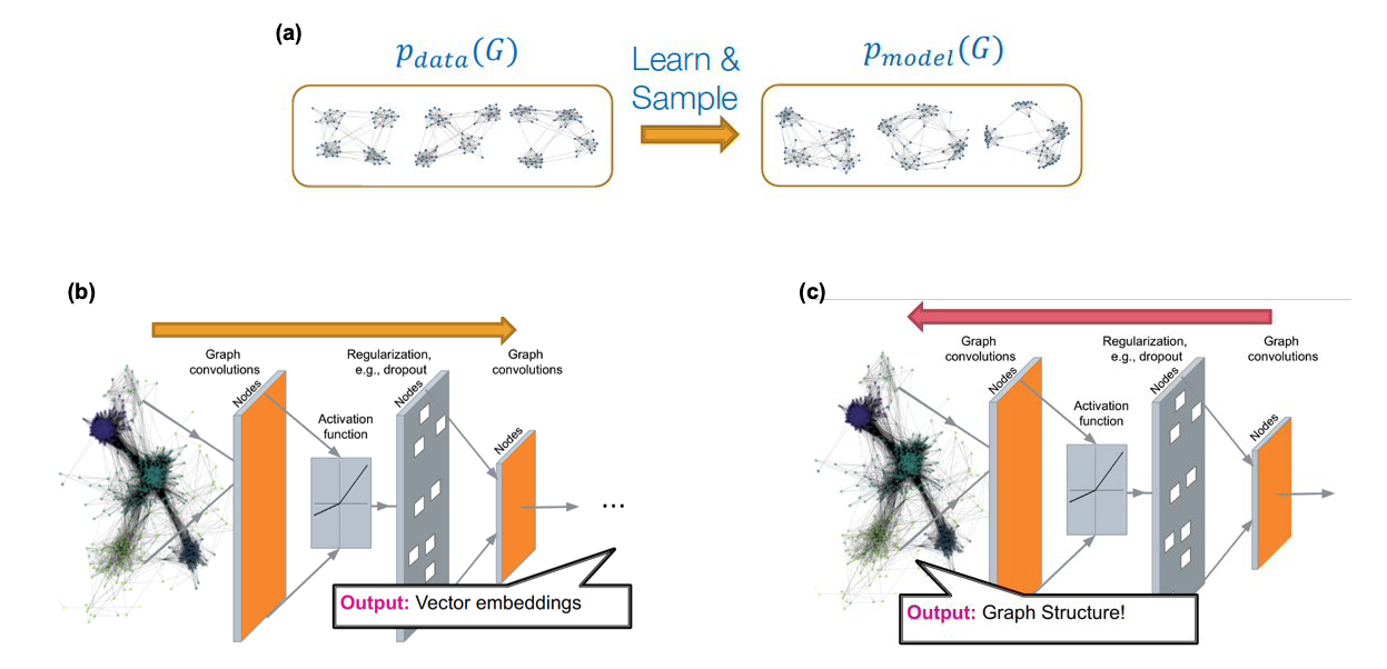 Source: “Machine Learning with Graphs” – Jure leskovec http://web.stanford.edu/class/cs224w/
We have already studied several network generation models in this course (mostly in Lesson-12 but also in earlier lessons). For instance, we have seen models with only one or two parameters (such as the Erdós-Rényì model or the preferential attachment model) as well as models with more parameters that can create networks with modular or hierarchical structure (such as stochastic block models). All of these models however are based on explicit, or prescribed, assumptions about the desired structure of the network. For example, we choose to use the preferential attachment model if we want to create a network with a power-law degree distribution of a certain exponent.
What if we want to generate networks that have similar structure with one (or more) given real networks – but we do not have an explicit structural characterization of those networks? For example, given a portion of the Facebook friendship graph, we may be asked to create several synthetic networks that have the same structural properties with the Facebook graph – even though we may not be in a position to list (or even know!) all those structural properties.
As shown in part-(a) of the above Figure, the goal in that case is to use one or more given graphs (the data) to learn a high-dimensional joint distribution (the model) that gives the probability that any two nodes are connected given the connectivity between all other nodes in a graph. We can then use that model to create many synthetic networks, of arbitrary size, with the expectation that all those networks share the same structural properties with the given data.
The main challenges in developing graph generative models are:
- the generative model should be able to generate graphs of arbitrary size and density. In practice this is difficult if the given data only refer to networks of a given size and density (e.g., it is hard to generate realistic dense networks if all the data refer to sparse networks).
- the generative model needs to consider the issue of “graph isomorphism”, meaning that some networks may appear different (e.g., we may have ordered/labeled the nodes in different ways) even though the networks are identical (or almost identical) in terms of structure.
- the generative model needs to learn all non-trivial structural properties of the given graphs, such as degree correlations, community structure, hierarchy, and many others, without being explicitly trained to capture any of these properties.
This is an active research area that spans both network science and machine learning. Most of the state-of-the-art “generative graph models” rely on deep neural networks, as shown in Figures (b) and (c) above. The deep learning architectures that have been adapted in this context are: variational auto-encoders, deep Q-networks (reinforcement learning), generative adversarial networks (GANs), and generative recursive neural networks (RNNs). We will not discuss these approaches in more depth here because they require prior knowledge in deep learning.
If you are interested to learn more about this topic, we recommend the 2020 article: “A systematic survey on deep generative models for graph generation” by X.Guo and L.Zhao.
One application in which graph generative models has attracted large interest is in computational chemistry (molecule design) and drug synthesis. Discovering a new molecule that is similar to existing molecules (e.g. a given set of antibiotics) is a very expensive and time-consuming process, especially if every candidate molecule is to be chemically synthesized and tested at the lab. Network science and deep learning techniques have been used to propose good molecular candidates (graphs between chemical elements) that have a high “score” in terms of their similarity to existing molecules.
The additional challenge, however, is that these candidate networks need to represent valid molecules. For instance, they need to satisfy the valency of each atom in the molecule so that the resulting chemical is stable. Another challenge is that the candidate networks should be, not just similar, but better than the given molecules in terms of various properties (e.g., a new antibiotic should be effective to bacteria that are already resistant to the existing antibiotics that are used as data in the corresponding generative model).
A recent survey of methods in this area is “Deep learning for molecular design” by D.Elton et al.
Advanced Topics: Interdependent Networks
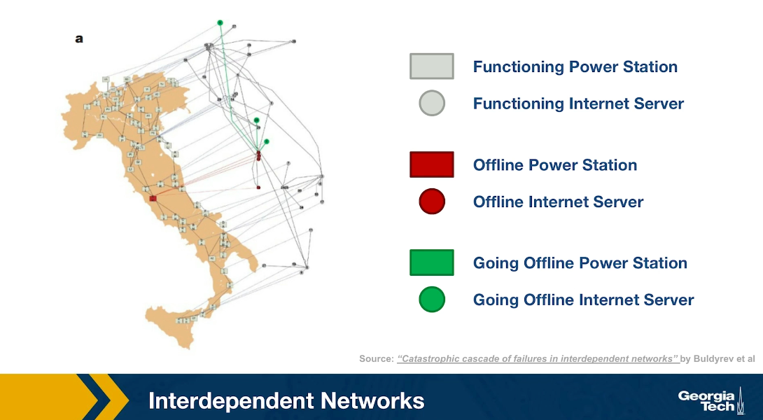
Another emerging topic of network science is that of interdependent networks or multi-layered networks. This illustration refers to a cascade of power failures that took place in 2003 in the power distribution network of Italy. We see two networks, on the map of Italy, we see the network of power generators while the network of computer severs that control those power generators is shown at the right over the map of Italy, It is important to understand that in order for a power generator to operate properly, it has to be controlled by one of those computer servers. In order for the computer severs to operate properly, they need to have power. So the two networks are interdependent.
At the first step of the process, one of the power generators shown here is red, went offline. Three of the computers servers went also offline because they depended on that power generator. The nodes that are shown in green here are nodes that will go offline at the next step of the process. Indeed at the next step of the process, some additional computer severs went offline causing two more power generators to go offline shown here in red.
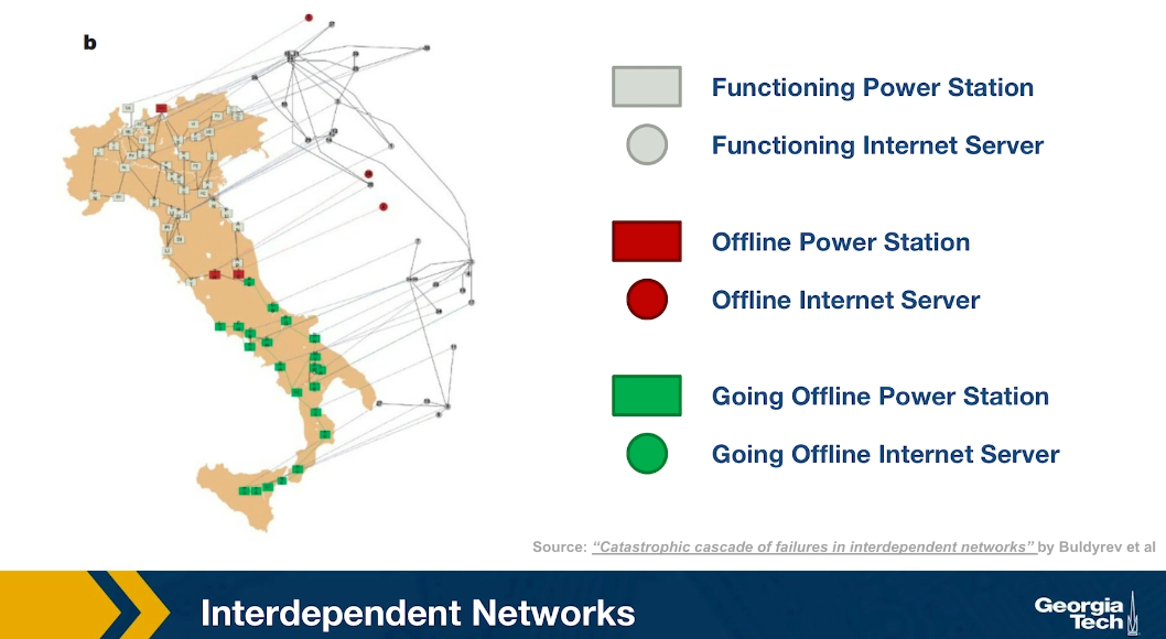
In the final step of the process, as you see, about half of the country went offline because all of those south power generators went offline together with the computer servers that control them. This is an example of an interdependent network. In many real-world systems there are such interdependencies between networks. For example in transportation, if there is a disruption in airlines because of a volcanic eruption or something else, many more passengers will start traveling by trains, buses or cars, potentially causing congestion on the land transportation network.

Advanced Topics: Temporal Networks
An active research area in Network Science is the study of Temporal Networks. In such networks, nodes and edges may be present only for specific time periods. For instance, a network that shows the phone communications between people may represent each call with an edge that has a specific start and end-time. Note that the transitivity property does not apply in temporal networks, in the sense that if node-A connects to node-B, and node-B connects to node-C, we cannot conclude that node-A connects to node-C.
For instance, Figure-a represents the communications between six people, arranged temporally in six time steps. For instance, during the first time period (t1) node-A contacted node-B, and node-C contacted node-F. If we ignore the temporal ordering of the links, we can reach completely wrong conclusions about the communication flows that are possible in a given network. For instance, if node-A is the only node with some information at time t1, is it possible that this information will ever reach node-F during the following six time steps?
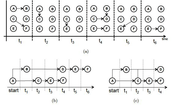 Source: “Temporal network metrics and their application to real world networks” (Figure 4.5) by J.K.Tang.
Figure-b shows that there are actually two different “temporal paths” from node-A to node-F. In one of them node-F would obtain the information at time t4, while in the other at t6.
We could also ask: what is the earliest time at which each node in the graph could receive this information? This is shown in Figure-c, referred to as the “minimum temporal spanning tree” originating at node-A.
These are only a couple of the many interesting questions we can ask about temporal networks. The temporal structure of edge activations can significantly affect the dynamics of processes that are taking place on a network, such as epidemics, information diffusion, or synchronization. Additionally, the metrics we have defined earlier to quantify the centrality of nodes (or groups of nodes) have to be modified in temporal networks so that they only consider temporally-valid paths.
If you are interested to learn more about Temporal Networks, we recommend the recent book “A Guide to Temporal Networks” by R.Lambiotte and N.Masuda.
Lesson Summary
This lesson focused on the overlap between Network Science and Machine Learning, with an emphasis on Deep Learning and Graph Neural Networks.
This is a relatively new area that has been mostly pursued in the research literature in the last five years or so.
The applications of this emerging area are numerous – mostly because many real-world problems can be modeled with graphs and because Deep Learning has enormous capabilities to learn complex features from data without the burden of manual “feature engineering”.
We should also mention however the main drawbacks of the Deep Learning approach:
First, the resulting models are over-parameterized (thousands or even millions of parameters!) – compare that with models such as Preferential Attachment that have only one parameter, or even Stochastic Block Graphs in which the number of parameters scales with the number of communities. Models with too many parameters may overfit the data and they can be computationally expensive in terms of training.
Second, Deep Learning models are often viewed as “black boxes”, i.e., they are not transparent in terms of how the (automatically identified) features relate to the given task. For example, if a neural network classifies the node of an online social network as “bot” (instead of human), we may not know why.
Third, Deep Learning models typically require lots of training data. This is not a problem as long as we are working with large graphs, or many graphs, and we have labeled data for the nodes and edges of those graphs. For smaller networks however, it may be more appropriate to rely on simpler models, such as those studied in Lesson-12.
The last part of this lesson also mentioned some other state-of-the-art network science topics (such as interdependent networks or temporal networks) that we do not have time unfortunately to cover in more detail. If you are interested to learn more about these topics, please refer to the provided references.